


Decathlon's rebranding is built on a strong conviction: a brand doesn't just transform visually; it must align its identity with its strategic ambitions. More than just a new logo, this is a comprehensive overhaul aimed at strengthening its international positioning, modernizing its image, and enhancing the customer experience. Here are the key elements of this transformation: the Orbite (new logo) / a deeper blue palette / a strengthened digital strategy / a simplification of the brand portfolio / an increased commitment to sustainability and innovation. Whether it's design, organization, or user experience, this transformation demonstrates that successful rebranding isn't solely about aesthetics, but about a coherent, sustainable, and forward-looking vision.
Decathlon has established itself as an iconic brand in the world of sports. Founded in France in 1976, it quickly became a key international player, offering accessible and innovative products to both amateurs and professionals. With numerous Decathlon stores worldwide, the brand covers a wide range of sports disciplines, from team sports to precision sports. This rebranding is in line with major brand transformations, as we analyzed in our article on the biggest rebrands of 2024.
An icon is built. To understand what makes a brand iconic, read our article on the 8 examples of the best brand platforms in 2025 : including Nike, which shares with Decathlon the ability to unite sport and a strong identity.
{{cta-1}}
Its success is based on an brand strategy integrated, combining design, production, and distribution. With the support of its engineers and 400 designers at Decathlon, the company develops high-performance products by leveraging a portfolio of expert brands: Kipsta for team sports, Simond for climbing and mountaineering, Btwin for cycling, Tribord for water sports, Quechua for hiking and mountain sports, Inesis for golf, and Kuikma for padel.
{{cta-1}}
In response to market evolution and consumer expectations, Decathlon is adopting an ambitious rebranding strategy. This change in logo and visual identity aims to reflect Decathlon's ambition to strengthen its position as an international sports brand.
Decathlon's transformation is marked by the introduction of a new Decathlon logo, called "the Orbit." It symbolizes movement, dynamism, and innovation, while preserving the roots of Decathlon's history. The Orbit is inspired by the iconic tilted "A" from the old logo, and can evoke several symbols such as a mountain, a sail, a wave, or even a heartbeat. This change reflects a desire for modernization and unification of thebrand image, while preserving its DNA.
A logo that preserves its DNA while modernizing is the definition of a successful evolution rather than a break. We explore this nuance in our article on brand evolution or revolution: understanding why and when.
The sports brand has also revised its color palette with a deeper blue, symbolizing trust and commitment. This shade also provides better readability and enhanced consistency across various digital and physical media.
Choosing colors is one of the most strategic decisions in a rebranding. Our guide to choosing your color palette explains how colors speak to your customers even before they read a word.
Alongside the logo change, Decathlon is adopting a more assertive digital approach to optimize the customer experience. The brand is focusing on a deep digital transformation, including a redesign of its website and online shopping platforms, aiming to make the experience more fluid, intuitive, and personalized.
📌 Also read: How to Execute a Successful Brand Rebranding?
Decathlon's CEO, Barbara Martin Coppola, highlighted Decathlon's ambition to unveil a brand identity more consistent with its global growth strategy. The brand thus aims to provide customers with a more seamless experience, both in-store and through Decathlon's digital supply chain.

Decathlon's rebranding goes beyond just a logo change. It's a comprehensive transformation of Decathlon, rethinking its organization to better reflect its values and commitment to sustainability, innovation, and customer experience. The company is working to better position Decathlon in the sports market by simplifying its brand portfolio and highlighting its products more effectively.
This evolution aims to improve product visibility while strengthening its brand image. Decathlon has built a marketing strategy focused on digitalization and communication optimization. Decathlon's brand thus relies on a strong, consistent identity adaptable to the new challenges of the global market.
This identity consistency is achieved through brand guidelines that are strong: the reference document that ensures the Orbit remains recognizable, from store to digital.
Decathlon's rebranding is not just about its brand image, but also its commitment to a sustainable and responsible transformation. As a global brand, Decathlon aims to strengthen its influence in the sports world by implementing forward-looking initiatives.

This example perfectly illustrates what a Love Brand is: a brand that goes beyond the product to create a lasting emotional connection. Discover our article on "Love Brands": Decoding Brand Love.
In a context where sustainability is a key issue, Decathlon integrates an eco-responsible approach into its brand strategy. The company invests in the eco-design of its products and the optimization of its supply chain to reduce its carbon footprint. It also aims to educate its customers about more sustainable consumption by offering alternatives such as renting and repairing sports equipment.
{{block-cta-1}}
Decathlon constantly invents new solutions to enhance the athlete experience. Thanks to its research and development network, the brand explores innovative technologies to optimize the performance and comfort of its products. Decathlon's ambition is to become an essential benchmark for innovation in the sports sector.
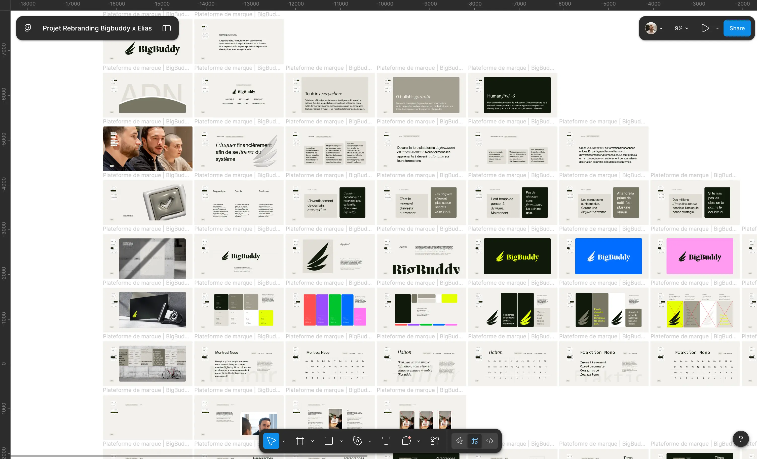
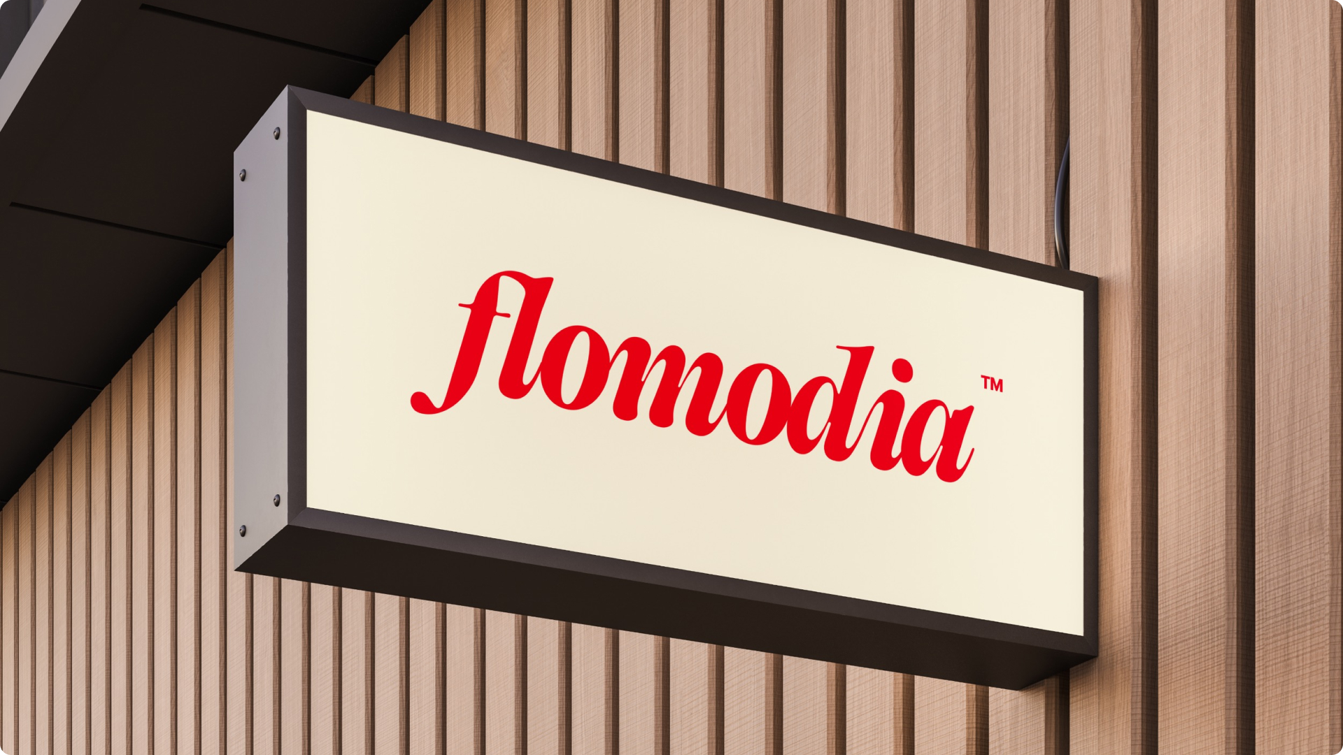
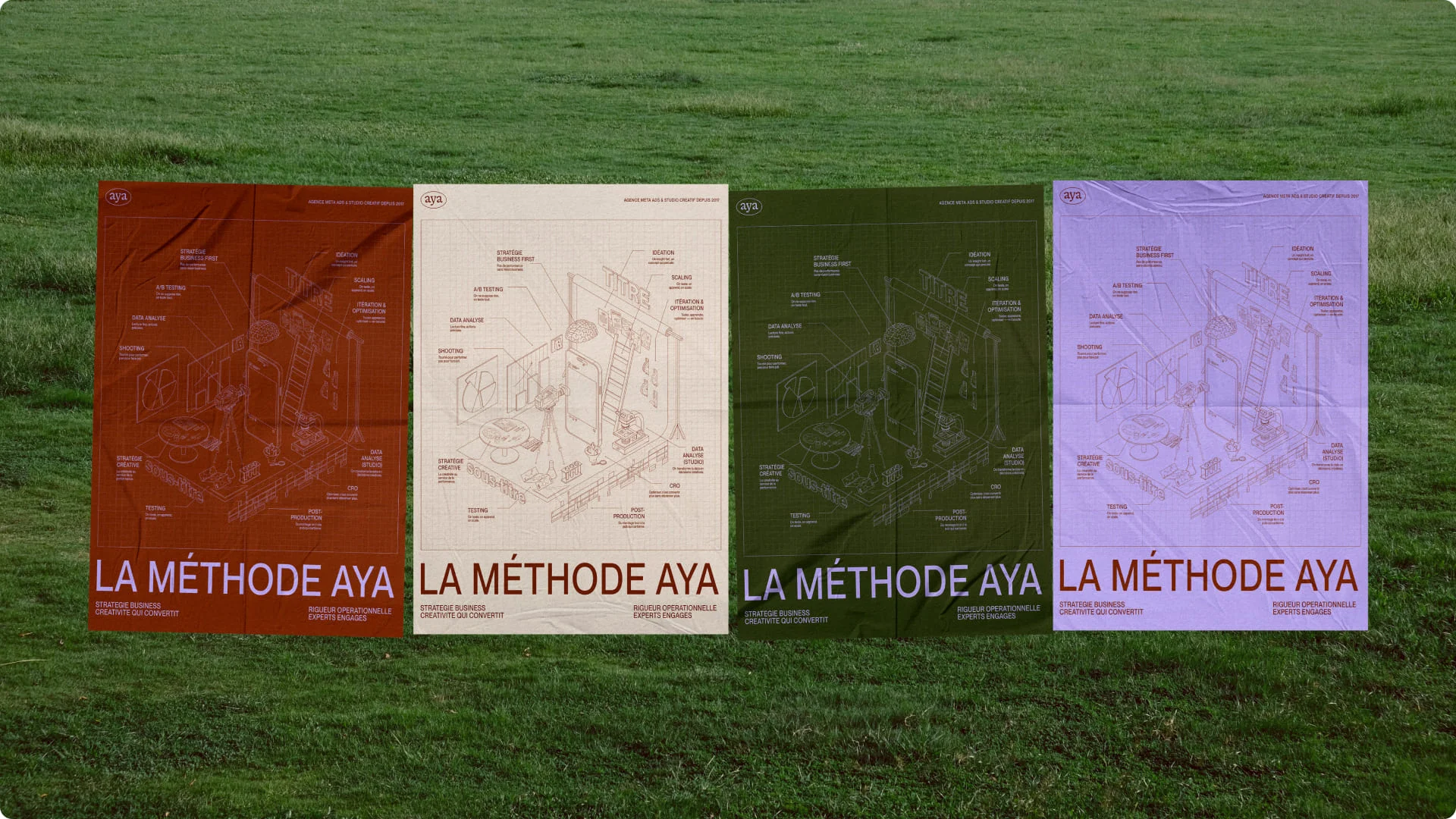
At Studio Elias, we understand the importance of strategic rebranding for brands looking to evolve and adapt to their environment. We have supported several companies in their transformation, with an approach based on creativity, strategy, and relevance.
Our rebranding projects include:

{{cta-3}}
These transformations illustrate what we explore in our Top 7 Rebrands of 2025, which includes Decathlon alongside Deezer, Back Market, Ligue 1, and others.
Our "pirate" approach allows us to go beyond the classic conventions of branding by offering bold, strategic, and user-centric solutions. We deeply analyze the DNA of each brand to extract a unique, impactful, and lasting identity.
Decathlon's rebranding perfectly illustrates how a brand can transform while remaining true to its essence. At Studio Elias, we support companies through these strategic transitions, reinventing their image to better conquer the future.
We formalize this brand DNA into a brand platform : the strategic document that lays the groundwork before any visual decision.


.jpg)
.jpg)


%20(1).gif)