Elias, Branding Studio, webflow partner

Top 7 rebrands in 2025: Decathlon, Deezer, League 1...

Your brand, our focus
Branding
resources
/
Branding
/
Top 7 rebrands in 2025: Decathlon, Deezer, League 1...
17/09/2024
12
Min

Rebranding Strategies That Defined 2025: Brand Examples

In 2025, several brand transformations made headlines, whether to modernize, better meet consumer expectations, or adapt to new strategies. All these developments highlight the importance of brand strategy in a company's success.

Together, let's review the work of:

  • Decathlon
  • Deezer
  • Cdiscount
  • Center Parcs
  • Lydia
  • BackMarket
  • Ligue 1

{{block-cta-1}}

Why Rebrand in 2025

A driver of company growth

Rebranding is a strategic step in a company's life, often essential when it reaches a growth milestone. Rebranding often helps companies mature.

To understand when and how to initiate this step, read our article on Brand Evolution or Revolution: Understanding Why and When.

Gain Brand Awareness and Convert Key Accounts

By modernizing its brand image, a company can seize new opportunities and enter previously inaccessible markets.

Develop Internal Culture and Attract Top Talent

Rebranding isn't just for external audiences; it also has a profound impact on internal culture.

{{cta-1}}

Decathlon: A Breath of Fresh Air for a Sports Giant

In 2025, Decathlon, the global leader in sporting goods, unveiled an audacious marketing repositioning that surprised many observers. With a global presence and well-established reputation, the brand strategy involved refreshing its image to better meet customer expectations while remaining true to its values of simplicity and accessibility.

Decathlon Image

A Digital Focus

In this successful rebranding strategy, Decathlon also strengthened its digital presence by redesigning the user experience on its website and apps. The interface became more intuitive, more immersive, and customer-centric, emphasizing interactive tools to help consumers choose the right sports equipment.

Decathlon Logo
We discuss this further in our article on the Decathlon rebranding.

The Deezer example: to touch your heart

Founded in 2007, it is one of the pioneers of music streaming.

Initially focused on creating personalized playlists, it quickly established itself as a major platform in France and internationally. Today, Deezer offers a vast catalog of millions of tracks, with a unique approach to music recommendations based on algorithms, but also on human selections made by editorial experts.

Deezer Logo

A colossal undertaking led by Koto

The execution of this project was entrusted to the London agency Koto. The project spanned several months, requiring close collaboration between Deezer's creative teams and Koto's. The main challenge was to apply this new image across all of the brand's assets.

Deezer Visual

A meaningful brand identity

Beyond the visual, this rebranding is accompanied by a deep strategic overhaul. This type of work is always part of a brand platform solid, which gives meaning to every visual decision. The logo, inspired by a heartbeat, reflects the idea that Deezer is more than just a streaming platform; it's an emotional connection to music. This symbolism embodies Deezer's ambition to become a key player, capable of engaging users beyond just listening, by inviting them to "live the music" fully​.

Deezer Logo

A strong identity always starts with a well-constructed brand platform. We explain how to create it in 5 steps.

Cdiscount Rebranding

Cdiscount: A bold rebranding to reposition itself in a highly competitive market

Cdiscount, founded in Bordeaux in 1998, is one of France's leading online retail players. Initially specializing in the marketing of electronic and multimedia products, the platform quickly diversified to become a general e-commerce site. With a community of over 10 million active customers, Cdiscount stands out for its competitive prices and aggressive promotional offers.

Cdiscount Logo

A Complex Industry with Multiple Challenges

Cdiscount's rebranding takes place in a highly complex environment. The e-commerce sector in France is saturated, with numerous stakeholders to satisfy: end customers, of course, but also partner sellers, shareholders, and carriers. Consumer expectations are evolving rapidly, and competition is fierce, especially against international players.

A Completely Redesigned Visual Identity

Cdiscount's repositioning marked a strong break from the past. The company opted for much brighter and more dynamic colors, moving away from its sober and functional image in favor of a more modern and energetic aesthetic.

Cdiscount Visual

A More Engaged and Assertive Tone

It's not just Cdiscount's appearance that has changed. The brand has adopted a much more engaged tone, in line with today's consumer expectations, who are increasingly sensitive to the values companies uphold. Through this new positioning, Cdiscount aims to affirm its closeness to its customers while highlighting its commitment to more responsible consumption.

Human Nature: Center Parcs

Center Parcs: A Successful Rebranding, Living Up to Its Heritage and Future

Founded in 1968 by Piet Derksen, Center Parcs has established itself as one of the most popular destinations for immersive nature getaways. Historically, the brand has distinguished itself by its ability to offer rejuvenating stays in nature, allowing families and friends to reconnect in exotic settings.

Center Parcs Logo

An Evolving Sector and a Need for Renewal

Facing a constantly evolving tourism sector, where travelers are increasingly seeking authentic, local, and sustainable experiences, Center Parcs decided to modernize its identity to remain relevant. In 2023, the company collaborated with DesignStudio agency for this ambitious project, which aligns with its reinvention. This essential overhaul aimed to better reflect the company's fundamental values while paving the way for new investments and the opening of new parks.

Center Parcs Design

Center Parcs Art Direction

DesignStudio's Work: A Strong and Emotional Identity

DesignStudio undertook a brand rediscovery process, visiting its parks across Europe, engaging with customers, and immersing itself in its history. This work led to a central concept: "Human Nature". This idea embodies Center Parcs' founding philosophy: harmony between humans and nature. This principle guided the entire redesign, from storytelling to the logo and brand identity, aiming to connect visitors not only with nature but also with each other.

A revised brand identity combines three essential elements: the Center Parcs name, nature, and humanity. The choice of the new typography, Bagoss, stands out with organic shapes and circular terminals, evoking a natural connection. This design is reinforced by a new vibrant color palette, which goes beyond the traditional greens associated with nature to include hues inspired by various natural elements. The result is a visual identity that reflects both the richness and diversity of the parks.

Center Parcs Design

Visual and Emotional Cohesion

One of the key elements of this redesign is the introduction of a system of park-specific badges, creating consistency across all sites while celebrating their uniqueness. Fuchsia MacAree's illustrations bring warmth and joy, while the photographs, organized into three levels (natural textures, human moments, and human-nature interactions), offer an authentic vision of the Center Parcs experience.

Center Parcs' new design, though modern and bold, remains true to the brand's essence. By focusing on emotion, human connection, and nature, this new visual identity offers remarkable consistency while engaging visitors on a deep level. The launch of this new brand generated significant interest, with a notable increase in traffic to the Center Parcs website from the very first days, proving the effectiveness and relevance of this successful rebranding.

Visual consistency is formalized in brand guidelines. Discover our guide on brand guidelines: definition and tips.

Lydia Becomes Sumeria

Lydia, founded in 2013, quickly established itself as one of France's most popular products, facilitating instant money transfers between friends with simple features. The phrase "Faire un Lydia" (to do a Lydia) even entered everyday language to refer to these quick transactions.

A Competitive Landscape and a New Vision

Lydia's name change to Sumeria was driven by strategic objectives. Sumeria aims to position itself as a full-fledged mobile bank, targeting millions of Europeans. This rebranding is accompanied by the launch of new offerings, including a savings assistance program, Sumeria+, which facilitates money management with innovative tools like automatic rounding and spending charts.

Sumeria Logo

However, the decision to change the name was not simple, especially in such a competitive market. Many users were attached to the "Lydia" identity and the phrase "Faire un Lydia." This transformation therefore elicited mixed reactions, with some users feeling disoriented by the change in image.

A New, More Mature and Credible Design

Lydia's historic blue has been replaced by a more modern and bold color palette, reflecting a more mature, almost essential identity. This new design aims to increase the brand's credibility in the banking sector, a market where user trust is paramount. By moving away from an overly youthful or "startup" image, Sumeria seeks to attract a wider audience.

Lydia Sumeria Design

Back Market: The Circular Economy Gains New Momentum

Back Market, a marketing leader in the sale of refurbished electronic products, also took a crucial step in 2025 with a rebranding aimed at strengthening its image as a key player in the circular economy. At a time when sustainability is at the heart of consumer concerns, Back Market sought to reposition itself by emphasizing ecology and quality.

Backmarket Creative Direction

A Logo Reflecting the Change

Back Market's new logo features understated colors and simple geometric shapes, symbolizing reliability and transparency. Backmarket also introduced a new visual signature that highlights its commitment to the planet, with graphic elements evoking recycling and the second life of electronic products. ‍

BackMarket Logo

A Strengthened Commitment

Back Market's successful rebranding isn't just about design. The company also strengthened its circular economy narrative by highlighting concrete actions to reduce its carbon footprint. Its communication now emphasizes the positive environmental impact of refurbished products, while reassuring users about the quality of the devices offered.

Ligue 1: A New Brand Image for a New Era of Football

The rebranding of the Ligue 1, France's top football division, in 2025 marked a turning point in the championship's history. This visual change accompanies a broader transformation of professional football in France, with the ambition of increasing the championship's international appeal.

A Logo that Embodies Passion and Elegance

The Ligue 1 logo features a clean and minimalist design. The number "1" is stylized in an angular shape, incorporating a diagonal line that conveys a sense of dynamism. The overall design is complemented by modern, uppercase typography, reinforcing the idea of power and stature.

A Global Positioning

Ligue 1 aims to reposition itself not only as a national championship but also as a key player on the international stage. With this evolution, the focus is on promoting young talent and the importance of innovation in club management. Partnerships with technology companies and digital streaming platforms are also central to this new brand image.

Ligue 1 Logo

Rebranding: A Strategic Lever in 2025

These examples show that a brand image and positioning of a company play a crucial role in its long-term success, especially in an era where transparency, sustainability, and innovation have become essential consumer expectations.

To learn more, read our article on brand differentiation: stand out or disappear.

Studio Elias brings together the best talent to transform your business into a brand.

At Studio Elias, we understand the importance of this evolution. We support companies through every stage of their rebranding, from strategic planning to creative implementation. Whether you want to modernize your visual identity, reposition your brand, or explore new creative avenues, we are here to turn your ambitions into reality.

{{cta-3}}

{{block-cta-2}}

We define your positioning

We help our clients define and express their strengths through a powerful Brand Idea.

Storytelling / Purpose / Naming / Values / Personality / Mission / Key messages.

We create a new visual identity

We create a consistent Artistic Direction, ensuring internal and external consistency.

Logo / Typography / Colorimetry / Photography / Illustration / Iconography / Motion / Mockup

{{cta-2}}

We launch your new brand online

We deploy your identity on the web. We connect you with your audience using Webflow

Wireframe / Web Design / Webflow / Custom Animation / GSAP / Responsive / SEO / Finsweet / Training / Maintenance

It's always good to take stock, book a call without delay !

And if you're looking for a rebranding on par with the examples we mentioned, we invite you to discover our TOP 7: The Worst Rebranding Mistakes to Avoid !

Elias, Branding Studio, webflow partner

Brand Strategy
Brand Identity
Brand Experience
Naming
Copywriting
Brand Idea
Logo
Photography
Illustration
3D & Motion
SEO
Website
Webflow
Custom Animation
Maintenance
Webdesgin

We are brand creators. We transform projects into a strong, online brand.

It's time to turn your project into a brand.

Brand Strategy
Brand Identity
Brand Experience
Brand Strategy
Brand Identity
Brand Experience

Top 7 rebrands in 2025: Decathlon, Deezer, League 1...

Ressources
/
Branding
/
Top 7 rebrands in 2025: Decathlon, Deezer, League 1...
Updated on
25/5/2026
Auteur
Clément
Expert Brand & Web @ Elias
0
1
2
3
4
5
6
7
8
9
0
1
2
3
4
5
6
7
8
9
%

The main thing to remember

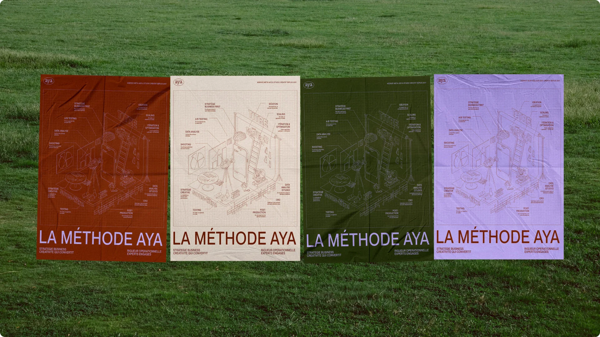
Rebranding is no longer just a "design refresh": in 2025, it becomes a major strategic lever that goes beyond aesthetics, placing brand identity at the heart of growth, engagement, and adaptation to new challenges.

  • Changingvisual identity, it's first and foremost about rethinking positioning, values, and the experience the brand offers its users.
  • Rebranding acts as a strong signal: modernizing the image, clarifying the message, conquering new audiences or markets.
  • It involves both internal and external aspects: corporate culture, logo, visual palette, digital assets, communication.
  • An evolving brand must consider overall consistency : every touchpoint (website, app, packaging, social media) must reflect the new identity.
  • The success of a rebranding lies in its alignment with long-term strategy, not a fleeting visual trend.

A successful rebranding is not limited to "changing the logo," but reinvents how a brand presents itself, interacts, and is perceived with clarity, consistency, and ambition.

Rebranding Strategies That Defined 2025: Brand Examples

In 2025, several brand transformations made headlines, whether to modernize, better meet consumer expectations, or adapt to new strategies. All these developments highlight the importance of brand strategy in a company's success.

Together, let's review the work of:

  • Decathlon
  • Deezer
  • Cdiscount
  • Center Parcs
  • Lydia
  • BackMarket
  • Ligue 1

{{block-cta-1}}

Why Rebrand in 2025

A driver of company growth

Rebranding is a strategic step in a company's life, often essential when it reaches a growth milestone. Rebranding often helps companies mature.

To understand when and how to initiate this step, read our article on Brand Evolution or Revolution: Understanding Why and When.

Gain Brand Awareness and Convert Key Accounts

By modernizing its brand image, a company can seize new opportunities and enter previously inaccessible markets.

Develop Internal Culture and Attract Top Talent

Rebranding isn't just for external audiences; it also has a profound impact on internal culture.

{{cta-1}}

Decathlon: A Breath of Fresh Air for a Sports Giant

In 2025, Decathlon, the global leader in sporting goods, unveiled an audacious marketing repositioning that surprised many observers. With a global presence and well-established reputation, the brand strategy involved refreshing its image to better meet customer expectations while remaining true to its values of simplicity and accessibility.

Decathlon Image

A Digital Focus

In this successful rebranding strategy, Decathlon also strengthened its digital presence by redesigning the user experience on its website and apps. The interface became more intuitive, more immersive, and customer-centric, emphasizing interactive tools to help consumers choose the right sports equipment.

Decathlon Logo
We discuss this further in our article on the Decathlon rebranding.

The Deezer example: to touch your heart

Founded in 2007, it is one of the pioneers of music streaming.

Initially focused on creating personalized playlists, it quickly established itself as a major platform in France and internationally. Today, Deezer offers a vast catalog of millions of tracks, with a unique approach to music recommendations based on algorithms, but also on human selections made by editorial experts.

Deezer Logo

A colossal undertaking led by Koto

The execution of this project was entrusted to the London agency Koto. The project spanned several months, requiring close collaboration between Deezer's creative teams and Koto's. The main challenge was to apply this new image across all of the brand's assets.

Deezer Visual

A meaningful brand identity

Beyond the visual, this rebranding is accompanied by a deep strategic overhaul. This type of work is always part of a brand platform solid, which gives meaning to every visual decision. The logo, inspired by a heartbeat, reflects the idea that Deezer is more than just a streaming platform; it's an emotional connection to music. This symbolism embodies Deezer's ambition to become a key player, capable of engaging users beyond just listening, by inviting them to "live the music" fully​.

Deezer Logo

A strong identity always starts with a well-constructed brand platform. We explain how to create it in 5 steps.

Cdiscount Rebranding

Cdiscount: A bold rebranding to reposition itself in a highly competitive market

Cdiscount, founded in Bordeaux in 1998, is one of France's leading online retail players. Initially specializing in the marketing of electronic and multimedia products, the platform quickly diversified to become a general e-commerce site. With a community of over 10 million active customers, Cdiscount stands out for its competitive prices and aggressive promotional offers.

Cdiscount Logo

A Complex Industry with Multiple Challenges

Cdiscount's rebranding takes place in a highly complex environment. The e-commerce sector in France is saturated, with numerous stakeholders to satisfy: end customers, of course, but also partner sellers, shareholders, and carriers. Consumer expectations are evolving rapidly, and competition is fierce, especially against international players.

A Completely Redesigned Visual Identity

Cdiscount's repositioning marked a strong break from the past. The company opted for much brighter and more dynamic colors, moving away from its sober and functional image in favor of a more modern and energetic aesthetic.

Cdiscount Visual

A More Engaged and Assertive Tone

It's not just Cdiscount's appearance that has changed. The brand has adopted a much more engaged tone, in line with today's consumer expectations, who are increasingly sensitive to the values companies uphold. Through this new positioning, Cdiscount aims to affirm its closeness to its customers while highlighting its commitment to more responsible consumption.

Human Nature: Center Parcs

Center Parcs: A Successful Rebranding, Living Up to Its Heritage and Future

Founded in 1968 by Piet Derksen, Center Parcs has established itself as one of the most popular destinations for immersive nature getaways. Historically, the brand has distinguished itself by its ability to offer rejuvenating stays in nature, allowing families and friends to reconnect in exotic settings.

Center Parcs Logo

An Evolving Sector and a Need for Renewal

Facing a constantly evolving tourism sector, where travelers are increasingly seeking authentic, local, and sustainable experiences, Center Parcs decided to modernize its identity to remain relevant. In 2023, the company collaborated with DesignStudio agency for this ambitious project, which aligns with its reinvention. This essential overhaul aimed to better reflect the company's fundamental values while paving the way for new investments and the opening of new parks.

Center Parcs Design

Center Parcs Art Direction

DesignStudio's Work: A Strong and Emotional Identity

DesignStudio undertook a brand rediscovery process, visiting its parks across Europe, engaging with customers, and immersing itself in its history. This work led to a central concept: "Human Nature". This idea embodies Center Parcs' founding philosophy: harmony between humans and nature. This principle guided the entire redesign, from storytelling to the logo and brand identity, aiming to connect visitors not only with nature but also with each other.

A revised brand identity combines three essential elements: the Center Parcs name, nature, and humanity. The choice of the new typography, Bagoss, stands out with organic shapes and circular terminals, evoking a natural connection. This design is reinforced by a new vibrant color palette, which goes beyond the traditional greens associated with nature to include hues inspired by various natural elements. The result is a visual identity that reflects both the richness and diversity of the parks.

Center Parcs Design

Visual and Emotional Cohesion

One of the key elements of this redesign is the introduction of a system of park-specific badges, creating consistency across all sites while celebrating their uniqueness. Fuchsia MacAree's illustrations bring warmth and joy, while the photographs, organized into three levels (natural textures, human moments, and human-nature interactions), offer an authentic vision of the Center Parcs experience.

Center Parcs' new design, though modern and bold, remains true to the brand's essence. By focusing on emotion, human connection, and nature, this new visual identity offers remarkable consistency while engaging visitors on a deep level. The launch of this new brand generated significant interest, with a notable increase in traffic to the Center Parcs website from the very first days, proving the effectiveness and relevance of this successful rebranding.

Visual consistency is formalized in brand guidelines. Discover our guide on brand guidelines: definition and tips.

Lydia Becomes Sumeria

Lydia, founded in 2013, quickly established itself as one of France's most popular products, facilitating instant money transfers between friends with simple features. The phrase "Faire un Lydia" (to do a Lydia) even entered everyday language to refer to these quick transactions.

A Competitive Landscape and a New Vision

Lydia's name change to Sumeria was driven by strategic objectives. Sumeria aims to position itself as a full-fledged mobile bank, targeting millions of Europeans. This rebranding is accompanied by the launch of new offerings, including a savings assistance program, Sumeria+, which facilitates money management with innovative tools like automatic rounding and spending charts.

Sumeria Logo

However, the decision to change the name was not simple, especially in such a competitive market. Many users were attached to the "Lydia" identity and the phrase "Faire un Lydia." This transformation therefore elicited mixed reactions, with some users feeling disoriented by the change in image.

A New, More Mature and Credible Design

Lydia's historic blue has been replaced by a more modern and bold color palette, reflecting a more mature, almost essential identity. This new design aims to increase the brand's credibility in the banking sector, a market where user trust is paramount. By moving away from an overly youthful or "startup" image, Sumeria seeks to attract a wider audience.

Lydia Sumeria Design

Back Market: The Circular Economy Gains New Momentum

Back Market, a marketing leader in the sale of refurbished electronic products, also took a crucial step in 2025 with a rebranding aimed at strengthening its image as a key player in the circular economy. At a time when sustainability is at the heart of consumer concerns, Back Market sought to reposition itself by emphasizing ecology and quality.

Backmarket Creative Direction

A Logo Reflecting the Change

Back Market's new logo features understated colors and simple geometric shapes, symbolizing reliability and transparency. Backmarket also introduced a new visual signature that highlights its commitment to the planet, with graphic elements evoking recycling and the second life of electronic products. ‍

BackMarket Logo

A Strengthened Commitment

Back Market's successful rebranding isn't just about design. The company also strengthened its circular economy narrative by highlighting concrete actions to reduce its carbon footprint. Its communication now emphasizes the positive environmental impact of refurbished products, while reassuring users about the quality of the devices offered.

Ligue 1: A New Brand Image for a New Era of Football

The rebranding of the Ligue 1, France's top football division, in 2025 marked a turning point in the championship's history. This visual change accompanies a broader transformation of professional football in France, with the ambition of increasing the championship's international appeal.

A Logo that Embodies Passion and Elegance

The Ligue 1 logo features a clean and minimalist design. The number "1" is stylized in an angular shape, incorporating a diagonal line that conveys a sense of dynamism. The overall design is complemented by modern, uppercase typography, reinforcing the idea of power and stature.

A Global Positioning

Ligue 1 aims to reposition itself not only as a national championship but also as a key player on the international stage. With this evolution, the focus is on promoting young talent and the importance of innovation in club management. Partnerships with technology companies and digital streaming platforms are also central to this new brand image.

Ligue 1 Logo

Rebranding: A Strategic Lever in 2025

These examples show that a brand image and positioning of a company play a crucial role in its long-term success, especially in an era where transparency, sustainability, and innovation have become essential consumer expectations.

To learn more, read our article on brand differentiation: stand out or disappear.

Studio Elias brings together the best talent to transform your business into a brand.

At Studio Elias, we understand the importance of this evolution. We support companies through every stage of their rebranding, from strategic planning to creative implementation. Whether you want to modernize your visual identity, reposition your brand, or explore new creative avenues, we are here to turn your ambitions into reality.

{{cta-3}}

{{block-cta-2}}

We define your positioning

We help our clients define and express their strengths through a powerful Brand Idea.

Storytelling / Purpose / Naming / Values / Personality / Mission / Key messages.

We create a new visual identity

We create a consistent Artistic Direction, ensuring internal and external consistency.

Logo / Typography / Colorimetry / Photography / Illustration / Iconography / Motion / Mockup

{{cta-2}}

We launch your new brand online

We deploy your identity on the web. We connect you with your audience using Webflow

Wireframe / Web Design / Webflow / Custom Animation / GSAP / Responsive / SEO / Finsweet / Training / Maintenance

It's always good to take stock, book a call without delay !

And if you're looking for a rebranding on par with the examples we mentioned, we invite you to discover our TOP 7: The Worst Rebranding Mistakes to Avoid !

Un projet en tête ?

Prenez un moment pour échanger avec nos équipes

Booker un call
Stratégie
Identité
Web
Stratégie
Identité
Web
Stratégie
Identité
Web

It's time to turn your project into a brand.

Brand Strategy
Brand Identity
Brand Experience
Brand Strategy
Brand Identity
Brand Experience