The main thing to remember
In short: 2026 was a record year for rebranding: social networks, fast food, sport, video games, museums, AI... no sector escaped it. Our ranking brings together the 30 most striking redesigns of the year, each time with the studio behind it.
The ranking: Instagram, Magnific, KFC, Coca-Cola, Stack Overflow, Tinder, Darc, Lacoste, Calendly, Granola, Ornikar, Sporting CP, Gaumont, BAFTA, McLaren, Bolt, EA SPORTS FC, Apple Music, 7up, Manchester City Women, The Norton Museum of Art, OM, 24 Hours of Le Mans, Ynov, HONOR, Xbox, Zalando, Birkenstock, Threads, Grand Theft Auto VI.
- Five trends dominate the year: simplification, custom typefaces, identities designed for motion, a return to heritage and the rejection of AI's generic aesthetic.
- Two studios won the biggest mandates: JKR (KFC, Coca-Cola, Sporting CP) and Koto (Stack Overflow, Bolt, Norton Museum of Art).
- The rebrandings that sparked the most reactions (Instagram, Apple Music, OM) are a reminder that a change of identity must also be prepared on the community side.
- A successful rebranding never starts with the logo: it starts with a clear brand strategy.
2026, the year every brand decided to get a makeover at the same time. From fried chicken to video games, from the Vélodrome to a Florida museum, we spent the year glued to new logos (and, let's admit it, to the furious comments that come with them).
At Studio Elias, a Paris branding agency, we follow every rebranding with the same question in mind: what does this new logo say about the brand's strategy? Here are the 30 redesigns that struck us most this year. And because a ranking without analysis is a bit like a logo without brand guidelines, we then explain what they teach us.
{{block-cta-1}}
The ranking of the 30 best rebrandings of 2026
01. Instagram: ten years of waiting, a refined wordmark

Studio: in-house, by Instagram's brand teams (Christy Silva and Cynthia Pratomo)
Ten years. It took ten years for Instagram to dare touch its identity, and let's just say nobody was ready. The in-house teams kept the script wordmark (they tried to remove it: the brand became unrecognisable), but refined it. Around it, everything moves: a "viewfinder" inspired by the camera icon to frame images, a wider Instagram Sans, a new Instagram Sans Mono and a handwritten font, Instagram Pen. The sunset gradient no longer shows up everywhere: it becomes a touch of light, like a light leak on film. The Internet grumbled. The Internet had grumbled in 2016 too. We know how that ended.
02. Magnific (formerly Freepik): new name, new business

Studio: AREA17 (Paris / New York)
Changing name is the most radical move in a rebranding. Freepik did it. Now Magnific, the brand leaves the free image bank (the one we all secretly used for a PowerPoint) to become a creative AI platform for professionals. AREA17 builds the identity around the "Monumental M", inspired by monuments that stand the test of time, an ES Klarheit Plakat FP typeface with bold angles and a magenta without the slightest caution. Signature: "Be Magnific". When the product changes nature, the name must follow. Otherwise, the brand lies, and users feel it.
03. KFC: the bucket becomes the brand's frame

Studio: JKR, with StudioDRAMA for the typography
A small confession: we haven't looked at a bucket of chicken the same way since this project. JKR made the KFC bucket the frame of the whole identity, with Colonel Sanders at the centre, a touch warmer than before. The red, white and black don't move a pixel, because you don't throw decades of recognition in the bin. Two custom typefaces, Kentucky Fried Serif and Kentucky Fried Sans, anchor the heritage. Launched in June 2026 in the UK and Ireland, the system is now heading for more than 34,000 restaurants. The stated goal: to become a "quick-experience restaurant", from the kraft bag to the app.
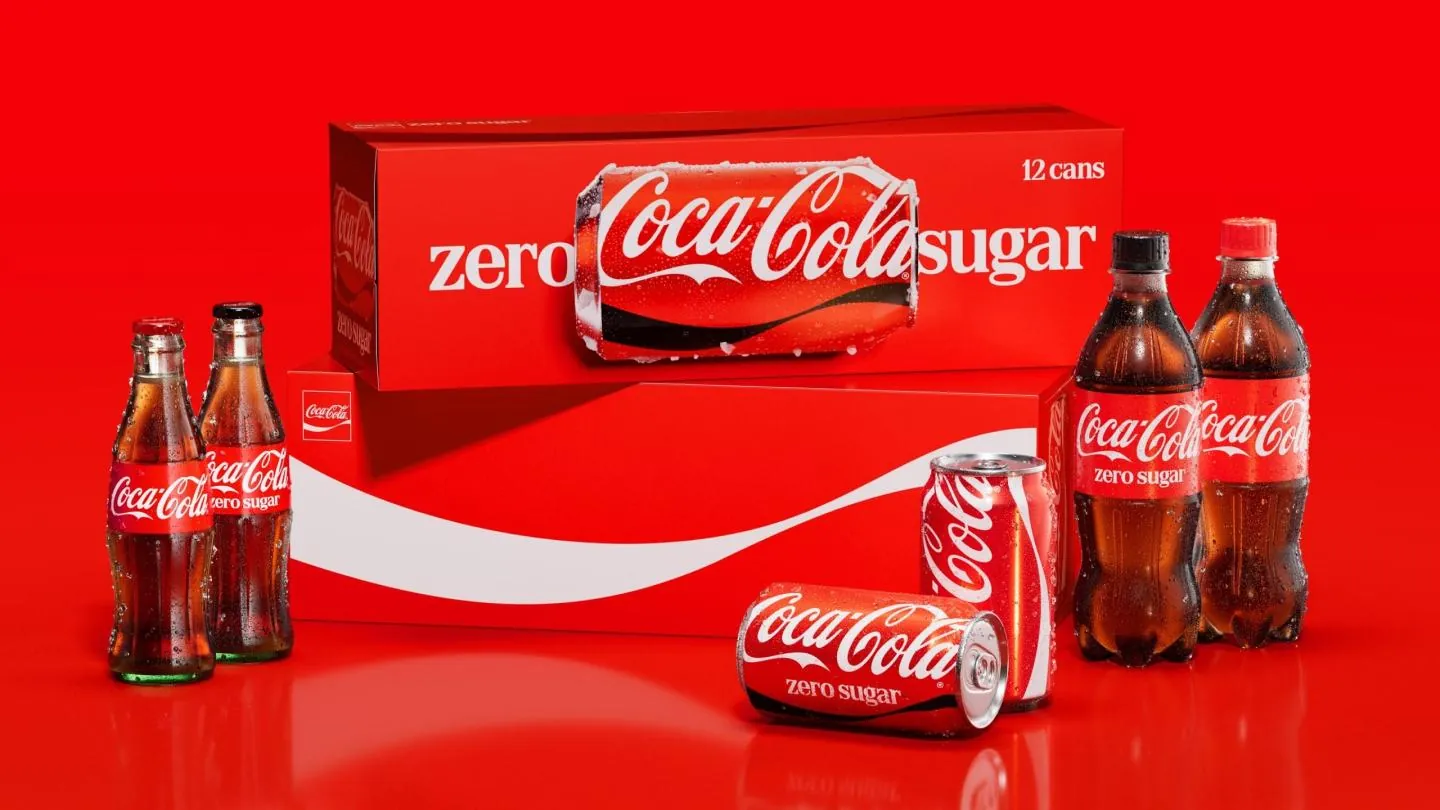
04. Coca-Cola: more Coca-Cola than ever
Studio: JKR
On to the drinks aisle, with the boss. "Make Coca-Cola more Coca-Cola": the brief fits in one sentence, and JKR (them again, right after KFC) follows it to the letter. The Spencerian script, the Dynamic Ribbon, the Arden Square, the red and the white: nothing disappears, everything is clarified, prioritised and harmonised across more than 200 markets. Proof that a major rebranding doesn't need to break everything to strengthen everything. At this level, value hides in discipline: every asset in its place, everywhere, all the time. Not very spectacular? That's exactly what makes it strong.
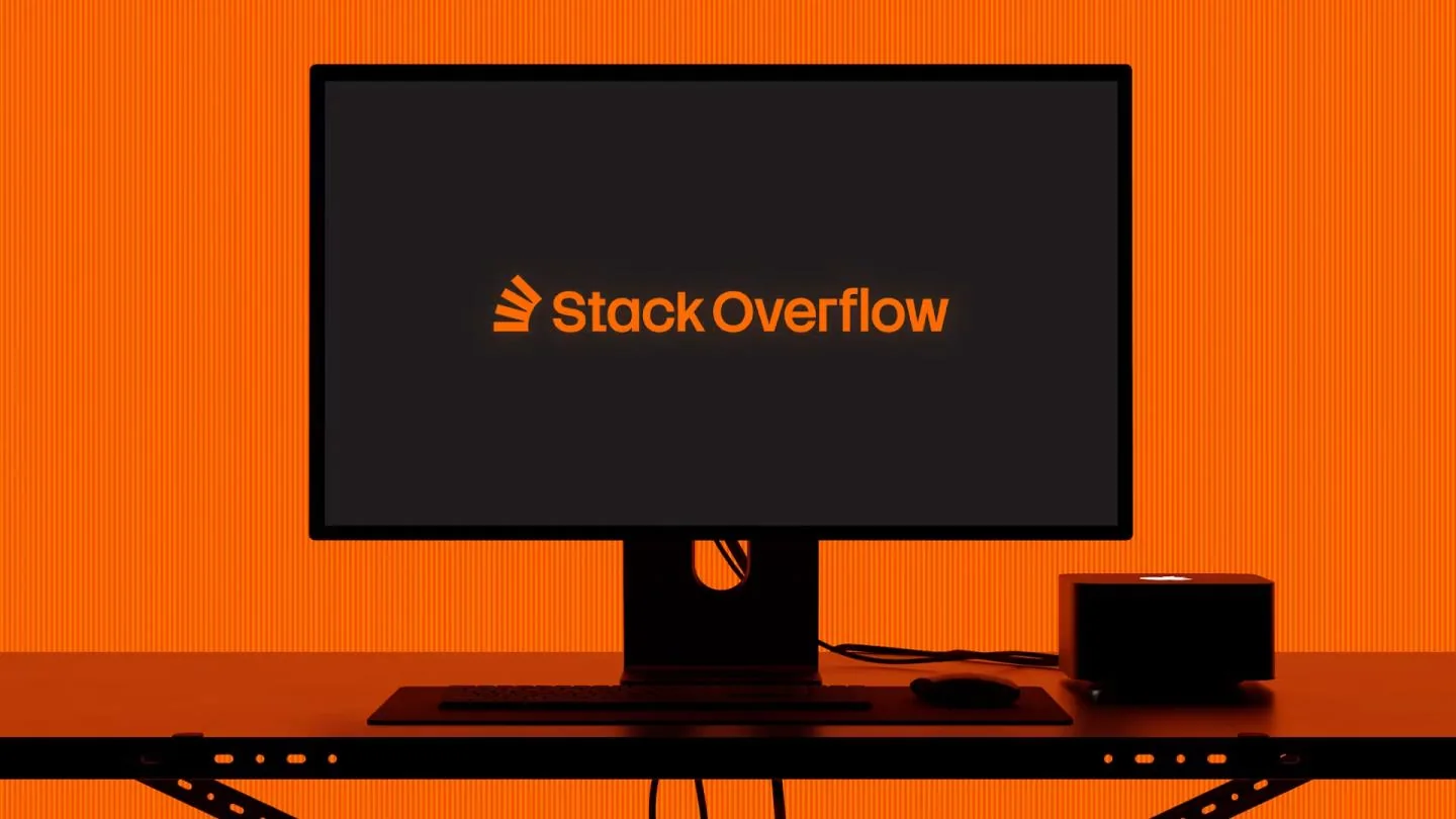
05. Stack Overflow: human truth in the age of AI
Studio: Koto
Heading to tech, developer side, with a first project signed by Koto. It has to be said: faced with generative AI, Stack Overflow had everything to lose (who still asks questions on a forum when an AI answers in three seconds?). The platform chose to move forward. The logo switches to flat monochrome and keeps its balancing stack of blocks, while the custom Stack Sans typeface adds a small "notch", like a building gesture. The repositioning is crystal clear: not a frozen repository, but a living engine of truth. Because no AI is better than the humans who fed it. Signature: "Always in Build".
06. Tinder: the flame stays, the palette opens up
Studio: Porto Rocha (New York)
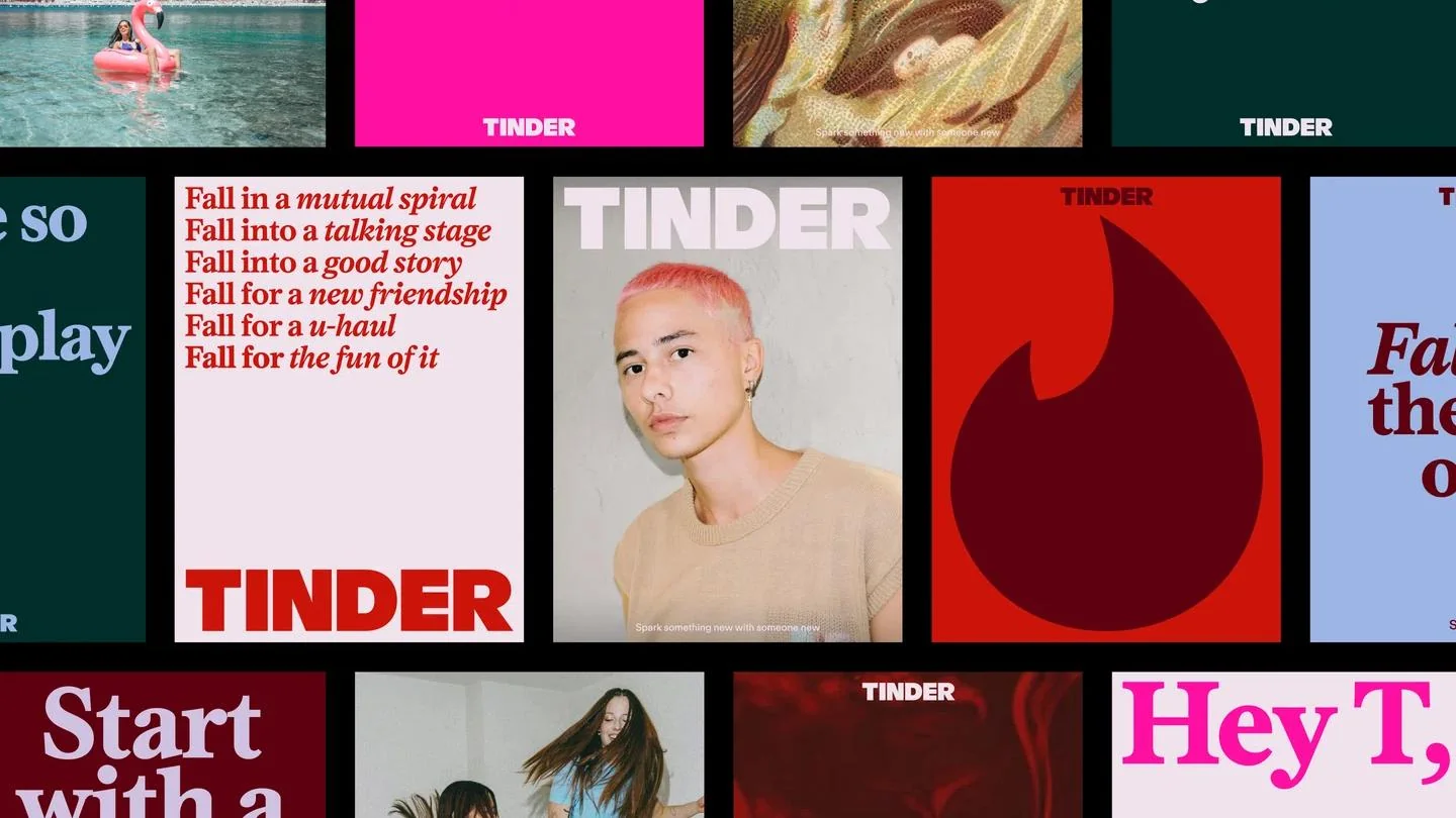
Almost ten years without touching its identity, then a match with Porto Rocha. The wordmark switches to capitals, in a sans-serif that stands its ground. The palette finally leaves the red-pink gradient to open up to blue and green. The flame is refined, not sacrificed (we were scared). The real stroke of genius is elsewhere: "T", a fictional columnist heir to the agony aunt, speaks on behalf of the brand, with the signature "happily TBD". Tinder no longer sells a swipe, it tells the thrill of the unknown. And frankly, it's much more romantic that way.
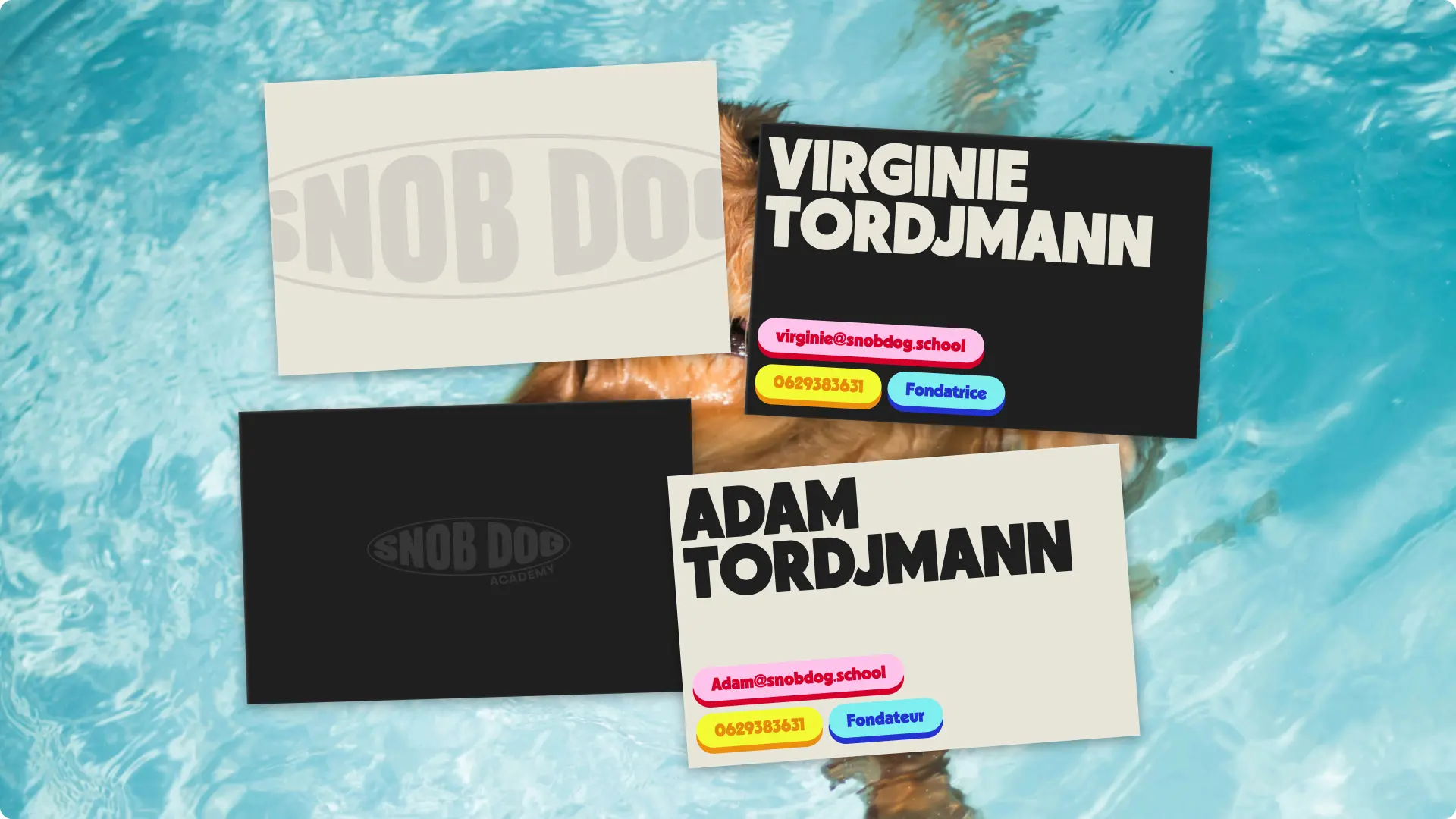
07. Darc: quiet heroism, from day one

Studio: Studio Elias
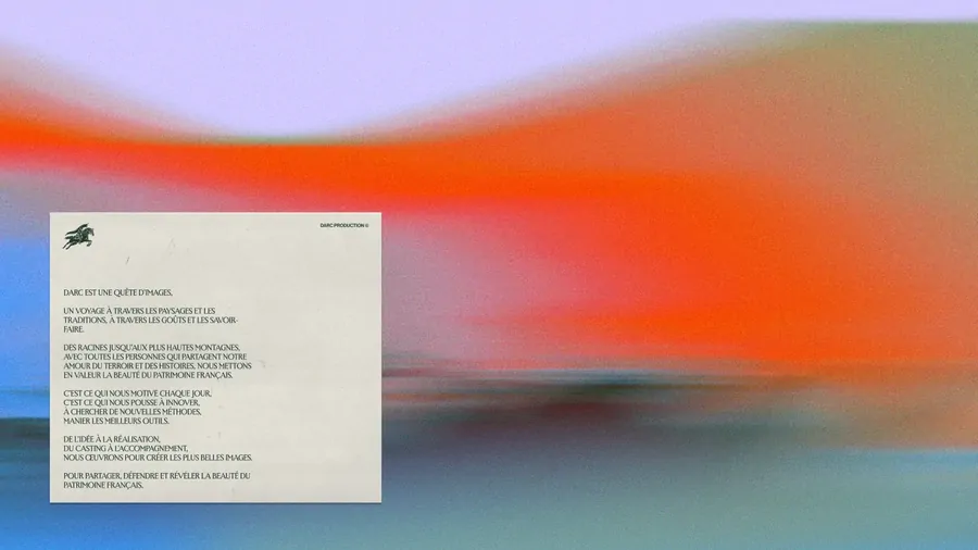
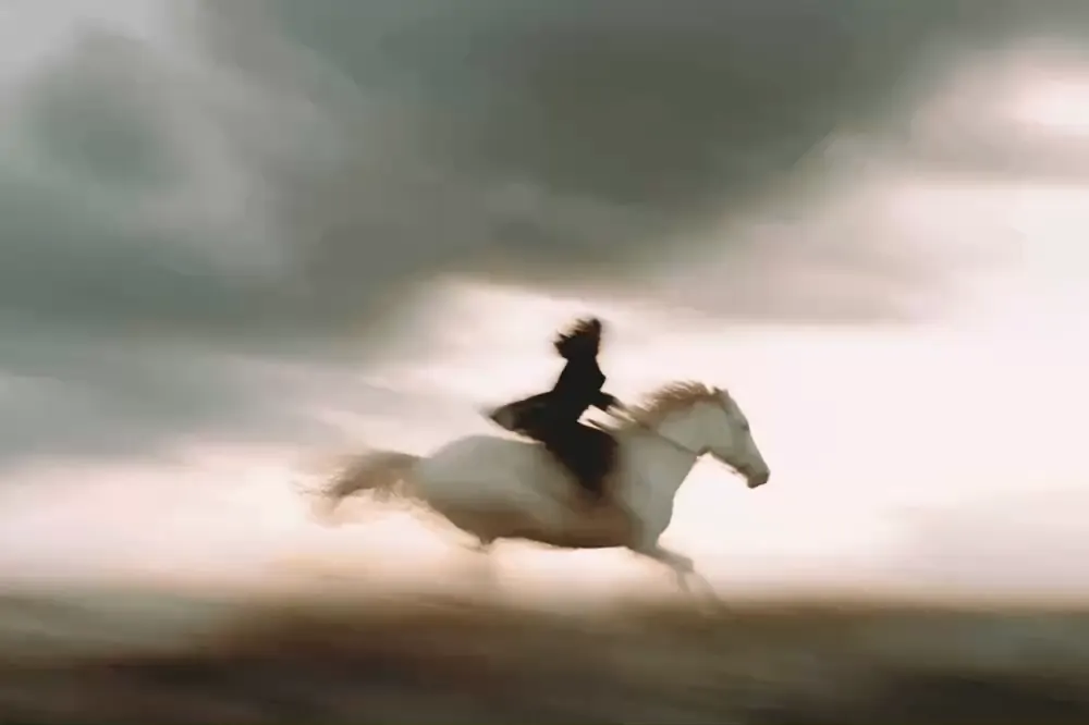
A little home spotlight, we own it. After Tinder and its matters of the heart, over to a brand that knew exactly what it wanted from day one. Darc, a new-generation agency that merges influence and video production, wanted to establish itself as a premium reference from launch, without going through the "little newcomer" stage. At Studio Elias, we built its territory around Joan of Arc: bravery, authenticity, mission, and a guiding idea, quiet heroism. Positioning, verbal identity, visual identity with an animated horse as a logo, a website with immersive videos: everything was designed from scratch through to launch. The result: three premium clients signed in the first year, with an average budget 180% higher than direct competitors. We're not very objective, but the figures are.
{{cta-1}}
08. Lacoste: the crocodile is French again

Studio: Commission Studio (London), by Christopher Moorby and David McFarline
One figure must have stung in Paris: in 2023, a good share of consumers didn't know Lacoste was French. Yes, the world's most stylish crocodile passed for an expat. Commission Studio responds with a new wordmark, a reworked crocodile and redesigned store signage. 93 years of heritage brought back into the light to settle a long-blurred positioning, between the tennis court and premium fashion. "Frenchness" stops being a detail and becomes the heart of the story. Which goes to show that sometimes, the best brief fits in a survey.
09. Calendly: goodbye toilet bowl, hello "C"

Studio: Smith & Diction
Let's be honest: Calendly's old symbol looked like a toilet bowl, and the Internet never let it forget. Smith & Diction flushed that running gag away. The new "C" is wrapped in a wave, like a simple meeting link that shifts the course of a day (or of a company). Neons give way to pastels around a central blue, and each product gets its own icon. Above all, Calendly changes scale: it's no longer a calendar, it's the invisible connector between people, powered by its AI assistants. For the first time, we almost want to send the link.
10. Granola: the AI that writes by hand

Studio: Ragged Edge (London)
Back to AI, but with a pencil in hand. All AI brands look alike: purple gradients, smooth shapes, promises of revolution. Granola, the note-taking tool, chooses imperfection. Ragged Edge draws an organic, sketch-like spiral, a script typeface based on co-founder Sam Stephenson's handwriting (with several variants per letter to break the regularity) and an earthy green at odds with the sector's codes. The concept, "progress over process", embraces a human, almost handcrafted brand. And it pays: $125 million raised, at a $1.5 billion valuation. Humans still have a bright future ahead.
11. Ornikar: a key to reassure parents

Studio: Bruno (French agency)
Back to France, and more precisely to the passenger seat. Ornikar has grown up: the disruptor of the cheap driving licence now wants to reassure young drivers... and their parents, who often pay for the insurance. The agency Bruno refines the signature purple and yellow, draws a clean logo that evokes a key (for the car, the insurance, the home) and dares an illustrative direction inspired by French lithography. On paper, a tech start-up doing lithography shouldn't work. In reality, that's precisely what makes it credible. The tone follows suit: less promotion, more proof.
12. Sporting CP: the 1945 crest returns

Studio: JKR, with the F37 foundry ("Sporting Sans" typeface)
Whistle blown, on to football, with a third JKR project in this ranking. 120 years of history, 25 years without a major redesign: Sporting CP deserved a gesture to match. The agency starts again from the 1945 crest to bring together five historic symbols (the Porta 10-A, the stripes, the shield, the crown and the lion) in a refined monochrome version. The Sporting Sans typeface, designed with the F37 foundry, and a graphic system inspired by the stadium's architecture complete the whole. In motion, the green and white stripes come alive. Heritage is no longer contemplated, it is lived, in the stands as on social media.
13. Gaumont: the daisy is reborn, with sound

Studio: Publicis Consultants and Carré Noir
Over to cinema, and in the French version to begin with. 130 years of films, and a daisy reborn. Publicis Consultants and Carré Noir draw an assertive "G" surrounded by radiating lines, at once flower, sun and spotlight flare, carried by a deep red and a custom typeface. Gaumont goes beyond the image: a sound identity, composed by Thomas Roussel and performed by a symphony orchestra at La Seine Musicale, now accompanies every production. We dare you not to get chills in the theatre. History doesn't stay in the museum: it serves a brand that must move audiences in theatres as on streaming.
14. BAFTA: an identity made of particles

Studio: Kiln (London)
We cross the Channel without leaving the dark theatres. Lights, camera... particles. For BAFTA, the British academy of film, games and television, London studio Kiln set aside frame-by-frame animation and built an identity generated procedurally in Cavalry, made of particles and digital physics. Each ceremony (Film, Games, Television, Craft) gets its own palette and faceted shapes, without ever detaching from the whole. The system works as well in a 30-second film as on a still poster, and it comes with a toolkit so that in-house teams can roll it out on their own. Spectacular, and autonomous. Every studio's dream.
15. McLaren: a logo straight from the garage

Studio: in-house, under the direction of David Woodhouse (Chief Creative Officer of McLaren Automotive)
Change of track, heading to motorsport. McLaren went looking for its new logo... in a garage. Literally: the wordmark is inspired by the sign of Bruce McLaren's family service station in Remuera, New Zealand, where he tinkered with the Austin Seven of his first victory. The name switches to capitals in a custom McLaren Sans, underlined beneath the "C". The Speedmark and the Speedy Kiwi stay, the papaya too, surrounded by new shades taken from a single photo of the founder. Frankly, we've seen nothing more moving in motorsport this year.
16. Bolt: a brand under high voltage

Studio: Koto
We keep the high voltage, but on the payment side. Koto's second project in the ranking: the studio takes Bolt's promise, "Shockingly Simple", literally and electrifies the whole system of this one-click payment solution. A sharp logo, a custom typeface punctuated with lightning bolts, a palette dominated by bright yellow and electric green. The identity goes as far as sound, with a sonic signature, and as far as imagery, with a very human photo and illustration direction. Logical: at Bolt, the brand is mostly experienced at the most stressful moment of an e-commerce site, when you take out your card. Might as well make it pleasant.
17. EA SPORTS FC: the triangle takes a thousand shapes

Studio: DixonBaxi
We let go of the wheel for the controller: a first stop in the world of video games with EA SPORTS FC, three years after its divorce from FIFA. For EAFC27, DixonBaxi turns the triangle (inspired by the player cursor in the game) into a free form, able to take on a thousand faces depending on the context. The system looks more like TikTok and Twitch than a Sunday TV broadcast, and that's deliberate: it must reflect all the profiles, ages and playing styles that make up football today. The stated ambition? To go "from campaign to culture". We approve, controller in hand.
18. Apple Music: an identity shaped by sound

Studio: in-house at Apple, with Fred Again (sonic logo) and NEST Acoustics
Change of mood, over to music with a heavyweight. For its new identity, Apple Music literally let the sound speak: a track played through an underwater transducer shaped a "liquid" identity, in line with Apple's Liquid Glass aesthetic. Producer Fred Again signs the new sonic logo. On the app side, a new wordmark, red accents removed, and an icon... in black and white, arriving with iOS 27.2. That one, we admit, divides even us. But the idea of making music visible is beautiful.
19. 7up: lime takes the lead

Studio: PepsiCo Design (in-house)
We open the fridge again, fifteen places after Coca-Cola, for another soda. At 7up, the recipe moved first: from "lemon-lime" to "lime-lemon", to win over Gen Alpha and Gen Z, 72% of whom prefer citrus. PepsiCo Design aligns the identity with this shift: a logo tilted upwards, the historic green kept and enriched with tangy shades, a territory built around "UPliftment", that feeling of momentum you get at the first sip. Product, flavour and identity move forward together. It's rare, and it's what makes the whole thing right.
20. Manchester City Women: an identity of their own

Studio: Nomad
Back on the pitch, after Sporting CP, but on the women's side this time. With Nomad, Manchester City Women becomes the first WSL club (the English women's league) to get an identity distinct from its men's team, without cutting the link with the parent brand. An M, C and W monogram drawn in a single stroke, nicknamed internally the "light trail", comes in sky blue, neon or chrome, with a signature that says it all: "It takes a city". Behind it, a real approach: the club's studies showed that fans of the women's team are younger, more often women and families, and that they needed to be spoken to differently. The crest stays at the centre, the rest belongs to them. A great lesson: a brand built with its community, not just for it.
21. The Norton Museum of Art: the archives as a compass

Studio: Koto
A short culture break, heading to Florida. Koto (whom we decidedly come across everywhere this year) finds the Norton Museum of Art's strength in its own archives. An old wordmark returns, built on a 40° angle in the "N" that runs through the whole system. Paul Manship's Diana, a sculpture commissioned at the museum's founding in 1941, becomes the emblem. A graphic "slash" runs across the media, and the palette borrows from Florida as much as from the works on display. Signature: "Where Art Meets Life". Galleries, gardens, restaurant and programming finally speak with one voice.
22. OM: four eras in one crest

Studio: in-house, by the club's teams
Back to football, heading to the Vélodrome. After a quarter of a century with the same crest, OM treats itself to a new one, unveiled on 8 April 2026 at Fort Ganteaume. The principle is clever: rather than inventing, the club draws on its own history. The structure of the M comes from the 1899 logo, the white ring from 1973, the curves from 1986 and the double ring from 1993. The result: an M finally fully contained within the O, a "Bleu Marseille" that blends the club's historic blues with those of the city, and a custom typeface inspired by the Mediterranean. A small revolution: the 1993 star and "Droit au but" now only appear in sporting contexts, such as on the shirt, and disappear from institutional and digital uses. In Marseille, touching the crest means touching a religion, and the reactions were... very Marseillais. But it's a real textbook case: an identity designed as a system, not as a mere logo. We had in fact unpacked what football teaches us about brands.
23. 24 Hours of Le Mans: the race becomes culture

Studio: frog (Capgemini)
Helmet back on: after McLaren, back to the asphalt, and this time the French way. The 24 Hours of Le Mans entrusted their new identity to frog, Capgemini's design studio. On the programme: a new signature, "Drive your destiny", and a visual language called "La Trace", highly sensory, rolled out from the track to screens, before, during and after the race. The real change is in the narrative: the event no longer presents itself only as the world's greatest endurance race, but as a cultural experience shared by more than 300,000 spectators. As Pierre Fillon, president of the ACO, puts it, the race doesn't change what it is, it reveals what it has become. A thought for everyone who has ever slept (or tried to) in the circuit's campsites.
24. Ynov: one voice for every programme

Studio: Studio Elias
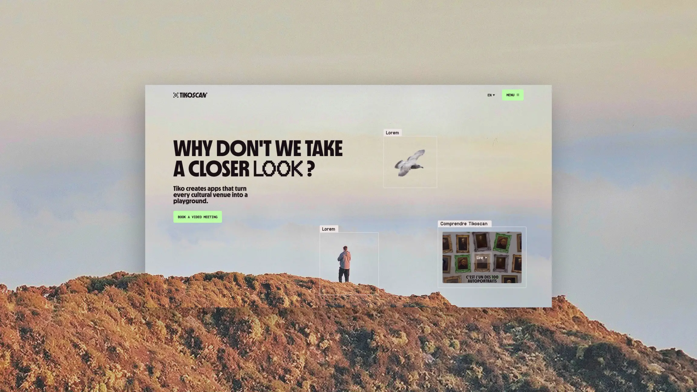
We leave the circuit to go back to class, with a second project signed by Studio Elias. Ynov, a network of schools training for digital professions, from tech to creative work and architecture, needed an identity able to speak to all its programmes with one voice. Our answer fits in three words: "Savoir faire évoluer" (know-how that helps you grow). A staircase for creative work, a cursor for tech, a sphere for architecture: 3D objects that give shape to each world, brought together in a single system. Because a school doesn't sell diplomas, it sells a trajectory. And between us, it's rather satisfying to watch its future designers grow up under an identity we drew.
{{cta-2}}
25. HONOR: "Dare to Be", heading for AI

Studio: in-house (no agency disclosed)
Back to tech, and not the most discreet. "Dare to Be": HONOR's new signature leaves no doubt. The logo, a circle crossed by a diagonal, symbolises going beyond perfection. Behind the sign, a real turn: with claimed growth of 25% in the first quarter of 2026, the brand wants to take on Samsung and Apple on embedded AI, not only on foldables and ultra-thin tablets. The rebranding doesn't decorate the strategy, it announces it. It remains to be seen whether the products will live up to the logo's panache.
26. Xbox: the return of the 2001 green

Studio: in-house (no agency disclosed)
We pick up the controller again for a return to the roots. In April 2026, Xbox buries the "Microsoft Gaming" name and goes back to its plain name. The black and white logo from 2019 gives way to a 3D sphere in radioactive green, instantly recalling the 2001 console. It's the brand's eighth logo in twenty-five years, and probably the most nostalgic. The message is clear: after years of corporate minimalism, Xbox wants to find its personality again. Thirty-somethings who spent their nights on Halo will appreciate it.
27. Zalando: a wordmark like a magazine cover

Studio: Kurppa Hosk (Stockholm)
We put the controller down and head to the fitting room. "How do I dress to feel like myself?": Zalando built its entire repositioning on the question we ask ourselves every morning in front of the wardrobe. To answer it, Kurppa Hosk redrew the wordmark, now displayed very large like the title of a fashion magazine, made the orange button (the famous "play" triangle) more intense and rolled out a large type family, also designed for accessibility. To embody the question, the brand brought out the big guns: Willem Dafoe, Brigitte Nielsen and Luka Sabbat, photographed as in an independent magazine. Launched in autumn 2024 then extended to more than 25 countries, the identity gives Zalando a new role: no longer an online catalogue, but the companion that helps everyone find their style. And frankly, we had never seen anyone so happy in a waiting room.
28. Birkenstock: the sandal as a blank canvas

Studio: Kit Studio
We stay in fashion, but slip on sandals. The product doesn't change. The brand does. With "Your Blank Canvas", Kit Studio takes Birkenstock out of the comfort and orthopaedics discourse to make it a blank page offered to those who wear it. A mascot and a bluish illustrative direction set the tone: more play, more expression, fewer spec sheets. Birkenstock moves from a product-centred brand to a brand driven by its identity. That's the whole difference between an object you buy and a brand you get attached to. With or without socks, we don't judge.
29. Threads: a voice of its own at last
Studio: Studio Nari (London), with the Threads design team
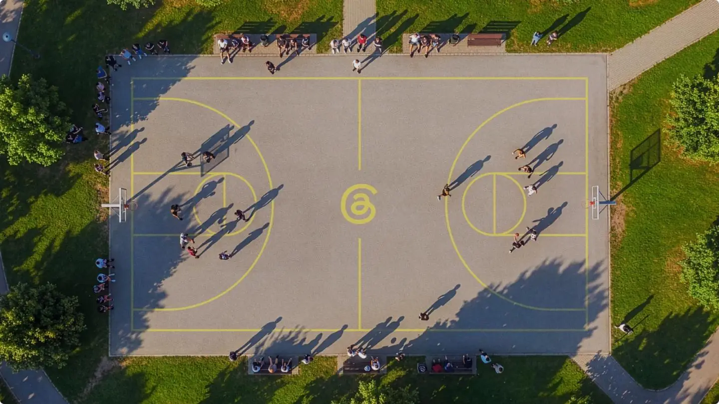
Back at Meta, where it all started with Instagram, but for a brand that wants precisely to break away from it. For almost three years, Threads lived in the shadow of its big sister: same Instagram Sans, same geometry, same weight. In 2026, with Studio Nari, the app finally gets a voice of its own. The wordmark becomes a custom drawing, angular and sculpted, and the @-shaped symbol keeps its loops but gains sharp cuts. The guiding idea has a nice name: the "Trending Chisel", inspired by the chisel-tip marker that highlights a sentence, like a conversation that circulates. The weight thickens, the italic leans forward, and the icon finally holds its own next to Instagram's. As Christopher Clare, head of design at Threads, puts it, the old identity felt "inherited rather than distinct". Moral: you can be born into a big family and want your own room.
30. Grand Theft Auto VI: a white outline is enough

Studio: Rockstar Games, in-house
We finish in style, heading to Vice City. And we won't lie: this is the one we were waiting for more than all the others combined. Technically, GTA VI didn't go through a full rebranding, hence its place in last position. In June 2026, Rockstar added a white outline to its neon logo, an open nod to previous episodes, then unveiled the official grid cover art, as tradition demands, and repainted its social networks in Vice City's blue and pink. But when a brand makes the whole planet tremble with a simple white outline, it has already won. The game comes out on 19 November 2026, and it's probably the biggest cultural event of the year. A personal note: the author of this article will be unreachable on 19 November. And probably on the 20th. Thank you for your understanding.
The 5 big rebranding trends of 2026
Thirty brands, thirty very different contexts... and yet, when you put the projects side by side, the same reflexes come back. Here are the five that jumped out at us. And to go further back, we have also ranked the best rebrandings of all time.
1. Simplification, again and again
Fewer effects, fewer colours, fewer details. Stack Overflow switches to flat monochrome, OM finally fits its M inside its circle, Ornikar draws a more sober logo, Calendly tucks its symbol into a rounded square. Logical: a logo must now work in an app icon a few millimetres wide as well as on a building front. But beware, simplifying doesn't mean impoverishing. At Coca-Cola, simplification takes nothing away: it puts every asset back in its place. It's a matter of discipline, not minimalism.
2. Custom typography becomes the norm
KFC, Stack Overflow, Granola, Sporting CP, Gaumont, Instagram, McLaren, Bolt, OM, Threads: at least ten brands in this ranking had their own typefaces drawn. Typography is no longer a font choice in a drop-down menu, it's the voice of the brand, the one you recognise before even reading the logo. An exclusive typeface avoids looking like everyone else, and it gives the visual identity a consistency no off-the-shelf font can offer.
3. Identities designed for motion
BAFTA generates its identity with particles, EA SPORTS FC turns its triangle into a free form, Sporting CP animates its stripes, Apple Music shapes its image with sound. The starting point of an identity is no longer the business card: it's the screen. And more and more, sound joins in, with the sound identities of Gaumont, Apple Music and Bolt.
4. Heritage as fuel
Lacoste reasserts its French origins, the Norton Museum brings a wordmark out of its archives, Sporting CP starts again from its 1945 crest, OM recomposes its own from four eras of its history, Gaumont celebrates 130 years of cinema, McLaren draws on a family garage sign, Xbox returns to the green of its first console. This isn't nostalgia: it's proof. In a world where anyone can launch a brand in a weekend, history becomes the hardest asset to copy.
JKR, one of the two most-cited studios in this ranking, had paved the way with Burger King: instead of a brand-new logo, the agency went back to one of the brand's old logos and perfected it, with a verbal identity and illustrations to match. Nostalgia, in the right dose, is worth any novelty effect.

5. The return of the human against AI
This is probably the strongest trend of the year. Granola draws its typeface from its co-founder's handwriting, Instagram creates a handwritten font, Threads draws its wordmark with a chisel-tip marker, Stack Overflow builds its whole repositioning on the value of human data. The more AI generates smooth content, the more brands want to leave the trace of a hand. Imperfection has become a sign of value.
The most controversial rebrandings of the year
A rebranding that gets no reaction is often a rebranding that says nothing. Again this year, some redesigns sparked real storms online. A quick tour of the most talked-about, in and out of the ranking.
Unveiling a new identity is a bit like Forrest Gump's box of chocolates:
"Life was like a box of chocolates. You never know what you're gonna get."
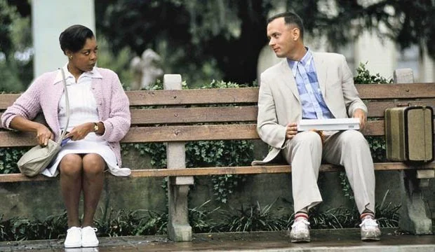
Applause, shrugs or an online petition: here is what brands got this year.
Instagram: the 2016 syndrome
Touching an app people open several times a day means exposing yourself. Instagram has known it since 2016, when its switch to the gradient was roundly mocked before becoming a reference. Here we go again in 2026: retouched wordmark, new fonts, a more discreet gradient, and an avalanche of indignant comments. Our bet: in two years, nobody will remember.
Apple Music: a beautiful identity, an icon that divides
The liquid identity built from sound won designers over. The black and white icon that arrived with iOS 27.2, much less so: some users found it dull, and even the design press wondered whether it was just a placeholder. The lesson is harsh but useful: an identity is also judged on its smallest format.
OM: touching the crest means touching a religion
Even before its official presentation, OM's new crest had leaked on social media, and the comparisons flew: Volkswagen, Inter, WordPress... The disappearance of the star and of "Droit au but" on some media finished annoying some of the supporters. Management defended two years of work and promised that the crest would write its own history as results come in. Lesson: in sport, the logo doesn't really belong to the club. It belongs first to those who wear it in the stands.
Spotify and its disco ball
Out of the ranking but impossible to ignore: in May 2026, Spotify temporarily replaced its icon with a disco ball. Users didn't follow, and the brand went back to its original icon. When an icon is part of daily habits, even a temporary operation can be experienced as a betrayal.
Sézane: "the brand has lost its identity"
Another one absent from the ranking, but present in every conversation: in August 2026, Sézane unveiled a new identity, and some of its customers reacted strongly, to the point that the fashion press spoke of a revolt. A brand built on a very emotional bond with its community must bring that community along with the change, not present it with a fait accompli.
The Jaguar precedent
Impossible to talk about controversy without mentioning Jaguar, whose radical turn set the Internet on fire at the end of 2024. We had unpacked Jaguar's bold rebranding at the time: leaping cat dropped, minimalist typography, unexpected palette, 100% electric positioning. Two years later, it remains the yardstick of controversy: every rebranding that divides is immediately compared to it.

What separates a bad buzz from a rebranding that ends up taking hold? The consistency between the new sign and the strategy it carries. An identity based on a real brand truth survives criticism. An identity based on nothing doesn't survive long. To avoid joining this list next year, we listed the worst mistakes to avoid in a rebranding.
How to succeed with your rebranding: 7 lessons from this ranking
You're not Coca-Cola? Neither are we. But the lessons of these thirty projects apply just as well to a ten-person start-up as to a multinational. For the full method, step by step, see how to do a good rebranding.
1. Start from strategy, not from the logo
Magnific changed its name because its product had changed nature. Calendly reworked its symbol because it no longer saw itself as a calendar. Darc set its positioning before even drawing its logo. In all three cases, the logo comes last. Before drawing anything, set your brand strategy and your brand platform: positioning, mission, values, target.
The best-known precedent is called Brevo. When Sendinblue expanded its business well beyond newsletters, its original name became too narrow: the brand became Brevo instead of staying locked into its first product.

2. Rely on a truth, not on a whim
Lacoste didn't change because it was bored, but because a survey showed its customers didn't know its French origins. Granola didn't choose imperfection by chance, but because its product helps humans think. A good rebranding answers a real, measurable problem.
3. Keep what makes your value
KFC kept its red, white and black. Tinder kept its flame. Coca-Cola kept everything. Before throwing anything away, take stock of your brand assets: what your customers recognise without thinking is worth gold.
4. Think system, not sign
BAFTA delivered a toolkit so its teams could roll out the identity on their own. Sporting CP designed its stripes for motion. A logo on its own doesn't make a brand: you need rules, adaptations and solid brand guidelines for the identity to hold on every medium.
5. Give your brand a voice
Tinder invented a fictional columnist, Gaumont treated itself to a sound identity, Zalando turned a simple question ("How do I dress?") into its whole story. Verbal and sound identity matter as much as visual identity: they are what carries the emotion.
6. Bring your community along
Manchester City Women built its new identity from interviews with players and supporters. Conversely, the controversies of the year show what happens when the public discovers the change without being prepared for it. Explain the why before showing the what.
7. Roll out everywhere, starting with digital
Bolt designs its identity for the moment of payment, Instagram for the feed, Apple Music for listening. Today, the website is often the first place people meet a brand: a rebranding that stops at the logo is half a rebranding. That's exactly the method we apply at Studio Elias. With KÖM, a repositioning and a new Webflow website doubled monthly quote requests and increased traffic by 30%. With Allshare, positioning, visual identity and website were rethought together, for a brand finally aligned.

One last point, often forgotten: a new website also needs preparing on the SEO and GEO side, so the brand doesn't lose in visibility what it gains in image.
{{block-cta-2}}
Frequently asked questions about rebranding
How much does a rebranding cost?
It all depends on the scope of the project. A simple graphic refresh (logo, colours) doesn't cost as much as a full redesign covering strategy, visual and verbal identity, adaptations and the website. As a guide, agencies generally start at around €5,000 and can go up to €30,000 to €50,000 for the most high-end. For a mid-sized company, a full rebranding is often between €20,000 and €80,000. We detailed everything, item by item, in our guide how much does a rebranding with an agency cost.
How long does a rebranding take?
Count around three months to build a new brand image: strategy, identity, first adaptations. Roll-out depends on the size of the brand. For an SME, it can be done in a few weeks once the identity is approved. For KFC, which is renewing more than 34,000 restaurants, or Coca-Cola, present in more than 200 markets, it takes years.
When should you rebrand?
When your image no longer tells who you are: a product pivot (Magnific), a new target (Ornikar, 7up), a skewed perception (Lacoste), a need for independence from a parent brand (Manchester City Women, Threads) or an identity that has aged (Xbox). On the other hand, being bored with your logo is not a good enough reason.
What is the difference between a rebranding and a logo redesign?
A logo redesign touches the sign. A rebranding touches the whole brand: positioning, visual identity and verbal identity, experience, sometimes even the name. The white outline added to the GTA VI logo is a logo redesign. Magnific changing its name, positioning and identity is a rebranding. The logo is only the visible part of a much broader visual identity.
Thinking about a rebranding?
If you've made it this far (well done, and thank you), the idea must be on your mind. Good news: you don't need Coca-Cola's budget to make a rebranding that counts. Above all, you need a clear strategy, an assumed brand truth and a team able to translate it into lines, colours and words. And if you are still looking for who to do it with, we have ranked the 12 best rebranding agencies.
At Studio Elias, we support brands from strategy all the way to the Webflow website, with precision and radicality. Discover our rebranding services, browse our portfolio or, even simpler, let's talk. We promise not to call you on 19 November.
{{cta-3}}