

On Wednesday 8 April, Olympique de Marseille presented its twelfth historic logo in front of its players, its coach and some Olympic legends. A solemn moment, thought of as a turning point. In less than 24 hours, Volkswagen had turned the situation around with a single Instagram comment: “Forever the first on this logo.”
Welcome to the era where each coat of arms becomes a field of communication, and where brands that do not control their identity are exposed to having others define it for them.
Since its foundation, OM has evolved at the pace of its time. The current logo was created in 2004 to recall a truth from Marseille: the blue of the Mediterranean, the star of the Champions League, the slogan “Straight to the point”. Twenty-two years later, Alessandro Antonello, managing director of Olympique de Marseille, justified the change with a digital argument: “When the old logo was designed, there were no smartphones.”
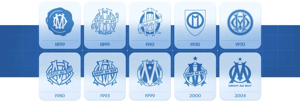
The argument is valid. It is also inadequate. Because a brand image does not adapt to the digital world, it connects people to an emotion. And the Marseille fans did not find this emotion in the new visual. They found a returned W.
{{cta-1}}
In this championship, the teams no longer compete only on the sports ranking. Monaco is maintaining its premium image. Lyon is building a coherent Lyon universe between stadium, jersey and digital content. And then there is FC Versailles, perhaps the best French example of what assertive and radical communication can give.
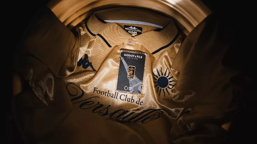
The Club du Peuple Versaillais is not content to inspire on the pitch. He creates content, shares his background, makes the dream of a generation that has never set foot in a match. Over 121,000 followers on TikTok, jerseys sold in 40 countries, an Xbox partnership transformed into a cultural moment. FC Versailles became a brand before being a sporting podium. That is the future of the modern club.
{{cta-2}}
The real lesson of the OM logo is not graphic. The fact is that in football as elsewhere, a brand reaches people when it is telling the truth, not when it presents a compliance report with digital standards. The star and the “Straight to the point” are not details that can be deleted depending on the medium: they are a breath of history, reminders of what the club went through to give joy to its audience.
At Elias, we believe that a spectacular brand is not born from a technical brief. It is born from a well-found emotional truth, translated radically into each visual element. The question is always the same: what in this brand can make a heart beat?
{{cta-3}}
Does your logo no longer look like you? Is your identity no longer inspiring your teams or your customers? It's exactly the kind of project that Elias loves.


.jpg)
.jpg)


%20(1).gif)