Ynov Campus
The school of metamorphosis
10 years of growth through school acquisitions, 14 campuses, 10,000 students a year. And yet: a ghost brand. Neither recognised externally nor felt internally. A patched-together identity, a design system that didn't allow the campuses to communicate consistently. Ynov was getting lost in the sea of private higher-education schools.
Recreating desire.
Organise the assets around a clear, distinctive idea, unite the campuses around a shared positioning, and give the teams the tools to communicate consistently. A complete rebrand: strategy, verbal identity, visual identity, rollout examples.
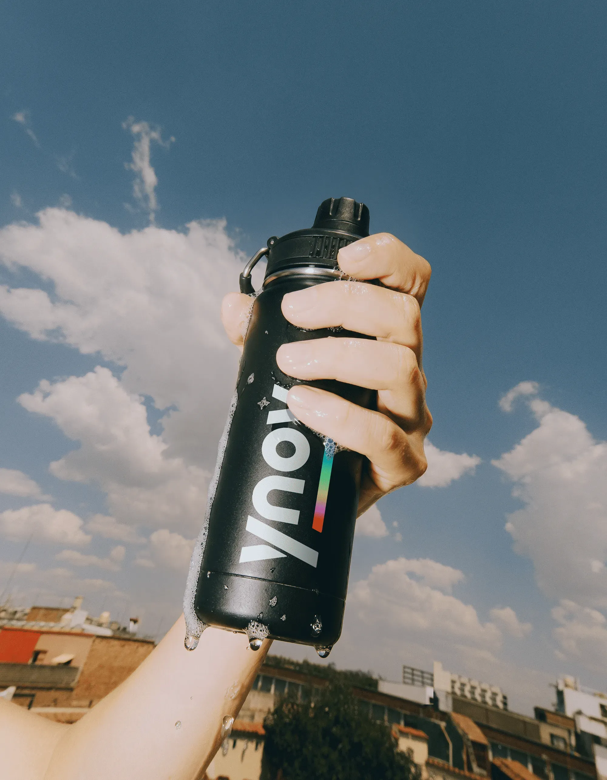

the school of metamorphosis
A territory that embraces Ynov's ability to anticipate tomorrow's jobs and to train profiles the professional world isn't expecting yet. With one strong idea: metamorphosis. Ynov doesn't train students, it transforms individuals. Tomorrow's digital creators, ready to seize reality and evolve with it. A school unlike any other. Dark where others are smooth. Sharp where others are well-behaved. Looking to the future where others look to the past.
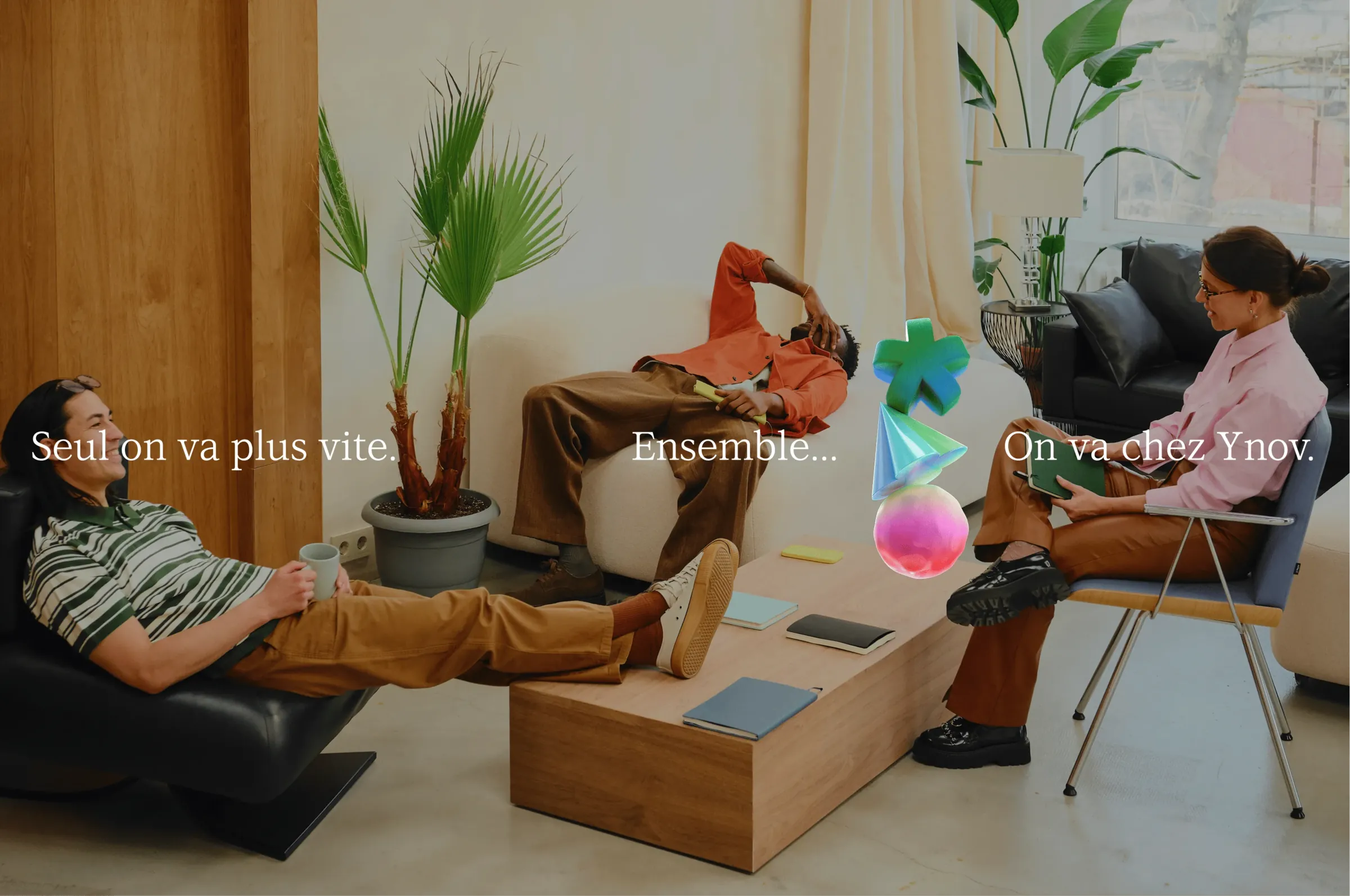
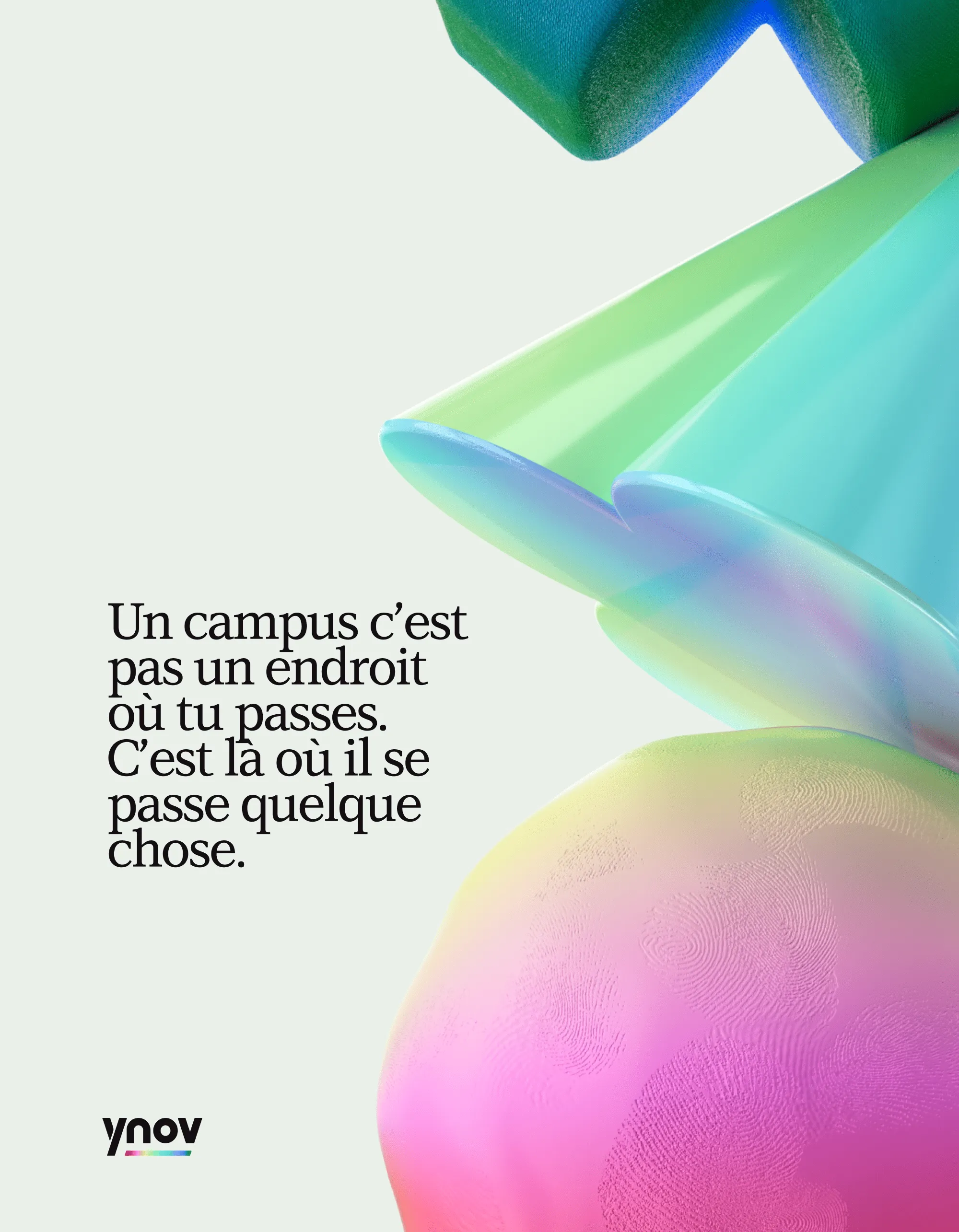
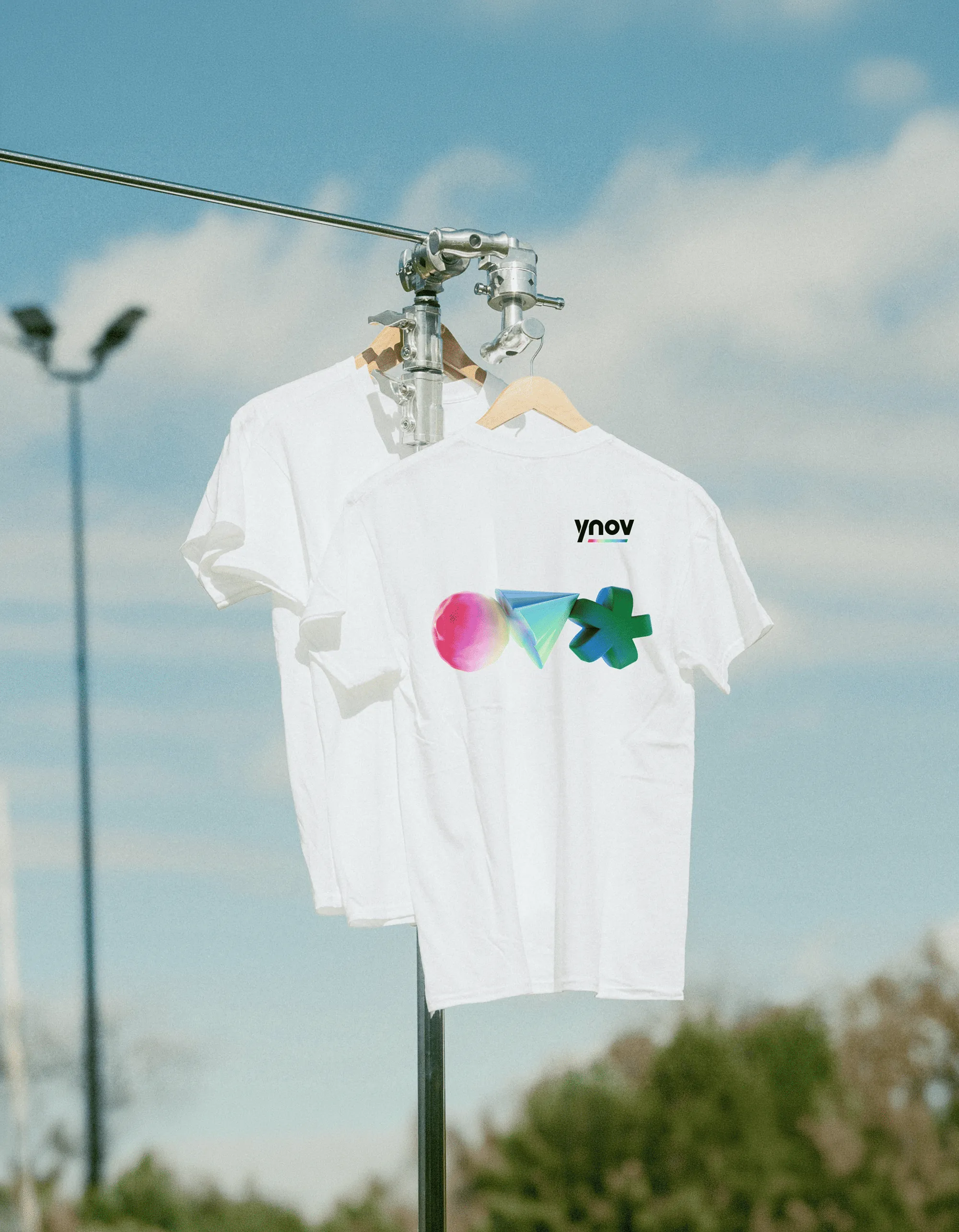

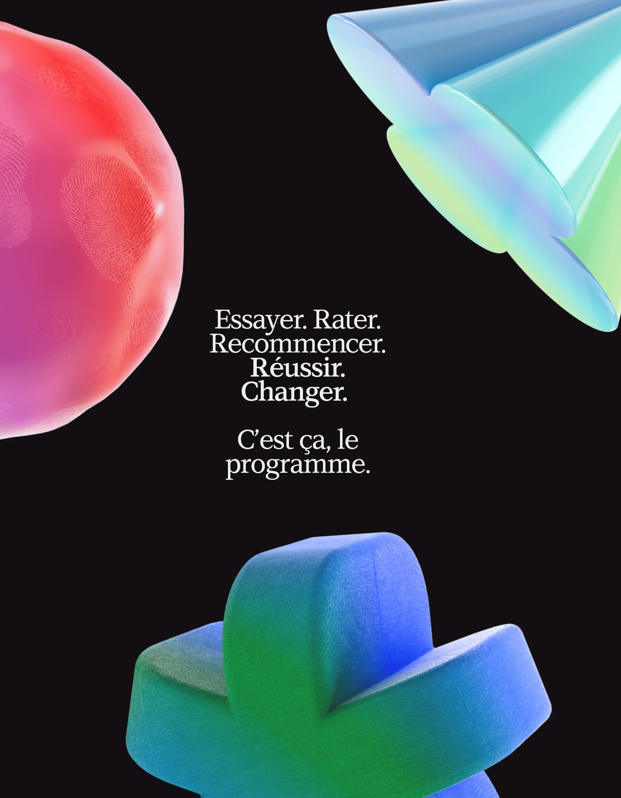
multiple “touchpoints”
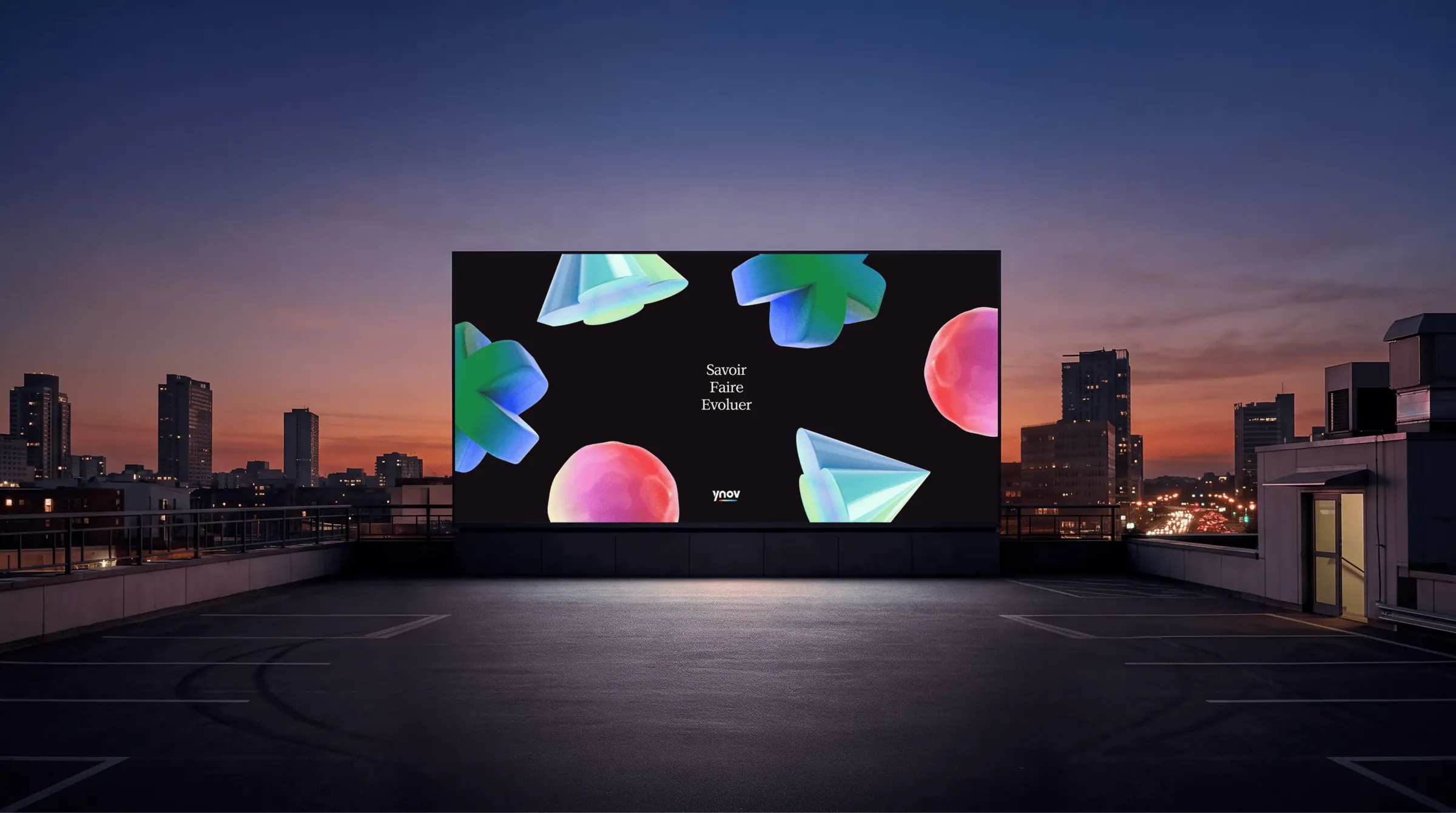
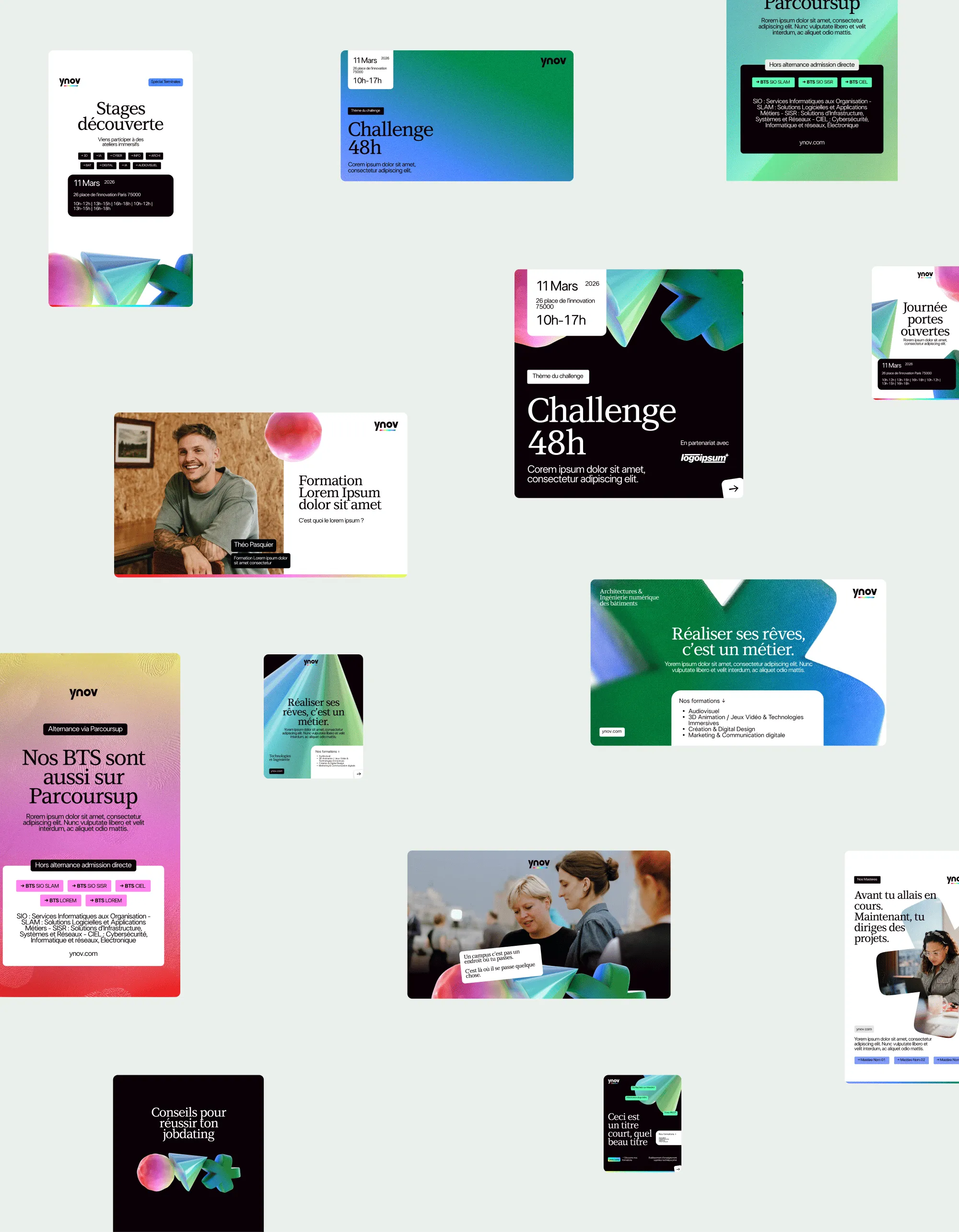
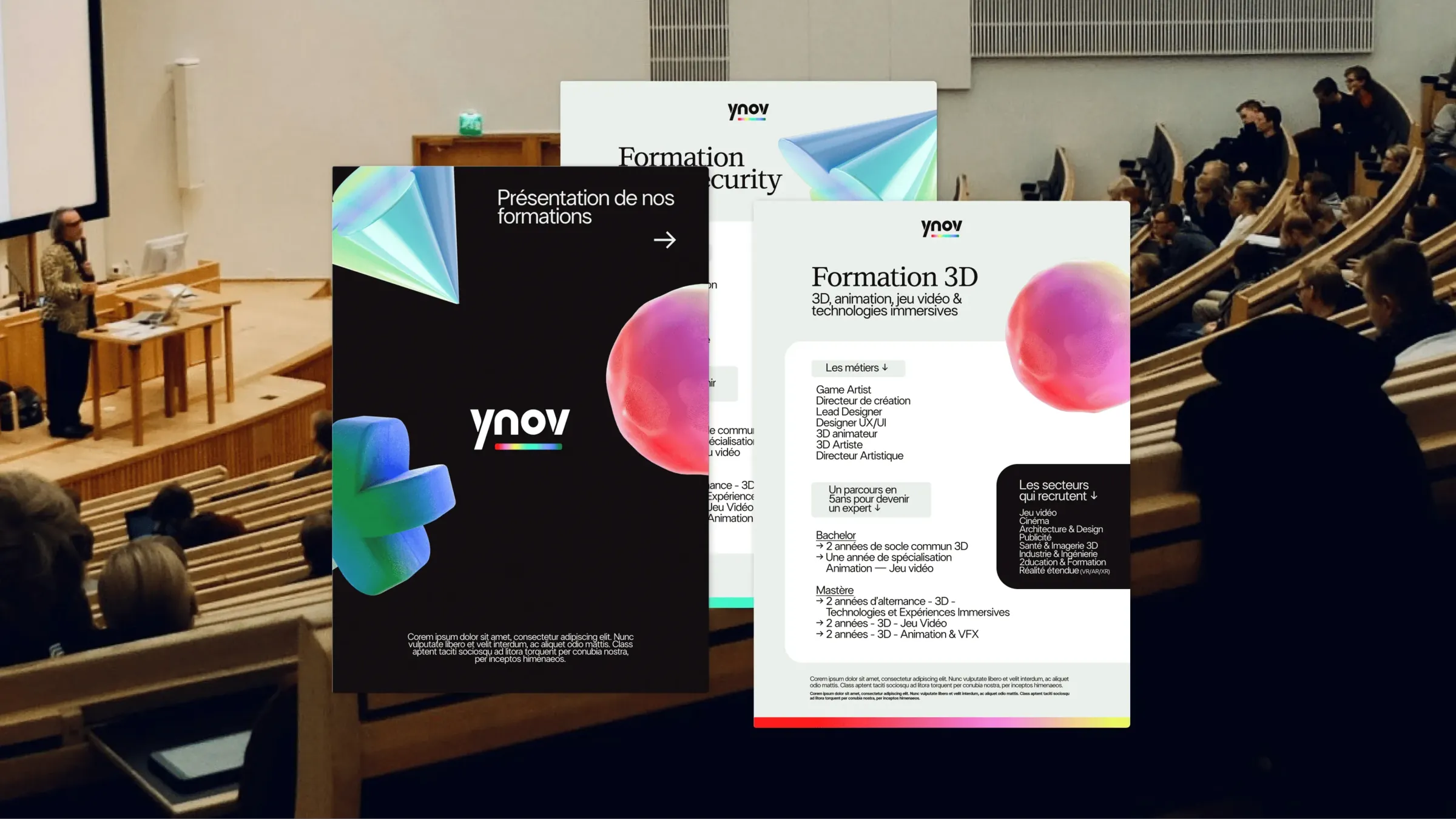
A dark territory, gradients and colours that break with the codes of the education world. One shape and one gradient per department to embody each universe. Numerous mock-ups to guarantee consistency across every touchpoint: design system, social media, brochures, motion design, AI workflow. All elements that will make the rollout of Ynov's new brand identity a success.

Thank you
Thank you Julie & Marie for your trust and kindness throughout this great project.