


Rebranding is one of the most strategic, and riskiest, moves a company can make. In this article, we break down 10 cases that redefined the rules of modern branding:
Ten brands. Ten lessons. One common belief: behind every successful rebrand, emotion always comes before spectacular design.
Rebranding is one of the most strategic and riskiest moves a company can make. Changing a brand's image means touching something profound: the emotional connection millions of consumers have with it. Yet, when executed well, a successful rebrand can transform a dormant asset into an irresistible commercial force. It can reposition a company in its market, attract new target audiences, and reignite a growth dynamic that nothing else seemed capable of reviving.
We've already talked about the 5 most successful post-COVID rebrands, and today, at Elias, we have selected the 10 best rebrands in modern branding history. Each example is analyzed to understand not only what changed visually, but more importantly, why this rebranding worked and what it truly achieved for the company.
{{block-cta-1}}
Before diving in, it's essential to understand the rebranding objectives that drive a company to act. Rebranding is rarely done on a whim. The most common reasons include: an evolution of brand strategy, entry into an international market, the need to differentiate in the face of more aggressive competition, or a mismatch between the current visual identity and the company's current aspirations.
Rebranding is not simply a logo change. It's a comprehensive process that impacts brand identity, communication, design, sometimes the brand name, and most importantly, how consumers perceive and feel about the brand. It's an act of strategic repositioning as much as an aesthetic one.
{{cta-1}}
In 1997, Apple was on the verge of collapse. Steve Jobs' return marked a clear break from the dull corporate identity Apple had been dragging along for years. Out went the multicolored rainbow identity, replaced by a monochrome, sleek, modern symbol. But beyond the logo change, the entire marketing strategy was rethought with the "Think Different" campaign.
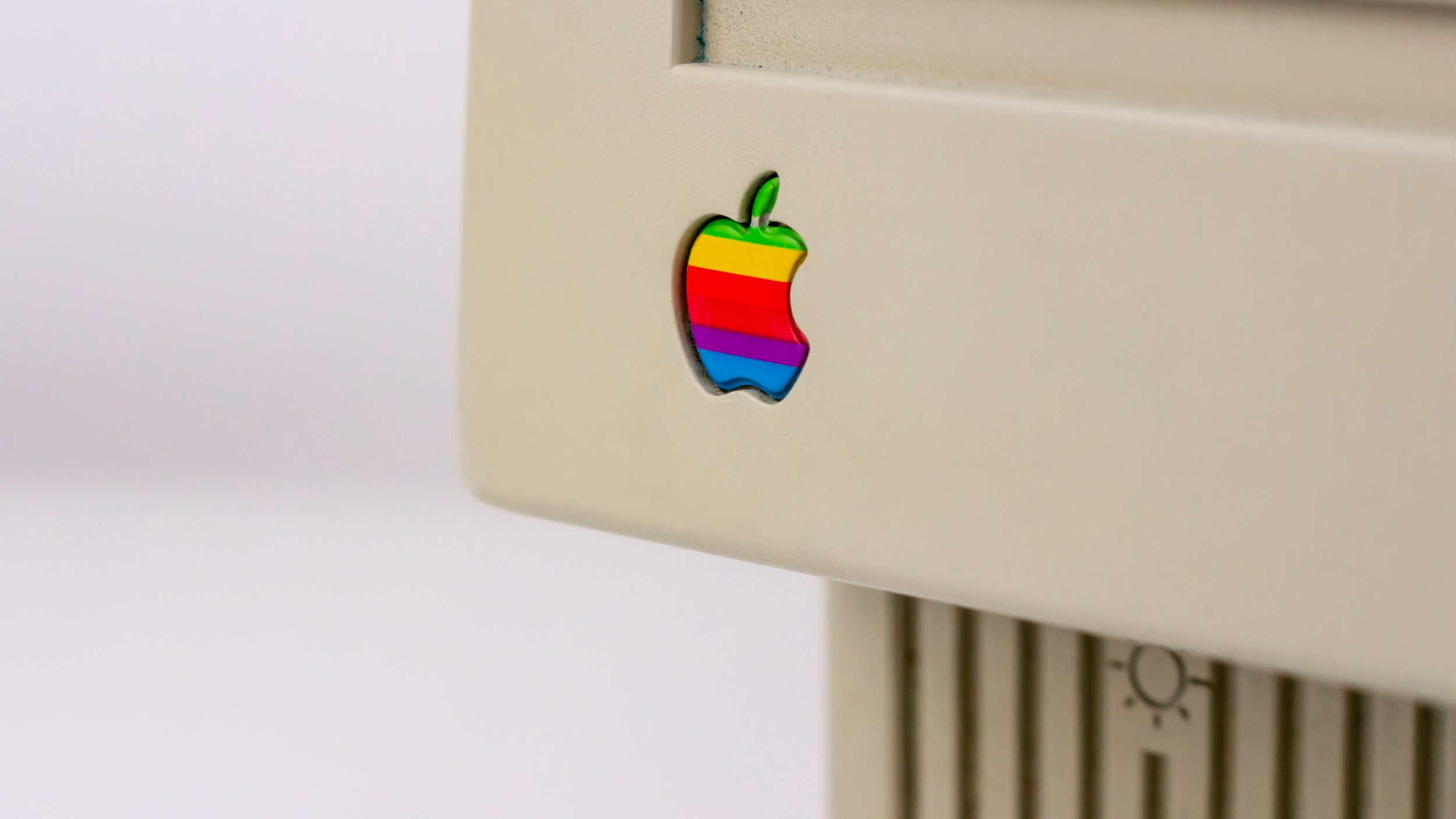
This successful rebranding was not just a graphic redesign; it was a radical repositioning. Apple decided to stop competing on technical specifications and instead focus on creativity, personality, and meaning. The brand chose to appeal to rebels, artists, and visionaries. Emotion became the core of the brand identity.
The result was historic. In just a few years, Apple transformed from a dying company into a global icon. The product didn't change overnight — it was the brand image that transformed everything. This case demonstrates that strategic rebranding can save a company, provided it's rooted in a profound truth and communicated with conviction.
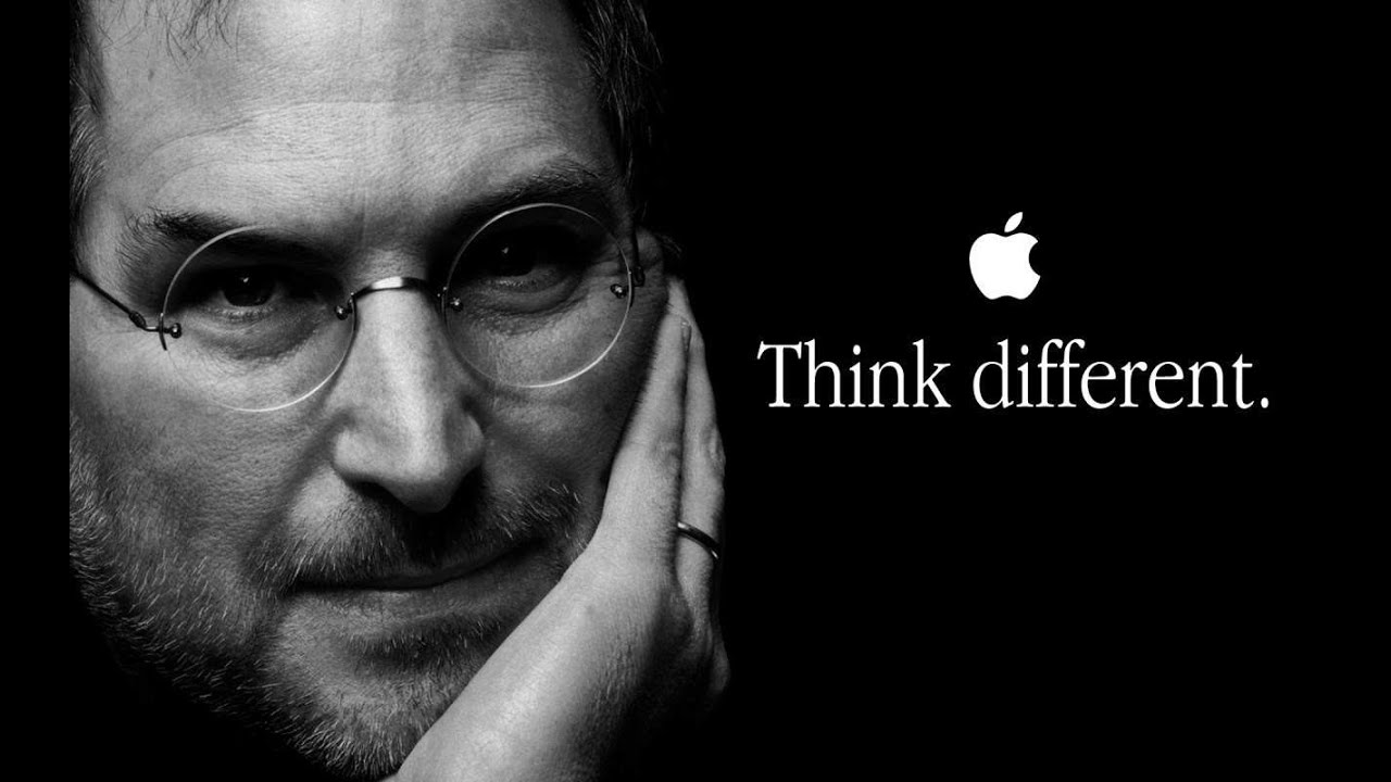
Key takeaway: Visual identity is merely the surface. Apple's true strength lies in the emotional idea that drives it.
Nike is a paradoxical example: its most powerful rebranding involved removing almost everything. In 1995, Nike dropped its name from under the Swoosh. The swoosh alone was enough. This was the culmination of extensive work to build such strong brand recognition that a simple symbol is enough to evoke the brand's entire emotional promise.
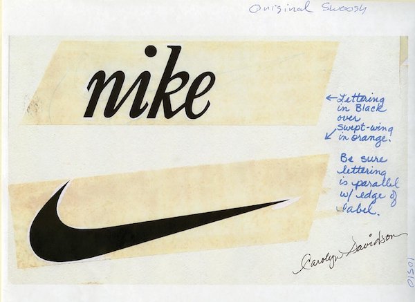
Nike's brand strategy is based on a simple idea: everyone is an athlete. This universal belief, championed by bold communication campaigns, has allowed Nike to transcend the sports market and become a cultural brand. The minor logo change in 1995 was, in reality, the culmination of years spent building a strong and consistent identity.
Nike perfectly illustrates what the best branding studios aim to create: a brand that doesn't need to explain what it is, because it's already deeply embedded in emotion and collective memory.
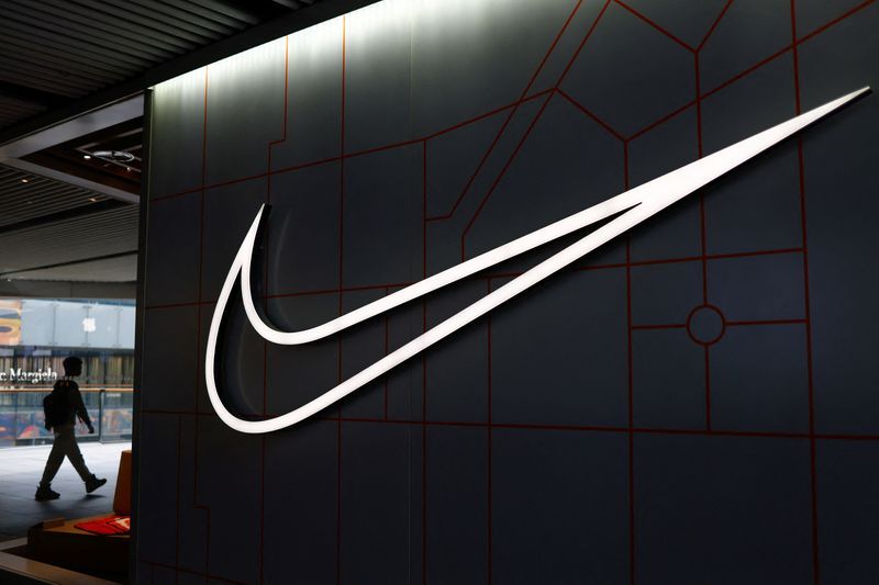
Key takeaway: Brand recognition is built over time, through consistency, before it can afford simplicity.
From Nike to Apple, we've also listed the 50 most famous logos on the planet in our dedicated article, company logos that have become true cultural emblems, recognizable at a glance.
In 2014, Airbnb underwent a major rebranding with the creation of the "Bélo," a symbol designed to represent belonging, people, places, and love. The redesign was mocked on social media, compared to all sorts of improbable shapes. And yet, this rebranding is now considered one of the most successful of the decade.
Why? Because it wasn't just a logo change; it was the manifestation of a new brand identity. Airbnb no longer wanted to be the platform for "cheap rooms." It aimed to embody the idea that anyone can feel at home anywhere in the world. "Belong Anywhere" isn't just a marketing slogan; it's the emotional truth of the brand.
This new strategy allowed Airbnb to attract a more premium clientele, justify upgrading its offerings, and assert itself against the competition from major hotel chains. The design was merely the final step in a comprehensive strategic process.

Key takeaway: A successful rebranding transforms perception without betraying the promise. The emotion conveyed by "Belong Anywhere" survived the mockery because it was genuine.
In the 2000s, Burberry faced a severe image crisis. Its iconic tartan pattern was co-opted by a culture it hadn't chosen, associated with violent behavior in the UK. The brand, without fundamentally changing its visual identity, had to undertake a complete strategic repositioning.
Under the leadership of Angela Ahrendts and Christopher Bailey, Burberry decided to refocus the brand on its British heritage and creative youth. Communication was revamped, digital channels were pioneered, and the design regained a sober, contemporary elegance. The rebranding involved total control over the brand's image: who wears it, in what context, and how it is presented.
In less than ten years, Burberry transformed from a brand in crisis to a global benchmark for accessible luxury. This case demonstrates that rebranding isn't always a visual revolution; it can be a gradual and methodical reclamation of brand image.
Key takeaway: Brand strategy also involves choosing who your customer isn't. Differentiation also means exclusion.
Old Spice is the perfect example of a successful rebranding achieved through a shift in tone. In the late 2000s, the brand was associated with an aging, outdated image, targeting a male audience from a bygone era. Rather than softening this image, Old Spice chose to turn it into an asset: it pushed the boundaries to the absurd and created one of the most viral advertising campaigns in history.
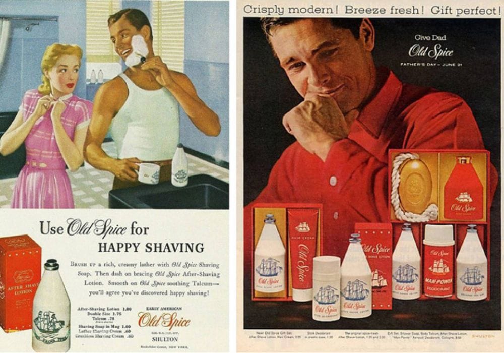
The change isn't in the logo or the identity; it's in the brand's personality. Old Spice chose to appeal to women as much as men, with quirky humor and self-deprecating wit. The result: a spectacular brand revival, with sales increasing by over 100% in just a few months.
This rebranding illustrates a key idea: it's not always necessary to change everything. Sometimes, it's the way a brand communicates that completely transforms its market perception.

Key takeaway: A brand's tone and personality are assets as powerful as its logo or design.
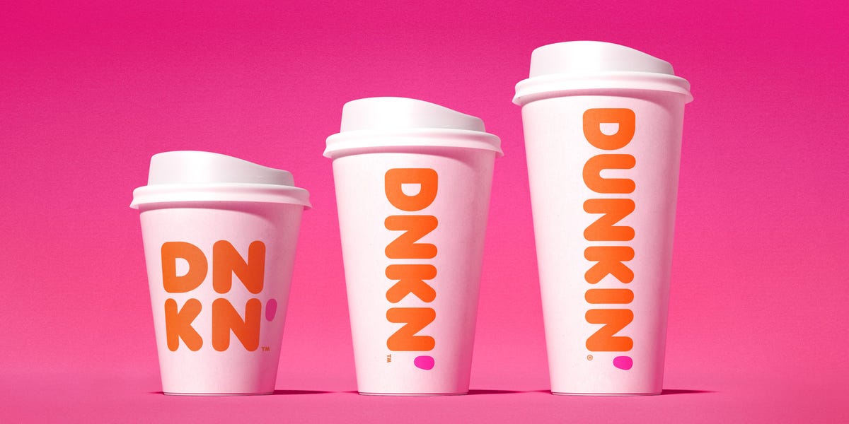
In 2019, Dunkin' Donuts decided to change its name to simply "Dunkin'". This name change might seem minor, but it signifies a deep strategic evolution. The brand aimed to signal to its customers — and its market — that it was no longer merely a donut vendor, but a go-to destination for beverages and snacks catering to an active lifestyle.
This strategic rebranding was accompanied by a complete visual overhaul, featuring modernized typography and a reaffirmed color palette. The process was exemplary in its rigor: every step was carefully considered to avoid alienating loyal customers while attracting new target audiences.
The challenge was to refresh the brand's image without losing the warmth and accessibility that are its strengths. Dunkin' successfully adapted its identity to a rapidly changing market, without betraying the emotional connection its consumers have had with the brand for decades.
Key takeaway: A well-executed brand name change can refocus strategy and send a strong signal to the market, without severing existing emotional ties.
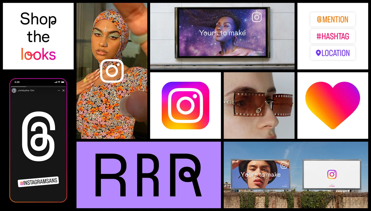
In 2016, Instagram changed its logo: out with the realistic Polaroid camera, in with a stylized colorful gradient. Public reaction was immediately negative. Thousands of posts lamented the loss of the app's "soul." And yet, this rebranding proved to be one of the most astute in the history of digital platforms.

The new logo reflects what Instagram has become: a young, dynamic, constantly evolving visual creativity platform. The old camera evoked nostalgia; the gradient evokes the present and the future. The identity change accompanied a profound transformation of the platform, which evolved from a simple photo filter to a global creative ecosystem.
This rebranding proves that initial consumer opinion should not be the sole compass for a brand change. What matters is consistency with the long-term strategic vision.
Key takeaway: Take the time to understand where the brand is headed before deciding how it should present itself. The visual identity should be a little ahead of current perception.
In 2019, Mastercard made a bold move: it removed its name from its logo in most contexts. Two overlapping circles, red and yellow, are enough. Like Nike before it, Mastercard reached a level of brand recognition that allows it to go wordless.
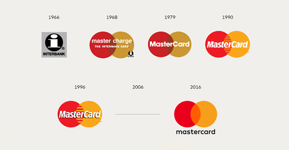
This successful rebranding is the logical conclusion of a long-term simplification strategy initiated in 2016. At each stage, superfluous elements were removed, until only the essentials remained: shape and color. This rebranding process illustrates how a brand can evolve gradually, without abrupt disruption, by progressively building a stronger identity.
The result is a brand that inspires trust through its clarity, confidence, and understated elegance. In a financial sector often perceived as opaque and complex, this streamlined brand identity is a major competitive advantage.

Key takeaway: Simplification is a form of strategic courage. Adapting one's visual identity to the digital age requires knowing how to remove as much as to add.
In 2011, Starbucks rebranded its logo, following the same logic as Mastercard and Nike: the brand removed its name from the iconic circle. The green mermaid, now standing alone, became the brand's global ambassador.
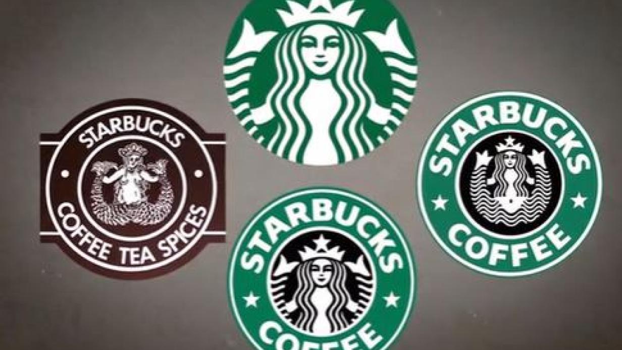
This change signals strong international ambition. Starbucks no longer wants to be merely an American coffee chain; it aims to be a global icon, understandable across all cultures, without the barrier of a name. This rebranding also paves the way for new products and offerings that extend beyond coffee, without the name "Starbucks Coffee" restricting perception.
The success of this repositioning stems from strength accumulated over years: a consistent customer experience, clearly expressed brand values, and visual recognition built through billions of touchpoints. Without this foundation, removing a name from a logo is suicidal. With it, it's a declaration of confidence.
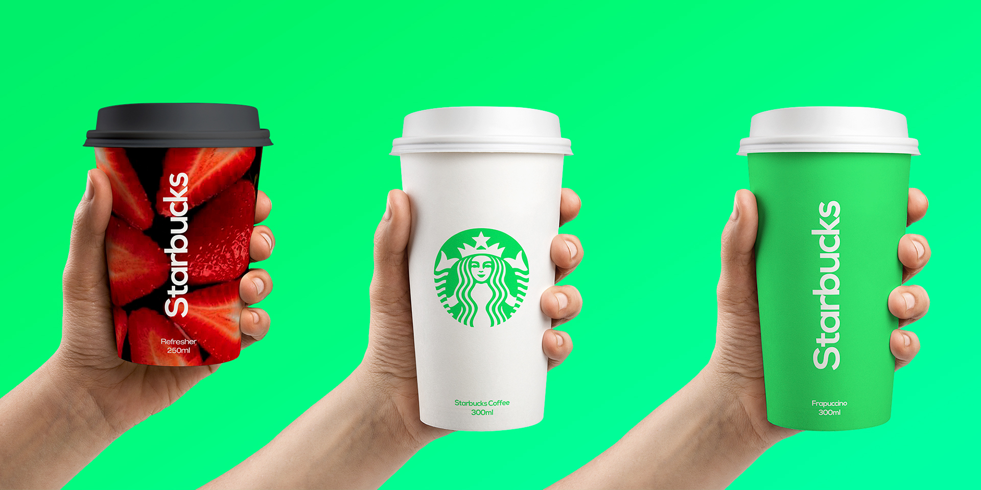
Key takeaway: A rebranding must build upon what already exists. The trust built with consumers is the most valuable asset.
Pepsi has undergone numerous logo changes over the decades, perhaps more than any other major international brand. This isn't a sign of weakness, but rather a deliberate brand strategy: to always stay in motion, always relevant, always in dynamic opposition to Coca-Cola.
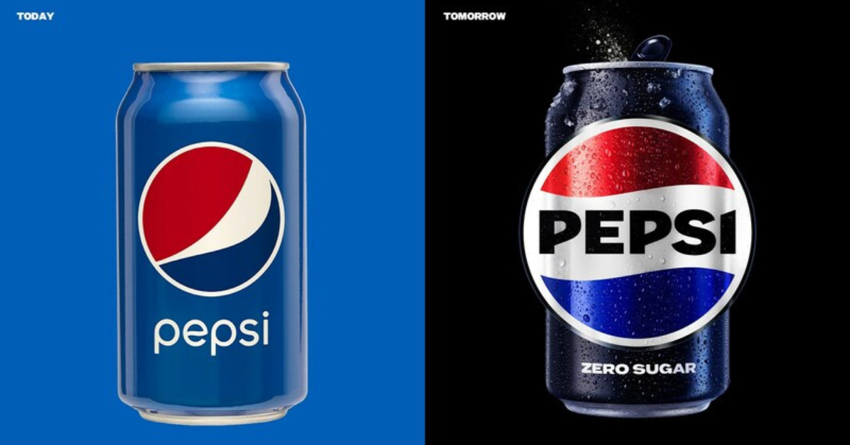
Each Pepsi rebranding has corresponded to an era, a target audience, and a generational mindset. The 2023 rebranding, which revisits the 90s brand image with contemporary modernity, is particularly successful: it plays on nostalgia while asserting new energy.
What makes Pepsi a fascinating case study is how the brand has leveraged change as a communication tool in itself. Regularly repositioning also sends a signal: Pepsi is alive, Pepsi is evolving, Pepsi is watching you.

Key takeaway: For challenger brands, rebranding can be an offensive weapon. Changing sometimes means asserting a refusal to be outpaced by a competitor.
By analyzing these ten exceptional rebranding cases, several powerful lessons emerge:
Emotion before visuals. In each example, the evolution of the logo or visual identity is merely the tip of the iceberg. What truly drives the power of these rebrands is the emotion they convey, the truth they reveal about the brand. Apple speaks of creativity. Airbnb speaks of belonging. Mastercard speaks of trust.
Strategy before design. A successful rebranding always begins with a reflection on the rebranding objectives: why change? For whom? Towards what? Design is merely the conclusion of rigorous strategic thinking.
The courage to choose. Every rebranding on this list involves taking a radical stance. To differentiate yourself means accepting that you won't please everyone. It's about choosing your target audience and dedicating yourself entirely to them.
The long game. These transformations didn't happen overnight. They are the result of a methodical process, a clear vision, and patient execution.
At Elias, we share a deep conviction with the teams behind these historic rebrands: a brand is not a logo. It's an emotion.

Our approach to branding starts with a simple question: what emotion should this brand evoke? Not just at first glance, but at the hundredth. Not just among customers, but internally, within teams, and throughout the company culture.
It's this conviction that has led us to work with brands like Allshare or Snob Dog, companies looking to emerge in competitive markets with a strong, differentiating, and emotionally resonant identity.


Our difference? We don't practice art for art's sake. We transform brands into assets. Every design decision, every typographic choice, every color serves a clear strategic objective: to increase the perceived value of the brand and create preference.
{{cta-2}}
We believe the best brands don't try to please everyone. They aim to deeply connect with the right people. With precision and boldness.
If you're looking for a studio that can guide you through your rebranding process — whether it's a complete overhaul or a strategic repositioning — we'd be happy to explore together what your brand could become.
Create spectacular brands, or nothing at all.
{{block-cta-2}}
If these examples inspire you to consider a refresh of your own brand image, here are the key steps to consider before making a choice:
Why change? Do you have a clear strategic reason: target audience evolution, market repositioning, business model change? Rebranding without a solid reason is an unnecessary risk.
What should remain? Every brand has emotional assets accumulated over time. Identifying what shouldn't be broken is as important as defining what needs to be created.
What emotion do you want to evoke? The question isn't "what logo do you want?" but "how do you want your customers to feel when they think of you?"
Are you ready to go all the way? A partial, uncommitted rebranding is often worse than no rebranding at all. The most successful examples share a common thread of radical execution.
Rebranding is one of the most powerful actions a company can take to reinvent itself, differentiate, and create value. But it requires a clear vision, a solid strategy, and partners capable of transforming an idea into a spectacular identity.
The ten brands in this ranking understood this. Perhaps it's time for you to ask yourself the same question they did: what if your brand deserves better than what it's showing today?










.jpg)
.jpg)





%20(1).gif)