The main thing to remember
In short: a good moodboard example starts from an emotion, not a colour. The 30 boards below cross an emotion, a sector and a logo type, with the palette that goes with them: enough to find the starting point of yours.
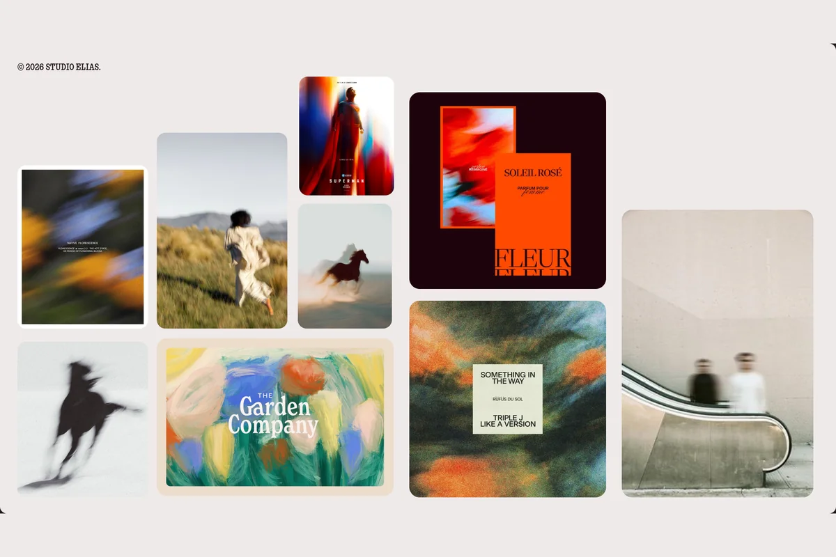
At Studio Elias, we build a moodboard for every brand identity. These 30 boards follow our workshop format, with references found on Pinterest, on logosystem.co and at the movies.
Opening Pinterest without choosing an emotion is Forrest Gump's box of chocolates: you never know what you're gonna get.
How to read these 30 moodboard examples?
At Studio Elias, a branding agency, we build a moodboard before every visual identity. For this article, we built 30 of them, in our workshop format. Each board carries three labels: the emotion, the sector, the logo type. At the bottom, a five-colour palette taken from the images.
A moodboard example is a board of about ten images, with its palette, that shows the mood a brand wants to make people feel before its logo is designed.
We start with the emotion, because a brand does not have to be pretty: it has to make people feel. The table shows what each label tells you.
| Label | What it tells you |
|---|---|
| Emotion (orange) | What your customer should feel when they see the brand |
| Sector (black) | The codes to keep, and the one to break |
| Logo type (beige) | The shape the first sketch will take |
| Palette | The colours to test, with their codes |
These boards are directions, not finished identities: the images belong to their authors and serve as references, as in a workshop. For the step-by-step method, read our moodboard guide.
{{block-cta-1}}
Moodboards for restaurants and hospitality
In food and hospitality, the board has to make people hungry and want to walk in: tableware, signs and packaging matter as much as the logo.
1. Boldness: specialty coffee, wordmark
Cobalt blue on white cups, an orange bag of beans, heavy type: the board turns down the brown and kraft everyone expects from coffee. The wordmark, a name set in bold, carries the whole brand.

3. Nostalgia: bakery, emblem
Pastry stripes, cream boxes, old-fashioned illustrations: this is the neighbourhood bakery. The emblem sits on a paper bag like a stamp.

10. Escape: hotel, retro crest
Pale stone, bougainvillea, sea-green slippers: the board sells a holiday before it sells a room. The crest is embroidered on a bathrobe and engraved on a key.

12. Warmth: trattoria, hand-drawn logo
Tomato red, tablecloth stripes, line illustrations of waiters and plates of pasta: everything looks handmade, like the food. The hand-drawn logo gives the owner a voice.

15. Conviviality: wine bar, serif wordmark
Plain bottles, thick paper coasters, a fine serif: this is wine among friends, not a stiff tasting. The serif wordmark works on a label as well as on a chalkboard.

23. Camaraderie: craft brewery, vintage label
Illustrated cans, bold colours, comic-book characters: every beer has its hero. The vintage label plays the beer you share with mates rather than the rare elixir.

Moodboards for fashion, beauty and luxury
In fashion and beauty, the board plays on skin and material: gestures, textures and packaging in close-up.
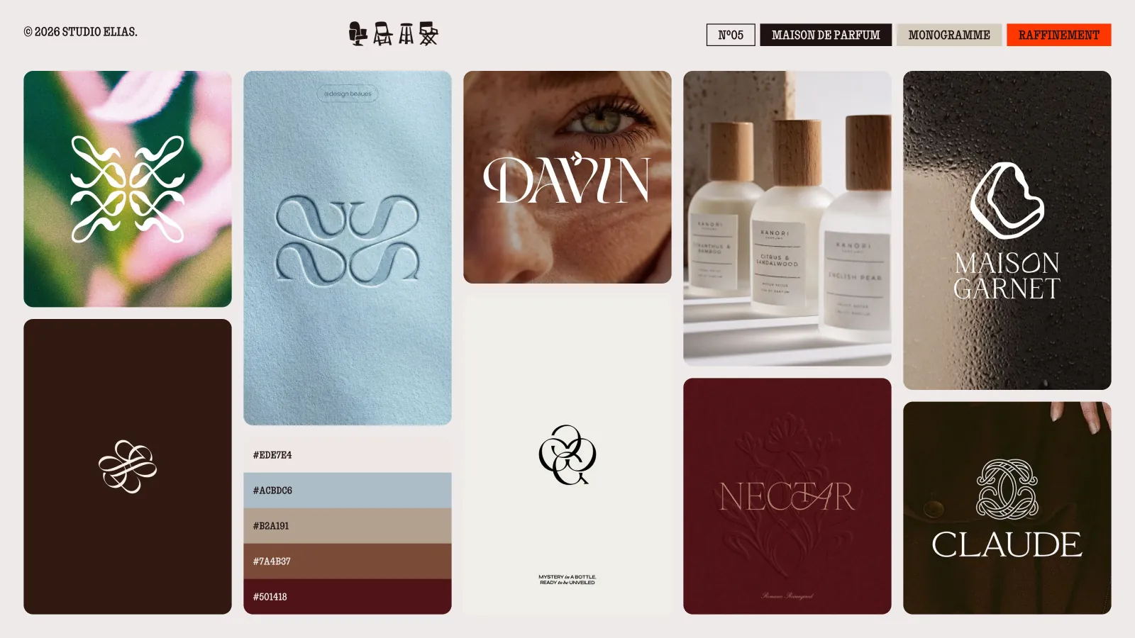
5. Refinement: perfume house, monogram
Embossed monograms, thick glass bottles, burgundy and powder blue: luxury shows in the relief, not in the gold. The monogram is signed small, on a cap.
7. Rebellion: streetwear, deconstructed wordmark
Black, red, crumpled paper, letters stretched until they are unreadable: the board is happy to put people off. The deconstructed wordmark changes shape from one T-shirt to the next, like a tag.

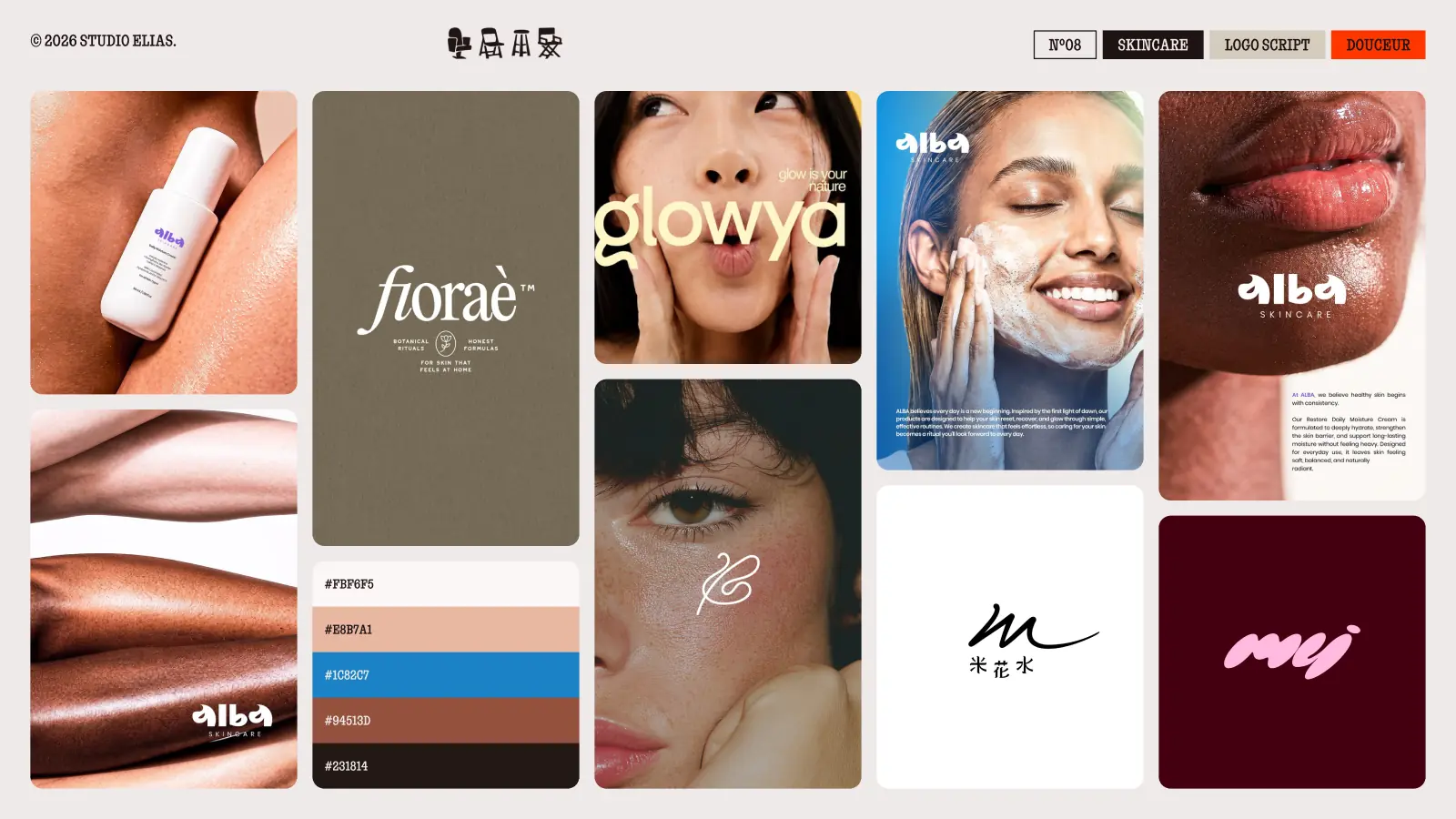
8. Softness: skincare, script logo
Skin in close-up, peach and sky blue, round letters: you want to touch before you read. The script logo looks like a signature on a bottle.
Moodboards for tech, finance and consulting
In tech and consulting, the risk is the interchangeable board: blue, gradient, office photo. These examples keep one code, break another.
6. Trust: fintech, geometric symbol
Apple green, electric blue, customer portraits: trust comes from faces, not from growth curves. The geometric symbol fits in an app icon.

11. Curiosity: artificial intelligence, abstract symbol
Purple and orange gradients, materials that seem to move: the board makes you want to click to see what comes next. The abstract symbol steers clear of the brain and the robot.

13. Power: industry, condensed wordmark
Concrete, containers, construction yellow, narrow and heavy letters: you feel the weight of the machines. The condensed wordmark reads from afar, on a truck or a helmet.

16. Admiration: architecture, minimal logo
Kraft paper, stone grey and a lot of empty space: the board leaves room for the buildings. The minimal logo is a few strokes, like an architect's signature.

24. Rigour: consulting firm, corporate wordmark
Midnight blue, serious portraits, large editorial type: the board looks more like a magazine than an annual report. The corporate wordmark stays discreet and lets the ideas speak.

One board is not enough to launch a brand: next come a logo, typefaces and usage rules, in other words a complete visual identity.
{{cta-1}}
Moodboards for sport, culture and leisure
Sport and culture live on gatherings: the board shows movement, crowds and posters you can see from far away.
9. Energy: gym, italic lettermark
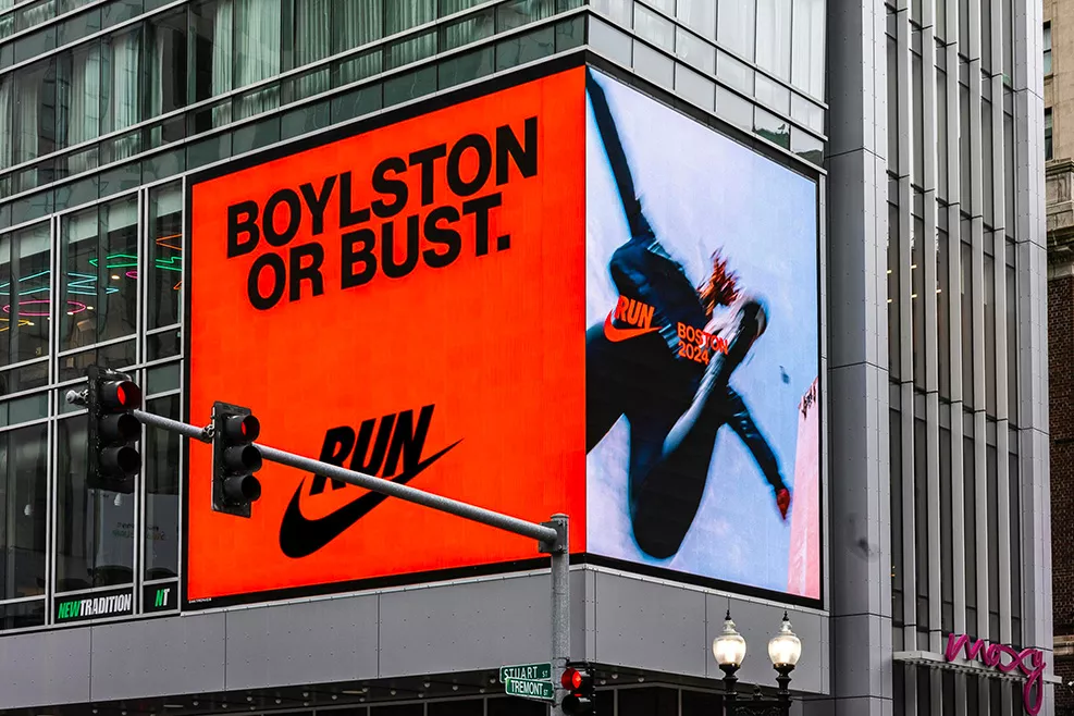
Neon yellow, purple, bodies blurred by speed: the image moves even when it stands still. The italic lettermark leans forward, like a sprinter in the blocks.

18. Pride: football club, crest
Royal blue, striped shirts, a crest on a flag and in a wax seal: the board talks to the fans before the sponsors. The crest sums up the club's history in one shape.

20. Freedom: bicycles, logo in motion
Green, orange, bikes drawn in a single line, blurred riders: you feel the road rushing by. The logo in motion suggests speed without drawing a whole bike.

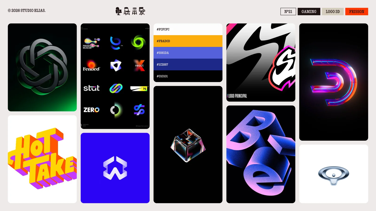
21. Thrill: gaming, 3D logo
Deep black, neon, shiny letters in volume: the board looks like a loading screen. The 3D logo spins on screen.
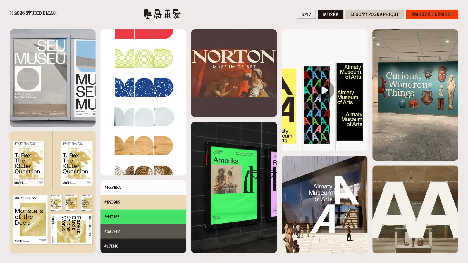
17. Wonder: museum, typographic logo
Big cut-out letters, exhibition posters, wayfinding in the galleries: the type becomes the first work of the visit. The typographic logo adapts to every exhibition.
26. Euphoria: music festival, dynamic logo
Acid green, orange, letters dancing on posters: you can almost hear the music. The dynamic logo changes shape with every edition and lends itself to motion design.

Moodboards for health, education and childhood
Health, school, childhood: sectors where the brand has to reassure without sending people to sleep.
2. Serenity: yoga studio, organic symbol
Sand, sage green, rippling water, stacked pebbles: the board slows your breathing down. The organic symbol, a hand or a stone, needs no words.

27. Tenderness: clinic, lowercase wordmark
Warm orange, yellow, hands and smiles, rounded shapes: far from hospital white. The lowercase wordmark talks to the patient as an equal.

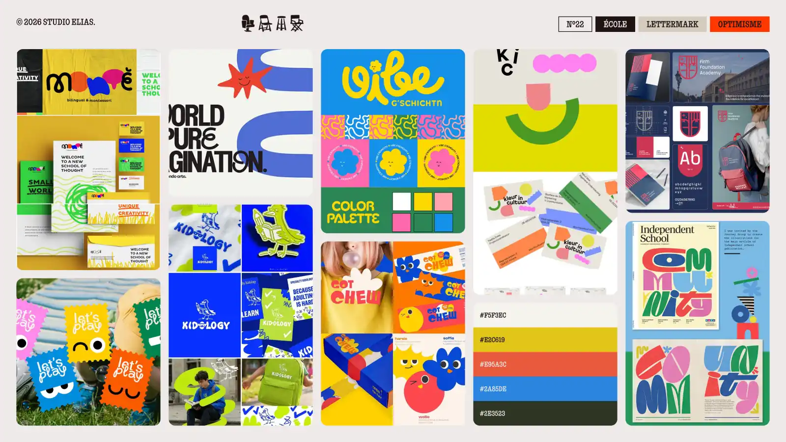
22. Optimism: school, lettermark
Primary colours, cut-out shapes, paper mascots: the school looks like a workshop. The lettermark, one or two letters, sticks on a bag or a notebook.
19. Hope: charity, human symbol
Sun yellow, pink, green, figures reaching for each other: the board shows people before causes. The human symbol is understood in every language.

4. Joy: toys, mascot
Round characters, candy colours, plush toys and stickers: children pick the mascot before the toy.

14. Mischief: snacks, character logo
Smiling packets, bouncing letters, clashing colours: the board makes people laugh in the aisle. The character logo turns every packet into a little hero.

25. Vitality: healthy food, rounded logo
Soft greens, colourful bowls, round shapes: the board makes you want to bite in. The rounded logo avoids the sad diet look.

Bonus: 3 film moodboards
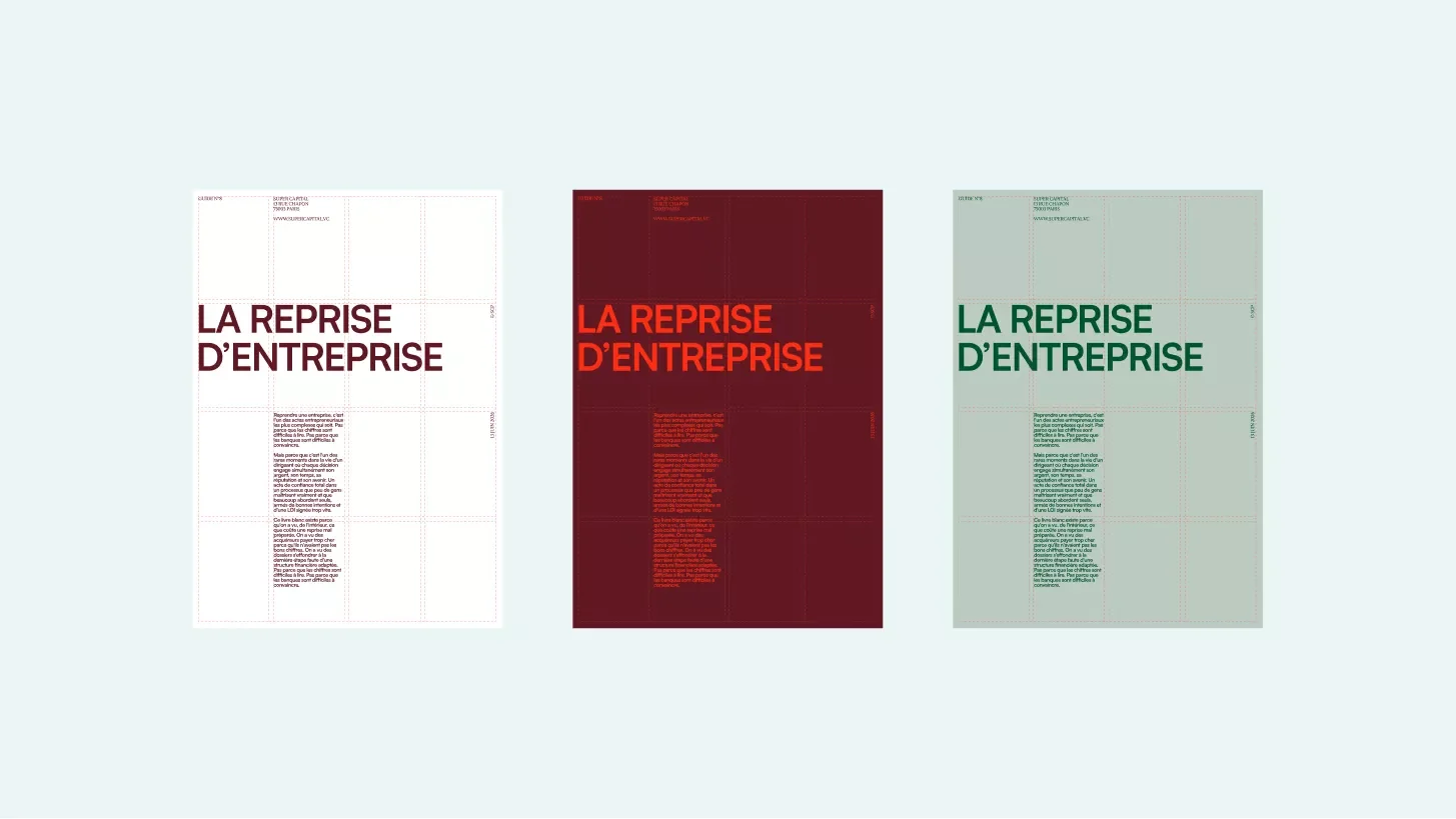
A film moodboard gathers scenes from one film to draw a mood from it: light, colours, framing. It is how we work in our workshops: for Super Capital, the word "elegance" turned into James Bond scenes.
28. Poetry: Amélie, Parisian café
Bottle green, red, golden light, tight framing on faces: the board gives a Parisian café full of little secrets.

29. Vertigo: Blade Runner 2049, tech
Burnt orange, icy blue, figures lost in huge sets: a tech that makes people dream more than it reassures them.

30. Desire: In the Mood for Love, fashion house
Deep red, curtains, patterned dresses, glances that avoid each other: desire comes from what is not shown. For a fashion house, it is a lesson in restraint.

From board to identity: 4 brands by Studio Elias
A moodboard is only worth the brand that comes out of it. Here are four boards that became identities for our clients.
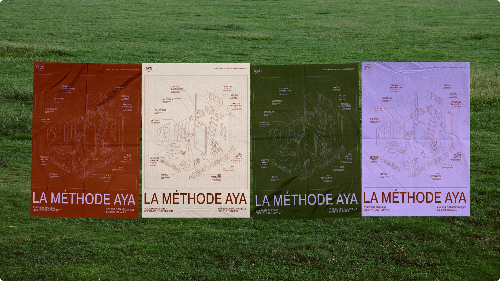
Super Capital: elegance, from film to poster
The finance consulting firm had many activities and a message that was not clear enough. The workshop turned "elegance" into James Bond scenes, and the posters kept that poise. The result: a much clearer image and teams aligned around one mission. See the Super Capital project.
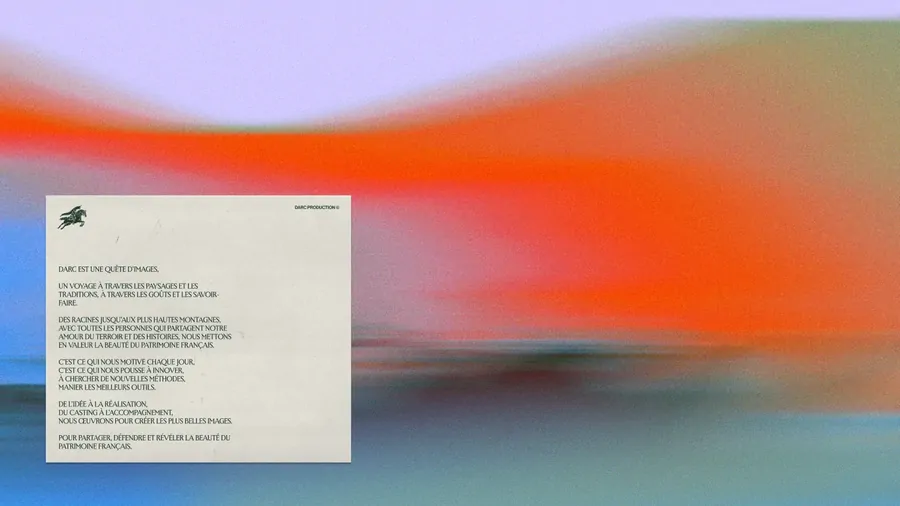
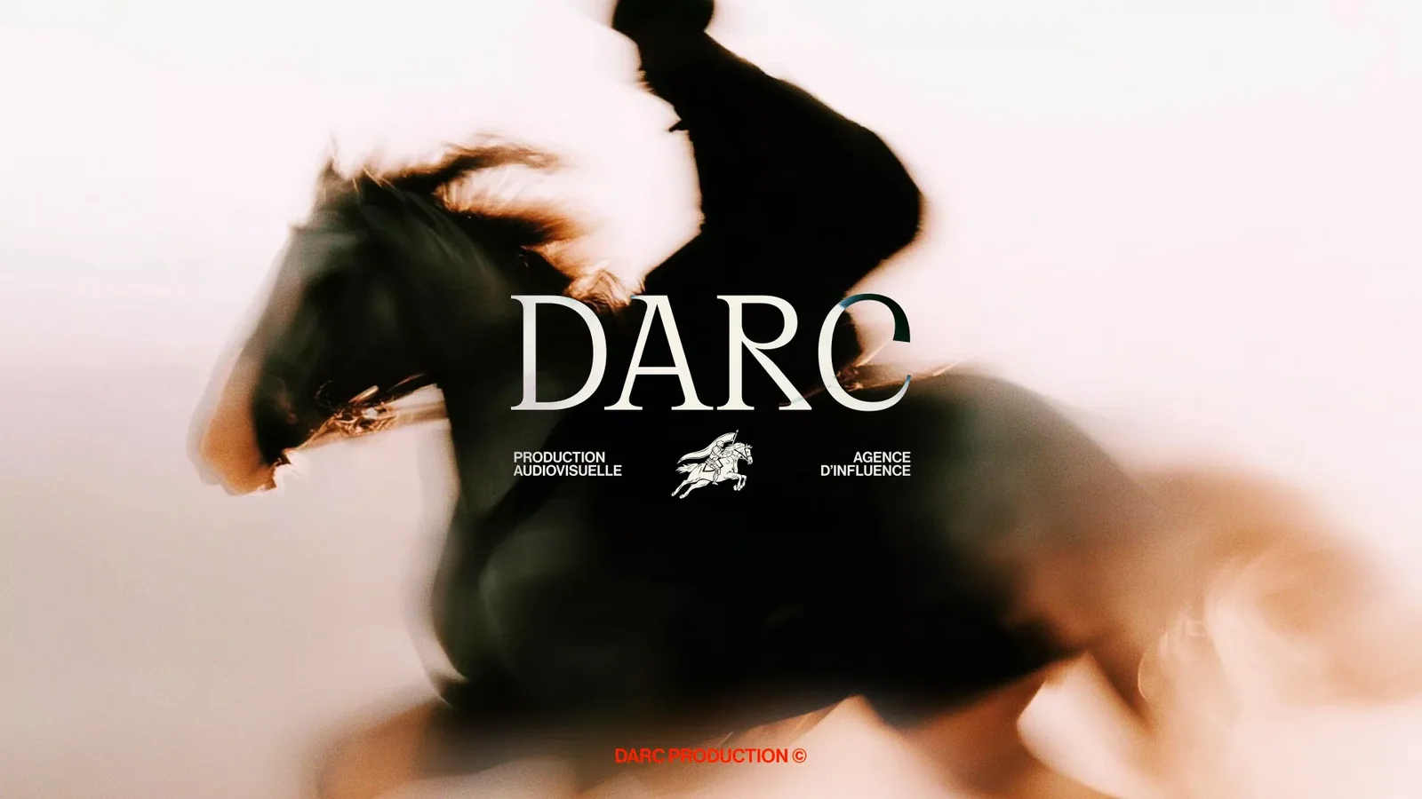
Darc: the horsewoman, from moodboard to logo
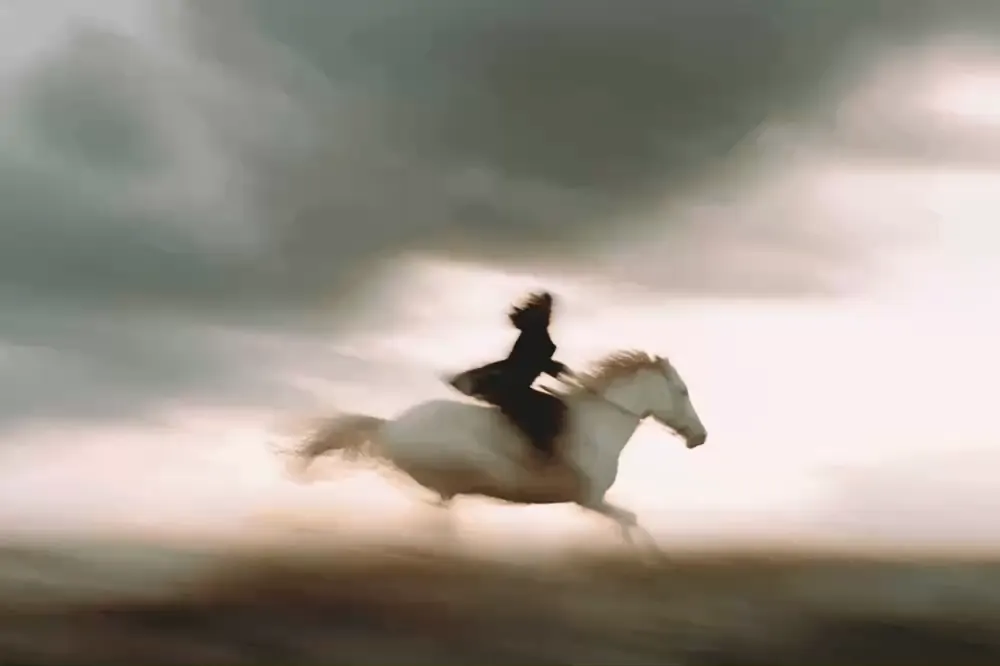
The influencer agency had to stand out from its market while gaining credibility. The horsewoman chosen in the workshop now gallops in the middle of the logo, and the agency signed its first great clients, who became partners. See the Darc project.
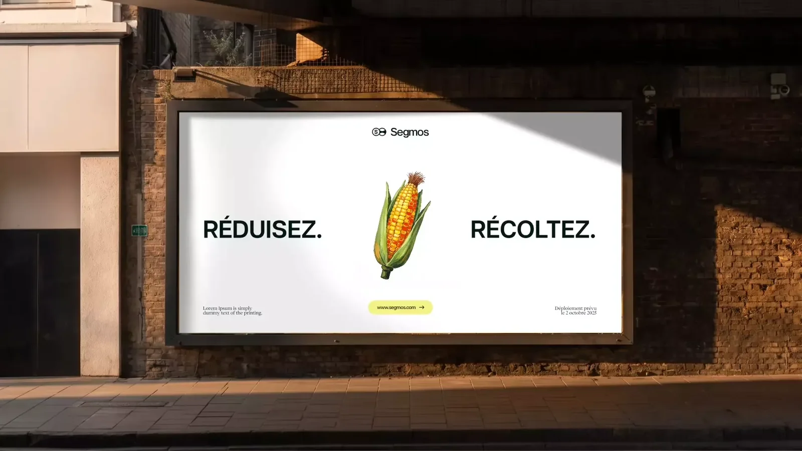
Segmos: low-carbon buying as an opportunity
The board had to show low-carbon trade as an opportunity, not a sacrifice. The identity leaves the codes of this traditional sector without losing seriousness: "Réduisez. Récoltez." (reduce, harvest) is displayed large in the street. See the Segmos project.
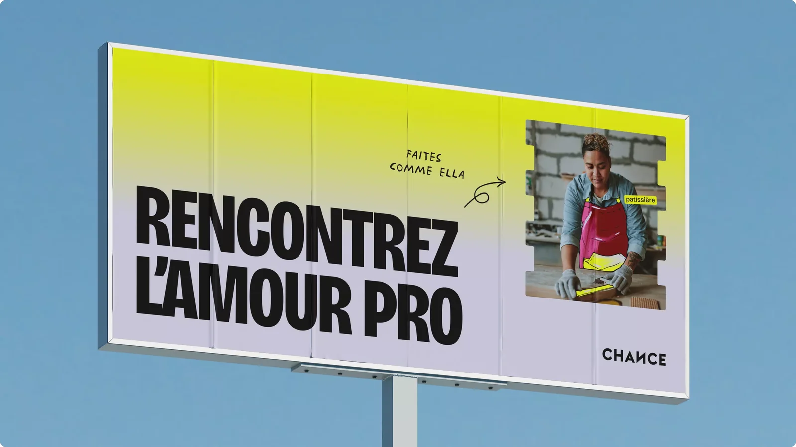
Chance: leaving a bland identity before the metro campaign
Chance, the leader in career assessments, had a bland identity just as it was launching a campaign in the Paris metro. The new identity gave a clearer message and very good results for that campaign. See the Chance project.
{{cta-2}}
What goes into a brand moodboard?
A brand moodboard brings together six ingredients, always the same. We build it after the positioning and before the first creative routes:
- mood images: places, gestures, light, including outside your sector;
- a five-colour palette, with its codes;
- two or three typefaces that speak with the same voice;
- reference logos, of the logo type you are aiming for;
- materials and textures: paper, glass, fabric;
- one emotion word, and the list of what the brand refuses.
That last point saves the most time: writing "not corporate" next to "boldness" rules out half the images before you even look for them.
Mistakes to avoid when you draw on these examples
A moodboard example is there to be read, not copied. Three mistakes come up often:
- Copying a board as it is: these images belong to other brands. Yours starts from your brand platform.
- Picking the prettiest board: the only question is whether it makes people feel the emotion you chose.
- Mixing two emotions: a board that is both "boldness" and "serenity" no longer says anything.
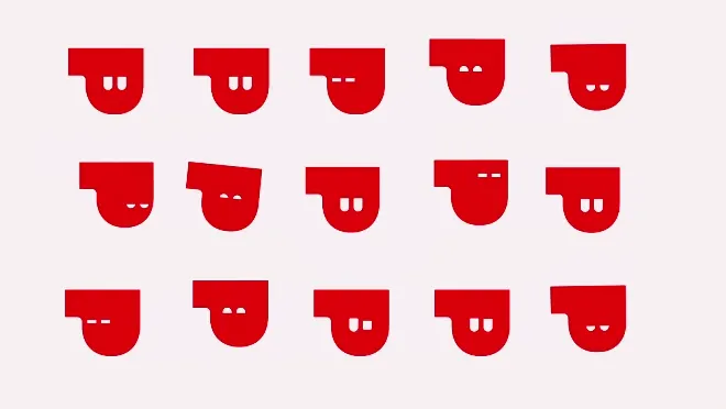
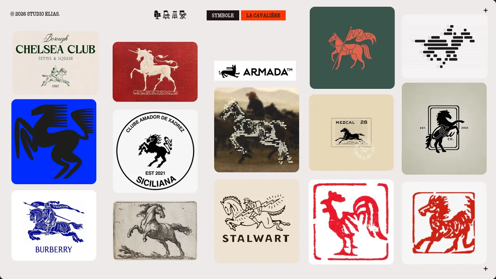
At Darc, the workshop compared several symbols before keeping the horsewoman, who now gallops in the middle of the logo.
How to go from an example to your own moodboard?
Take a board as a starting point, then replace each image with a reference that speaks about you:
- Pick the emotion in one word, after your brand strategy.
- Keep two or three codes of your sector, break one.
- Look outside your sector: films, architecture, fashion, on the inspiration websites we use.
- Test the palette on your real media, business card, home page, slide deck, as in our colour palette guide.
Then we sort, as in Highlander:
"There can be only one."
We put three boards side by side, everyone votes, and only one moves on to the logo stage. The other two helped us learn what the brand is not.

{{block-cta-2}}
Have you picked your emotion? At Studio Elias, every identity starts with this workshop: we can build the board with you.
{{cta-3}}
Frequently asked questions
What makes a good moodboard example?
A good moodboard example shows a single emotion, follows the codes of its sector or breaks one, and gives a precise palette. You should be able to say in one sentence what the brand wants people to feel. If the board pleases without anyone knowing why, it decorates more than it guides.
Which tool can I use to make a moodboard for free?
Pinterest to collect, Figma or Canva to assemble. As they say in Les Bronzés font du ski: « Vous avez de la pâte ? Vous avez du sucre ? Avec la pâte, vous faites une crêpe et vous mettez du sucre dessus ! » (Batter, sugar: you have a crêpe.) Images, a palette, one emotion word: the rest is assembly.
How many images should a moodboard have?
Our boards hold 9 to 11 images and a five-colour palette. That is enough to set a mood and few enough to read at a glance. Beyond fifteen images, the board hesitates between several directions and the team no longer knows which one to follow.
Trend board, inspiration board, moodboard: what is the difference?
All three are boards of images that set a mood. "Trend board" comes from fashion and interiors. In branding, we say moodboard or inspiration board: it is used to choose a brand's direction before its logo is drawn.
What is the difference between a moodboard and a vision board?
A moodboard sets the mood of a brand before its visual identity: it serves a design decision. A vision board gathers personal goals, to keep you motivated. Both are boards of images, but only the moodboard is judged on one question: does the brand make people feel the chosen emotion?