


The rebranding of Tripadvisor, signed by Koto, demonstrates how a historic brand can be modernized without losing its DNA.
This project goes far beyond a simple logo change: it is a global, visual and strategic redesign, which repositions Tripadvisor as an experience platform rather than a simple review site:
The result: a brand image that is more lively, more universal, and perfectly in line with market trends.
Tripadvisor no longer seeks to accumulate reviews, but to create connections and inspire.
The rebranding of Tripadvisor, signed by the agency Koto, stands out as one of the most interesting case studies of recent years. At a time when travel platforms are multiplying, where traveller reviews are everywhere, and where the line between marketing and user experience is becoming increasingly blurred, Tripadvisor needed to rethink its identity.
The brand has therefore chosen to modernize its logo, to review its color palette, and to simplify its entire graphic system. A redesign that is not just an aesthetic change: it is a global repositioning, a way of reconnecting the brand to its original mission, to help travelers travel better.
For more than twenty years, Tripadvisor has been the reference platform for finding a hotel, restaurant or activity. But as the world of travel has digitized, the experience has become more complex: more offers, more photos, more content. The result: a brand image that was beginning to lose coherence and clarity.
This rebranding is therefore a response to a real need: to make the platform more accessible, more readable, and more modern. The idea was not to change everything, but to succeed in evolving without betraying yourself.
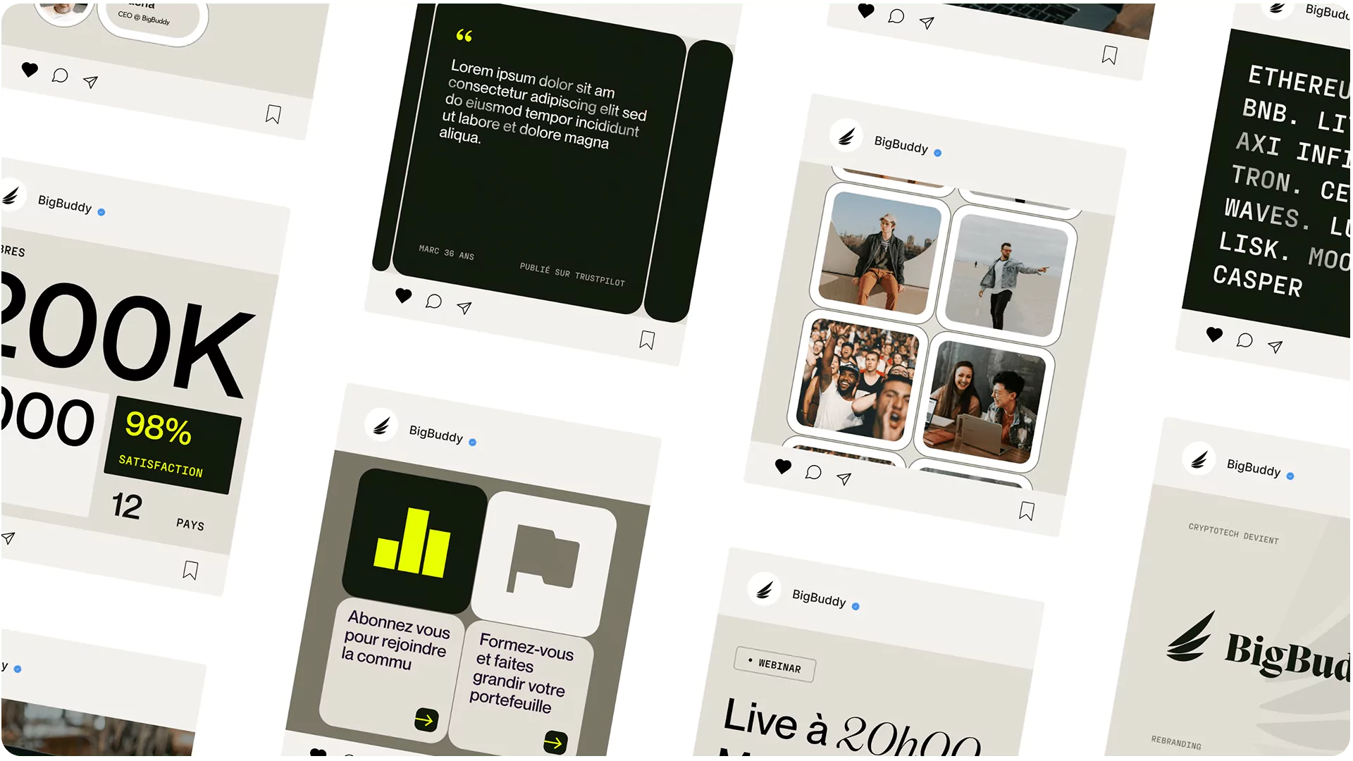
As we often say at Studio Elias, modernizing a brand is not about erasing the past, but about making it evolve over time. It is the same philosophy that we applied in our project. BigBuddy, a brand that we have redesigned to better reflect its mission and identity.
{{cta-1}}
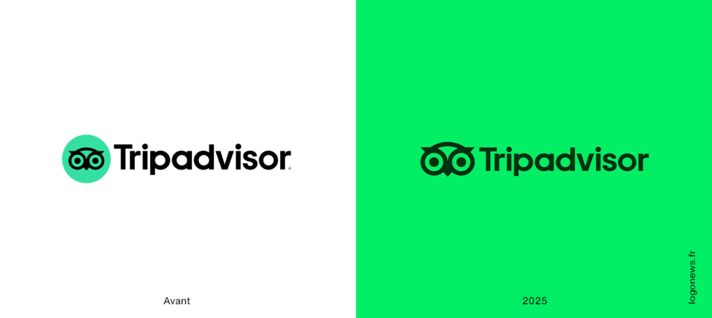
The rebranding of Tripadvisor is not just a change in style: it is a complete rebrand of identity, designed to reflect a new vision of travel. The logo has been modernized to become more legible, more digital and more adaptable to all media, from the website to mobile applications, to social networks.
The brand has chosen the path of simplicity: a clearer layout, geometric typography and a more refined visual structure. This strategic choice allows the logo to live better in digital environments, while remaining instantly recognizable.
The evolution of the graphics system is just as significant. The iconic green, now called Trip Green, has been reworked to reflect a new energy: brighter, more modern, and above all more consistent across the brand's multiple touch points. This color palette combines vitality and trust, two essential values for a company whose mission is based on the credibility of opinions and the loyalty of its community.
Typography, for its part, was designed as a natural extension of the logo: simple, legible, elegant, it reinforces the feeling of proximity and universality that Tripadvisor seeks to inspire. By combining strong artistic direction with a seamless experience, the brand succeeds in speaking to all travelers, whether seasoned explorers or Sunday planners.
This redesign does not change the essence of Tripadvisor: it clarifies it. It puts an end to the visual complexity accumulated over the years to refocus the brand on what matters most: trust, simplicity and the pleasure of discovery.
This is the same logic that we defend at Studio Elias: to design identities that are not only aesthetic, but that reflect a clear intention and positioning. A strong brand doesn't need to overdo it. It just needs to be fair, consistent, and recognizable at every interaction.
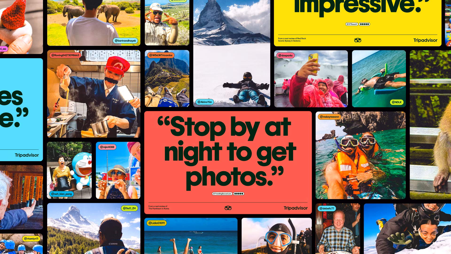
One of the major challenges of this restructuring was readability, a criterion that is often underestimated, but essential when talking about a global platform like Tripadvisor. With millions of pages, continuous customer reviews, and an infinity of images of travelers shared every day, the brand had to rethink its visual system to remain clear, consistent and pleasant to navigate, regardless of the medium.
The priority was simple: to regain fluidity. Before, the experience could seem dense, sometimes confusing, between the advertising inserts, the ratings and the multiplicity of information displayed on the same page. Koto therefore chose to put the human back at the center, by rethinking the graphic architecture and visual hierarchy to guide the eye rather than overloading it.
The result is a quieter, more breathable, but also more expressive identity:
This new design is more than just a facelift. It tells of a change in philosophy: moving from an evaluation site to an inspirational platform. Typography structures, color creates coherence, and the photo embodies life.
Functionally, each graphic element has been designed to serve the user experience: the reservation button is more visible, reviews are easier to read, visuals load more quickly, and the entire journey is fluid. The user thus rediscovers the pleasure of browsing, searching and sharing, without ever getting lost in the density of information.
This is what we call useful rebranding: work that seeks not only to “look better”, but to concretely improve understanding, use and trust. Which appeals to the eye as well as to the mind.
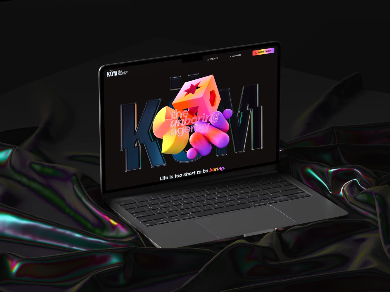
At Studio Elias, it is precisely this type of approach that we defend: creating visual identities that are not limited to a graphic universe, but that redesign the entire customer experience. An approach that we have, for example, applied to the project Köm, where design only made sense if it made it easier for the user to read, understand and project.
{{cta-2}}
By rethinking how brands are read, looked at, and experienced, Tripadvisor shows that design can become a driver of clarity. And this is undoubtedly the secret of a successful project: transforming every graphic detail into a tool of simplicity in the service of a more human experience.
Behind the design, there is a strong message: Tripadvisor no longer wants to be just a database of reviews or a comparison tool. The brand seeks to become a global community of travelers, a living space where everyone can share, be inspired, and relive their experiences.
This change of focus is profoundly transforming the perception of the product. We no longer consult Tripadvisor to simply “read a review”, but to prepare a trip in a different way, by discovering the human stories behind each destination. Customer reviews become stories, photos turn into memories, and the brand, once perceived as functional, takes on an emotional and narrative dimension.
The visual identity therefore supports this ambition: the new logo and the range of colors set the tone for more human, warmer communication. The simple and friendly typography reinforces proximity. Even the iconic green, which is brighter, now symbolizes freshness, trust and openness.
It is no longer a cold site where hotels are compared, it is a travel companion, a brand that accompanies rather than judges. The speech softens, the visuals breathe, the voice becomes that of a friend on the road who makes you want to leave rather than checking boxes.
This approach is particularly interesting from a branding perspective, as it illustrates the power of tone of voice and emotional design in a repositioning strategy. By changing the way people talk and show, Tripadvisor is changing the way they are perceived.
This is a logic that we also apply to Studio Elias, especially on the project Kom, where our objective was to put the personality of the brand back at the heart of the discourse. The challenge was not only graphic, but strategic: to attract through emotion, to reassure through structure, and to connect through tone. As with Tripadvisor, each word, each color, each visual interaction had to translate a clear positioning and a coherent brand promise.
This type of approach, halfway between design and strategy, is now essential to appeal to a younger and more connected audience. A generation that no longer buys a product, but an experience, a value, an identity.
And in this sense, the rebranding of Tripadvisor is part of the great 2025 branding trend: living, embodied brands that do not seek graphic perfection but emotional accuracy. Brands that know how to speak the language of their users, while maintaining a clear, consistent and inspiring direction.
We often talk about rebranding to refer to a change in logo or typography, but the case of Tripadvisor goes much further. It is a complete repositioning, which affects branding as well as marketing, product and experience.
The site has been redesigned to offer a smoother experience, the booking tools are better integrated, and photos are put at the heart of the experience. The entire communication system has been aligned to create total coherence between visual identity and functionality.
It is this global approach that makes the difference between a simple graphic review and strategic branding. An approach that we detail in our article How much does an agency rebrand cost?, where we explain why a successful brand identity is never limited to a change in appearance, but involves working on brand perception, vision, and consistency.
What makes Tripadvisor's rebranding particularly successful is the way in which design isn't just about looks: it becomes the engine of the experience. Each graphic element, from the iconic green to the typography, plays a specific role in understanding the product and in how travelers interact with the platform.
The new visual device is not just a set, it's a compass. It guides the user through pages, reviews, photos, and booking tools. White space brings breath, the visual hierarchy clarifies the steps, and the unified graphic language reinforces trust, a crucial point in a world where 90% of decisions are based on perceived credibility.
This is where redesign makes perfect sense: branding becomes a performance tool, a way to improve use and increase customer satisfaction. Travelers don't just feel that Tripadvisor looks better, they find it easier, faster, and more fun to use.
This philosophy is in line with what we defend at Studio Elias: design should not only seduce, it should serve. In our projects, we build living graphics systems, designed to evolve over time, support communication and offer a consistent experience on all media. This is what we have applied, for example, to BigBuddy, where each color, each word, each visual element aimed to create a natural relationship between the brand and its community.
The Tripadvisor case thus recalls a simple truth: a good rebranding is not a “change of look”, but a rewriting of the relationship between a brand and its audience. A relationship where design becomes an extension of the voice, where every visual detail tells something authentic, and where the experience becomes the true signature of the brand.
The Tripadvisor case shows that big brands must also know how to reinvent themselves. In a world where everything is changing: tools, behaviors, technologies like AI, a brand that remains static always ends up losing its audience.
Rethinking your visual identity means rethinking your reason for being: Why do we exist? What experience do we want to have? What message do we want to leave?
The rebranding of Decathlon, which we also analyzed in our article on the strategic transformation of the brand, goes in the same direction: that of modernising, clarifying and inspiring. These evolutions are not simple aesthetic changes: they are strong acts of communication, designed to last and to create relationships.
And that is exactly what we stand for at Studio Elias: each redesign is an opportunity to redefine the perception of a brand, to build a coherent experience, and to create a real impact.
The new Tripadvisor is not content with changing the logo. He redesigned his color, his typography, his voice, and the way he talked to travelers. The whole forms a global, legible, human and modern identity, a natural evolution for a brand that has accompanied millions of users in their discoveries for years.
More than just a makeover, it's an inspiring case study on how to make a brand evolve with the times. And for us, at Studio Elias, that's exactly why branding remains the core of any growth strategy today.


.jpg)
.jpg)


%20(1).gif)