The main thing to remember
A successful visual identity isn't judged on Behance. It's judged in real life.
In this article, we analyze 7 concrete examples, real cases with precise business stakes. Chance, which had to exist in a split second in the metro. The Norton Museum, which carried 80 years of heritage without being able to tell its story. Nike, which had let challengers take the ground it created. Pipole, which wanted to step out of the intermediaries' shadow.
Ce qu'on montre ici :
- what you should really look at in a visual identity example,
- why a beautiful identity that doesn't hold up in real use remains theoretical,
- the 3 qualities shared by all identities that work over time,
- and how to judge whether yours lives up to your ambition.
Don't collect references. Look for proof.
We often see the same mistake in leadership meetings. A brand wants to “modernize its image”, then the discussion gets stuck on a logo, a color, a typeface. Too narrow. A good visual identity example doesn't just show a graphic result. It shows a brand decision. A stance. And above all, a system able to last over time, on every touchpoint.
This brand decision always starts with a clear brand strategy: without positioning, visual choices remain preferences.
That's where most brands lose impact. They think of visual identity as packaging, when in reality it's a perception tool. Well designed, it clarifies positioning, speeds up memorability and supports acquisition. Poorly designed, it blurs the messaging, weakens credibility and makes every communication more expensive.
Visual identity examples: what you should really look at
When you analyze a visual identity example, you shouldn't start by asking whether it is “beautiful”. The real question is more demanding: does this identity make the brand sharper, more desirable, more recognizable?
A strong identity rarely rests on a single sign. It lies in the consistency between the logo, typography, palette, compositions, imagery, motion, and sometimes even how headlines are written or an interface is paced. Each element plays a role. But none works alone.
To understand how these elements come together into a coherent system, our guide to brand guidelines: definition and advice details each component.
You also need to look at the business context. It's the starting point of any brand strategy. An identity for a startup preparing a fundraise doesn't have the same constraints as an agency trying to escape dependence on a few big referrers. A B2C brand with heavy paid media visibility doesn't have the same needs as a B2B player whose sales cycle relies on trust and proof.
In short, a good example isn't a style exercise. It's the right answer at a specific moment for the brand.
7 visual identity examples and what they prove
1. Chance - making a mission visible
Chance operated in a market where many players look alike. The same promise of personal transformation. The same caring tone. The same reassuring visual codes, sometimes too smooth. The risk was obvious: becoming interchangeable.
The identity work therefore had to create more contrast. Not to make noise. To bring out uniqueness. With a high-stakes metro campaign, the brand needed a more direct, more embodied and more memorable expression.
Here, the right choice wasn't to overload. It was to densify. A bolder visual language, a sharper hierarchy, signs able to hold their own in a saturated environment. The result: clearer messaging, a stronger presence and a campaign that performs better because the brand is recognizable in a second.
2. Norton Museum of Art (by Koto): revealing rather than inventing
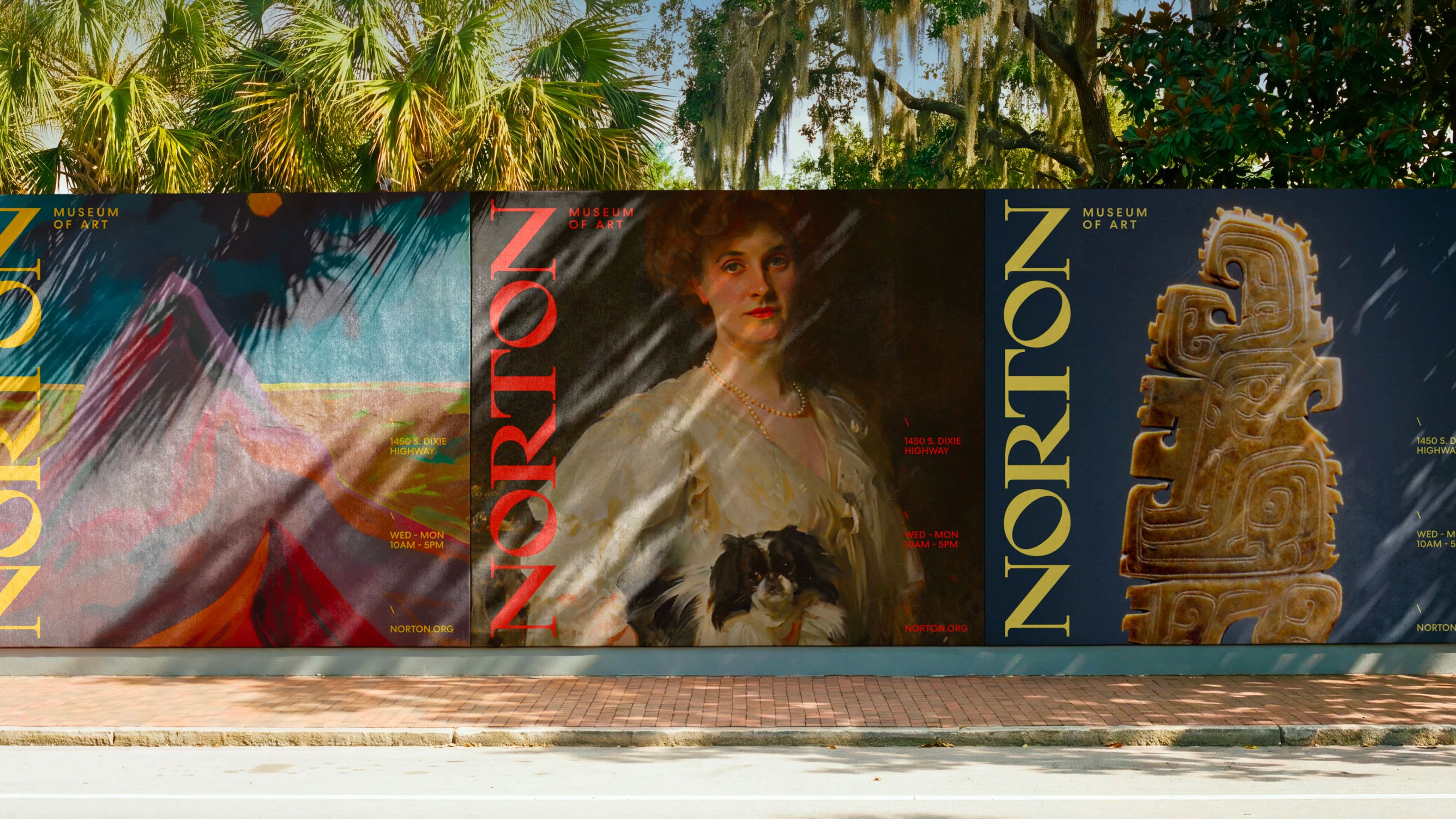
The Norton Museum of Art had everything it needed to shine: more than 80 years of collections, a place where galleries, gardens and daily life naturally coexist. But its brand didn't yet carry that ambition at its true height.
Koto's work starts from a simple principle: invent nothing. The historical wordmark was sleeping in the archives. The 40° angle of the “N” was already there. The Diana sculpture, commissioned in 1941, was waiting to become a symbol again. The identity wasn't built. It was revealed.
That's the right lesson here. A coherent system (a palette drawn from the works on display, a graphic slash as a metaphor for the meeting of art and life, a website designed so the interface steps aside for the collection) can turn existing heritage into a brand able to address an international audience. Without a break. With precision.
3. Köm: raising the offer without betraying the DNA
When an agency launches a new offer, the subject isn't only what it sells. It's what it becomes. For Köm, launching a brand content offer called for an identity that matched its ambition without breaking with its original reputation.
The sensitive point in this kind of project is balance. If the identity stays too close to the existing one, the new offer lacks relief. If it changes too abruptly, it blurs brand continuity.
The good example here lies in the ability to raise the level of sophistication without losing the original signature. A successful identity doesn't deny the past. It reframes it to open up a new territory.
4. Nike Run (by Porto Rocha): reclaiming lost ground
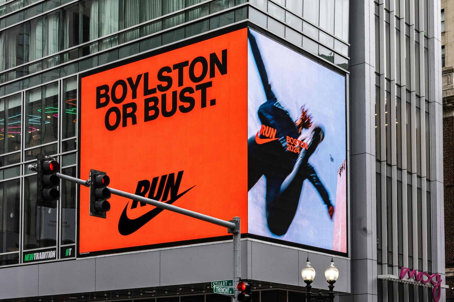
Nike invented running culture. And yet, by spreading across every vertical, the brand had let challengers take ground in the very category it created. Porto Rocha's mandate was direct: make Nike the undisputed running brand again.
The answer doesn't start from a break. It starts from the roots. The RUNSWOOSH, a new logo unifying all of Nike's running initiatives under a single signal, isn't an invented symbol. It's a statement. Assertive typography, an uncompromising tone, an identity that amplifies the emotions that push runners forward.
This case illustrates a useful truth: when a brand loses ground in a market it built, the solution isn't to chase the challengers. It's to reaffirm clearly what it was at the start, and to say it louder.
5. Pipole: stepping out of the intermediaries' shadow
Pipole wanted to depend less on large agencies and speak more directly to key accounts. It's a common issue among production companies: the know-how is real, but the perception remains subordinate.
A well-thought-out visual identity can correct this imbalance. It gives stature. It lets an agency be seen as a strategic partner rather than a mere executor. That doesn't necessarily mean luxurious or cold codes. It means control: a strong editorial presence, a consistent art direction, materials that inspire trust from the first contact.
When this shift succeeds, the effects show quickly: better lead quality, renewed contracts, a more credible sales pitch.
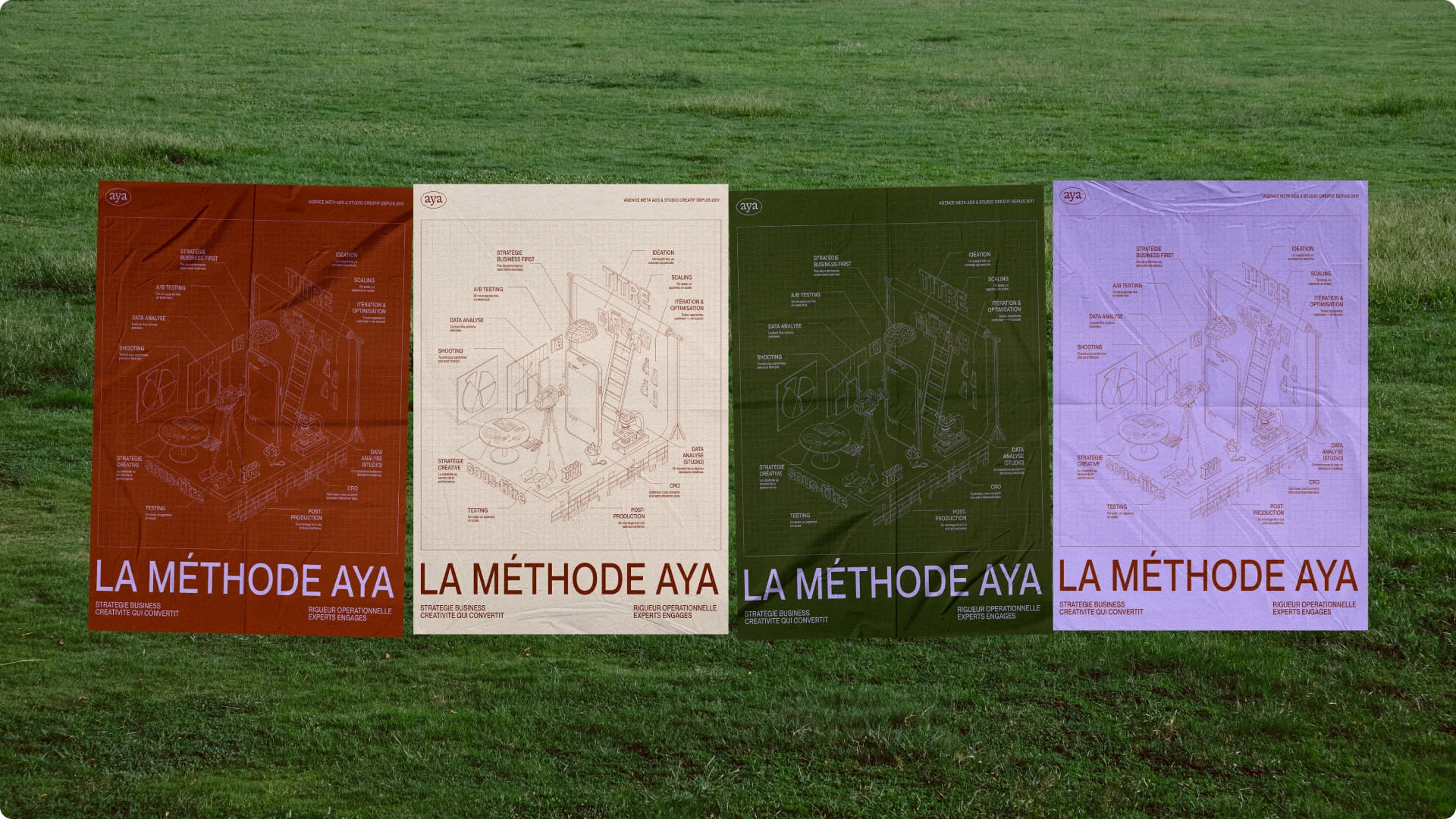
6. Aya: revealing a DNA that was already there
Some brands don't have an underlying problem. They have a translation problem. Their energy, their high standards and their uniqueness already exist. But nothing in their identity or materials expresses it properly.
That's often the case with agencies specialized in acquisition or performance. They focus on results. Their image takes a back seat. Until the moment this lack of form becomes a limit to growth.
In this kind of project, the identity's role isn't to invent a character. It's to make visible what was already the brand's strength. This work requires precision. Too many effects, and the brand rings false. Not enough, and nothing really changes.
7. The useful counter-example: a beautiful identity that serves no purpose
It needs to be said clearly: not every elegant identity is effective. Some are impeccable on Behance but weak in real use. Too thin at small sizes. Too rigid for social media. Too abstract for a sales pitch. Too dependent on an art director to live properly.
It's the blind spot of many rebrands. An appealing world gets approved in a presentation without testing how it behaves on real materials. A premium identity must hold up on a homepage, a sales deck, a paid campaign, a product sheet, a trade show banner, a social template. Otherwise, it remains theoretical.
What a good visual identity example always has in common
You almost always find three qualities.
First, clarity. The brand is quickly understood. You sense its stance, its price level, its territory. Then, consistency. Every sign seems to belong to the same system. This system is formalized in rigorous brand guidelines: they ensure every sign stays consistent, whatever the medium. Finally, the right tension. There's enough uniqueness to leave a mark, without resorting to gratuitous effects.
To build that uniqueness, our article on brand differentiation: stand out or disappear gives a concrete framework.
The rest depends on context. A hospitality brand may seek more visual sensuality. A deeptech will often have to balance the complexity of its subject with accessibility. An HR company will look more for trust and projection. There's no universal recipe. Only well-made decisions.
How to judge your own visual identity
The right test is simple. If you remove the logo, is your brand still recognizable? If your teams have to create a presentation tomorrow, do they know how to do it without improvising? If a prospect discovers your website in ten seconds, do they grasp your level of standards?
Another useful signal: look at the friction. If every new piece of material reopens debates about colors, tone, layout or level of formality, the problem isn't execution. It's often the absence of a system.
A mature visual identity doesn't answer every question for you. However, it reduces hesitation. It provides a framework. It speeds up the right choices.
For companies of 5 to 30 employees, it's often a quiet but decisive turning point. When the image becomes aligned with the ambition, everything flows a little better: recruitment, price perception, the quality of incoming opportunities, the sales pitch. This alignment starts with a well-defined brand platform, even before touching the visuals.
At Studio Elias, that's precisely where branding becomes useful: when it isn't content with being beautiful but helps a brand take its place.
If you're looking for a visual identity example for inspiration, don't just collect references. Look for proof. Ask yourself what each visual choice makes possible, what it simplifies, and what it brings the brand in real life.
To see concrete proof, also read our article on 8 examples of the best brand platforms in 2026, brands that made visual choices in line with their business ambition.