


Deezer is reinventing itself to reconnect with its deepest essence: the love of music and human connection. In a streaming world where everything is the same, the French brand chooses to stand out with an emotional visual identity, carried by a daring purple heart. This change is not just a simple makeover: it is the response of a company that wants to put emotion back at the center of the user experience.
Result? A brand identity that is more human, more alive and more recognizable, capable of making the hearts of fans beat as much as that of the platform itself.
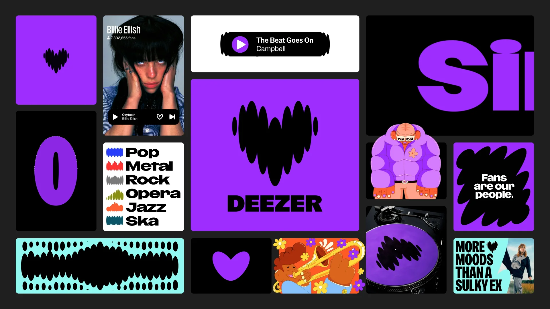
When Deezer Changing the logo is not just a visual adjustment. It is a declaration of love for music, a strong signal sent to millions of users around the world. In November, the French music streaming platform unveiled a new logo, an audacious purple heart designed by the London studio Koto. This rebranding marks a major step in the history of French streaming: that of a brand identity refocused on emotion, connection, and the pleasure of listening.
Since its creation in Paris in 2007, Deezer has established itself as one of the main music streaming platforms in the world. With more than 90 million titles available and a presence in more than 180 countries, the brand has contributed to democratizing online listening and promoting French artists on the international scene.
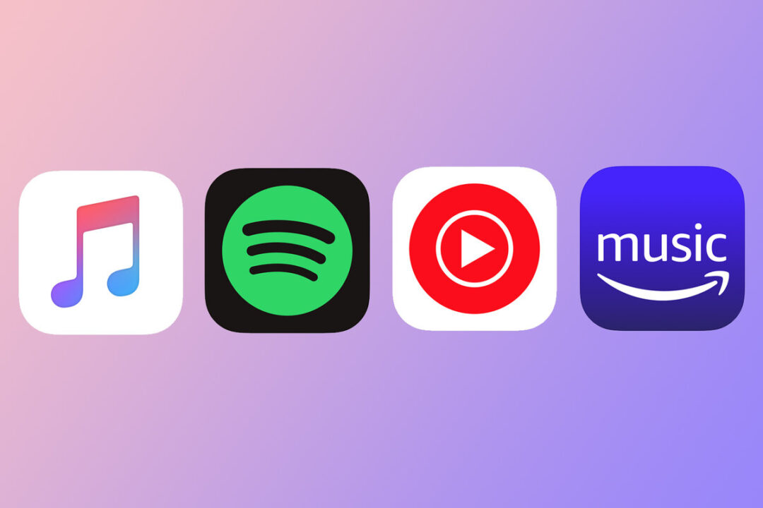
But after more than fifteen years of existence, Deezer had to reinvent itself. In a market dominated by Spotify, Apple Music or Amazon Music, the challenge was no longer just to offer a rich catalog, but to find a strong, unique identity that was emotionally connected to its audience.
The rebranding of Deezer responds to a clear desire: to put the love of music and human connection back at the heart of its discourse. The company wants to reiterate that it is not a simple technological platform, but a cultural player, a daily companion for millions of music lovers.
Deezer's marketing director, Maria Garrido, summarizes this vision perfectly:
“We don't just want people to listen to music, we want them to experience it.”
This sentence illustrates the full meaning of the change in Deezer's logo and brand image. The purple heart, a central element of the new design, reflects this universal emotion that connects each listener to their favorite song. It is a way of reconnecting the brand to its roots: passion, sharing and sincerity.
This rebranding is part of a more global brand strategy: that of a French player that assumes its difference and claims its place in global culture. Deezer is reinventing itself without denying its heritage, by adopting a bold and contemporary brand image that reflects Deezer's priorities: people, proximity and music as an experience.
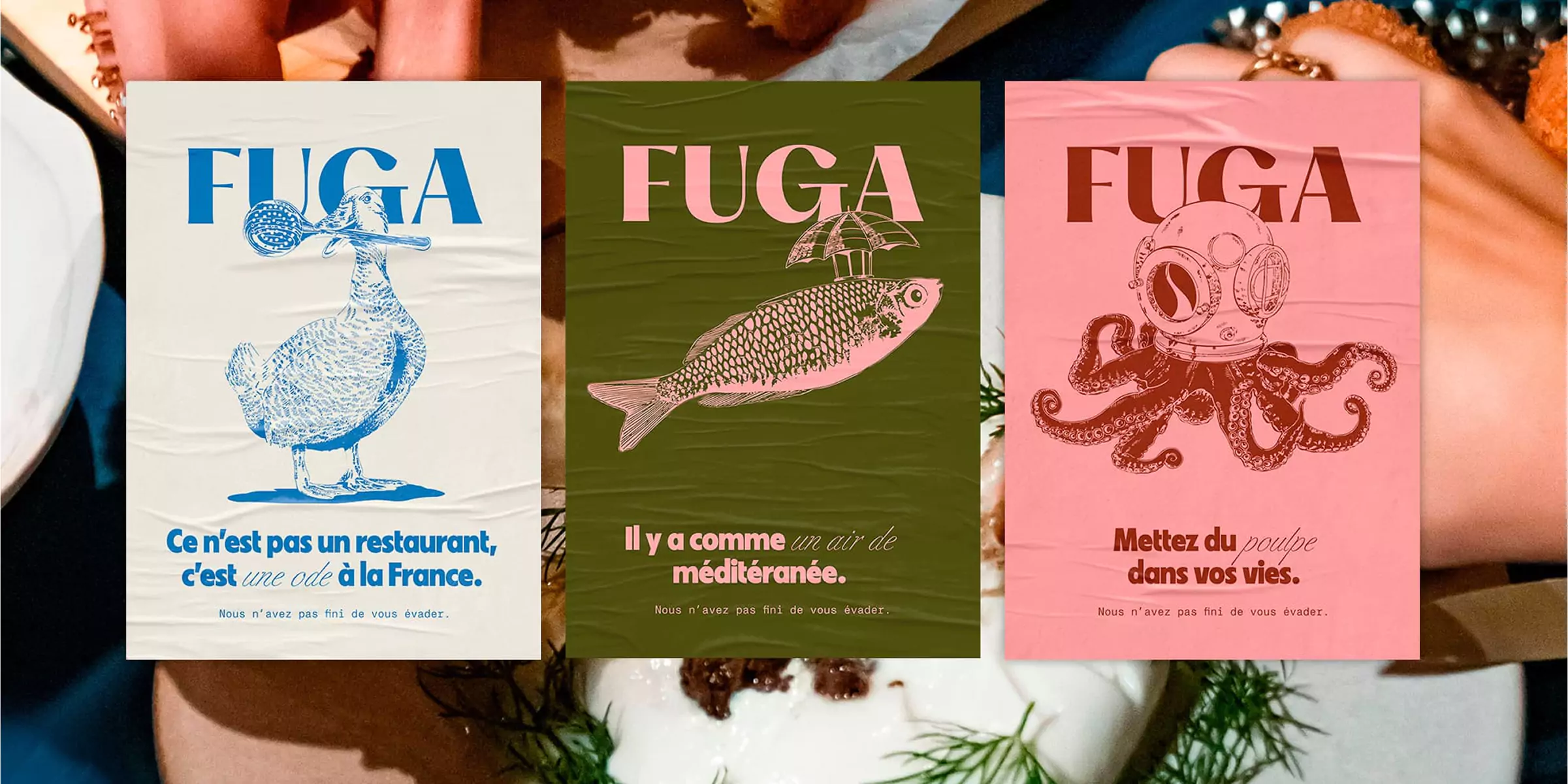
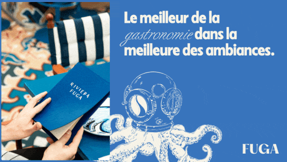
This approach is echoed in our work at Studio Elias. On the project Fuga, we supported a brand at the crossroads of design and emotion. The objective was similar: to create a sensory identity, capable of arousing feelings even before a word was read. Where Deezer uses the heart as a symbol of universality, Fuga creates an immediate emotional experience. In both cases, the design is not decorative: it is strategic. It reflects a brand's desire to reconnect with its audience, to embody its promise, and to offer a coherent experience across all contact points, from the site to visual communication.
That's the whole point of major contemporary rebrandings: not simply changing the logo, but revisiting a relationship.
The purple heart-shaped logo is much more than a graphic symbol: it summarizes the essence of Deezer's branding. The heart evokes passion, proximity and community. Its purple color, unique in the streaming landscape, reflects creativity and audacity. It is a direct response to the graphic neutrality of its competitors: a visual bet that differentiates and humanizes the brand.
This new logo also reflects a more lively visual identity for Deezer. The patterns inspired by “beats”, dynamic animations, and Deezer Sans typography all contribute to the same goal: to bring the platform to life and offer an improved user experience.
At Studio Elias, this attention to movement and rhythm speaks to us particularly. In our work on Pipole, we explored the same idea: a living graphic identity, designed to breathe at the pace of its users and evolve over time.
{{cta-1}}
Deezer seeks to build a coherent visual ecosystem: from the website to the mobile application, each element contributes to the same user experience. This brand identity is based on four pillars:
The result: a graphic identity capable of evolving over time, adaptable to each market, while remaining immediately recognizable.
The CEO of Deezer, Jeronimo Folgueira, also emphasized the strategic dimension of the project:
“This rebranding marks a key step in our history: that of a company that not only sells a subscription, but a way of experiencing music.”
A strong choice, which testifies to Deezer's ability to reinvent itself without betraying itself.
Rebranding Deezer isn't just a style exercise or an aesthetic update. It is a strategic answer to an essential question: how to remain relevant in an environment where each music streaming platform offers the same artists, the same titles, and the same playlists?
Faced with this homogenization of the offer, differentiation no longer involves the catalog, but through identity. Deezer got it: its competitive advantage is based on its brand personality, its voice, and the way it brings music to life.
By focusing on an emotional visual identity, Deezer is renewing what has always been its strength: a human, French and authentic approach. The purple heart becomes the symbol of this intimate relationship with users, a way of saying “here, the music is felt before you listen to it”.
This logo change is accompanied by a new tone of communication: warmer, more spontaneous, closer to fans. The brand now speaks to people who love music, not just those who pay for a Deezer subscription. The visuals, too, follow this logic: colorful, lively images that focus on the experience rather than the product.
This approach is in line with a fundamental trend observed by many brands: the transition from functional to relational design. Branding is no longer a question of form, but of emotion. It is the same philosophy that we defend at Studio Elias, where each identity is designed to tell a story and connect an audience to a vision.
On projects like Pipole, this emotional dimension is essential. We designed a brand identity that reflects the vitality of a medium that connects creators to their community, just as Deezer seeks to connect artists to their fans. This parallel shows how design, when well thought out, becomes a strategic tool: it structures perception, influences trust, and transforms a simple brand into a real experience.
In a world saturated with images and sounds, Deezer reminds us that a logo can be a vector of meaning, not just a graphic sign. Her purple heart does not seek to impress, but to bring people together. It marks the return of a French brand that embraces its emotion, its culture and its desire to create links.
This new face of Deezer is part of a larger trend: that of emotional branding. Today, brands are no longer just looking to sell a product or service, they are looking to create a connection, to resonate with their audience on a more intimate level.
Deezer provides a strong example of this evolution. By placing the purple heart at the center of its visual identity, the brand is taking a step aside in a sector often perceived as purely technological. It assumes a more sensory, more human vision, where music becomes a universal language and the platform, a place of emotion. Here, experiencing music takes precedence over simply listening to it. This approach overturns the logic of passive consumption to put the experience back at the center: an experience that engages, inspires and brings people together.
This is an orientation that we also see in our collaborations at Studio Elias. Each visual identity we design seeks to reflect a story, a state of mind, a way of relating to the world. Design is no longer just a shell: it is becoming a strategic tool. It influences perception, loyalty, and fuels brand marketing over the long term.
In a project like Fuga, for example, we explored this same balance between emotion and structure: how can an identity be both sensitive and functional? How can a visual universe make one feel before explaining? These questions are at the heart of contemporary branding, where each visual choice becomes a demonstration of values.
{{cta-2}}
And that's where the strength of Deezer's rebranding lies: in its ability to get a message across without even saying a word. A simple shape, a unique color, and a universal emotion are all that is needed to bring a brand identity back to life.
To go further and understand how this type of transformation is built, discover also our article: How much does an agency rebrand cost? A comprehensive guide to understanding the steps, investments, and choices that allow a brand, like Deezer, to reinvent itself without getting lost.
The change made by Deezer is not an isolated one. In recent years, many brands have undertaken profound redesigns to realign their image with their values and their audience.
Among them, Decathlon is a perfect example of this strategic transformation. Also to read: The rebranding of Decathlon: a strategic and ambitious transformation


.jpg)
.jpg)


%20(1).gif)