

The aerospace industry isn't exactly known for its creative boldness. Yet, these ten rebrands prove that a technical brand can be desirable, provided it commits to a clear artistic direction rather than hiding behind the complexity of the trade.
This top 10, ranging from Vast to Ecosmic, including Rocket Lab, Bombardier, and Saudia, covers a wide spectrum of approaches: full rebrands, multi-entity brand architecture, measured refreshes, and launch identities. What they all share is a refusal to settle for being merely functional.
Key takeaways: heritage is not a hindrance, as Honeywell proved by modernizing 100 years of history. A rebrand doesn't always require reinventing everything, as demonstrated by Air Works. And a cohesive visual system—from logo to merch to UI—fundamentally changes how a brand is perceived.
This is the approach Studio Elias brings to projects like Effiblue, a deeptech company specializing in nanomaterials used in aeronautics, where the challenge was to make breakthrough technology accessible to demanding investors and industrial partners.
A tech brand doesn't need to be cold to be credible. It needs to be precise.
Following our ranking of the most iconic websites in the sector, it’s time to look at the brands themselves. In recent years, the aerospace industry has seen a surge of ambitious rebranding projects, driven by creative agencies focused on building a strong image for companies in highly technical fields. Here are ten identity redesigns that are shaping the sector, from logo to visual guidelines.
{{block-cta-1}}
Vast delivers one of the best recent examples of space branding: an identity inspired by 1970s NASA modernism, warmed up by a more human-centric design. Logo, motion, UI, iconography, signage, and merch—every piece tells the same visual story.
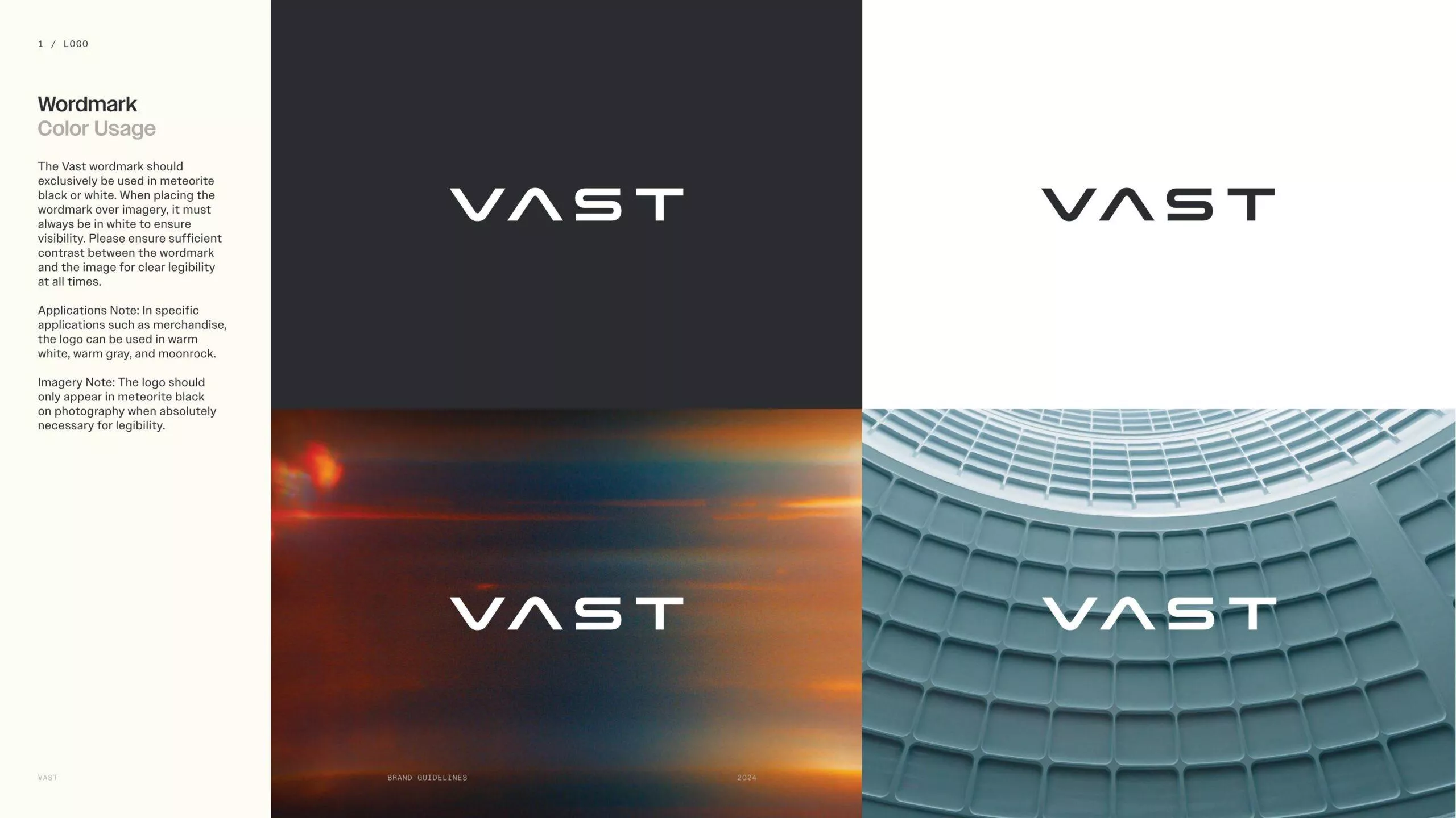
This is the definition of a cohesive brand system; our article on how to structure a design system explains how to achieve this.
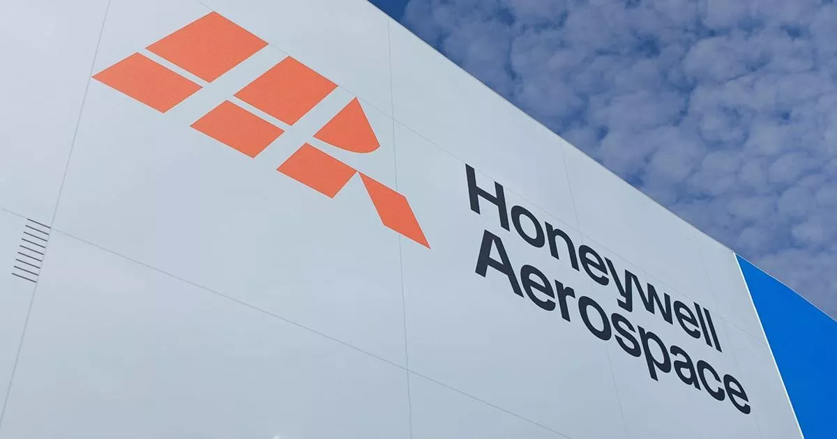
Following its spin-off from the Honeywell group, Aerospace has established itself as a fully independent brand. A fresh start that demonstrates how to modernize an identity with over 100 years of history without losing corporate credibility.
This is exactly the nuance explored in our article brand evolution vs. revolution: understanding why and when.
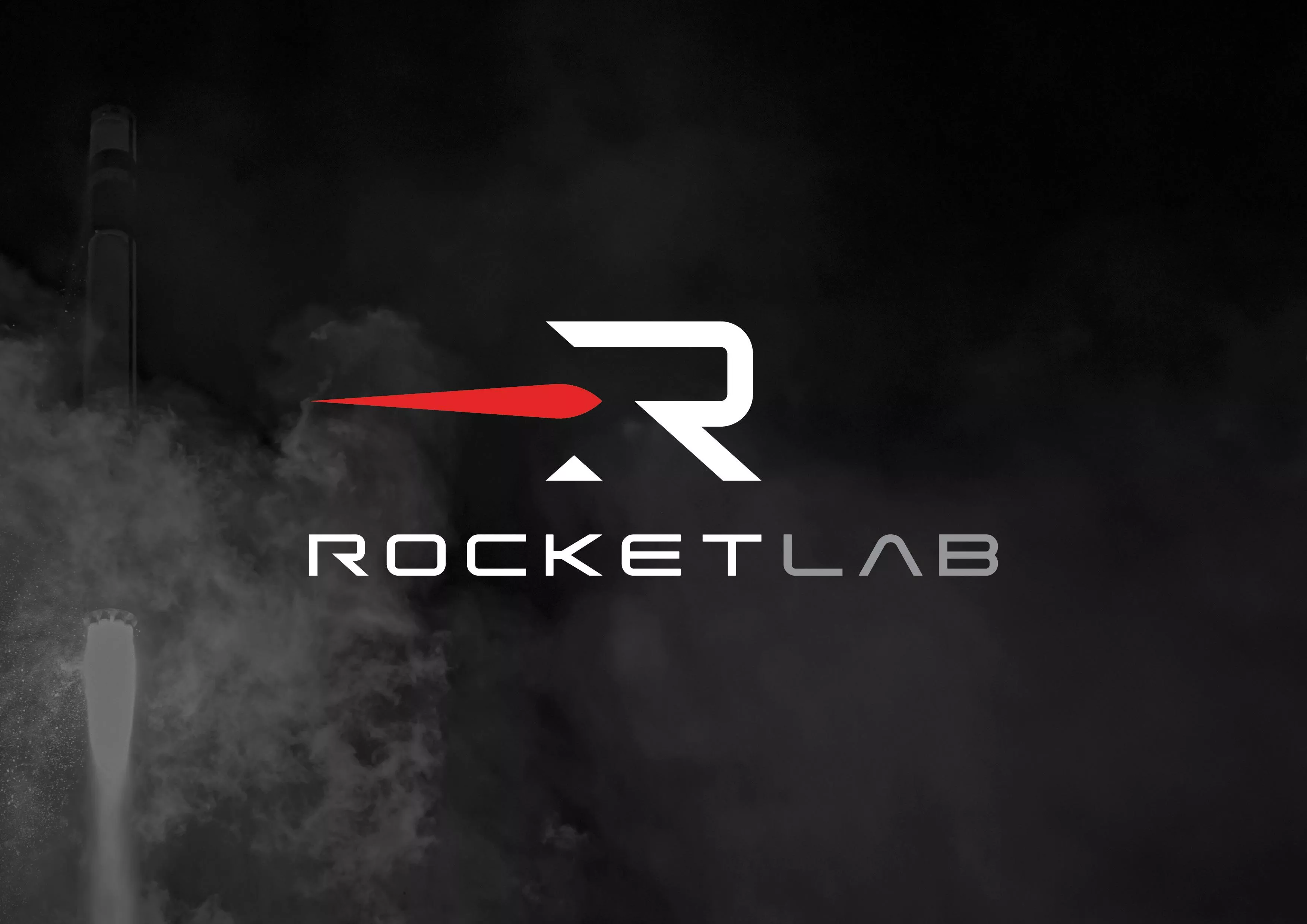
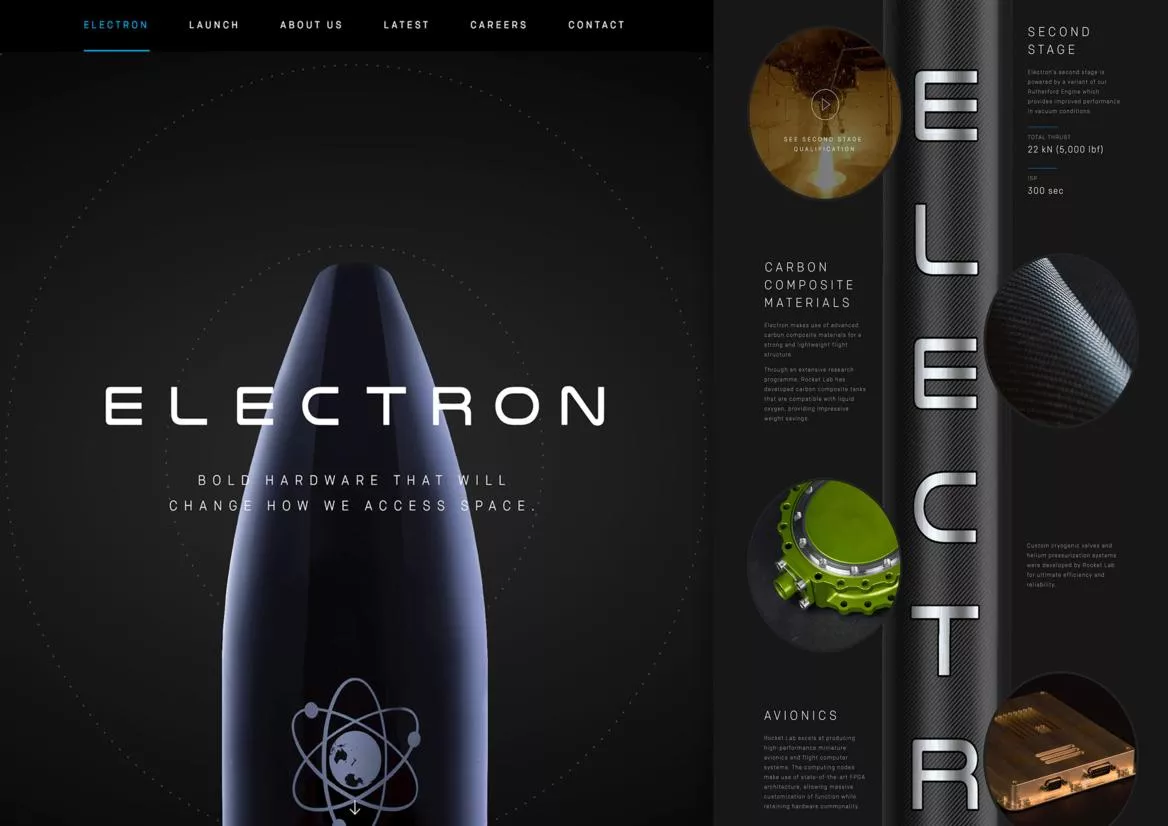
New logo, new graphic system, and new applications right down to the rockets: this refresh supports the transformation of Rocket Lab, as it evolves from a simple launch provider into a full-service space company.
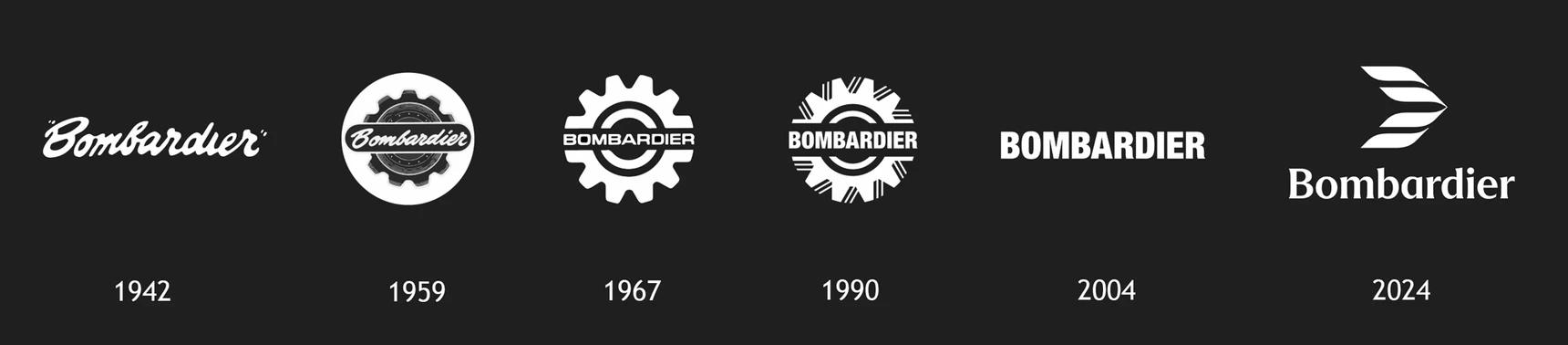
The manufacturer unveils its new symbol Bombardier Mach, a custom typeface, and a reimagined visual expression. A great example of premium modernization that connects heritage with contemporary design.
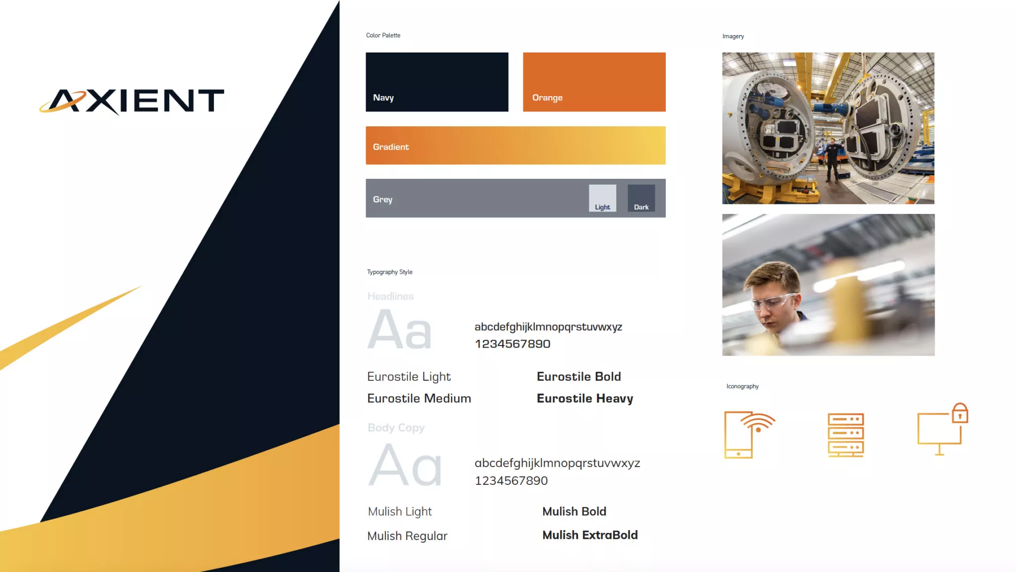
Following several acquisitions, Axient needed to exist as a single brand. With the support of a creative studio, they launched a new name, logo, identity, website, and videos. The result combines technical angles and orbital curves into a unified graphic language.
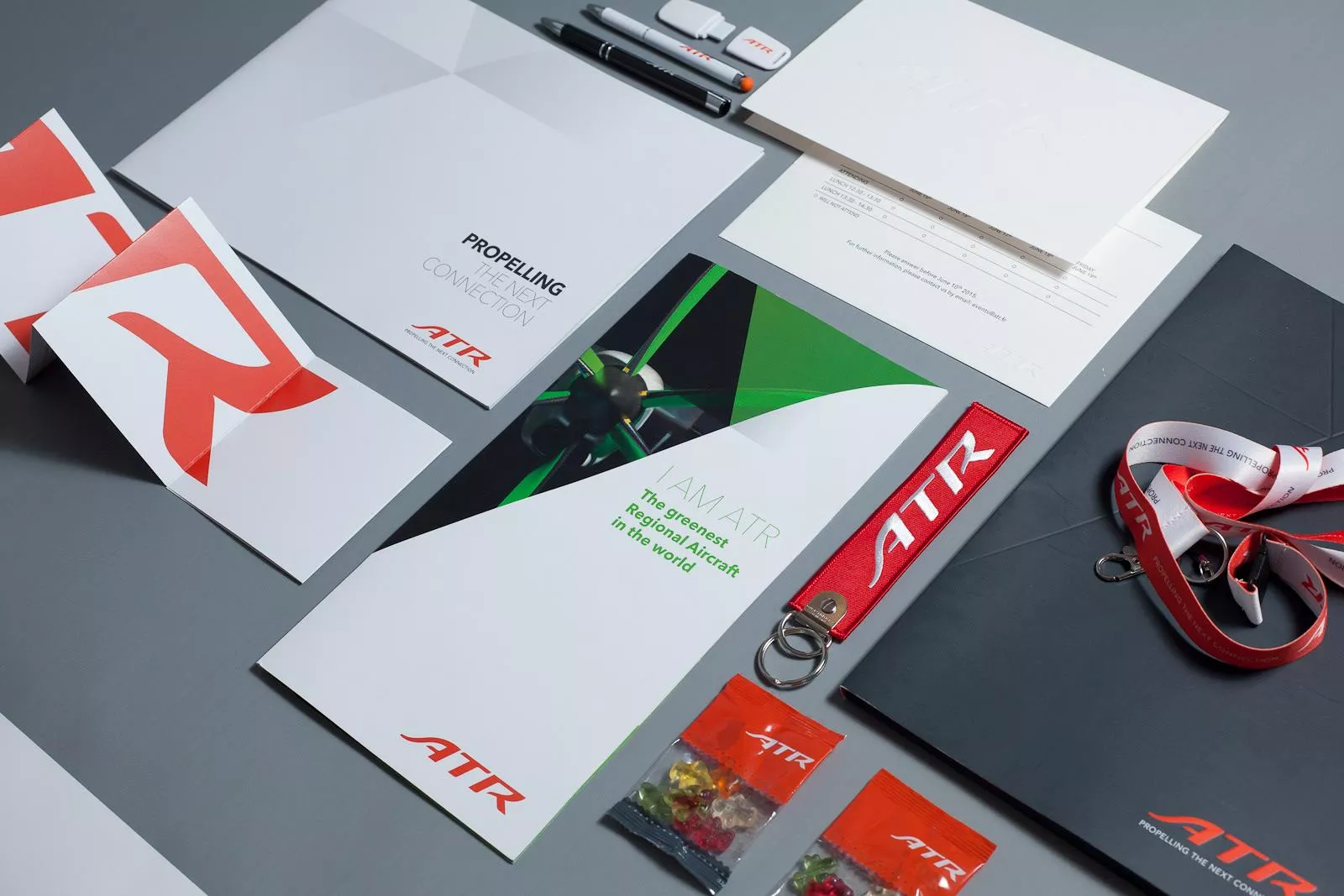
The Franco-Italian manufacturer ATR rethinks its positioning around the "Into Life" platform, deployed across digital, products, signage, and print. A graphic charter designed to personalize every touchpoint.
Red, black, and highly geometric: Spatial adopts a new visual territory inspired by the principles of aviation and industrial precision, accompanied by a new website to embody this creative shift.
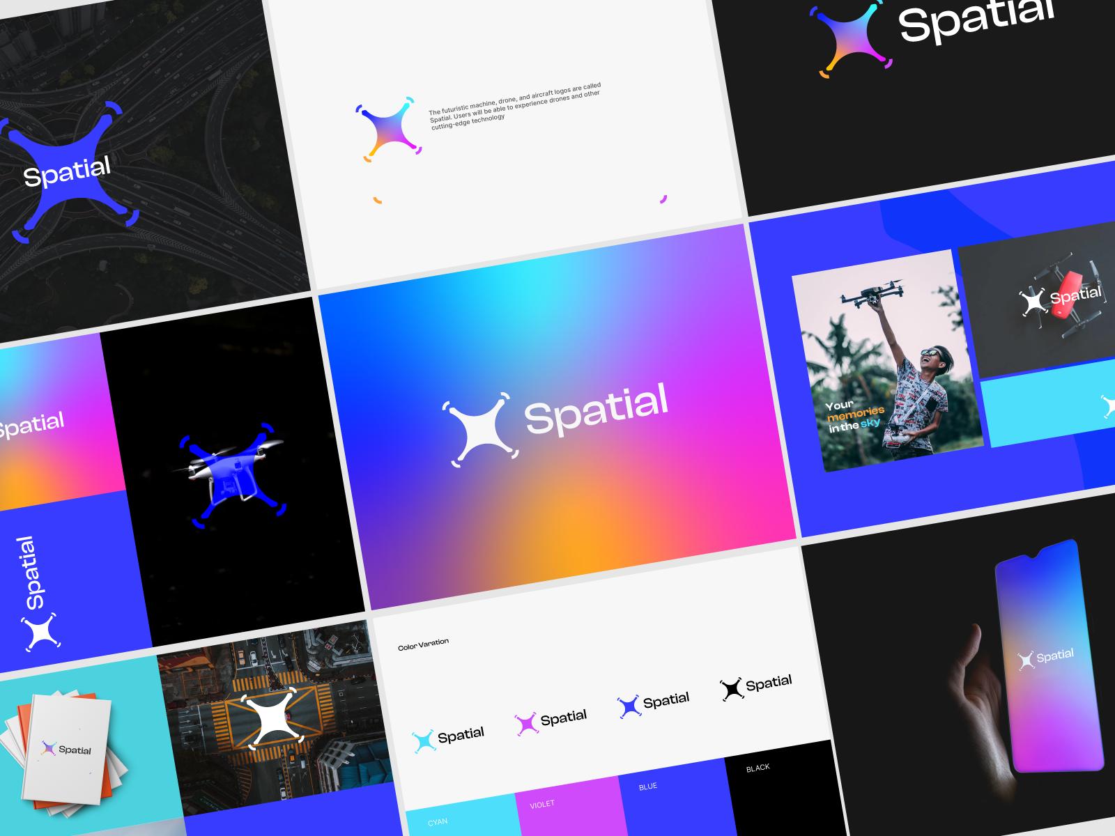
Rather than a clean break, Air Works opts for a refresh: a simplified logo, an updated palette, and continuous lines symbolizing adaptability. An approach that proves a successful rebranding doesn't always require reinventing everything.
Saudia, Saudia Technic, Academy, Cargo, Private: the Saudi group is rebranding its entire aeronautical ecosystem in one go. A textbook case of brand architecture on a group-wide scale.
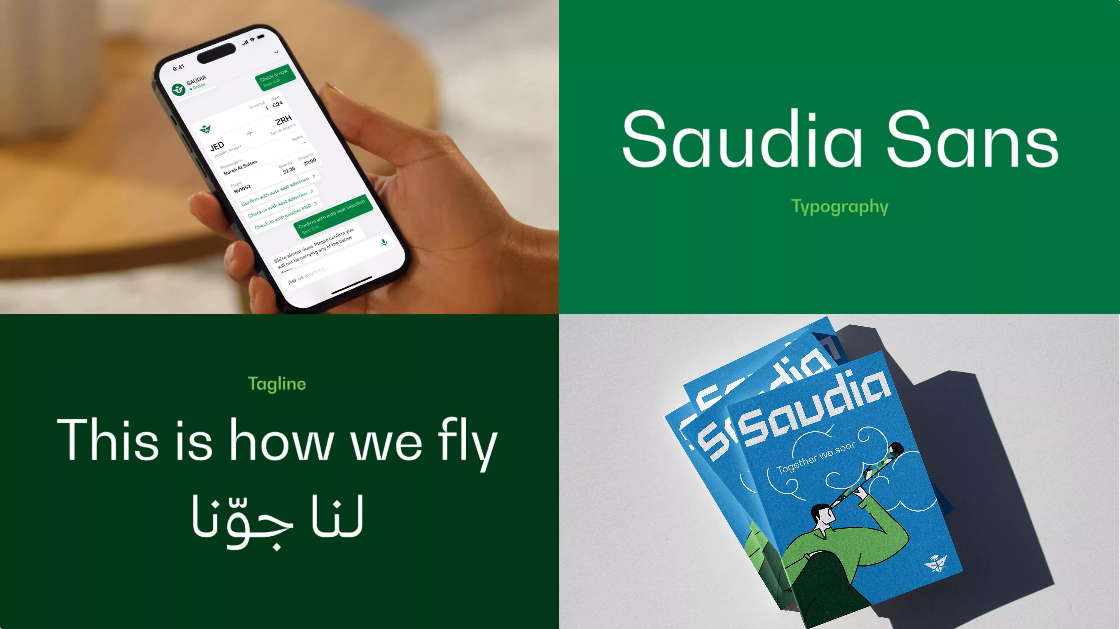
To learn how to structure a multi-entity brand architecture, check out our article on brand platforms: definition and steps.
Less well-known but equally compelling, Ecosmic has refined its branding to highlight the intersection of space and software. It’s a more international, tech-forward identity, clearly visible on their Behance profile.
{{cta-1}}
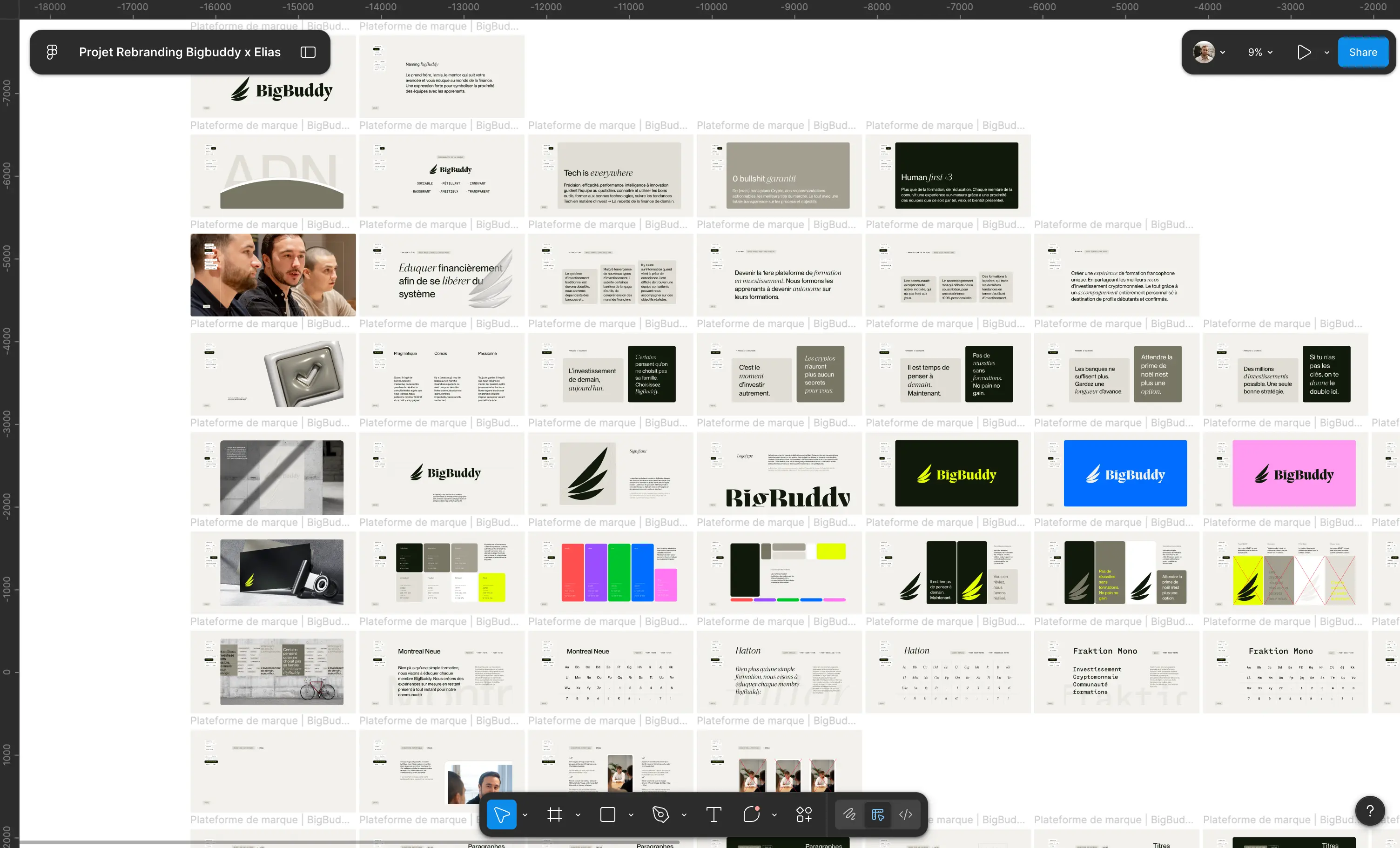
These ten rebrands share one common thread: they prove that technical brands can be desirable. This is exactly the approach taken by Studio Elias, a Paris-based branding agency, through projects like Effiblue, a deeptech firm specializing in the nanomaterial Ginestium® used in aeronautics, and Allshare, a specialist in payroll management. Two very different companies, but the same result: a strong identity, a cohesive image, and a website designed to connect the brand with its audience.








.jpg)
.jpg)



%20(1).gif)