

Deezer, Decathlon, Meta, Jaguar, X : five iconic brands that chose to reinvent themselves after the pandemic. Not just a simple facelift — a deep strategic transformation, driven by new markets, new ambitions, and a radically more digital world.
In this article, we break down:
And because a successful rebranding is always a blend of meaning and design, we also show you how Studio Elias applies this logic in its own projects.
What if your logo isn't telling the right story anymore?
Since the pandemic, the world has changed, and so have brands. It's no longer just about selling, but about building connections, embodying a vision, and being useful and credible in an ultra-connected world.
As a result, giants like Deezer, Decathlon, Facebook (Meta), Jaguar, and Twitter (X) have taken a strong turn. New name, new tone, new stance. In this article, we break down 5 post-Covid rebrandings that made an impact and, more importantly, what they can teach you about the power of a true brand image.
It has already appeared in our TOP 7 rebrandings in 2024 and not without reason, Deezer delivered a remarkable rebranding with a strong symbol!
A multi-colored equalizer-shaped logo, a bit technical, a little dated. It symbolized an era when streaming services competed purely on technology. It was legible and effective, but impersonal.
A stylized heart, somewhere between a sound wave and a pop icon. A warmer color palette. A more contemporary typeface. Deezer now projects a softer, more emotional personality. And proudly French. A powerful concept to embody the love of music, but also a desire to forge a connection with users.

This emotional connection is the very definition of a Love Brand. To understand how such a brand is built, read our article on "Love Brand": Decoding Brand Love.
Koto Studio, a London branding agency that has also revamped the identities of Deliveroo, Skyscanner, and Slack. Their signature? An approach that puts people at the center, with meticulous attention to detail. A perfect partner to inject new energy into the brand.
With this new branding, Deezer aims to establish a clear position in an ultra-competitive market. Rather than imitating Spotify or Apple Music, the brand is refocusing on its French-speaking roots, its cultural commitments, and its role as an everyday musical companion. It wants to be "the platform that understands you," not just a catalog of tracks. A communication campaign accompanied this transformation, featuring colorful visuals and a warmer, more approachable tone.
Because the logo works perfectly in small format on mobile (an essential point today), because the heart is a strong and universal symbol of emotion, and because the visual identity is flexible enough to live everywhere: on social networks, in playlists, in ad campaigns. Deezer becomes an inspiring example of successful post-Covid rebranding: a calculated and emotional choice that gives new meaning to the brand.
A very recognizable logo: the word "Decathlon", in white capitals on a blue background. Solid, simple, no frills. The brand image of an accessible, family-friendly, somewhat raw store. Effective, but stuck in an era when the brand only talked about price and products.

A redesigned visual identity with a new, more flexible typography and an iconic symbol: the winged "D". More dynamic, more premium, while retaining the blue signature that makes the brand recognizable. This more refined and airy design presents a modernized vision of sport, aligned with new customer expectations.
The giant Wolff Olins, behind the rebrandings of Google, The Met, and TikTok. A global reference in brand strategy, chosen for its ability to transform everyday companies into aspirational brands.
Decathlon is evolving. Today, the brand is no longer just a sports product distributor; it's a global sports player. Mobile apps, equipment rental, textile innovations, personalized coaching… The rebranding supports this transformation from an "equipment seller" to an ecosystem of sports solutions. It was therefore essential to choose an identity that could reflect this transformation, both in-store and online.
We analyzed this rebranding in depth in our dedicated article: Decathlon's Rebranding: A Strategic and Ambitious Transformation.
Because the new "D" works perfectly as a pictogram, evoking movement, lightness, and performance. And most importantly, because it modernizes the brand image without betraying it. It presents Decathlon as an agile, innovative, and always accessible brand, capable of speaking to both families and seasoned athletes. A smart, adaptable, and long-lasting design.
Facebook was that blue F that had become almost institutional. The social media giant, a bit clunky, sometimes criticized, but always unavoidable.

Meta. An umbrella brand. A logo halfway between an infinity symbol and stylized VR glasses. A change of name, universe, and ambition.

The transition was managed internally, but with the help of external consultants. Among them were creatives who had worked at Moving Brands or Pentagram, though Meta remains discreet about the details.
Meta no longer wants to be just a social network. With this redesign, Mark Zuckerberg is showcasing an ambition: to become the central player in the metaverse, a parallel virtual world where people can work, interact, and consume. The name change clarifies this ambition: Facebook is no longer the primary product.
{{cta-1}}
Because the metaverse remains unclear to many. Because the old name had enormous recognition. And because some see it as a PR move designed to make people forget the scandals associated with Facebook. But visually, the Meta brand is modern, understated, and ready to be adapted across a thousand products.
A leaping feline, embodying power and speed. The kind of logo you can't miss on the hood of a luxury car.

An ultra-minimalist wordmark. No more jaguar. Just the name, in a clean, almost cold typeface. All designed for the electric era.
Callum, the agency founded by former Jaguar designer, Ian Callum. An in-house collaboration, to preserve the DNA while looking to the future.
Jaguar aims to become 100% electric by 2025. The repositioning is clear: moving from aggressive luxury to silent, refined, almost Scandinavian luxury. This image change accompanies a complete overhaul of the product range and services.
Because removing a logo as iconic as the big cat is daring. But also because this choice perfectly aligns the brand image with tomorrow's values: ecology, sobriety, modernity.
We dedicated a full article to the Jaguar rebranding, if you want to learn more, you know what to do!
A small, cheerful, familiar blue bird. The universal symbol of the tweet. A simple, endearing, accessible brand.

A letter. "X". Cold, raw, sharp. Almost a non-brand, sparking as much fascination as rejection.

No official agency. This rebranding is the work of Elon Musk himself, with the collaboration of a few freelance designers. A radically unconventional approach.
Elon Musk acquired Twitter to transform it into a Chinese-style super-app: messaging, payments, content, AI... The name and logo change aims to break with the past, particularly the controversies. X is becoming a laboratory for Musk's experiments.
Because the name "Twitter" held enormous value. Because the shift was abrupt, without transition. But from a purely calculated perspective, the rebranding reflects a desire to open a new chapter, even if the overall picture is still unclear.
What do all these rebrandings have in common? Strategic alignment. They aren't just cosmetic lifts. They are decisions deeply tied to the evolution of the product, the market, and the target audience.
Another common thread: digital. Today, a brand's image primarily lives online. On social media, in an app, on a website, in animation, in thumbnails, in dark mode... A good identity is no longer enough: you need a fluid, adaptable experience, designed for all screens.
This is exactly why we deploy all our identities on Webflow. Discover why developing your showcase website with Webflow is the right choice.
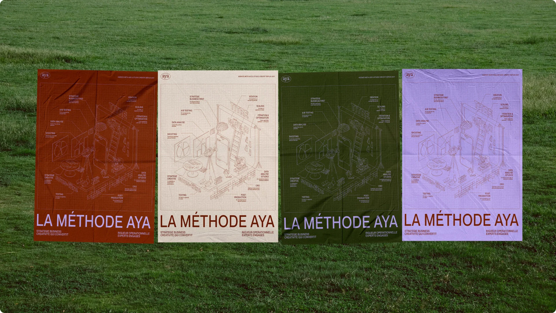
At Studio Elias, we understand this well: a brand isn't just a logo in a corner of a screen. It's a complete experience, a system that breathes consistency, from your brand's message down to the final pixel.
That's why, in all our rebranding projects, we work on:
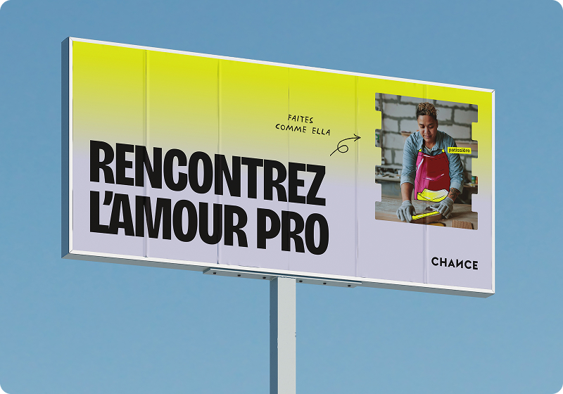
Fuga Family offers vibrant and escapist venues in the heart of Paris: Riviera, Laïa, or Francette – blending gastronomy, creativity, and unique settings.
Our mission: to create a comprehensive identity that matches their experiences, combining strategy, design, and digital deployment.
👉 Outcome : a unified, strong brand that invites you on a journey from the very first click.

Fugu is an audiovisual localization studio based in Lille, dedicated to bringing stories and emotions to the world by removing linguistic and cultural barriers. Their ambition is to become the essential language partner in the audiovisual industry.
Our mission: to establish a digital identity that reflects their young, agile, and human approach.
👉 Outcome : a consistent and distinctive identity that positions Fugu as a modern and essential player in audiovisual localization.

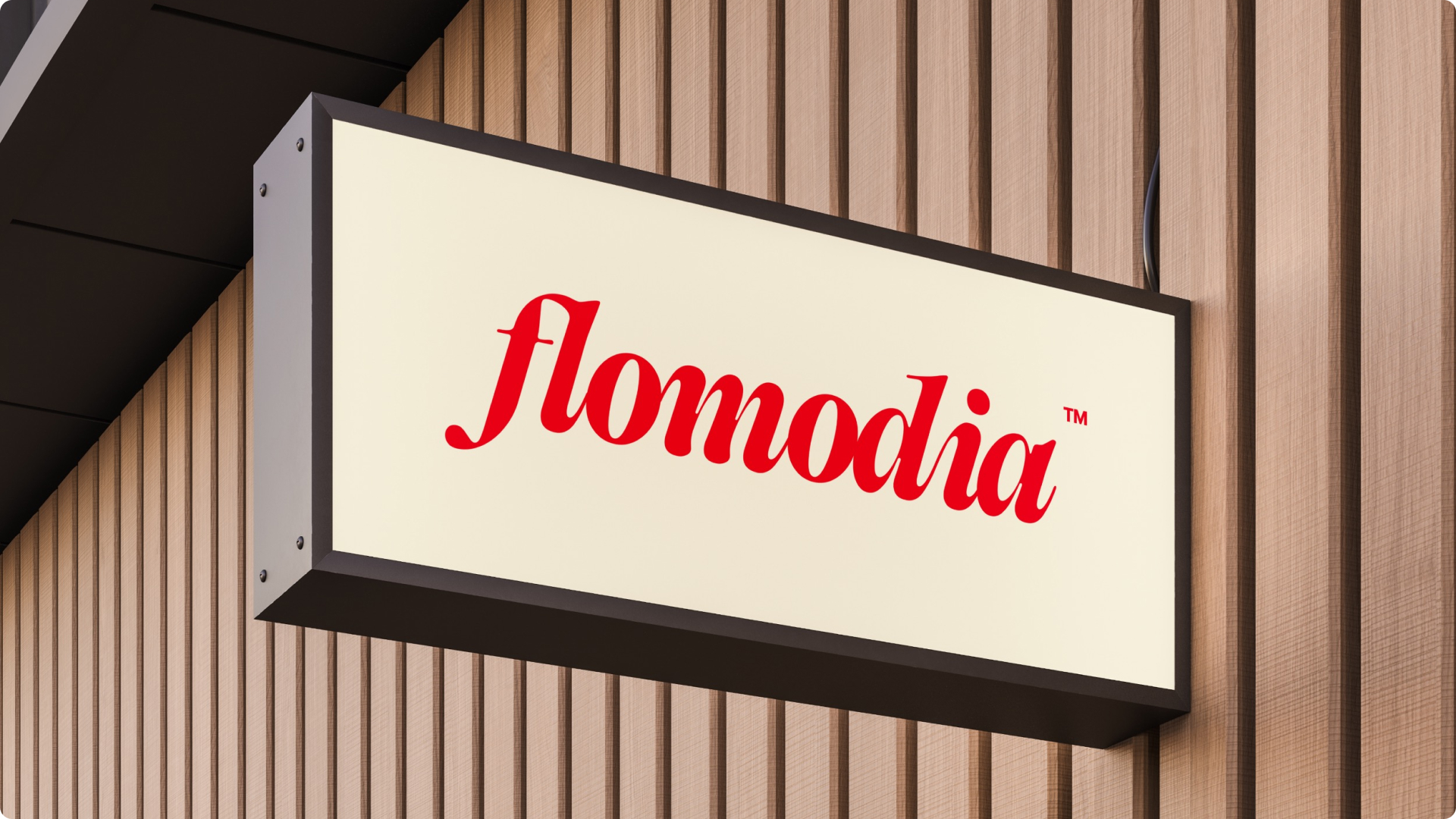
Flomodia is a community that inspires, educates, and motivates entrepreneurs to take action. Their ambition? To create a true hub dedicated to entrepreneurship, both physical and digital.
We have:
👉 Result : an inspiring brand, aligned with its audience and its mantra: Let’s f*cking do.

{{cta-2}}
What sets us apart isn't just our creativity, but our method:
{{cta-3}}
At Elias, every project is designed to be coherent, impactful, and immediately deployable on the web. And because we think long-term, what we deliver is a true foundation for growing your brand.
👉 And if you're ready to take action, find out how we can help you on our dedicated rebranding page.


.jpg)
.jpg)


%20(1).gif)