
The best VC sites, incubators and investment funds are no longer content with presenting a structure: they are becoming real support tools.
The ecosystem is evolving towards more educational platforms, with fluid experiences and simple but strategic narratives.
A successful site must clarify its positioning, show the startups supported, promote concrete results and facilitate access to information such as making contact.
Design no longer only serves to seduce: it structures the message, reassures and accelerates the decision.
Today, a good site allows you to understand, project yourself and fully enter the ecosystem.
In the startup ecosystem, the website has become a real strategic entry point. Long before an appointment, a pitch or a fundraiser, it all starts with an online search.
An entrepreneur, a founder or a project leader will look for:
And in 90% of cases, the first contact is made via a website.
A good site is no longer just about presenting a business. He must:
At Studio Elias, we design sites for actors in financing, innovation and support. Our belief is simple: good design should serve a business purpose.
{{block-cta-1}}
Here is our selection of the 30 best websites for VCs, incubators and investment funds in 2025.
Today, business creation involves digital technology.
Entrepreneurs use:
An incubator or VC must therefore offer a clear, fast and effective experience.
A good site allows you to:
It is a development tool in its own right.
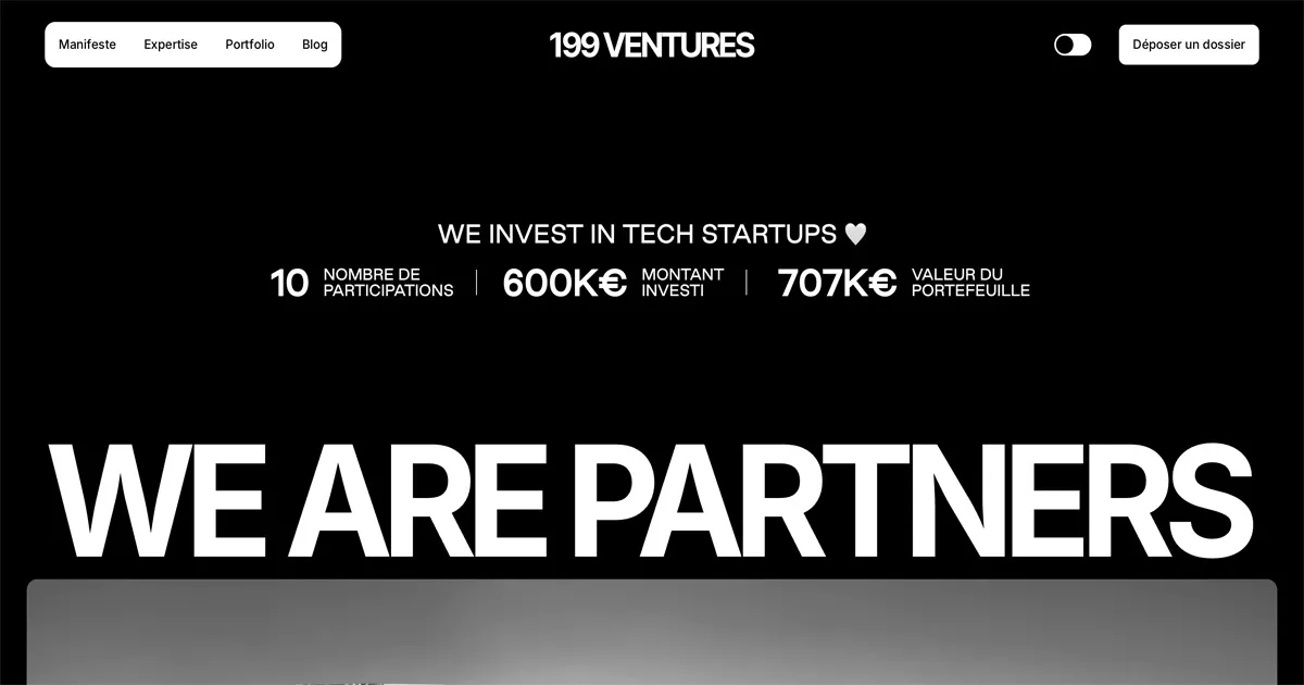
An ultra-minimalist site, but extremely effective. Here, nothing superfluous: the tone is direct, the promise is clear, and the user journey is fluid. A great example of performance-oriented design.
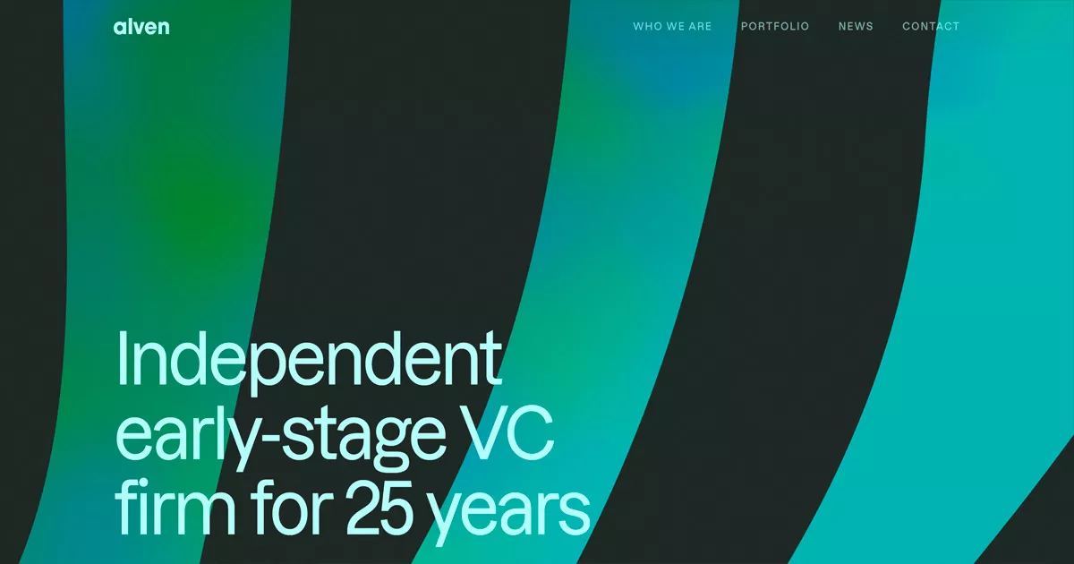
A site perfectly balanced between branding and information. Alven succeeds in highlighting its startup portfolio, its team and its positioning in Europe, while keeping navigation simple.
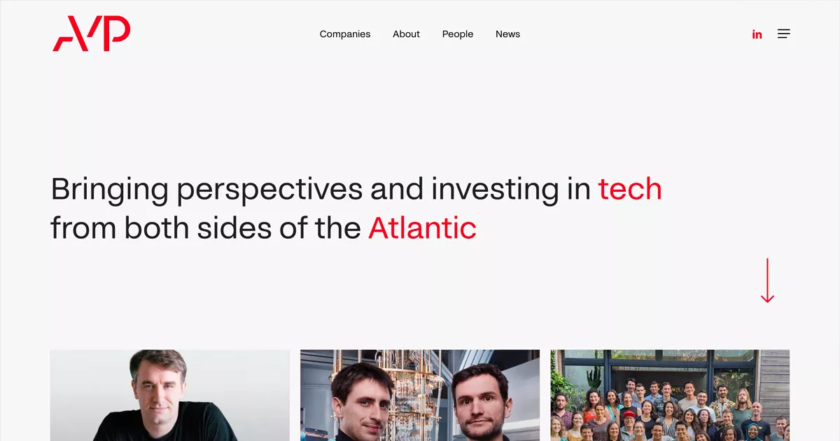
A very corporate site, but controlled. The layout is clear, the information accessible, and the credibility of the fund is immediately noticeable.
Positioned on industrial innovation, the C4V site makes a complex universe accessible. A good example of pedagogy applied to a technical sector.
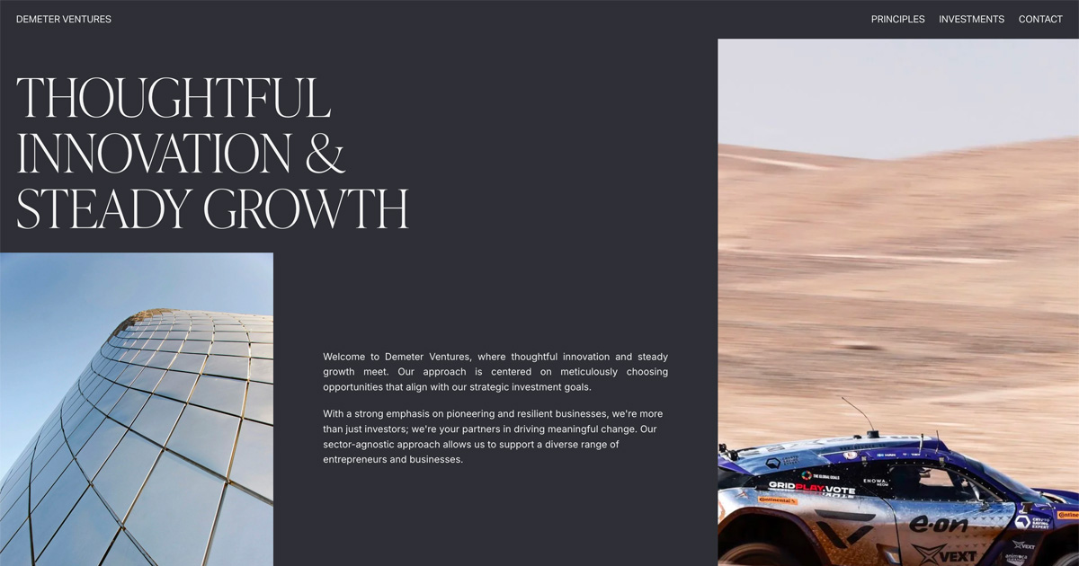
An organized site that highlights projects related to ecological transition. The information is rich, but remains legible thanks to a good hierarchy.
A more human approach, focused on the relationship with the entrepreneur. The site insists on support and a long-term vision.
An incubator run by a large group, with a site that values its power and its international network. Very good work on credibility and the ecosystem.
A community site, designed by entrepreneurs for entrepreneurs. The content highlights the founders and the exchanges rather than the structure itself.
Modern design with a strong focus on innovative projects. The site highlights startups and funding opportunities.
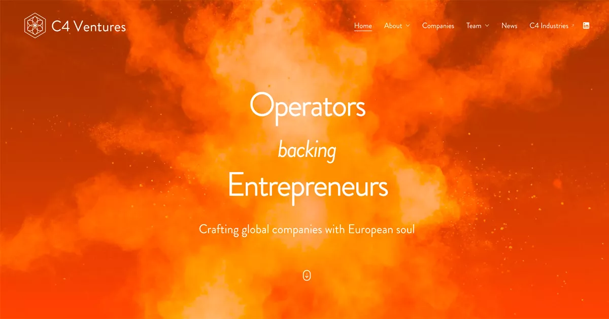
A unique positioning based on operators. The site perfectly reflects this approach by putting forward field experience.
One of the best sites on the market. Global, structured, clear, it allows you to quickly understand the various funds, programs and geographical areas.
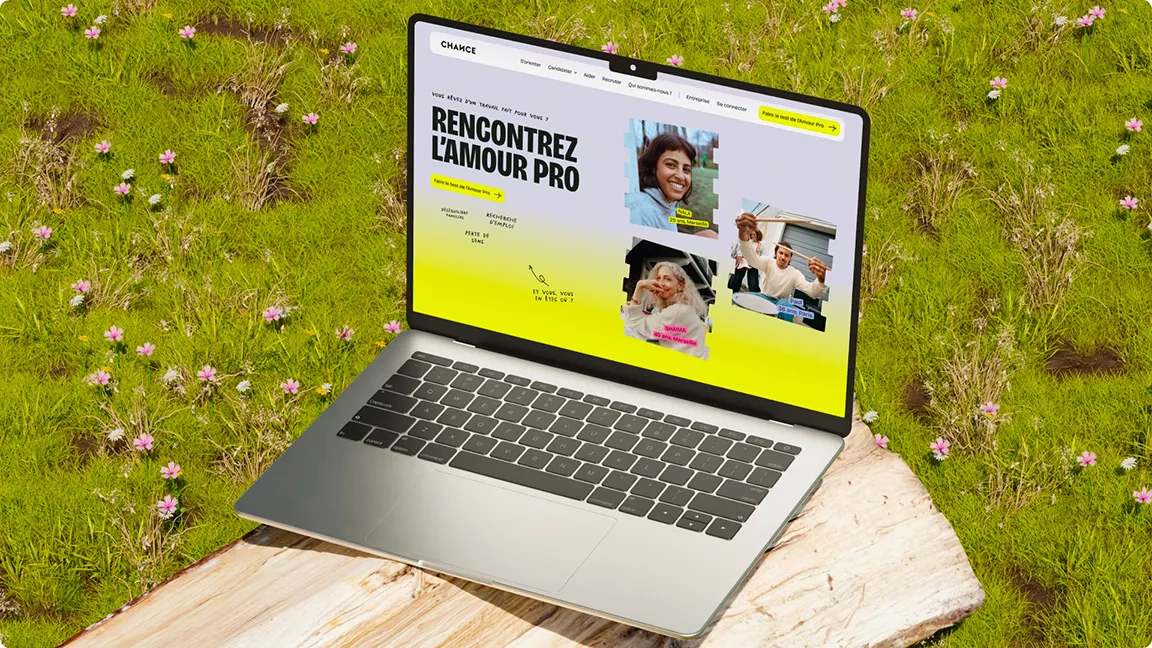
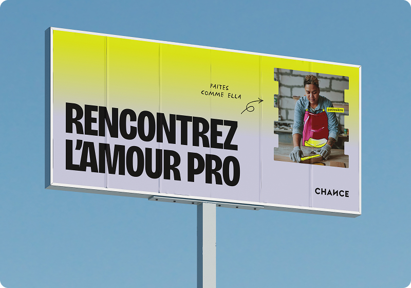
Our Chance Project proposes a different approach to incubation: here, we assist individuals as well as projects.
The site was designed as a real digital product:
The program combines:
This is an excellent example of a site, signed by Studio Elias, that transforms a need (retraining, orientation) into a concrete initiative.
The design was designed to reassure, structure and guide each stage of the journey. An interesting case of incubation applied to humans rather than startups.
{{cta-1}}
A premium site that inspires ambition and requirement. The artistic direction reinforces the high-end positioning.
A dense but well-structured site. It provides a quick understanding of investment areas and strategies.
A clear site, focused on deeptech innovation. Very good work on the structuring of information.
A solid corporate site, with strong international credibility. It highlights the investment capacity and the global network.
A site very focused on branding and visual identity. It immediately stands out for its artistic direction.
A recognized incubator in Paris. The site perfectly values the program, the community and the supervised startups.
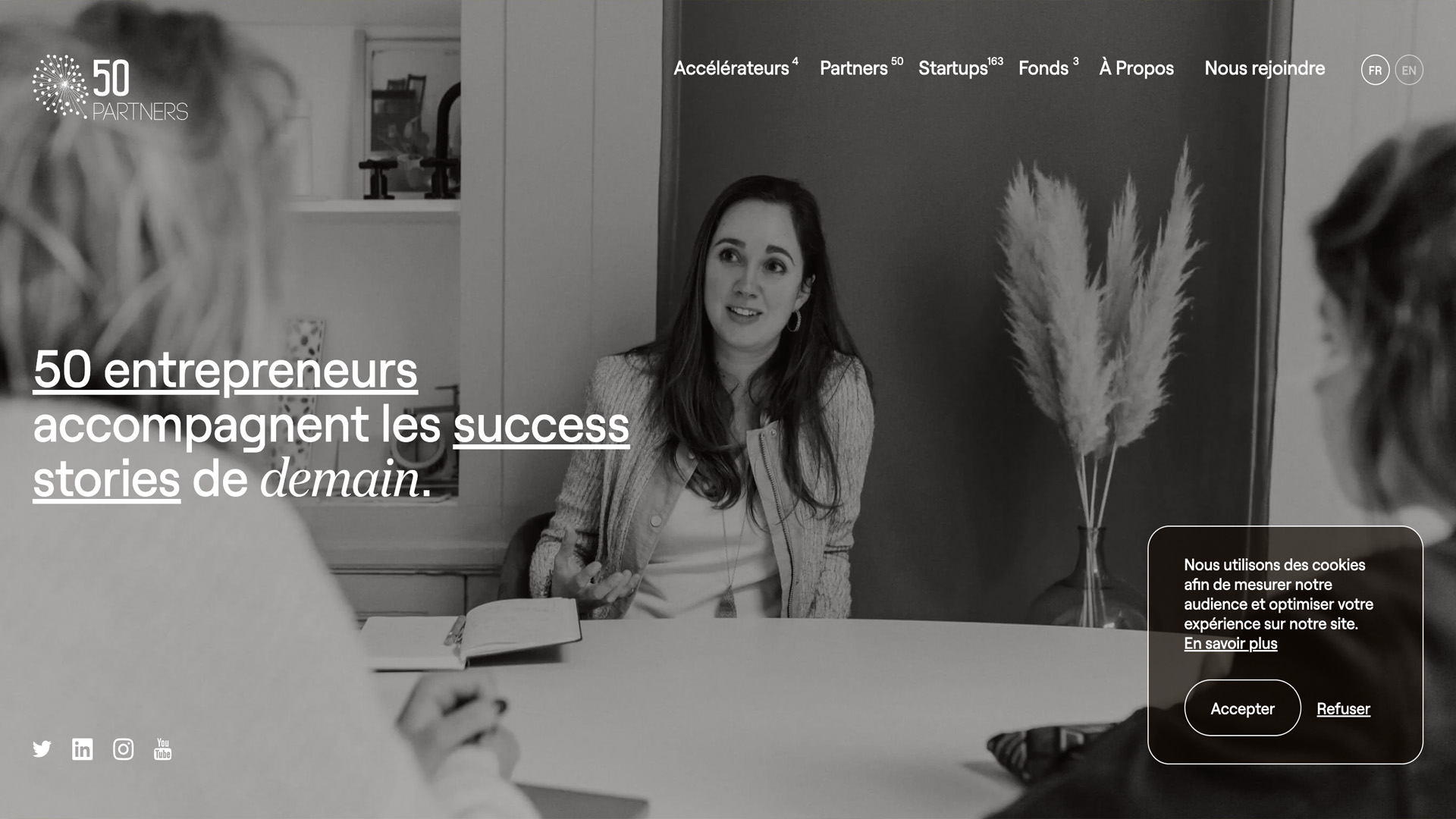
Simple, legible, effective. The site gets to the point with good clarity of positioning.
A great example of storytelling applied to the VC. The site tells a vision before presenting an offer.
A very fluid UX, designed to guide the user at each stage. The site is educational and engaging.
A global, structured site that perfectly reflects an international presence. Very good work on readability.
A modern site, focused on innovation and impact. The design is differentiating and consistent with the mission.
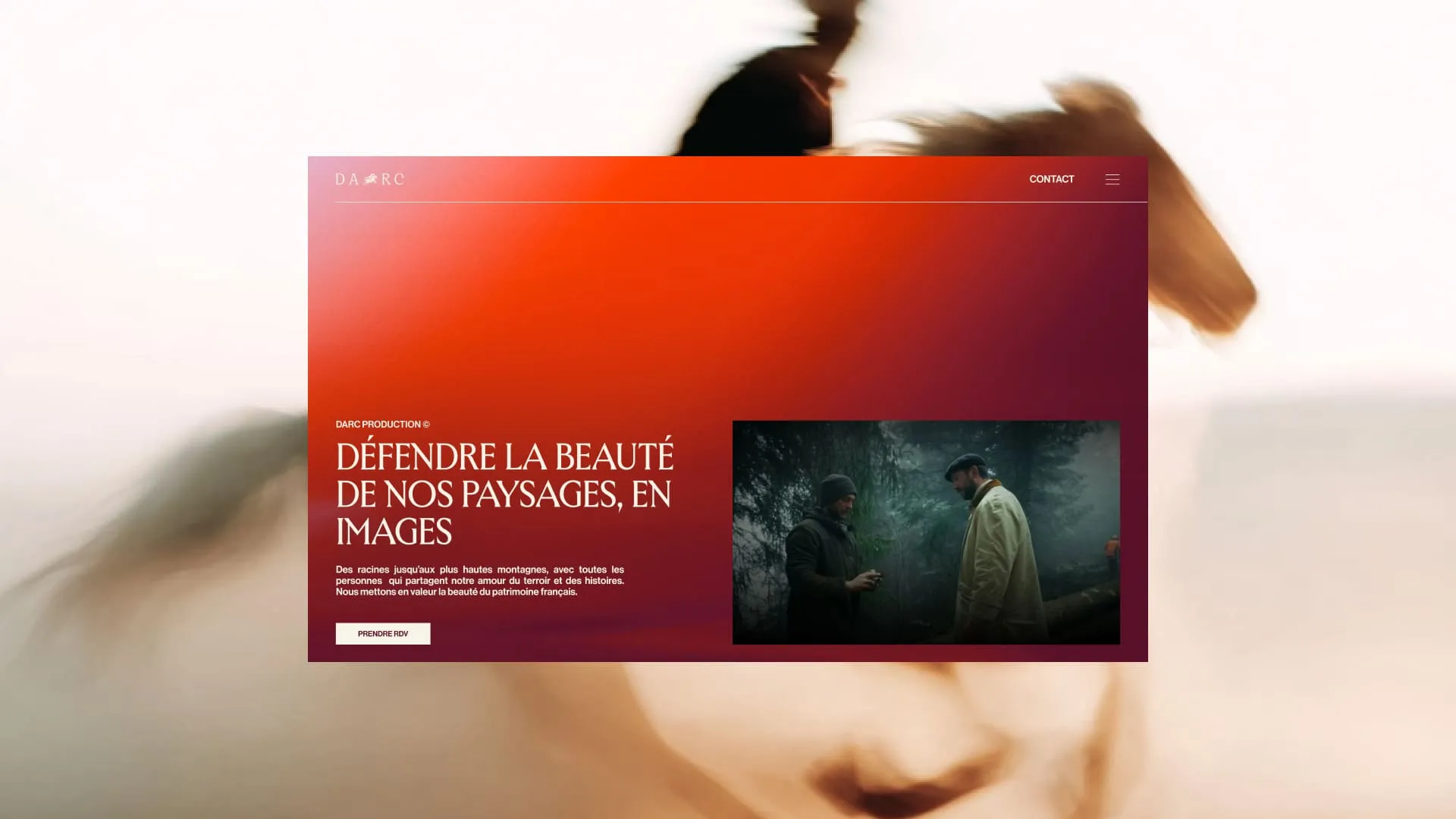
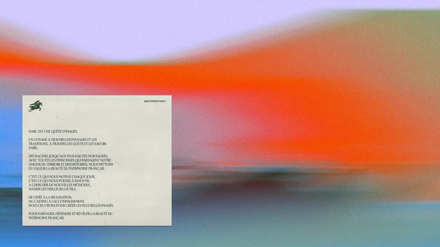
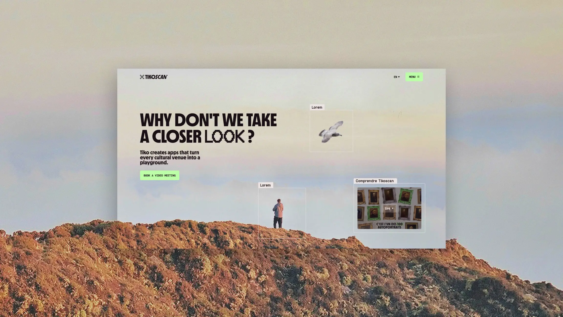
Our DARC project does not position itself as a VC or an incubator, but as a key player in the ecosystem: the one who builds the image and the story.
The site is based on:
Unlike conversion-oriented sites, DARC favors emotion and perception.
In a context of fundraising or launching a startup, the ability to tell a story is essential. And that's exactly what this site embodies.
An excellent example of advanced branding, at the service of projects.
{{cta-2}}
A simple and effective site. It highlights expertise and startups with clarity.
A very well executed institutional site. It immediately inspires confidence thanks to its structure and content.
A clear and educational site, with good accessibility of information.
A site designed for entrepreneurs, with a direct and action-oriented discourse.
Minimalist but impacting. The site highlights the projects and the network.
A site that values long-term support and relationships with startups.
The best sites allow you to immediately understand:
And that is not a detail.
In a context where entrepreneurs compare several incubators, accelerators or funds in parallel, attention is extremely limited. In a few seconds, they should be able to say to themselves: “is this structure made for me?”
A clear mission allows us to set the framework: we quickly understand the vision, the ambition and the role of the structure in the ecosystem.
The type of startup supported (early stage, scale-up, scale-up, deeptech, impact, SaaS...) allows you to project yourself immediately. This is what prevents confusion and unqualified applications.
Finally, the proposed value: financing, support, network, expertise, must be legible without effort. It is she who triggers interest and makes you want to go further.
The faster this understanding is, the more effective the site is. On the other hand, a fuzzy or too dense site creates friction... and leads to the loss of opportunities.
{{block-cta-2}}
Startups are at the heart of the content:
That's what creates credibility.
A good site guides the user:
Each step is designed to reduce friction.
The design allows you to:
It is not an aesthetic question, but a strategic one.
If you are a support structure, here are the basics.
What type of project do you support? At what stage? With what vision?
Your program should be understandable:
Your value is also based on:
They are your best ambassadors.
Work on your keywords:
Good referencing makes it possible to attract qualified projects.
We talk about it in our article dedicated to optimizing your SEO.
In an ultra-competitive environment, design is no longer limited to an aesthetic dimension. It is a real strategic lever that directly influences perception, understanding and decision.
First of all, it allows give credibility to a company. In the startup and investment ecosystem, everything is going very quickly. An investor, a partner or an entrepreneur forms an opinion in a few seconds. A poorly structured, dated or confusing site can immediately create doubts about the quality of the project or fund. On the other hand, a controlled, coherent and modern design sends a strong signal: that of a serious, aligned and professional structure. It is often the first proof of rigor.
Design also plays a key role in reassure an investor or partner. A well-designed site makes it possible to clarify essential information: strategy, investment thesis, types of projects supported, results, team. This clarity reduces uncertainty. However, in a world where risk is omnipresent, the ability to simplify and structure a discourse becomes a competitive advantage. The more readable a site is, the more it gives the impression that the company masters its subject.
It also allows Structuring an idea. Many innovative projects are complex by nature. The design comes to translate this complexity into something understandable. Thanks to visual hierarchy, typographical choices, content blocks, and interactions, it becomes possible to guide the reader and make a message clear in seconds. A good site acts as an educational tool: it helps to understand what the company does, why it exists and how it is different.
Finally, design contributes directly to improve the user experience. A smooth journey, well-placed calls-to-actions, intuitive navigation... all this reduces friction and makes it easier to take action. Whether it's applying for a program, contacting a fund or submitting a project, each interaction should be quick and easy. A poorly designed site creates obstacles. A well-designed site eliminates them.
That's why a good site can really speed up a fundraiser or a contact. It does not replace the product or the vision, but it allows them to be expressed in a clear, impactful and convincing way. In some cases, it even makes the difference between a project that grabs attention... and a project that goes unnoticed.
The top VC sites, incubators, and investment funds all understood one thing:
👉 their site is a development tool
They don't just present their business. They accompany, explain, reassure and convert.
At Studio Elias, that's exactly our approach: designing sites that really help grow your business.
Because today, a good site is not useful to exist. It is used to speed up.








.jpg)
.jpg)



%20(1).gif)