


In 2025, a SaaS website is more than just a support tool: it's a conversion engine and a growth driver. The best websites combine a clear value proposition, an immediate product demonstration, a consistent design, conversion-oriented navigation, and flawless technical performance.
The most inspiring SaaS websites – notion / webflow / linear / superhuman / pitch / framer / miro / arc / figma / clickup – all demonstrate the same thing: an effective website isn't just about looking good; it must clarify, reassure, convince, and guide the user to action.
Beyond design, these sites stand out for:
At Studio Elias, this branding + performance approach is at the core of our method: a SaaS website should be a business accelerator, not just a showcase. This is what we designed for Allshare: a clear, structured, modern site, conceived as a true acquisition tool.
A good SaaS website doesn't just explain a product: it conveys a vision, simplifies the essentials, and transforms a visitor into a user. It's a strategic asset, capable of driving software growth long-term.
In a world where every click counts and every pixel can make a difference, a SaaS software website is no longer just a support tool: it's a real growth driver. Whether it's for generating leads, converting visitors into users, or simply establishing a strong brand image, design and user experience are at the heart of any digital strategy. To understand the fundamentals of good web design in 2025, discover our selection of the best web designs of 2025.
At Studio Elias, we help ambitious SaaS companies create high-performing, aesthetically pleasing websites tailored to market needs. Through this top 30 list of the best SaaS websites in 2025, we're sharing the platforms that, in our opinion, push the boundaries of design, clarity, and effectiveness.
But before we dive into this ranking, let's take a moment to highlight a project we're proud of.
{{block-cta-1}}
Allshare is a French SaaS solution that facilitates the sharing of financial information between companies, chartered accountants, and investors. A dense, complex, strategic subject... which we had the pleasure of translating into a clear, structured, and modern interface.
And it's no coincidence that this site catches the eye: it was 100% designed and developed by Studio Elias on Webflow, our favorite playground.

Wondering why we chose Webflow? Read our article on why develop your showcase website with Webflow in 2025.
{{cta-3}}
With Allshare, we applied our proven methodology for SaaS projects: listening to needs, understanding the product, creating a tailor-made user journey, and distinctive design. All with a single goal: to provide the company with a high-performing, beautiful, and scalable SaaS website capable of supporting its growth.
This project perfectly embodies our vision for SaaS websites: a strategic tool, centered on user needs, but without compromising on aesthetics or technical performance.
Allshare is not just a "beautiful website": it's a business driver optimized for conversion, a powerful branding tool, and an example of what we love to design for French SaaS publishers.
Do you also have a SaaS software project you want to make visible? Let's talk.
{{cta-1}}
A minimalist, clean, and very well-structured site. The SaaS provider presents its product with pages tailored to each customer type. The use of interactive demos is a model for any SaaS website. The overall design inspires great clarity and facilitates immediate understanding of the tool, regardless of the visitor's level of familiarity. Special mention to the "template gallery" section, which demonstrates the product's power while educating the user.
One of the best examples of a SaaS website: dynamic design, rich interactions, useful and well-organized content. The site demonstrates the power of the editor... by being built with Webflow itself. Leading by example. It also features excellent integration of the blog, customer case studies, and Webflow University: a complete ecosystem dedicated to building trust and product education.
{{cta-1}}
Linear reinvents project management with a clear, fast, and extremely visual website. The dark mode provides a strong style, and the user experience is remarkably effective. The content is succinct but extremely well-thought-out: every word is weighed, every animation adds value. An excellent example of understated yet memorable branding.
A model of minimalism. Few elements, but each is meticulously designed for conversion. The promise is clearly stated, and the interface aims to be as fast as the experience it offers. Access is by invitation only, creating a controlled sense of exclusivity through its design and language.
Pitch combines storytelling and animation to offer an engaging user experience. Slides become navigation elements, and each section illustrates a different use case. The dynamic color palette and scroll-triggered micro-animations create a highly cohesive presentation that aligns perfectly with the world of modern presentations.
Framer, an interactive design platform, offers a fluid, dynamic, and aesthetically striking website. Scroll-triggered animation is perfectly executed, and micro-interactions make navigation engaging. The site adopts a highly creative visual language, in tune with its target audience (designers), and showcases use cases with animations directly from the product interface.
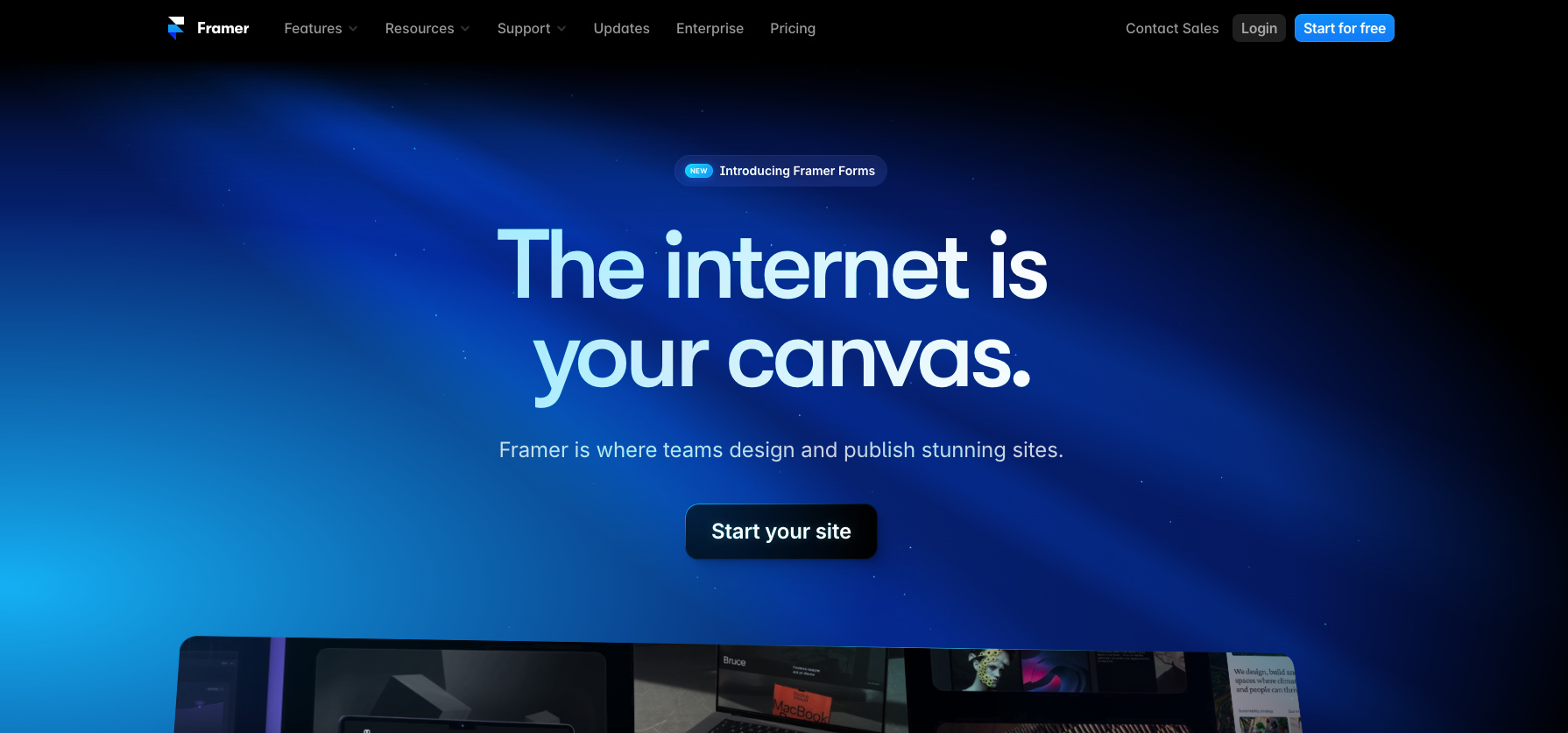
Undecided between Webflow and Framer for your project? We break it down in our comparison Webflow vs Framer: which tool to choose in 2025.
Immersive illustrations, fluid navigation, and step-by-step explanations of each feature. Use cases are clearly presented and cater to various professional audiences. Miro effectively uses social proof with logos, testimonials, and client stats, all while maintaining an educational and reassuring interface.
A highly editorial and poetic design for productivity-oriented SaaS software. The visual universe evokes writing and creation. The site offers a very fluid user journey with many well-integrated product videos, allowing for immediate immersion in the tool.
Arc boldly embraces retro-futuristic design, with daring visuals and a modern presentation. The site's interface is conceived as a brand manifesto. The tone of voice is distinctive, giving the impression of entering a community rather than just using a product. The visual identity is exceptionally unique.
Figma continues to inspire designers with a site that highlights community, use cases, and new product features. Micro-interactions, the integration of community projects, and dedicated landing pages for specific workflows (UX, design systems, etc.) make it an absolute benchmark.
A vibrant and colorful site that perfectly reflects the creative world of audio/video editing. Smart animations accompany scrolling without hindering readability. Features are presented with humor, clarity, and accessibility. A true lesson in UX simplicity.
A dynamic, vibrant site that immediately highlights product usage. The experience is ultra-visual, with in-context demonstrations right from the first section. The fun yet professional aesthetic perfectly matches its creative target audience.
An immersive yet technical world. Runway positions its tool as an AI revolution in video creation, and this is reflected on its website. The visual effects convey a high-tech feel without slowing down navigation.
.webp)
The site emphasizes simplicity and personalization. It features a clean, elegant platform with well-highlighted integrations. Open source is also a prominently featured communication point.
A technical yet welcoming website that successfully makes a synthetic data generation solution appealing. The branding is modern, the explanations are clear, and the promise is strong.
With its modern, colorful, and conversion-oriented website, AhoyConnect clearly positions itself for businesses looking to engage their communities. The design combines storytelling, social proof, and product highlighting.
Parabola focuses on accessibility. Workflow automation is illustrated with elementary and instructive animations. Each step is explained, which reassures less technical users.
A confident website that embraces its dark, minimalist, and tech identity. Raycast speaks to developers in their own visual language. A great balance between performance, clarity, and product culture.
Soft design, fluid navigation, Slite adopts a reassuring and human tone. The website seamlessly integrates product demonstrations and customer testimonials, with a clear information hierarchy.
.webp)
A no-code website builder that proves its simplicity through its own interface. The website is fun, animated, and instructive. Navigation is intuitive and highlights the community's creativity.
The site highlights goal management with pastel color codes and a very visual approach. The interface is clean, features are illustrated, and the promise of simplicity is delivered.
A fluid UX that enhances the electronic signature process. The site is structured like an acquisition funnel, with sections dedicated to each stage of the customer journey. Animations are subtle yet effective.
Trello remains true to its original design but has intelligently modernized it. Icons, colors, navigation… everything is clear. The site caters to both new and advanced users.
The site is an ecosystem in itself. It's packed with demos, videos, and use cases. The visual identity is strong and consistent. A site that sells while supporting skill development.
ClickUp maximizes the product experience. The site showcases everything that's possible, with ergonomics that help users envision themselves using the tool. Excellent use of comparisons and social proof.
.webp)
The site perfectly reflects the product's world: cheerful, hand-illustrated, accessible. The interface is fluid, demos are instant, and the brand gives the SaaS a true personality.
Retro design, a modular interface, and a quirky tone. The site clearly targets bootstrappers and indie hackers. The UX is straightforward, the branding is unique, and transparency is everywhere.
One of the most minimalist sites on this list. Its strong contrast, ultra-smooth animations, and very strict hierarchy make it an anomaly in the SaaS world. For lovers of elegant simplicity.
Basecamp has always challenged conventions, and its website is no exception. Very text-heavy, very confident, no frills. It feels like a solid, self-assured brand that speaks directly to its users.
A site designed for clarity and education. Every email feature is illustrated, pricing is clear, and the overall impression is one of reliability. Ideal for small teams and beginners.
In a SaaS model, where users sign up, subscribe, and test the product directly online, the website becomes much more than a storefront: it's an active salesperson, available 24/7. It plays a fundamental role in acquisition, reassurance, and conversion.
A good SaaS website must be able to:
But that's not all:
A well-designed site also meets the needs of all stakeholders in a SaaS project:
It must also adapt to the prospect's different maturity stages:
A good SaaS website is therefore a strategic player in its own right, capable of supporting business growth at all stages of its development.
And to achieve this, choosing the right technology (like Webflow), the right content, and the right partner can make all the difference.
{{cta-1}}
After analyzing the top SaaS websites of 2025, one observation stands out: beyond the design or technology used, certain fundamental principles consistently emerge. Whether the SaaS is for product teams, HR, marketing, or finance, the most successful platforms share several common characteristics:
From the very first second, it's clear who the product is for and what problem it solves. No unnecessary jargon, no detours: the value proposition is direct, clear, and aligned with user needs.

Videos, animated captures, or live demonstrations immediately immerse the user in the tool. You don't just read about the features: you see them in action.
In 2025, mobile access is essential. The best SaaS websites aren't just responsive: they are designed mobile-first, with smooth animations and interactions.
Colors, typography, illustrations, editorial tone... The most impactful brands leverage their website as a powerful vehicle for their visual identity. We remember these sites because they possess a distinct personality.
This is the core of our service forvisual identity : building a coherent, memorable, and distinctive graphic universe.
The user journey is intelligently mapped out, featuring visible CTAs, clear options, and minimal friction. The goal: to effortlessly guide users from scrolling to taking action.
To learn more about UX best practices that build trust, check out our article on 8 Webflow Elements to Improve Your Site's UX.
The goal is to create a SaaS website that functions as a natural funnel towards registration or a demo.
.webp)
An effective SaaS website isn't just about looking good. It needs to be designed as a seamless user journey, built around the tool's value proposition. Here are the essential elements:
The goal is clear: to create a SaaS website that functions as a natural funnel towards registration or a demo, by eliminating friction at every step of the journey.
A well-designed website is a continuous sales tool. And at Studio Elias, we know how to build it.
And for this tool to be visible, SEO is essential. Discover our 12 tips to improve your Webflow site's SEO.
{{cta-2}}
Creating a website for a SaaS company isn't just about pages, buttons, or CMS. It's a deep dive into identity, positioning, and product perception. This positioning is formalized in a brand platform : the strategic document that aligns vision, values, and brand expression.
The best SaaS websites in this ranking share a crucial commonality: they don't sell a list of features; they tell a story, a vision. A way of working, a solution to a problem, a promise of efficiency or simplicity.
And this vision is reflected at every level of the site:
This is what transforms an "informative" site into a true driver of engagement and conversion.
At Studio Elias, we don't design a SaaS site as mere window dressing for software, but as a strategic extension of the brand. It's this branding + performance perspective that makes all the difference.
{{block-cta-2}}
SaaS is a rapidly expanding model. And in this ultra-competitive market, your website is often the first point of contact between your product and your future users. A simple presentation tool? No. It's a growth accelerator, a marketing lever, and an extension of your sales team.
The 30 examples we've shared clearly illustrate this trend: refined design, fluid UX, clear positioning, immediately perceived value. They prove that a good website doesn't just inform; it engages, reassures, and transforms.
At Studio Elias, we believe that a successful SaaS website is never a matter of chance. It's the result of in-depth work on identity, messaging, usability, and user needs. And that's precisely what we offer our clients.
Launching your SaaS tool? Looking to evolve your online presence?
Let's discuss your project.


.jpg)
.jpg)


%20(1).gif)