The main thing to remember
The e-commerce giant has redesigned its visual identity to regain consistency after more than twenty years of rapid expansion and diversification. The famous logo smile remains at the heart of the system, but it is now part of a more fluid approach, designed for all media, from the website to packaging, including Prime Video or mobile applications.
This change is by no means a simple facelift. It is a global strategy:
- Simplifying an ecosystem that has become too complex.
- Unify communication between different markets and products.
- Modernizing the image to build trust and readability globally.
- And above all, put the customer experience back at the center, with a clear and accessible visual language.
In short, Amazon proves that a clear and well-structured identity is not an aesthetic detail, but a real driver of performance.
When a global leader like amazon Reviewing your visual identity is never trivial. This project, designed by the agency Koto in close collaboration with the group's internal teams, marks an important step in the evolution of the brand. After more than two decades of rapid expansion, from e-commerce to express delivery, including Amazon Prime, Kindle or Prime Video, the company needed to regain global consistency. This redesign aims to simplify a structure that has become complex, to modernize its image for the digital world and to better reflect the promise of accessibility that has always been its strength: to make each product and each interaction clearer, more fluid and more human.

A global but fragmented brand
Over the years, Amazon has multiplied products, services and sub-brands: Amazon Prime, Prime Video, Amazon Fresh, Kindle, not to mention the marketplace where thousands of sellers publish each item every day. This expansion, while extraordinarily successful commercially, has made the global identity difficult to read and manage. Each entity, whether it was a streaming platform, a delivery offering, or a connected product, seemed to speak a slightly different visual language.

The Amazon logo was sometimes used inconsistently, the colors varied from one medium to another, and the graphic codes fragmented by country or team. This lack of consistency hampered clarity and, more broadly, the customer experience.
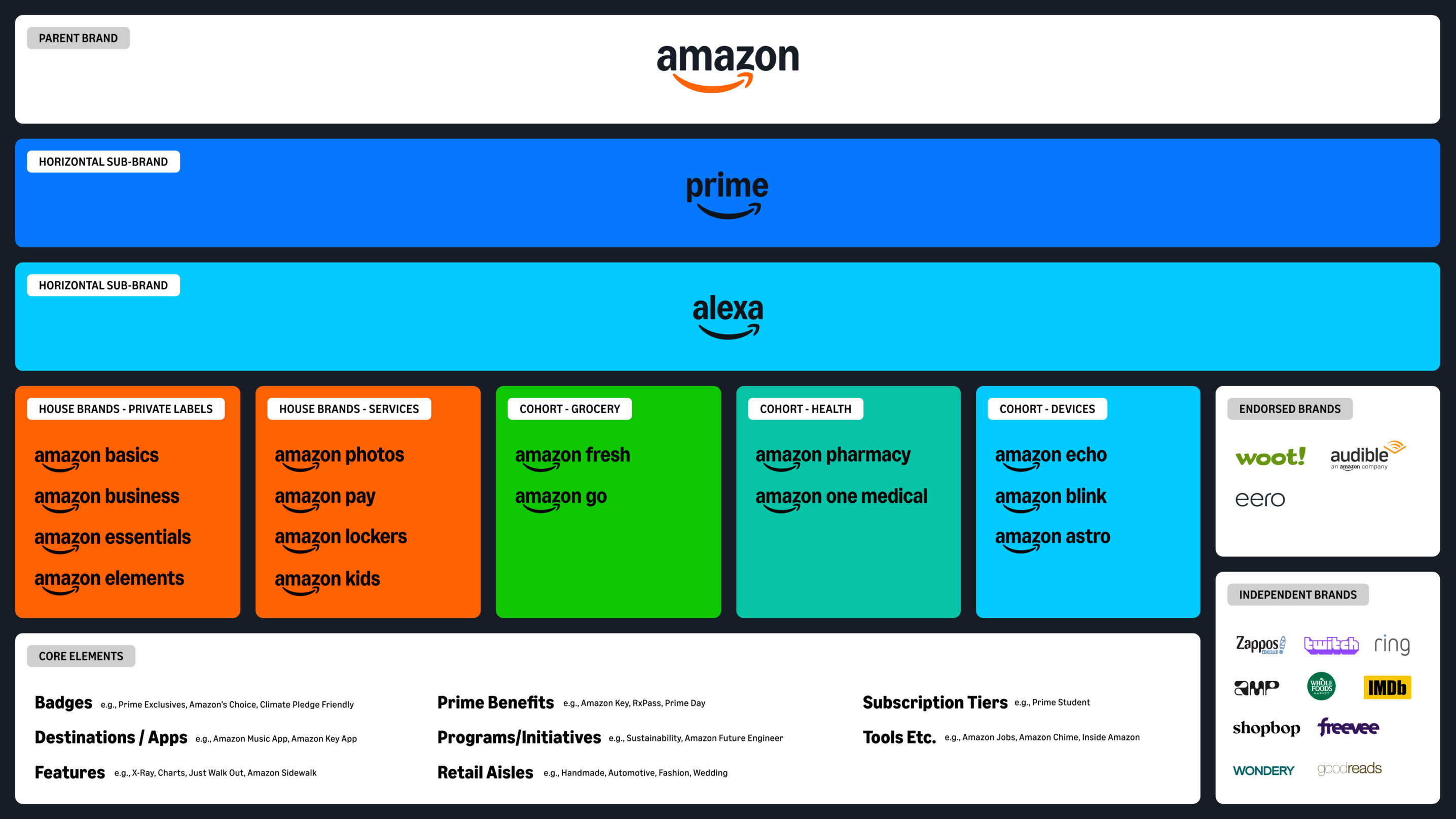
The challenge for Koto was therefore twofold: on the one hand, to streamline and simplify the visual structure; on the other hand, to maintain the flexibility necessary for such a large group. It was necessary to create a common language capable of unifying more than 50 entities while leaving room for the specific expression of each universe produced. The final objective: an identity that is at once coherent, accessible and scalable, capable of bringing together all offers, from delivery to streaming, from books to mobile applications, under the same recognizable smile.
{{cta-1}}
The smile, a universal symbol
The rebranding of Amazon does not erase the past, it relies on its most powerful symbols to better make them evolve. The famous smile on the Amazon logo, that arrow that connects the A to Z, remains at the heart of the visual identity. It still embodies this idea of a complete and accessible proposal, but in a more refined, more balanced form, and better adapted to current uses.
This new visual identity has been redesigned to live in all environments: on the internet, mobile applications, packaging, advertising or even video interfaces. The logo thus gains in readability and impact, while maintaining this implicit promise: to allow each customer to “find everything they need, from A to Z”.

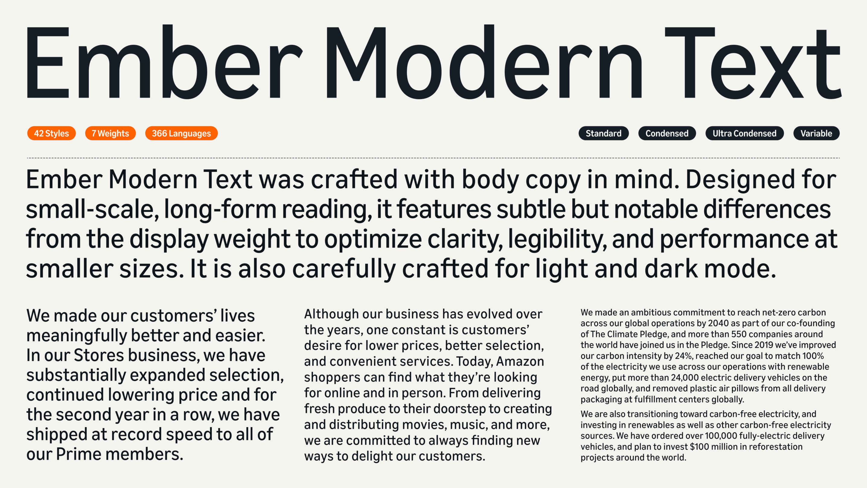
Koto also opted for a color palette refocused on Smile Orange, an iconic shade that reflects the energy and warmth of the brand. In addition, there is a custom typeface, designed to cover more than 364 languages. A highly strategic choice for a global brand, which places visual coherence and accessibility at the heart of its system. This unified typographic work ensures that Amazon speaks with one voice, whether it's a product page in France, a Prime Video campaign in India, or Amazon Fresh packaging in New York.
Simplifying without impoverishing
One of the key principles of this rebranding is rationalization. In other words: doing less, but better. Faced with the complexity of its multiple services, Amazon needed a visual language that could streamline creation, without diluting its identity. The graphic elements have therefore been redesigned to become modular and coherent: typography, colors, pictograms, grids and visual hierarchies now follow the same framework. This simplified system allows design teams to produce faster, while ensuring brand consistency across every touchpoint, from site to advertising.
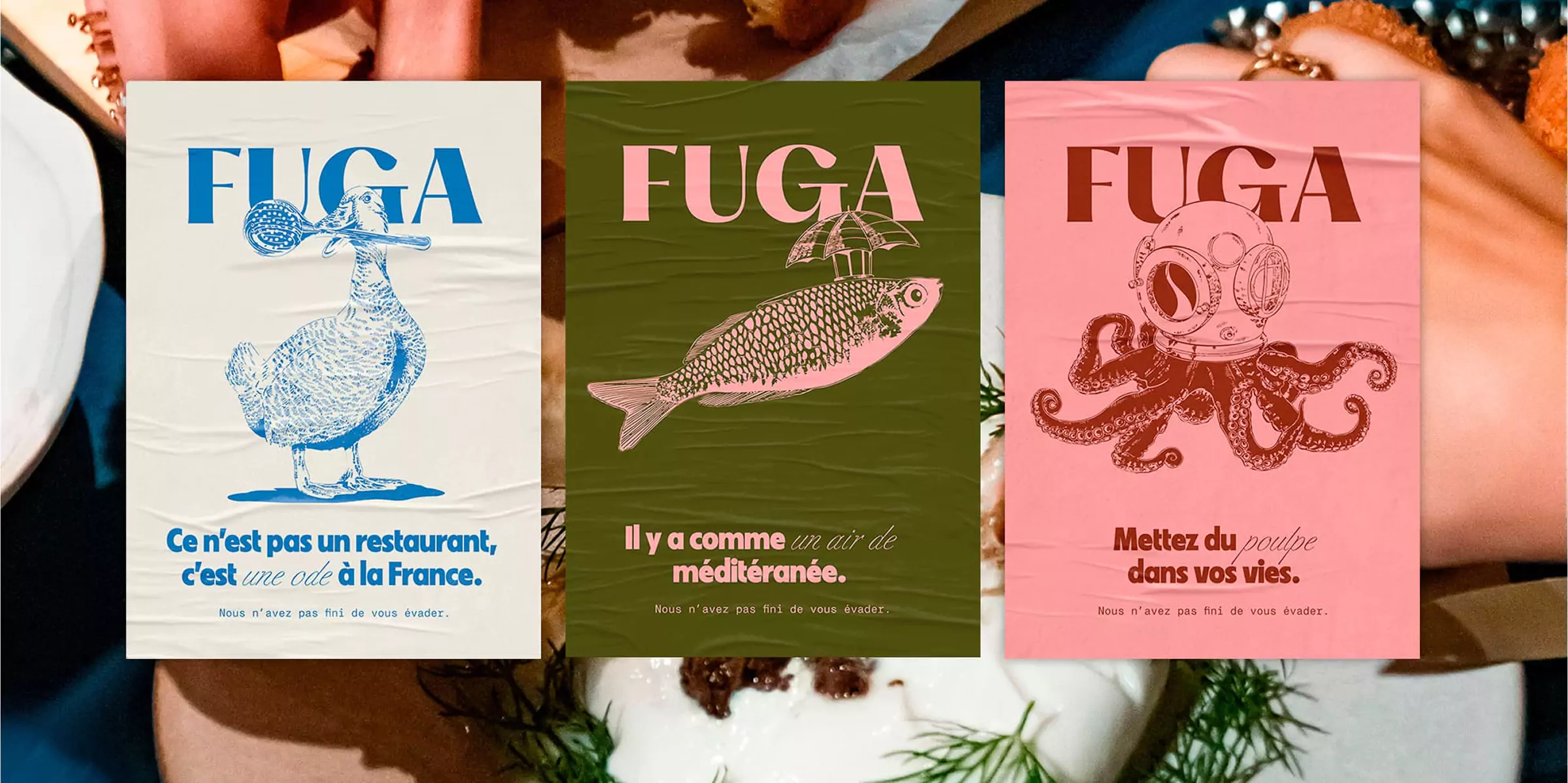
This is an approach that we fully share at Studio Elias, especially on projects like Pipole or Fuga. In these two cases, it was a question of designing a brand identity capable of living on very different media, social networks, web, print or motion, while maintaining a strong and identifiable signature.

The new Amazon system is a perfect example of this philosophy: simplicity is not synonymous with empty minimalism, but with efficiency. It is a strategic way to make the brand more agile, clearer and closer to its users, without ever sacrificing its personality.
A rebranding that matches Amazon's scale
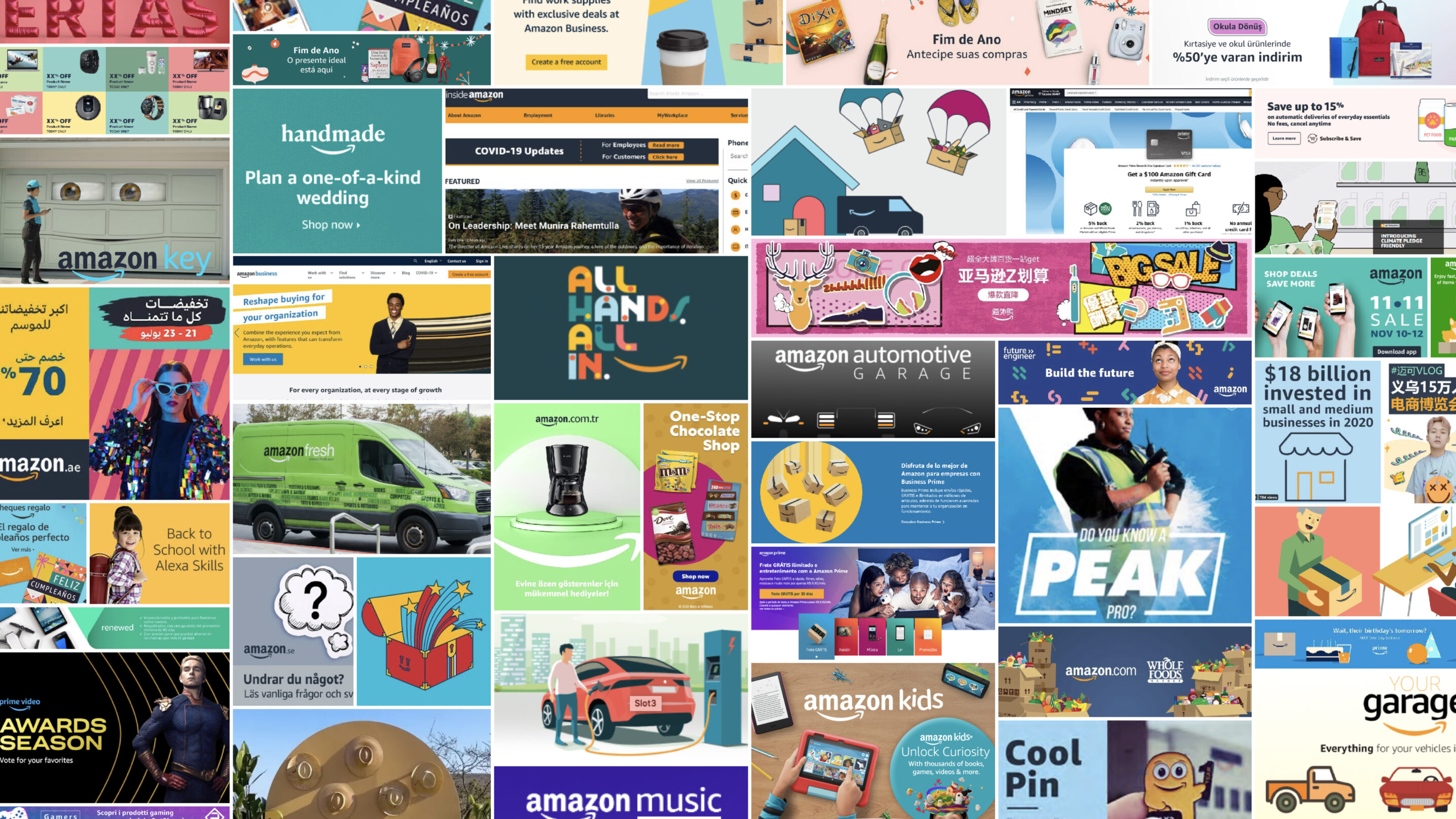
Redefining the visual identity of a giant like Amazon is not only a question of aesthetics: it is a strategic operation of a rare magnitude. The group needed to rethink how its brand was expressed through millions of product pages, apps, campaigns, and digital media across the world.
The challenge for Koto and the internal teams was not to “change for the sake of change”, but to clarify brand perception, in a world where every visual detail influences trust and the purchase decision. By rethinking its visual system, Amazon has restored coherence to its digital ecosystem while maintaining a human and accessible dimension.
This type of transformation is typical of major global brands, but it also inspires younger businesses looking to structure themselves without losing their personality. In fact, this is an approach that we often support at Studio Elias: rethinking branding not as a simple facelift, but as a tool to better tell stories, sell better, and better connect with its users.
Global consistency, from the marketplace to Prime Video
This new face of Amazon is being deployed on all of its contact points: the website, mobile applications, packaging, advertising, streaming, payment cards or even display campaigns. Nothing has been left to chance. Whether you order a product on the marketplace, follow a series on Prime or discover an Amazon Fresh offer, the experience remains fluid, legible and immediately recognizable.
This visual coherence creates continuity between the worlds of shopping, entertainment, and content, while reinforcing a sense of trust. The consumer knows that they are evolving in the Amazon ecosystem, regardless of the medium or the moment.
Branding then becomes a real driver of marketing performance: it attracts, retains and improves the overall perception of the company. A well-structured identity is also clearer communication, capable of transforming a simple interaction, a page, a package, into a coherent and engaging experience.

A lesson for all brands
The story of Amazon's transformation is a reminder that no company, even the most influential, is immune to visual fragmentation. As a brand grows, adds new offerings, services, or markets, its identity can lose consistency. Hence the importance of a clear brand system, designed to adapt to all contexts: telephone, web, print, streaming, delivery or product packaging.
This is exactly the philosophy we defend at Studio Elias: to develop your brand on solid foundations, while offering it an evolving design. A good visual identity is not just a logo or a color, it is a structure that allows creativity to be expressed without breaking coherence.
This balance between consistency and flexibility is the key to a strong and sustainable brand. And to go further on the subject, we invite you to read our article: How much does an agency rebrand cost?
An evolution driven by data and customer experience
Amazon's rebranding is not only based on a new visual identity, it is based on a detailed understanding of customer experience and buying behaviors. Each element of the design, from the logo to the color palette, has been designed to improve readability and navigation on all media: web, mobile or packaging.

The teams have also integrated the digital dimension into the heart of the device: typography optimized for screens, contrast studied for better accessibility, animations and fluid micro-interactions in applications. A more intuitive, clearer design that naturally accompanies users, whether they are viewing a product page, watching a Prime movie, or following a delivery on their application.
This approach centered on data and use is in line with the way we design brands at Studio Elias: branding is not limited to aesthetics, it becomes a strategic tool to improve each stage of the customer journey, from the first impression to conversion.
An identity designed for the whole world
This project is not only a graphic redesign: it is a reflection on how Amazon speaks to millions of people, in very different cultural and linguistic contexts. The brand does not sell the same thing in Tokyo, Paris or São Paulo, but it must nevertheless transmit the same emotion and promise.

By rethinking its visual system, Koto allowed Amazon to adapt its expression to different markets while maintaining a common base. The multi-lingual typography, unified color palette, and accessibility principles ensure a seamless experience for every user, regardless of country, language, or medium.
This is an approach that we also value at Studio Elias: creating identities capable of traveling, evolving and remaining recognizable everywhere. Design is no longer a simple matter of aesthetics; it is becoming a universal language, at the service of global understanding and coherence.
{{cta-2}}
In conclusion
With this new Amazon logo, the group proves that it knows how to reinvent itself without ever denying its essence. The iconic smile remains, but it is now part of a clearer, more modern and, above all, more globally consistent brand identity. This global work combines design, strategy and flexibility, three essential pillars to support the evolution of the group's offers, whether Amazon Prime, Kindle or Amazon Fresh. It is a strong example of sustainable and effective branding, where form and substance come together to strengthen customer relationships and visual recognition.
And if this project inspires you, discover another iconic rebranding, that of a French brand that has been able to transform its image while remaining true to its DNA: The rebranding of Decathlon: a strategic and ambitious transformation