Overview
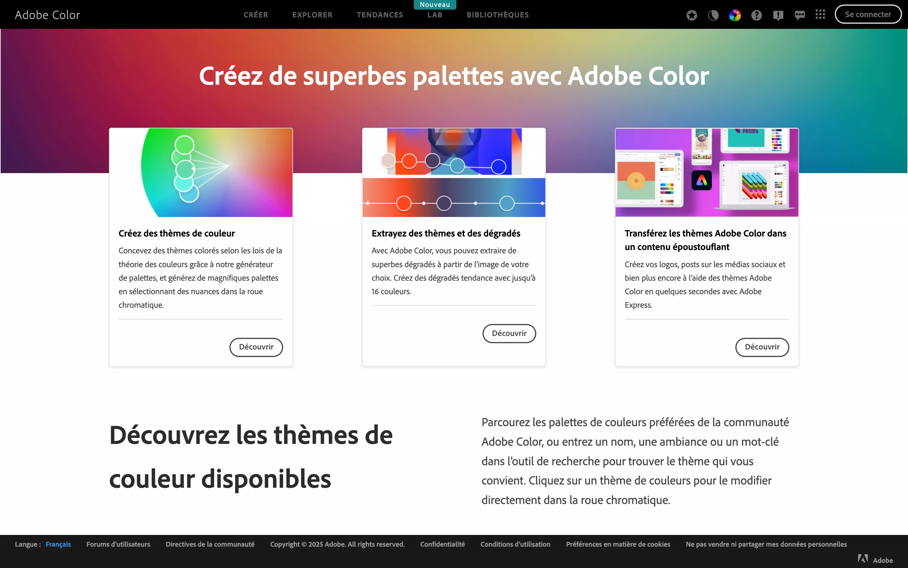
Adobe Color is an intuitive, powerful tool for generating and refining color palettes. Available online, it offers several creative modes based on harmony rules (complementary, analogous, triad, etc.), as well as tools to extract colors from an image, browse trends or analyze auto-generated themes. All in a visual interface that makes it easy to explore, share, save and bring palettes into your projects through Creative Cloud Libraries, Figma (via plugin) or Webflow (via hex codes).
Pros
- Intuitive exploration of color theory
Start from classic rules (complementary, monochrome, triad, etc.) or play freely with the color wheels. - Immersive extraction from images
Drop in a photo or an inspiring visual and instantly generate a palette from its dominant, subtle or ambient colors. - Stylish trends
Discover trending palettes used by the community or by sector (branding, social, packaging…) to stay current. - Smooth saving and reuse
Palettes can be saved to your Creative Cloud library, ready to use in Figma, Photoshop, Illustrator… or easily copied into Webflow. - Accessibility testing
Check contrast between colors (WCAG), essential for an interface that is accessible to all. - Light, fast interface
Just move the sliders, view the harmonies and copy hex codes in a few clicks; everything is built for speed.
Cons
- Limited customization
You get a palette, but adjusting color by color stays manual, with no automatic iterative testing. - Not built for offline use
Although integrated with Creative Cloud, it usually needs a connection and can’t be used offline. - Less rich than some pro generators
For complex systems or dynamic palettes, other tools may offer more granularity. - Few contextual suggestions
The tool gives you the palette but no usage guidance (text, background, UI, branding); it’s up to you to apply it in context.
Why Studio Elias recommends Adobe Color
At Studio Elias, Adobe Color is our reference to:
- Build consistent visual universes from the design phase onward.
- Quickly experiment with palettes from inspiring images or trends.
- Ensure suitable visual accessibility by testing contrast directly.
- Easily share color choices with our clients or teams through palette links or Creative Cloud.
It is an essential tool in our design toolbox: simple, effective and complementary to Webflow for creating visually powerful, harmonious interfaces.
A palette only works if it serves the brand: our guide to choosing your colour palette explains the method, and our visual identity agency builds palettes tested across every medium.