


Le secteur fintech ne vend plus seulement des services financiers : il vend de la confiance. Et le site internet est devenu le premier endroit où cette confiance se construit, ou se perd.
Ce top 30, d'Alan à Avnear, en passant par Swan, Pennylane, Spiko et Effiblue, confirme cinq tendances structurantes en 2026 : la preuve de confiance est omniprésente (chiffres clés, logos partenaires, notes vérifiables), le SEO et le contenu sont devenus des actifs à part entière, la donnée en temps réel s'intègre dans l'expérience, l'UX simplifie des produits complexes, et l'IA personnalise l'expérience visiteur.
Ce que les meilleurs sites fintech ont en commun : ils ne se contentent pas d'expliquer un produit. Ils structurent une offre complexe, répondent aux objections, proposent un parcours clair vers la conversion et renforcent la crédibilité de la marque à chaque scroll.
Un site fintech réussi n'est pas seulement rassurant. C'est un système complet qui génère de la valeur, pour l'entreprise comme pour ses utilisateurs.
Le secteur fintech ne vend plus seulement des services financiers : il vend de la confiance. Sur un marché où chaque entreprise promet de simplifier la banque, le paiement ou la gestion de patrimoine, le site internet est devenu le premier point de contact entre une marque financière et son client. Il ne s'agit plus d'un simple support d'information, mais d'un véritable outil de conversion, capable de rassurer un utilisateur avant même qu'il n'ouvre une application ou ne parle à un expert.
Une entreprise fintech qui veut se différencier sur un marché saturé doit donc penser son site comme un actif stratégique. Il doit refléter la solidité de l'entreprise, la clarté de son offre et la maîtrise de sa technologie, tout en restant simple à utiliser pour le grand public comme pour les investisseurs.
Un bon site fintech permet de :
Les meilleures entreprises fintech l'ont compris : leur site internet est aujourd'hui leur meilleur commercial, disponible 24 heures sur 24, sur tous les marchés. Qu'il s'agisse d'une néobanque, d'une plateforme d'investissement ou d'un service de gestion de patrimoine, le principe reste le même : chaque page doit aider le visiteur à comprendre, en quelques secondes, pourquoi il devrait faire confiance à cette entreprise plutôt qu'à une autre.
C'est justement l'objet de ce classement. Nous avons sélectionné 30 sites internet fintech, en France et dans le monde, qui illustrent chacun à leur manière comment la stratégie de marque et le design peuvent transformer un service financier en expérience mémorable et aider une entreprise à créer un lien durable avec ses clients. Ce sont, à nos yeux, parmi les meilleurs sites du secteur.
Le secteur financier a longtemps été perçu comme rigide, institutionnel, parfois froid. Les fintechs ont changé la donne en plaçant l'expérience utilisateur au centre de leur stratégie digitale. Aujourd'hui, un site fintech performant repose sur plusieurs piliers :
Les fintechs les plus avancées utilisent aussi la donnée pour améliorer leur site en continu : elles analysent le comportement de leurs visiteurs, testent différentes pages et optimisent chaque parcours pour maximiser la conversion. 👉 Le site devient alors un véritable système au service de la croissance, capable de s'adapter en temps réel aux besoins du marché.
{{cta-1}}
Tous les sites fintech ne se valent pas. Les meilleurs partagent des caractéristiques communes qui permettent de comprendre immédiatement :
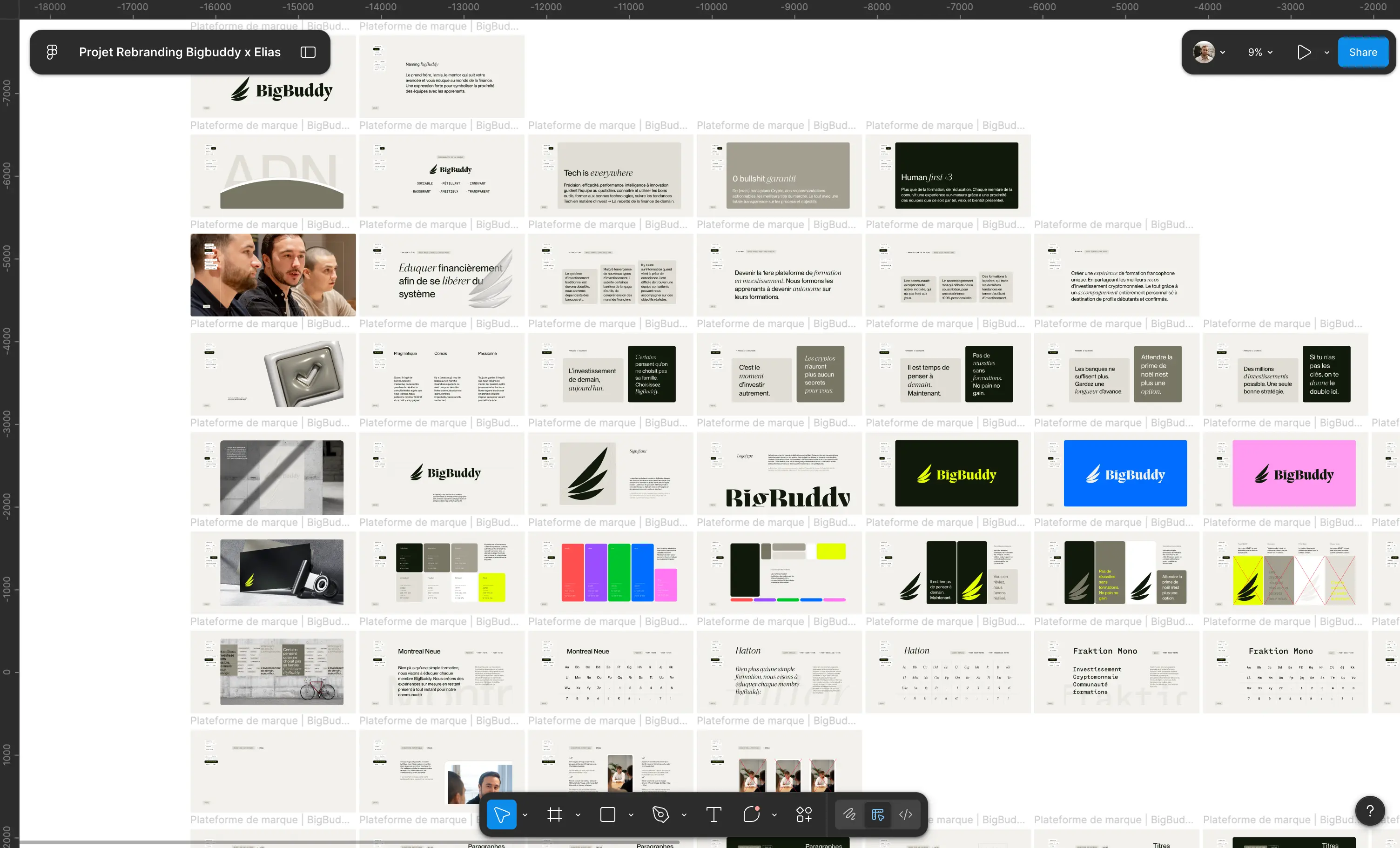
Comme pour ces plateformes, chez Studio Elias, on va plus loin. On intègre une stratégie de marque claire, une identité visuelle forte, un discours structuré autour de la valeur créée et des preuves concrètes de performance. 👉 C'est cette combinaison qui transforme un site financier en véritable outil de conversion, capable de rassurer un utilisateur sur un sujet aussi sensible que son argent.
{{block-cta-1}}
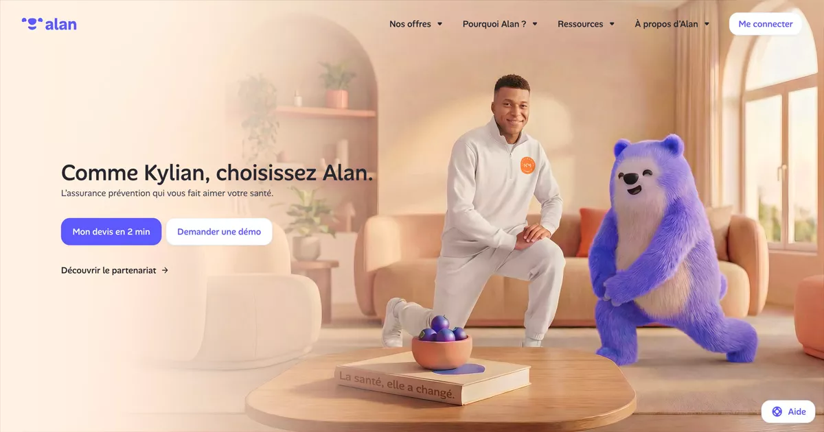
Une assurance santé pensée pour être comprise en un coup d'œil.
Alan reste la référence absolue du branding startup français dans le secteur financier et l'assurance santé. L'entreprise a construit un univers illustré coloré, cohérent sur chaque page, qui rend un sujet complexe accessible à tous les utilisateurs. Le site s'appuie sur un contenu clair, une navigation simple et une identité de marque immédiatement reconnaissable, renforçant la confiance sur un marché aussi exigeant que la santé et la finance.
C'est la définition d'une [identité visuelle](https://www.elias.studio/savoir-faire/identite-visuelle) solide, notre article sur comment créer une identité visuelle forte développe ce point.
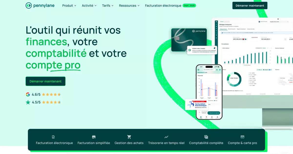
Une plateforme financière pensée pour les experts-comptables.
Pennylane s'adresse à un public professionnel exigeant et le fait savoir dès la page d'accueil. Le site propose une identité SaaS premium très maîtrisée, avec une hiérarchie de contenu qui met en avant les fonctionnalités clés de l'outil : gestion, facturation, données comptables en temps réel. La marque démontre une expertise réelle du secteur financier tout en restant simple à utiliser au quotidien.
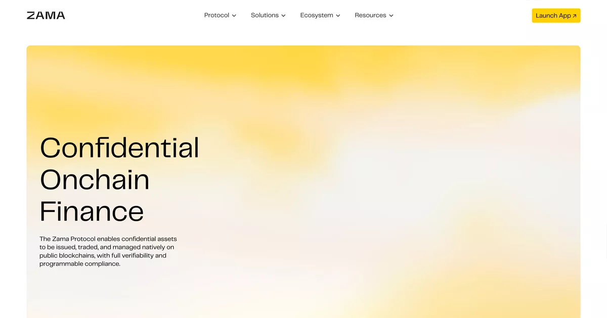
Le chiffrement homomorphique au service de la blockchain.
Zama développe une technologie de pointe pour sécuriser les données financières et cryptographiques, et son site le prouve. L'identité deeptech et crypto est très travaillée, entre rigueur scientifique et modernité visuelle, fruit d'un important travail de recherche mis en scène avec sobriété. Le contenu explique une innovation technique complexe de façon pédagogique, un exercice rare dans un secteur souvent hermétique.
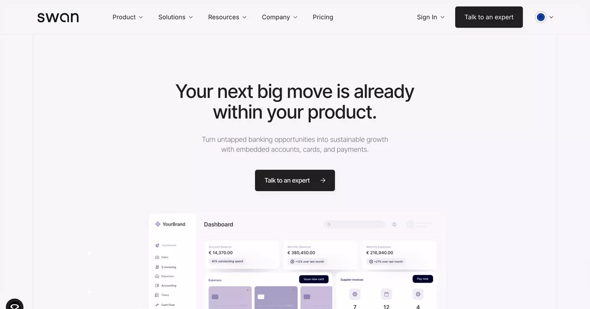
Le Banking-as-a-Service pensé pour les développeurs.
Swan illustre parfaitement la nouvelle génération de services bancaires en ligne destinés aux entreprises tech. Le site adopte une approche « developer-first » à la française, avec une documentation claire, un design épuré et un discours orienté sur la facilité à intégrer sa technologie. Une référence pour toute plateforme qui doit convaincre à la fois des équipes produit et des décideurs financiers.
C'est l'enjeu d'une stratégie de marque claire : définir qui on s'adresse avant de penser le design.
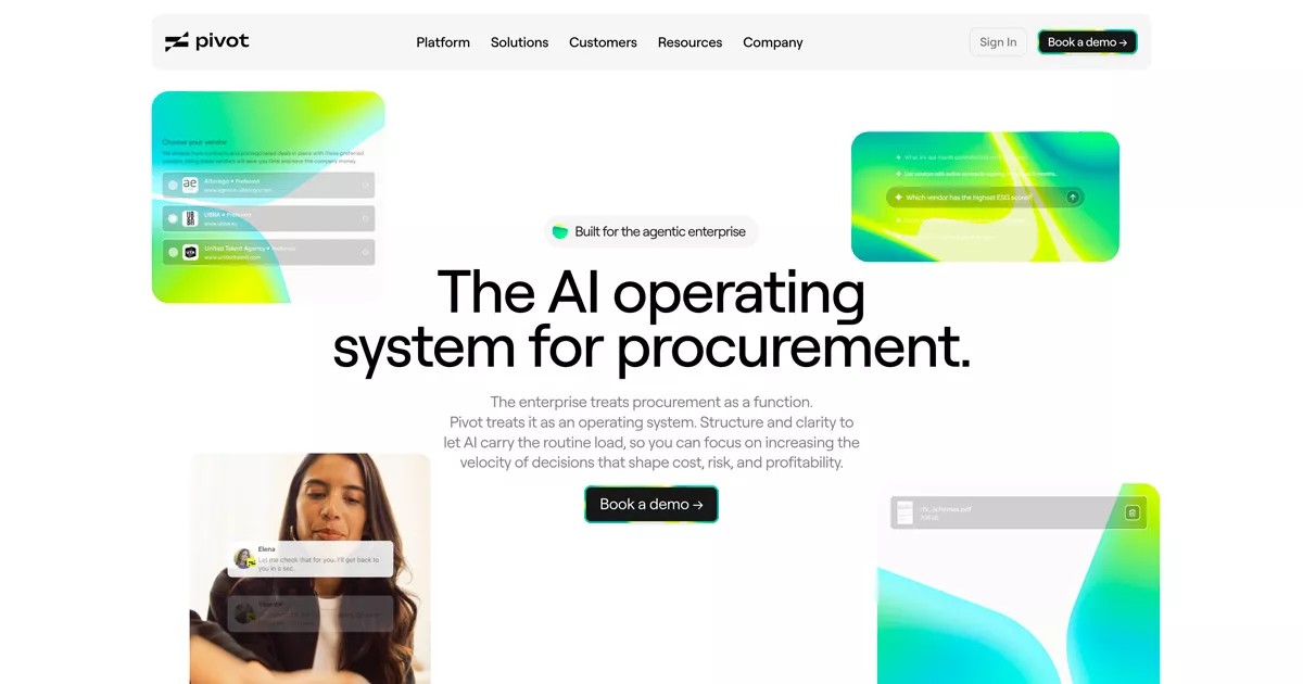
Des achats d'entreprise pilotés par l'intelligence artificielle.
Pivot mise sur une identité SaaS contemporaine pour présenter une solution encore récente sur le marché des achats professionnels. Le site utilise un design épuré et une structure de contenu simple pour expliquer comment l'intelligence artificielle peut optimiser la gestion financière d'une entreprise. Un bon exemple de la manière dont une jeune marque peut affirmer son expertise dès ses premières pages.
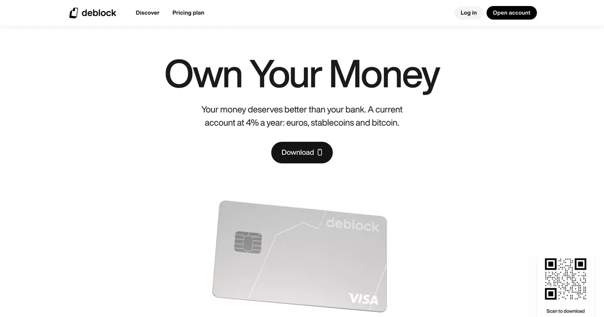
Une banque crypto sans garde-fou, assumée jusque dans son design.
Deblock revendique un positionnement radical sur le marché des cryptomonnaies et le traduit dans un branding crypto-natif résolument moderne. Le site combine un ton direct, une identité visuelle affirmée et une mise en avant claire des fonctionnalités de paiement et d'investissement.
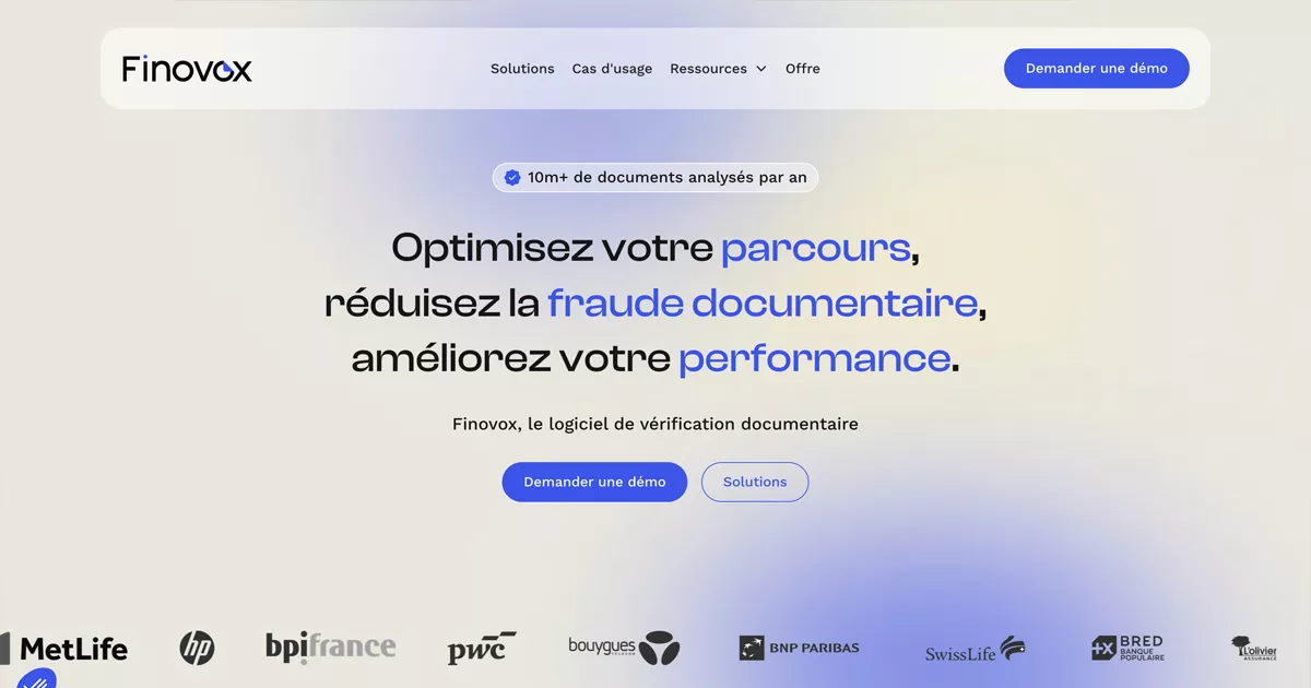
La détection de fraude documentaire au service des banques et des assurances.
Finovox s'adresse aux acteurs les plus réglementés du secteur financier, banques, assurances, fintechs et organismes de crédit, et son site en assume toute la rigueur. L'identité mise sur une palette verte qui inspire confiance et sécurité, une mise en page épurée et des statistiques chiffrées qui démontrent la fiabilité de la technologie. Avec des clients comme BNP Paribas ou MetLife affichés en preuve sociale, le site transforme un sujet aussi technique que la vérification documentaire en véritable argument de crédibilité.
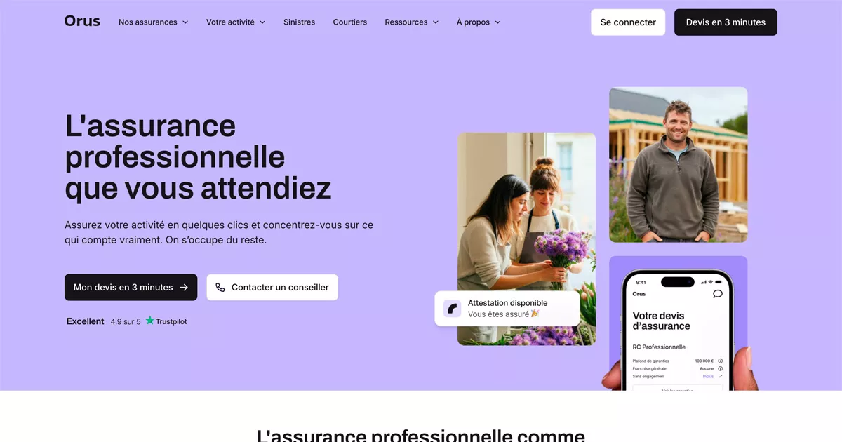
Simplified business insurance for SMEs.
Orus uses a direct tone and a fresh visual style that breaks away from the traditional codes of the banking and insurance sectors. The site makes a topic often perceived as complex accessible by focusing on simple content, fluid navigation, and visuals that inspire trust.
An ESG platform designed for responsible investors.
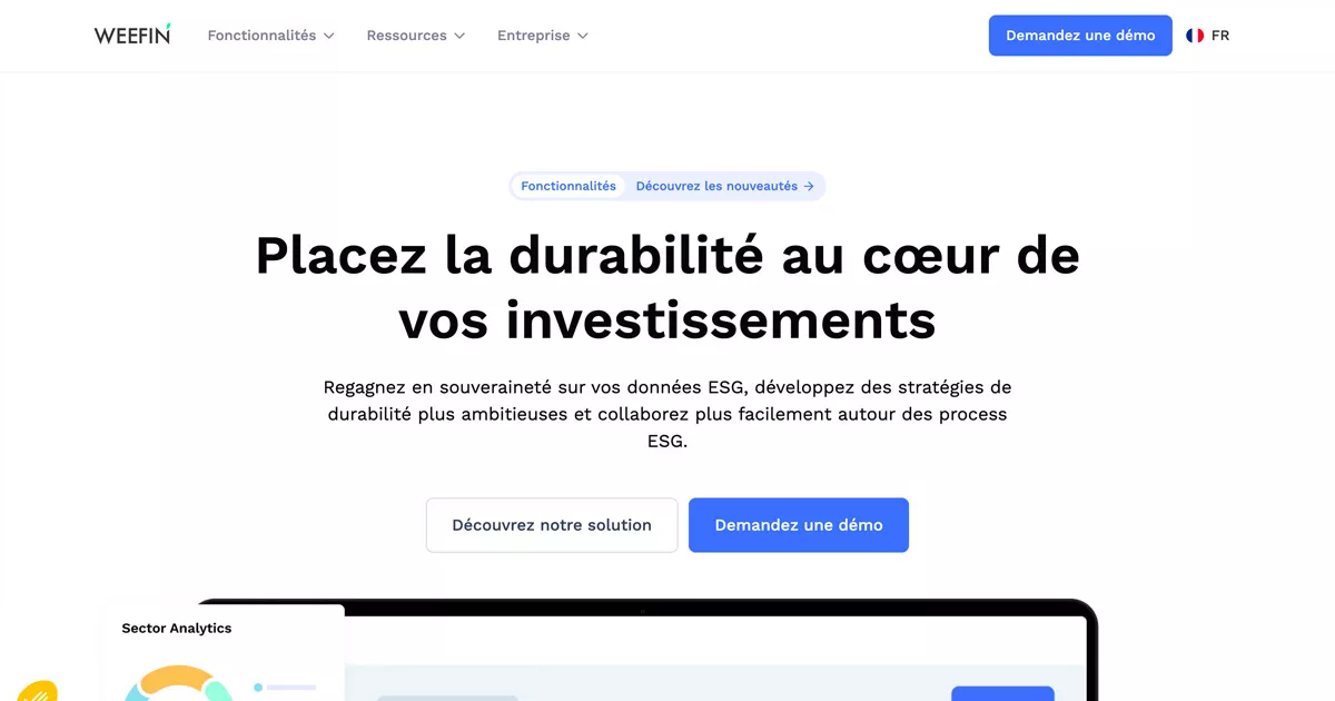
WeeFin has established itself as a benchmark in sustainable fintech, with a sober branding that reflects its positioning in responsible finance. The site highlights ESG data and analysis tools intended for evaluating investment portfolios, all while maintaining a clean visual identity. It is a great example of how a financial company can combine professionalism, technology, and positive impact.
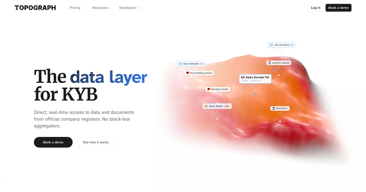
The KYB data layer designed for fintechs and neobanks.
Topograph targets fintechs, neobanks, and compliance software providers that need to verify business identities in real time. The site relies on a clean design and clear typography to convey a highly technical positioning: direct access to official registries, without intermediaries. The displayed certifications (SOC 2, ISO 27001, GDPR) and client logos build trust in a field as sensitive as regulatory compliance.
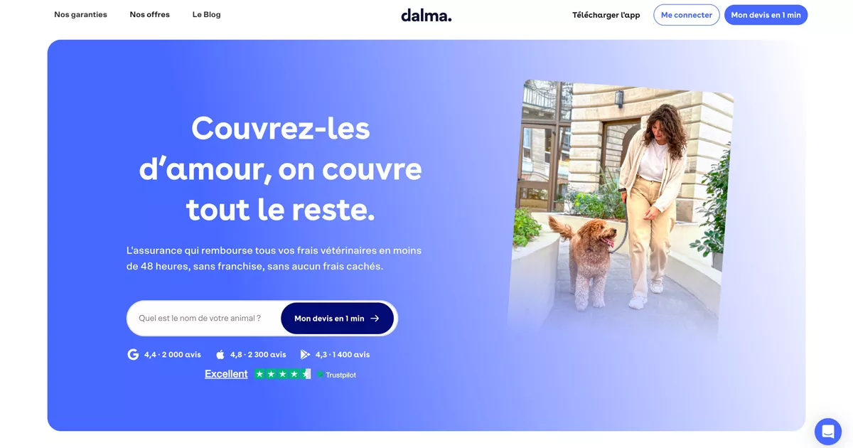
Pet health insurance that breaks industry norms.
Dalma proves that a financial product, even in a niche sector like pet health insurance, can rely on warm and colorful branding. The site uses an accessible pet-tech aesthetic to reassure visitors on a sensitive subject.
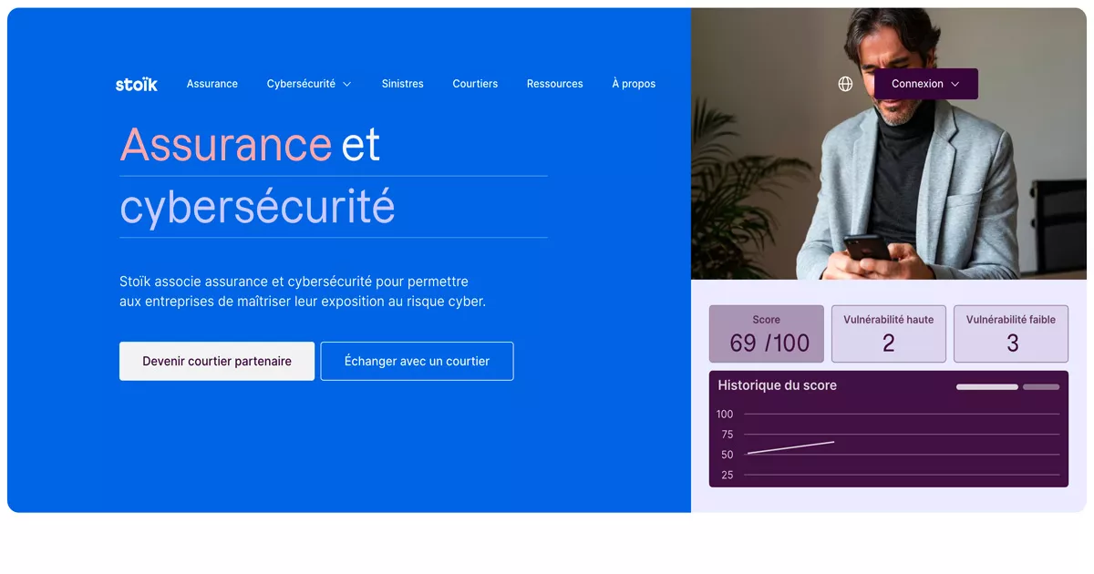
Cyber insurance designed to reassure decision-makers.
Stoïk targets companies facing growing digital risks, and its site reflects this with a modern and reassuring insurtech identity. The content highlights the team's technical expertise and the simplicity of the subscription process.
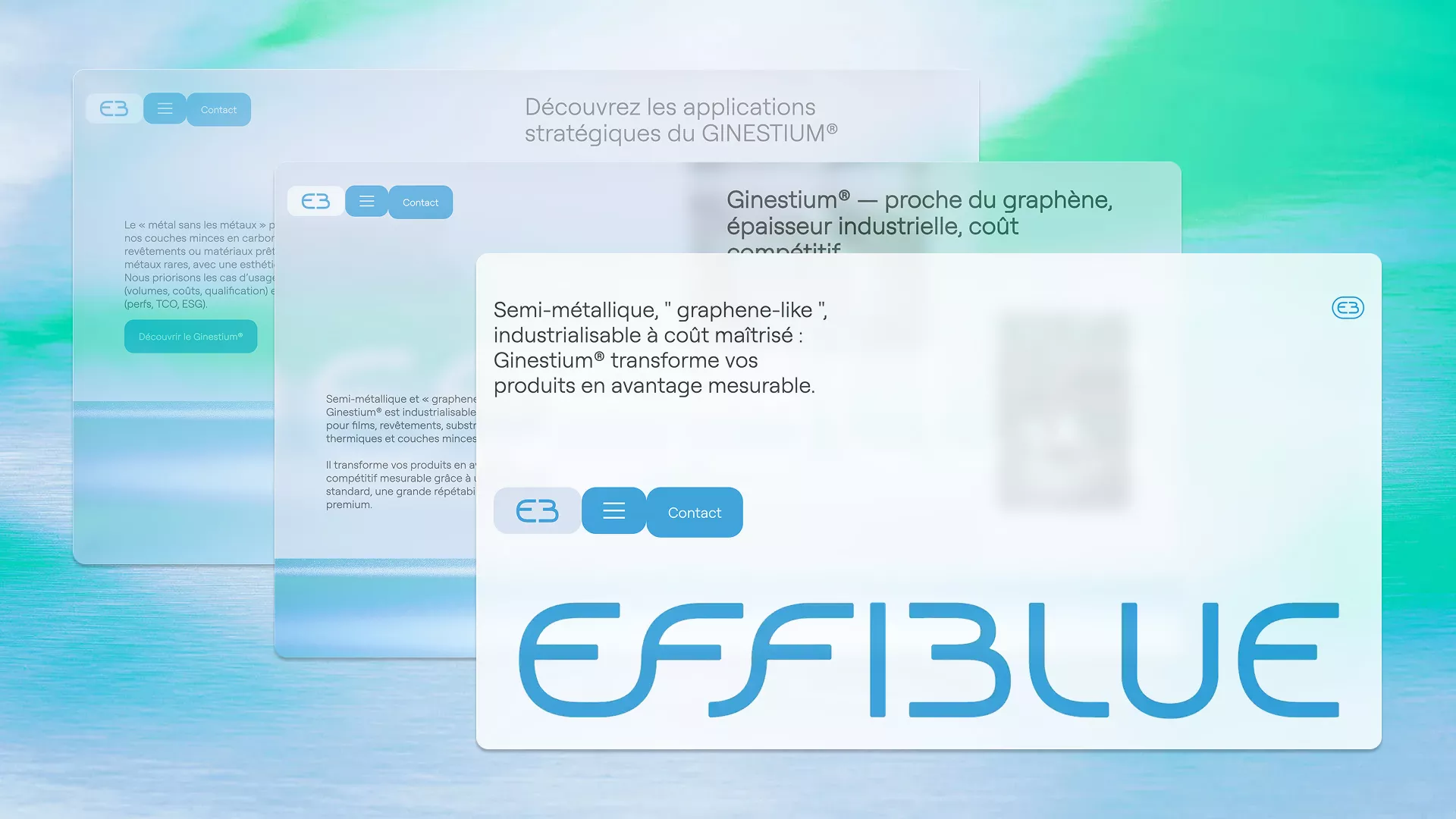
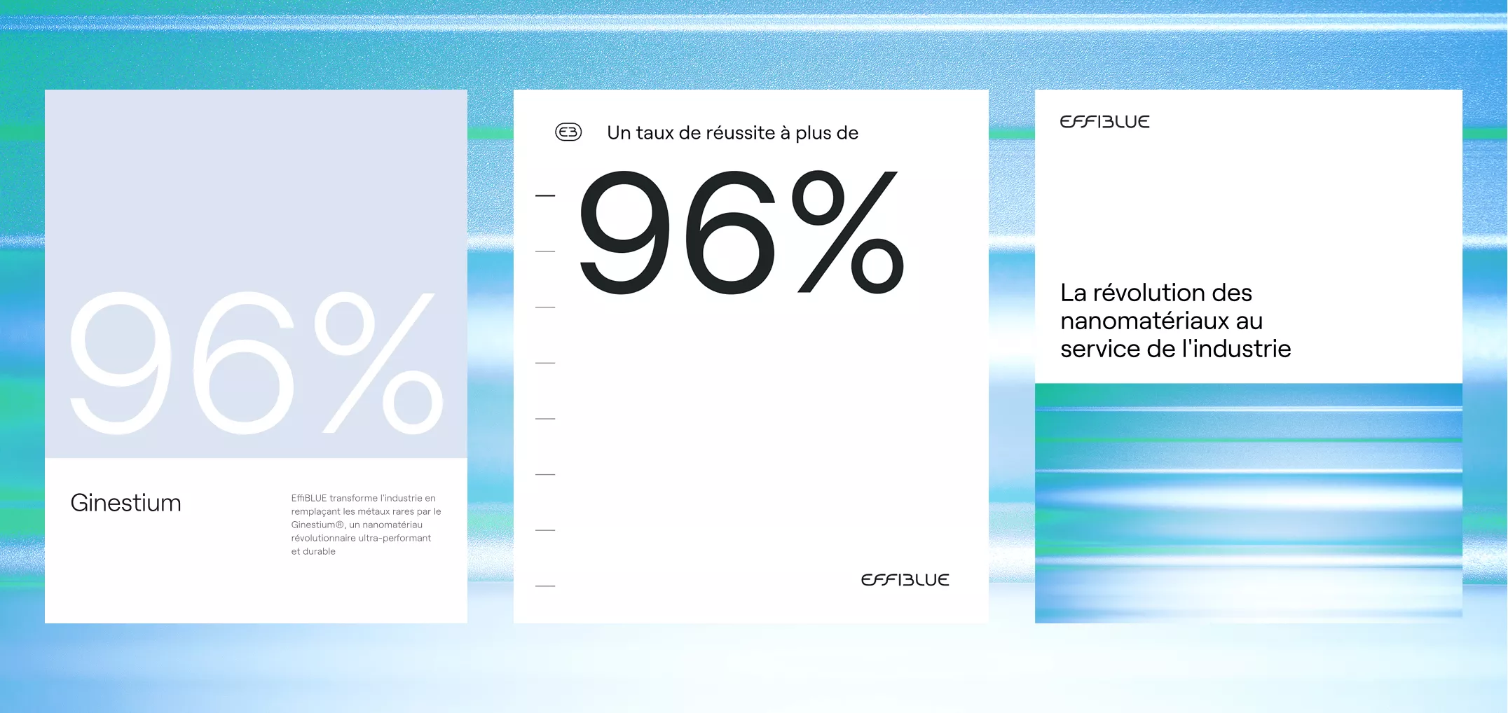
Our Effiblue project, designed to win over financial investors.
Our Effiblue project illustrates how a website can become a powerful tool for a funding strategy. Developed to support a breakthrough technological innovation (Ginestium®), the brand needed a site capable of earning investor trust ahead of a strategic fundraising round.
The site is built on:
👉 A concrete example of how branding can serve financial goals, far beyond the traditional fintech sector.
To understand our approach, read our article on when to rebrand your visual identity.
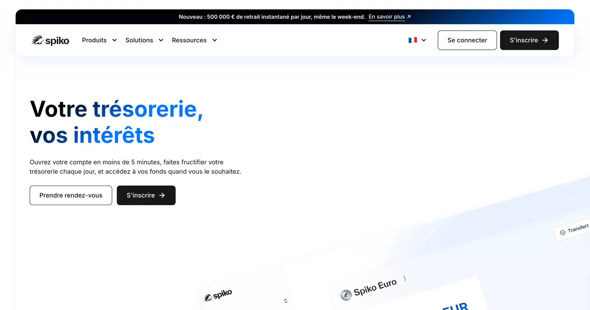
Next-generation investment funds.
Spiko is part of the new wave of crypto and fintech brands that rely on clarity to persuade. The site presents a complex investment offering in a simple way, with content that explains the mechanics of investment funds without unnecessary jargon. A benchmark for platforms that need to make financial products, still unfamiliar to the general public, accessible.
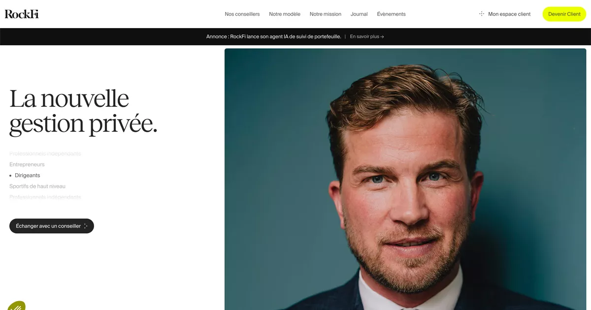
Private wealth management, modernized.
RockFi is taking on a historically conservative sector with high-end wealthtech branding. The site showcases wealth management expertise through a sober design and a fluid user experience. A great example of how a brand can modernize a premium financial service without losing credibility with its clients.
{{cta-2}}
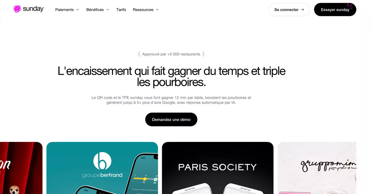
The QR code payment that changed the restaurant industry.
Sunday has built an instantly recognizable consumer brand around a simple action: paying the bill in seconds. The website displays strong brand consistency, from the logo to the tone of voice, and demonstrates how a payment fintech can become a daily habit. A benchmark for any company looking to turn a financial service into a memorable experience.
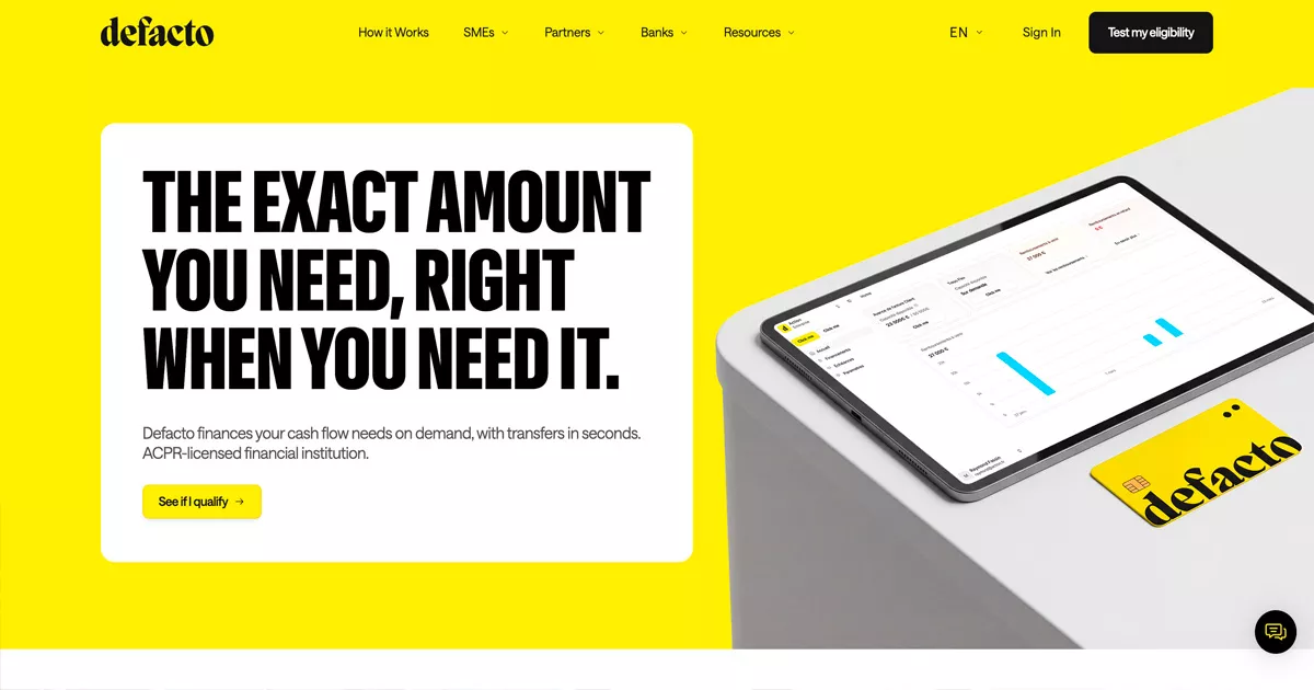
Instant financing designed for SMEs.
Defacto addresses a concrete need: accelerating access to credit for small and medium-sized businesses. The site adopts a modern, direct B2B fintech branding, with content that gets straight to the point regarding timelines, amounts, and financing terms. A great example of how simplicity can become a competitive advantage in the credit market.
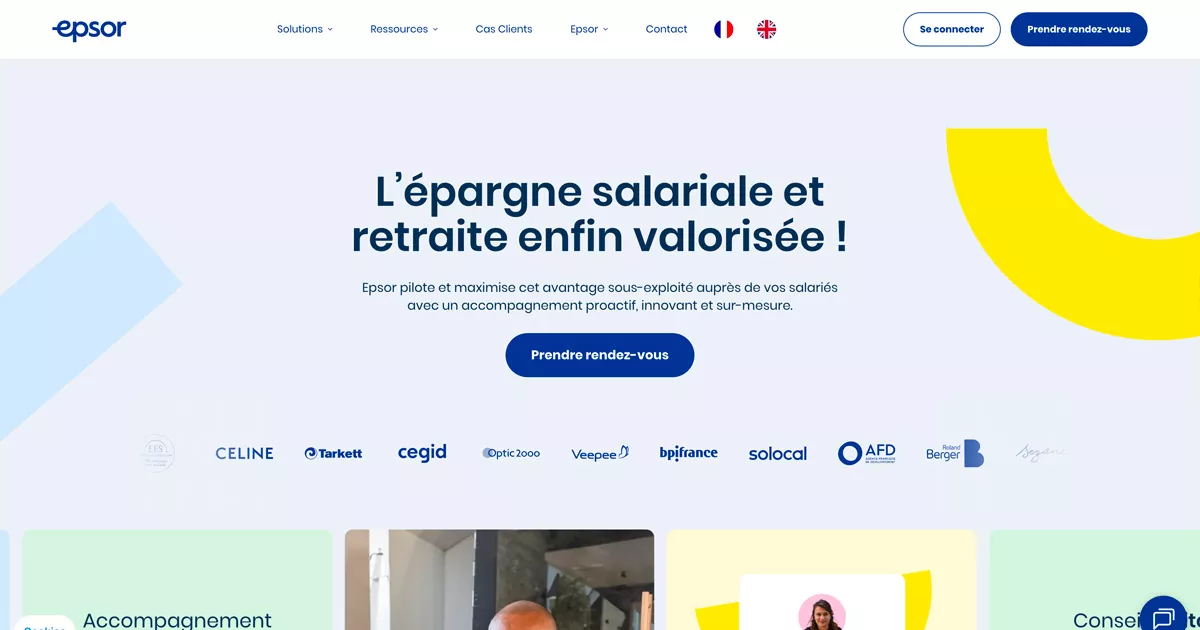
Employee savings, finally made accessible.
Epsor tackles the vast subject of savings and retirement with a resolutely accessible HR fintech identity. The site simplifies a complex administrative journey by focusing on clear content and a user experience designed to help every employee manage their money better, as well as the company supporting them. A benchmark for financial services that need to reach a non-expert audience.
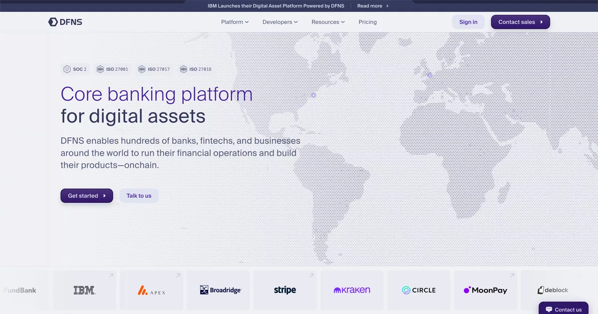
Securing digital assets, without compromise.
Dfns targets a technical and demanding market: digital asset security. The site adopts a sober cybersecurity and Web3 branding that inspires confidence without visual excess. The content highlights the system's reliability and the team's technical rigor, two essential criteria for convincing institutional clients.
SaaS procurement optimization, made transparent.
Najar offers a clear product positioning in a still-young market: corporate SaaS spend management. The site structures its content around the concrete needs of finance teams and IT decision-makers. A great example of how a B2B fintech can differentiate itself by focusing on simplicity rather than technical complexity.

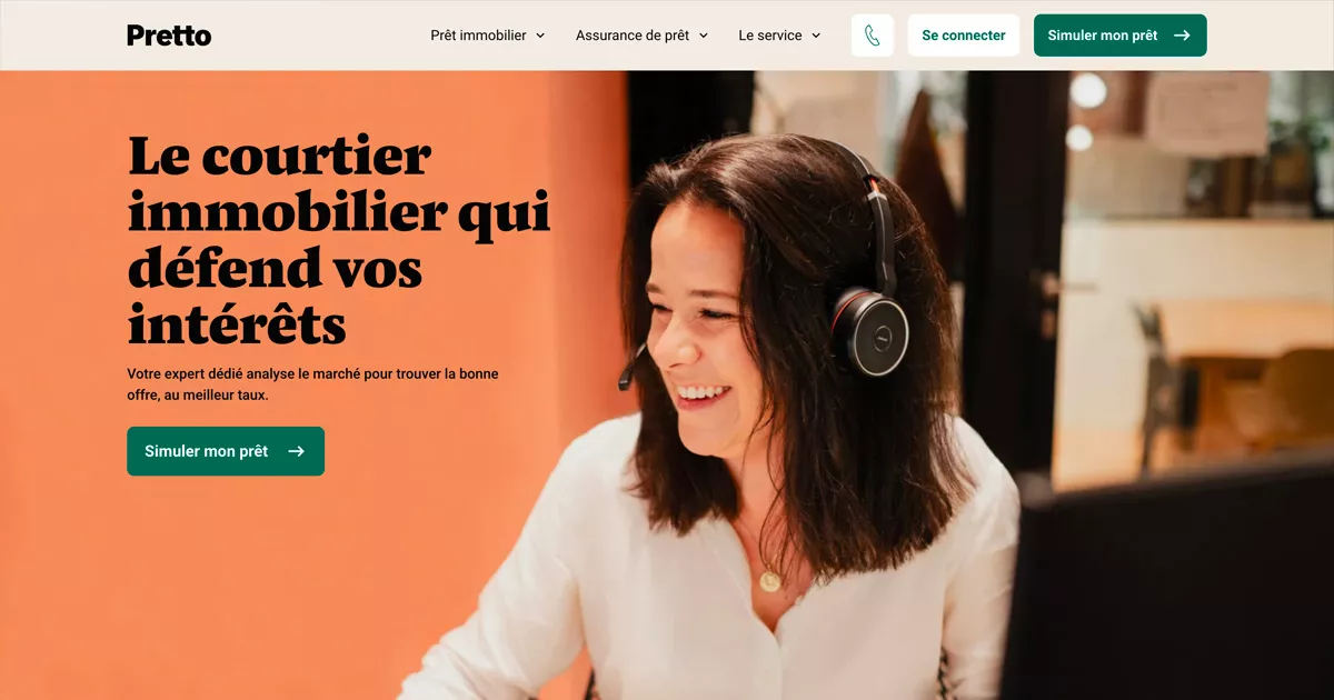
Online mortgage brokerage, providing peace of mind from the first click to the last.
Pretto has built a highly polished consumer-facing website, designed to reassure visitors during one of the most significant financial decisions of their lives. The content explains every step of the mortgage process with simplicity while highlighting the expertise of its brokers. It serves as a benchmark for banking services looking to humanize a journey often perceived as complex.
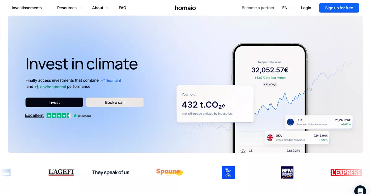
Making carbon markets accessible to individuals.
Homaio provides access to the carbon market, a financial space long reserved for institutions. Their climate and finance branding is fresh yet cohesive, featuring educational content that explains how to invest in the ecological transition. It is a prime example of how a fintech can successfully combine financial performance with environmental impact.
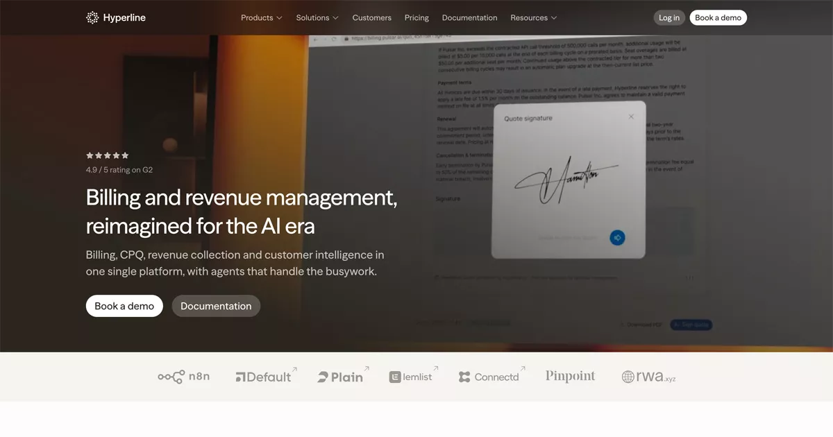
Billing and revenue management designed for the AI era.
Hyperline relies on a hero video and highly polished product showcases to win over B2B SaaS companies. The site adopts a distinctly modern tone driven by artificial intelligence and confidently displays its 4.9/5 rating on G2 as social proof. It is a reference point for platforms aiming to demonstrate performance through concrete data rather than mere promises.
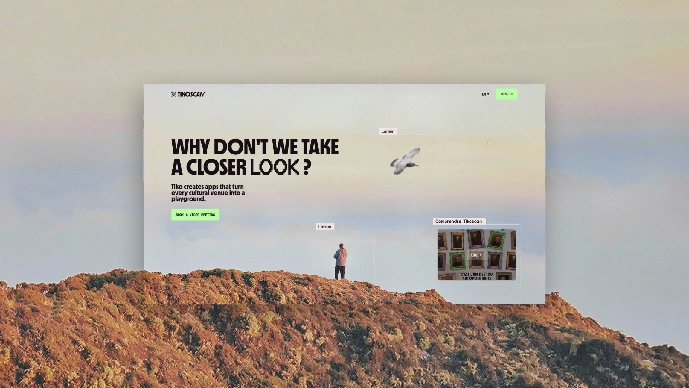
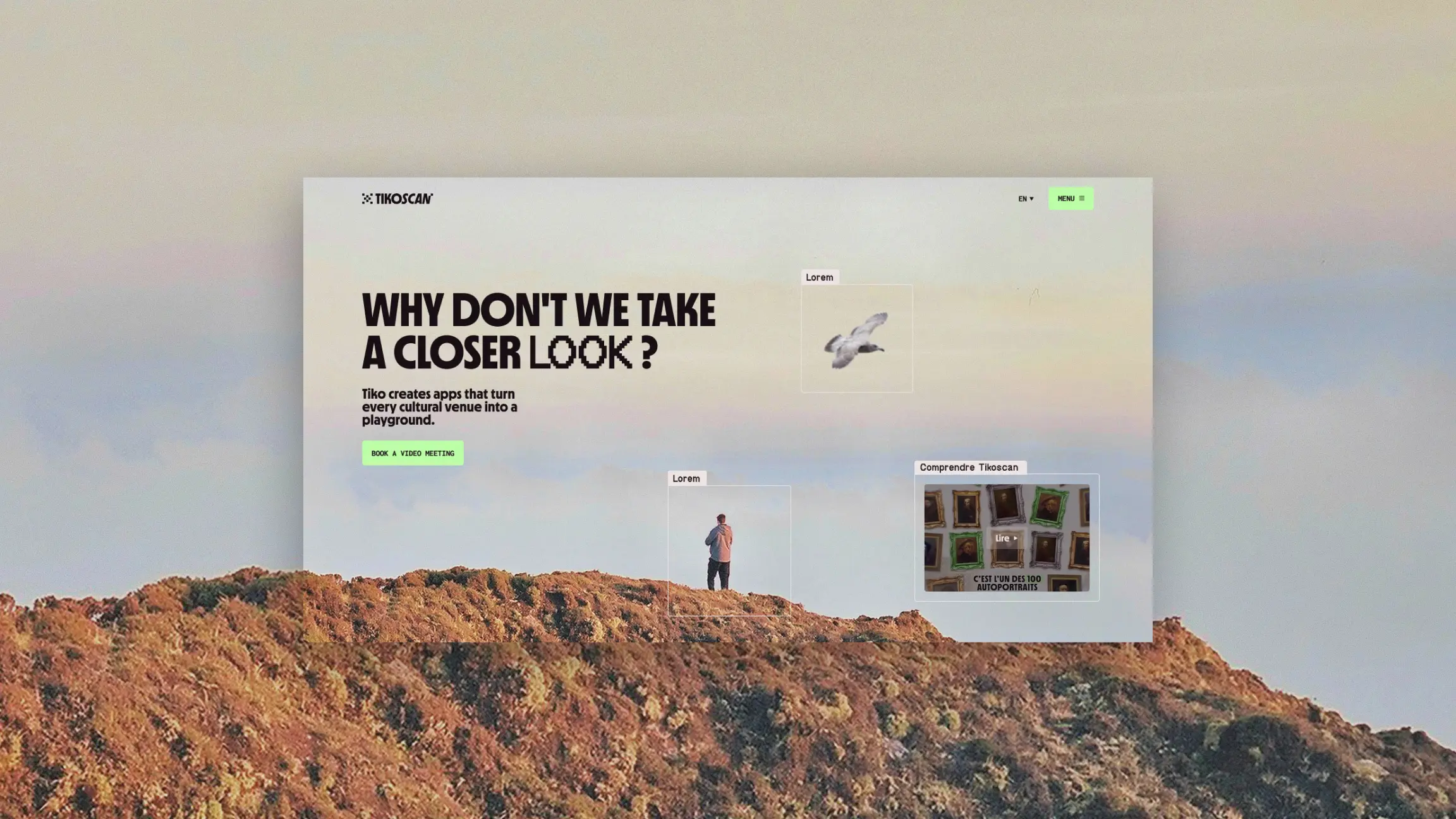
Our Tikoscan project: a growth strategy designed as a system.
Our Tikoscan project demonstrates how a well-crafted brand identity can directly serve business and financial objectives. The company, which specializes in real-time visual recognition for cultural venues, needed to structure its prospecting to triple its growth targets.
The work accomplished allows for:
👉 Proof that the rigor applied to fintech brands applies just as much to a high-growth tech company.
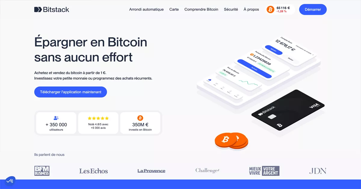
Bitcoin savings, mobile-first.
Bitstack showcases its app through polished screenshots and a physical card co-branded with names like Nike, Netflix, and Ikea. The site targets a mainstream audience discovering cryptocurrency investment, using an accessible aesthetic and content that demystifies digital savings. A benchmark for fintechs looking to democratize a product still perceived as technical.
Anti-theft insurance designed for luxury goods.
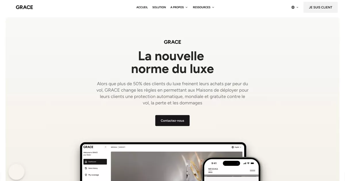
Grâce builds its site using the visual language of luxury, blending elegant storytelling with features on clients like Rimowa and Messika. It is one of the highest-quality sites in the insurtech sector, capable of reassuring a demanding clientele about the protection of high-value assets. A remarkable example of how a financial brand can borrow the codes of another industry to strengthen its legitimacy.
Private equity real estate investment, democratized.
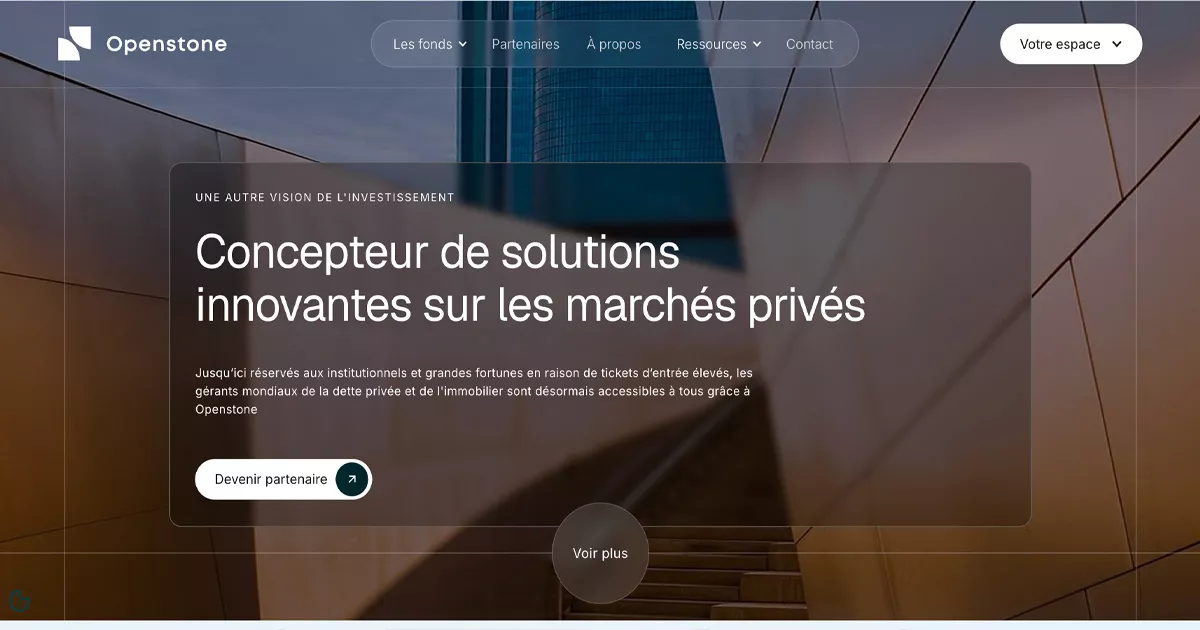
Openstone features a high-end institutional design, highlighted by a video from its Chief Investment Officer and logos as prestigious as Blackstone, Goldman Sachs, and Carlyle—global benchmarks in financial markets. The site makes a market historically reserved for institutional investors accessible, while maintaining a level of visual sophistication worthy of the industry's biggest players.
A white-label insurance company designed for brokers.
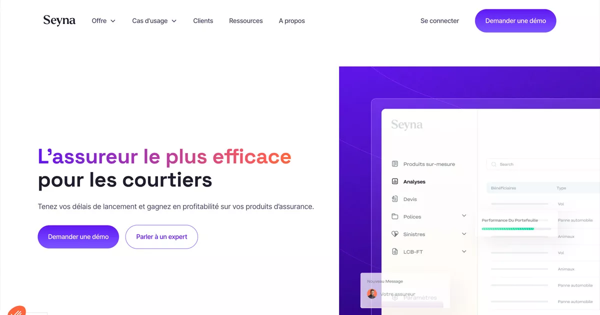
Seyna relies on clean typography and highlighted key figures, such as 57% growth or 142 million euros in premiums, to demonstrate its performance. The site adopts a distinct B2B SaaS tone, where data directly serves the brand's credibility. A great example of how the financial sector can use its own results as a sales argument.
Smart payment solutions designed for e-commerce merchants.
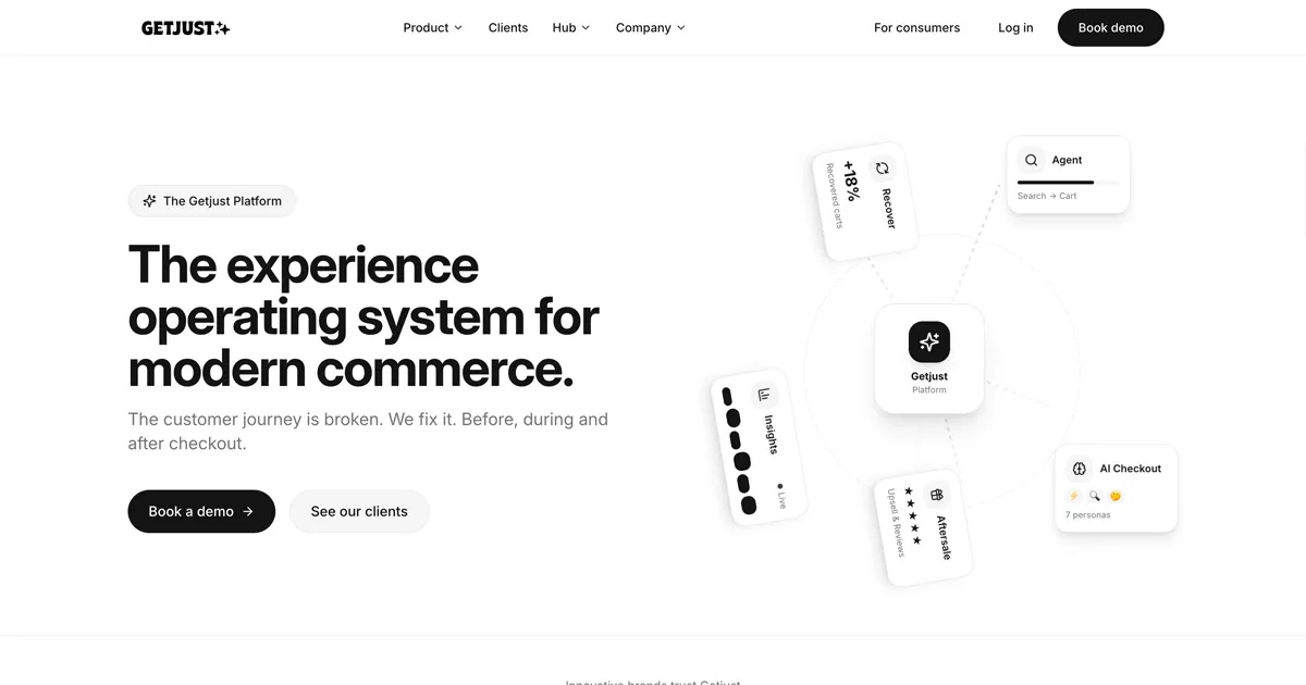
Just focuses on "smart checkout," an area where every second counts for e-commerce conversion rates. The branding is modern and commerce-oriented, with content that concretely explains how the product improves its clients' financial performance. A benchmark for payment platforms that need to prove their value in seconds.
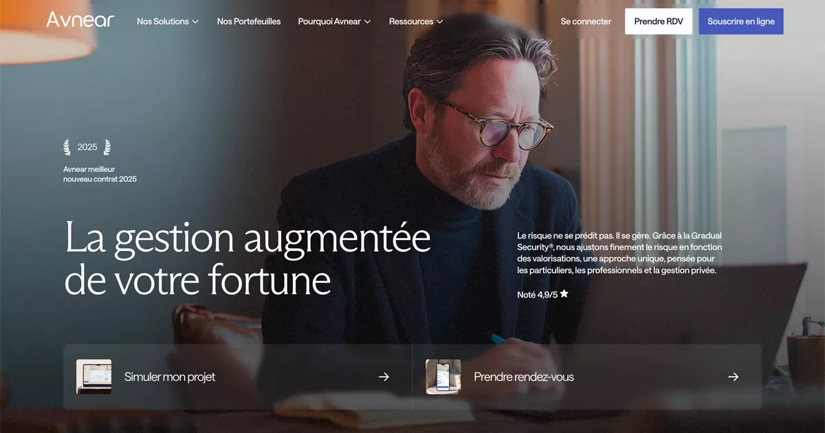
Wealth management, augmented by artificial intelligence.
Avnear rounds out this ranking with a premium financial aesthetic, supported by 4.9/5 rated testimonials and a strong press presence highlighted on the site. The brand combines advanced technology with human reassurance to appeal to a clientele with high standards for wealth management. It is a perfect summary of what the best fintech sites should aim for today: trust, data, and simplicity.
Fintech websites are evolving rapidly, keeping pace with a financial sector that is itself undergoing a major transformation. Several clear trends emerge from this ranking.
Fintech companies no longer just claim to be reliable; they prove it. The best sites showcase:
👉 Trust has become a core feature of the website, just as important as the product itself.
Search engine optimization has become essential for any financial platform that wants to be found before it can be chosen. The best fintechs are developing robust marketing strategies around their content—both on their websites and social media—designed for the long term:
We discuss this in our article dedicated to SEO optimization.
👉 The goal: drive qualified traffic and build long-term brand credibility.
Data is at the heart of both product and design decisions. The most advanced fintechs use:
👉 Every feature is designed to measure and improve service performance, and to give users better visibility into their money and daily activities.
Faced with sometimes complex financial products, user experience has become the primary differentiator. A good site must:
👉 Simplification is the first step toward building trust.
Artificial intelligence and advanced technologies are now being integrated directly into the website experience, not just the product. They allow for:
👉 A trend that will continue to shape the sector in the years to come.
A fintech website can no longer just be beautiful. It must be designed as a complete system, capable of reassuring a client on a subject as sensitive as their money, demonstrating real expertise in the financial sector, and converting a casual visitor into a loyal customer or a convinced investor.
The best companies in this ranking build their websites as a true business asset, at the intersection of brand strategy, technology, and performance. They understand that trust cannot be claimed; it must be demonstrated, page after page, data point after data point. Developing such a platform takes time, but it is this creative work that ultimately allows for an experience that lives up to the company's ambitions.
At Studio Elias, a branding agency and Webflow development, every site is designed to align brand identity, content, and financial goals, regardless of the company's industry. Whether the project is a consumer neobank, an investment platform, or a B2B tool for accountants, the method remains the same: understand the business, structure its messaging, and design a visual system built to last, both on its website and across all its online platforms.
{{cta-3}}
👉 A successful fintech site isn't just reassuring. It’s a site that generates value, for both the company and its users.









.jpg)
.jpg)





%20(1).gif)