


In 2025, web design will emerge as a powerful platform for brand expression. It's no longer just about aesthetics, but about impact, identity, and experience. The most impactful websites share several common characteristics:
In 2025, good web design will be one that marries creativity with utility, transforming a website into a true brand experience.
Every year, web design reinvents itself, and 2025 is no exception. Typography takes center stage, animations become smoother than ever, AI makes its way into designs, and some websites dare to push boundaries, even breaking established conventions.
But beyond fleeting trends, a crucial question emerges: how to create a website that leaves a lasting impression, without sacrificing usability or brand consistency ? That's where creative intelligence comes into play. And at Studio Elias, we love getting lost for hours exploring the web's best gems.
In this article, we're sharing the web design trends that are making waves in 2025, our favorite platforms to fuel your inspiration, and most importantly, a selection of sites that made us want to applaud in front of our screens. Spoiler: there are some real gems.
Ready to feast your eyes?
{{cta-1}}
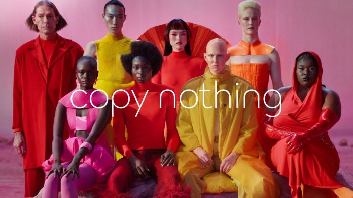
Gone are the days of lukewarm design and "clean-up" redesigns. In 2025, brands are daring. They shake up their conventions, rethink their visual identity from A to Z and proudly display their new look. The goal? To make a lasting impression and differentiate themselves in an oversaturated online world.
Let's take the example of Jaguar : the iconic brand has traded its classic aesthetic for a much more refined, almost minimalist design, with a digital experience tailored for modern luxury (and electric cars). The result? A clarified brand image, a site that feels fresh and spacious… and a true visual statement.
These bold redesigns aren't just for show: they reflect a strategic repositioning. We're rethinking information hierarchy, revisiting interactions, and no longer afraid to create contrast, visual tension, or even break classic grids. Find out more in our dedicated article on Jaguar's bold rebranding.
The message is clear: web design is a medium of expression in its own right. And in 2025, the brands that succeed are those unafraid to break the mold.
In 2025, typography no longer whispers: it speaks volumes and commands the space it deserves. Headlines are displayed in maxi size, words become graphic elements in their own right, and sometimes, a single sentence is enough to capture attention.
Why the resurgence of oversized typography? Because it gets straight to the point. In a world where attention is won or lost in 3 seconds, a well-placed, well-designed word can have more impact than a 30-second video. It's simple, clear, and striking.

{{block-cta-1}}
We're seeing the emergence of websites that embrace an ultra-typographic design, with few or no images at all. Playful use of weights, style variations, scroll animations: typography becomes the main tool for storytelling, setting a mood, and expressing an identity.. Identity begins with the right typographic choices: our guide to choosing the right color and typography palette guides you step-by-step.
And the good news is: this style adapts equally well to a fashion website or a B2B landing page. You just need to choose the right font, gauge the level of boldness, and keep one golden rule in mind: readability is king.

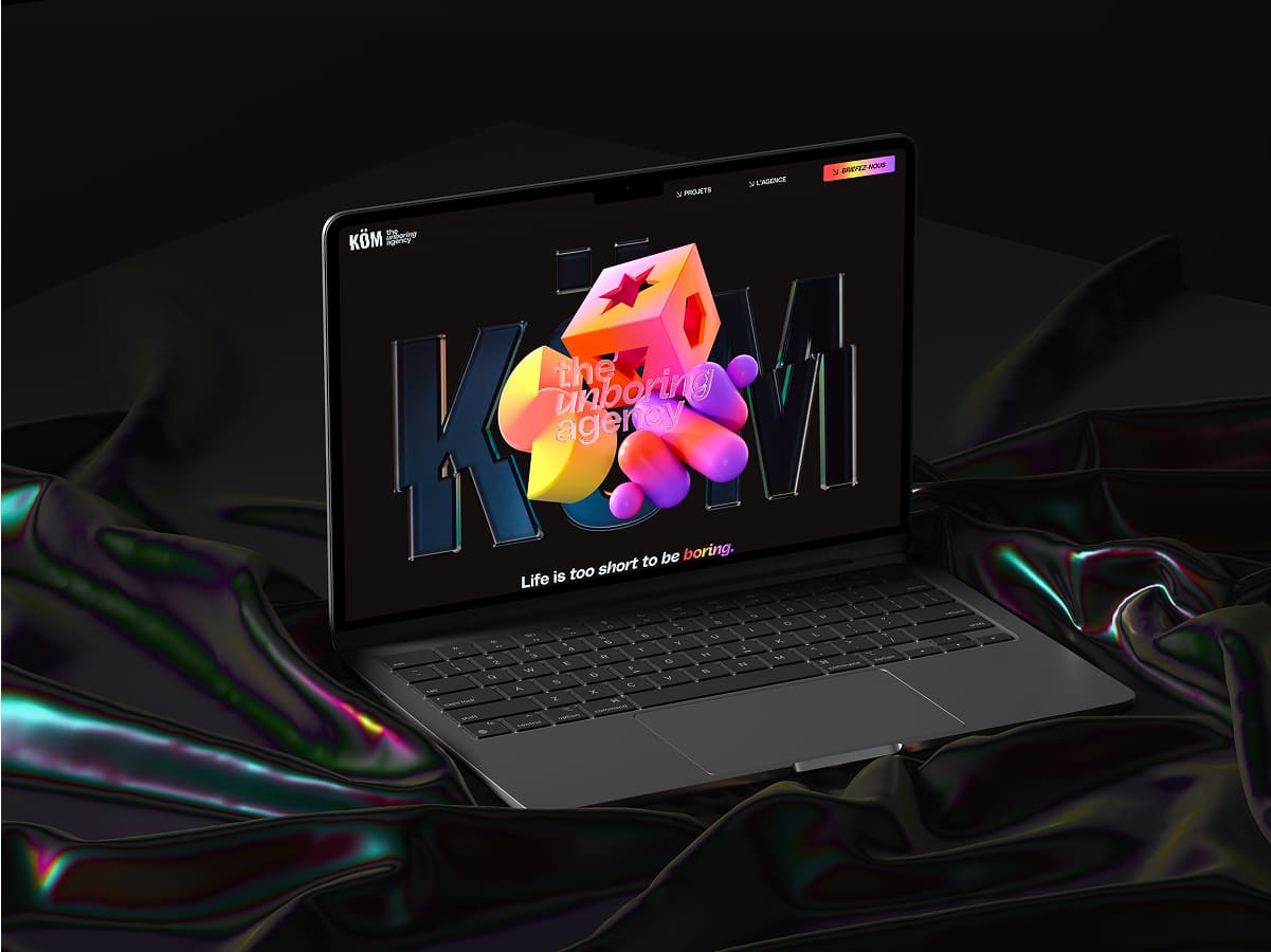
3D is no longer reserved for Hollywood studios or large e-commerce budgets. In 2025, it's appearing on more and more websites, driven by simpler, lighter... and much more accessible tools.
Gone are the days of hyper-technical renderings impossible to integrate without a Unity developer on the team. Today, platforms like Spline, Rive or even Webflow (thanks to integrations) enable adding an interactive 3D touch without bogging down site performance.
What we love about this trend is that it creates a truly immersive experience : a product that rotates in real-time, a background that reacts to the mouse, a gamified experience that captures the user from the first second. All without sacrificing mobile or accessibility (when done well).
So no, you don't need a cutting-edge graphics engine to integrate 3D into your site. But you do need a good idea, a clear objective, and most importantly: a seamless integration that serves your storytelling.
{{cta-1}}
It's the underdog's revenge: digital brutalism continues to assert itself in 2025, with its straight lines, unforgiving fonts, and layouts that seem to scream: "I do what I want." And surprisingly... it works.
Inspired by brutalist architecture, this web style emphasizes transparency, visual honesty, and a no-frills approach. Buttons that look like pure HTML, extreme contrasts, a typographic hierarchy bordering on chaos—all 100% intentional.
But make no mistake: behind this "anti-design" lies a genuine creative intention. Brutalism attracts, challenges, sometimes disturbs, but it never leaves anyone indifferent. And that's exactly what it aims to do.
Brands that adopt this style often want to break the mold of classic corporate design and assert a strong, even rebellious, personality. It's also a way to stand out on an increasingly standardized web.
So yes, it's raw. Yes, it's divisive. But when it's done well, it has character, boldness, and a whole lot of style.
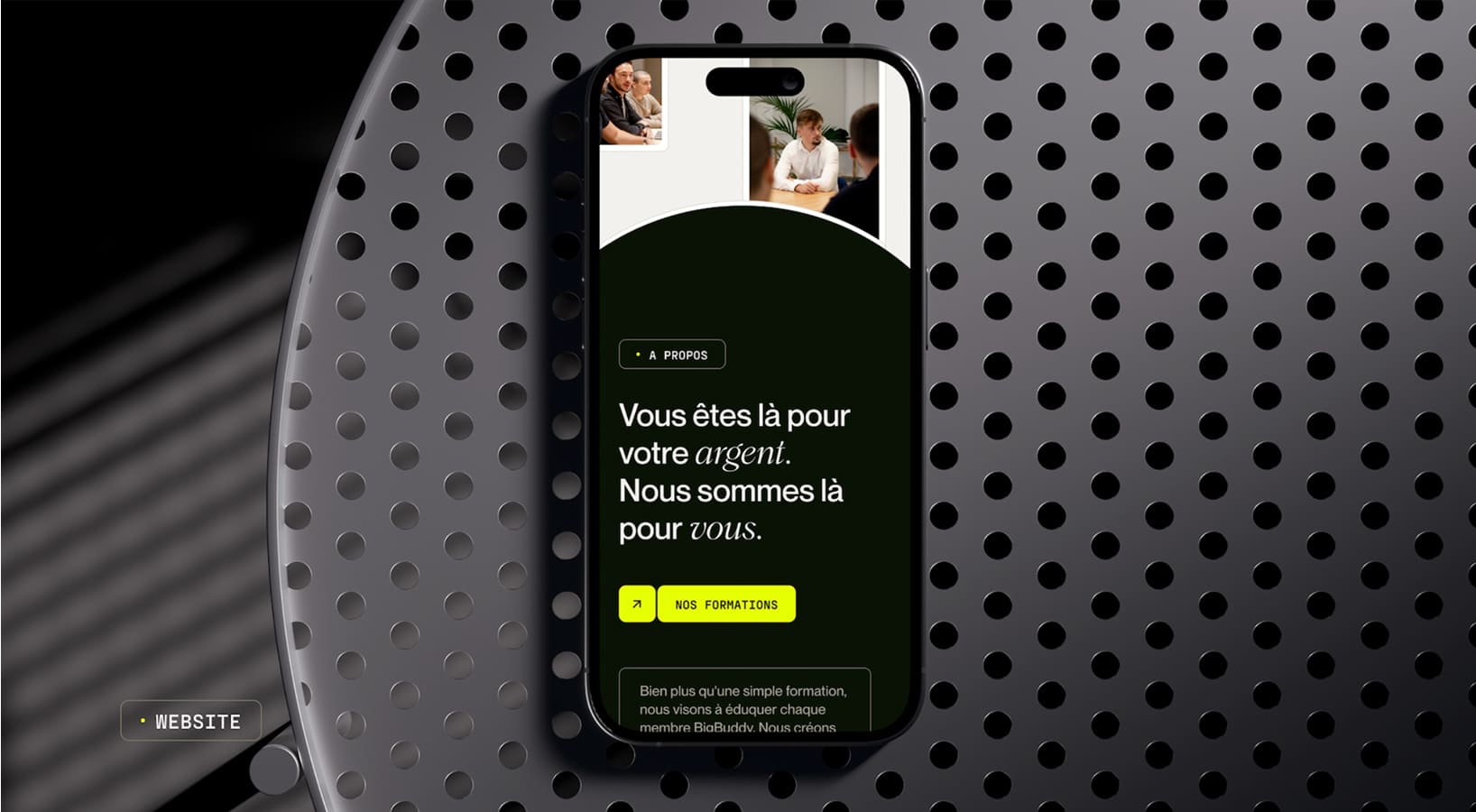
In 2025, dark mode has ceased to be a trend: it's become the norm. And for good reason: it's everywhere. On our phones, our apps, our dashboards, our favorite sites... and even in our default system settings.
But why so much love for dark mode? First, because it's easier on the eyes, true comfort, especially at night or for professions that spend their day (and evening) in front of a screen. Secondly, because it instantly gives a more sophisticated look to any site, provided it's well-executed.
Warning: dark mode isn't just about inverting colors. It's about designing a dedicated palette, adapting typography, working on contrasts, and avoiding the "black background + unreadable pale gray text" effect (no thanks). All while ensuring you offer an experience as smooth as the light version.
Today, integrating a dark mode is also a sign of modernity. It shows that you think about the user, their comfort, and that you are up-to-date in your design choices.
In short, not offering a dark mode in 2025 is like having a non-responsive website in 2015 : it's a bit of a faux pas.
{{cta-2}}
In 2025, creating a beautiful, fast, and responsive website is no longer enough. If it's not accessible to everyone, it's incomplete. Accessibility is no longer a bonus or a technical constraint: it's a true design philosophy, integrated from the very first mock-up.
What does that mean in practice? Sufficient contrasts, readable texts, well-thought-out tags, fluid keyboard navigation, alternatives for visuals… in short, a site that works for all users, including those with disabilities.
At Elias, this requirement is integrated right from the brand strategy phase: we consider the user experience before we consider the design.
But beyond the technical aspect, it's also a matter of inclusivity. In 2025, we design interfaces that avoid stereotypes, speak to diverse profiles, and take into account the variety of backgrounds, cultures, and uses.
Accessibility isn't about ticking a checklist. It's a human-centered design choice. And a significant bonus: it's also good for SEO, engagement, and even your brand's perception.
At Studio Elias, we are convinced that good design is inclusive, not exclusive. And this conviction is, rightly so, becoming a requirement for today's web.
It's impossible to ignore AI in 2025. It has crept into our tools, our processes… and sometimes even our mood boards. But don't panic: AI doesn't replace the designer, it augments them (and saves them a tremendous amount of time).
Today, tools like ChatGPT, Midjourney, Uizard, and even Framer AI allow us to generate wireframes, color palettes, text, or even animations... in a few clicks. The result: less time spent on repetitive tasks, more room for creativity and intention.
But what truly interests us is AI as a lever for personalization. Thanks to it, interfaces adapt in real-time to user behavior, offer tailored content, and dynamically optimize UX. The website becomes intelligent, almost alive.
Of course, it also raises challenges: ethics, control, brand consistency... But one thing is certain: AI is now an integral part of the web designer's toolkit. Ignoring it would be a bit like continuing to code in Flash in 2025 (don't do that).

1. Gucci Cosmos
An immersive website blending 3D, narrative scroll, and ambient music. You explore a virtual exhibition as if you were there. A masterclass in digital storytelling.
2. Apple Vision Pro
Apple leans into emotion with a clean and polished interface, fluid animations, and a narrative centered on the user experience. Simple, powerful, memorable.
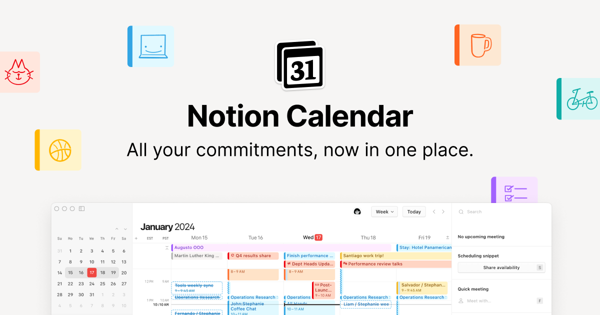
3. Notion Calendar
Extreme minimalism, subtle animations, impeccable visual hierarchy. A good example of anSaaS 2025 friendly interface.
4. Rive
Interactive website for an animation tool. Everything is dynamic, fluid, and instructive. Perfect for demonstrating what the tool can do… by using it. UX + product demonstration = winning combination.
🔗 rive.app
5. Spline
Real-time 3D design, dynamic interface, pastel tones, and scroll interactions. A site that brilliantly showcases its product's capabilities.
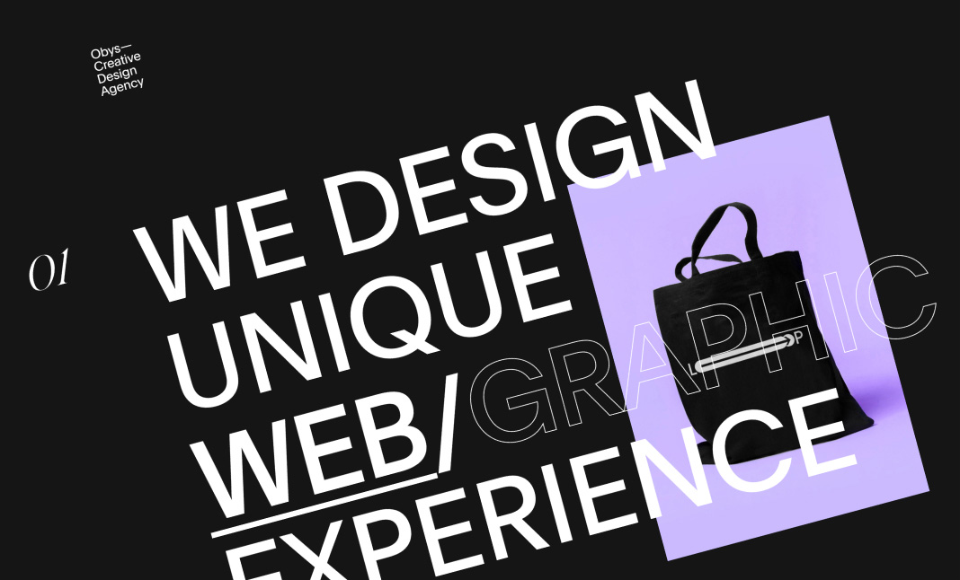
6. Obys Agency
Masterful brutalism, polished micro-interactions, narrative scroll + stylish dark mode. An agency that dares, and it shows.
7. Merci Michel
A French agency that fully embraces humor, a strong identity, and a site that changes with the time of day. Creative, lively, and very human.
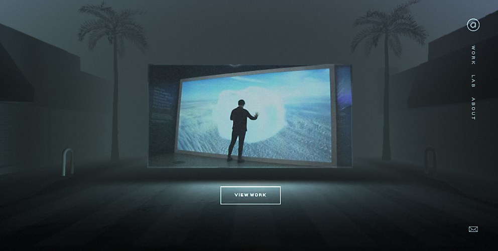
8. Resn
One of the wildest sites of the year. Surreal interactions, visual glitches, perfectly synchronized sound and image. An offbeat experience that leaves a lasting impression.
9. Active Theory
Every scroll is an animation. The agency pushes interactive storytelling to its limits. You feel like you're in a movie. A true digital spectacle.
10. Back Market (new homepage 2025)
New tone of voice, new, more mature, more responsible design. Gone is the "funny startup" look, making way for a fully embraced and well-designed circular economy.
1. Awwwards
The temple of web design. Every day, websites from around the world are rated on their design, UX, and content. A true showcase of visual excellence.
🔗 awwwards.com
We tell you all about this platform in our article Awwwards: The World's Best Websites.
2. CSS Design Awards
A cousin of Awwwards, and just as rigorous. It showcases ultra-creative gems, with a strong emphasis on technical innovation and user experience.
🔗 cssdesignawards.com
3. Behance
The ultimate social network for creatives. You'll find complete projects there (UI, branding, motion...), categorized by theme and popularity.
🔗 behance.net
4. Dribbble
Perfect for quick inspiration. Here, you'll often find previews (or "shots") of mockups, interfaces, and visual ideas. Less context, but plenty of style.
🔗 dribbble.com
5. Siteinspire
A clean catalog of websites selected for their graphic quality. You can filter by industry, style, platform... Efficient, clear, focused.
🔗 siteinspire.com
6. Land-book
A bit like Pinterest, but for web design. Ideal for spotting trends in landing pages, homepages, and SaaS.
🔗 land-book.com
7. One Page Love
As its name suggests, it specializes in "one-page" websites. Handy for portfolios, product campaigns, or events.
🔗 onepagelove.com
8. Httpster
Less known, but incredibly stylish. You'll find quirky, experimental, and even a bit punk sites there. Perfect for stepping off the beaten path.
🔗 httpster.net
9. UI Movement
Focuses on micro-interactions, transitions, and scroll effects. Great for beefing up your animations and interfaces.
🔗 uimovement.com
10. Designspiration
A visual search engine. Type in a keyword, color, or style, and let yourself be inspired.
🔗 designspiration.com
Studio Elias Tip: Set up a weekly inspiration routine with 2 or 3 of these platforms, and save your design crushes in a Notion or Figma board. You'll see, inspiration always comes back.
{{block-cta-2}}
In 2025, web design is no longer just about looking pretty: it tells a story, engages, and delivers an experience. We're embracing more radical redesigns, oversized typography, immersive interfaces, and we're considering all users — not just those scrolling on Wi-Fi on a MacBook Pro.
Here are the 4 key takeaways to remember:
At Studio Elias, we love creating websites that stand out without ever forgetting the user experience or the brand visionIf you have a project in mind (or simply a desire for something beautiful), we're here to talk.


.jpg)
.jpg)


%20(1).gif)