

The Paris 2024 design is more than just a visual aesthetic; it's a strategic initiative that celebrates French expertise, innovation, and identity consistency across all platforms.
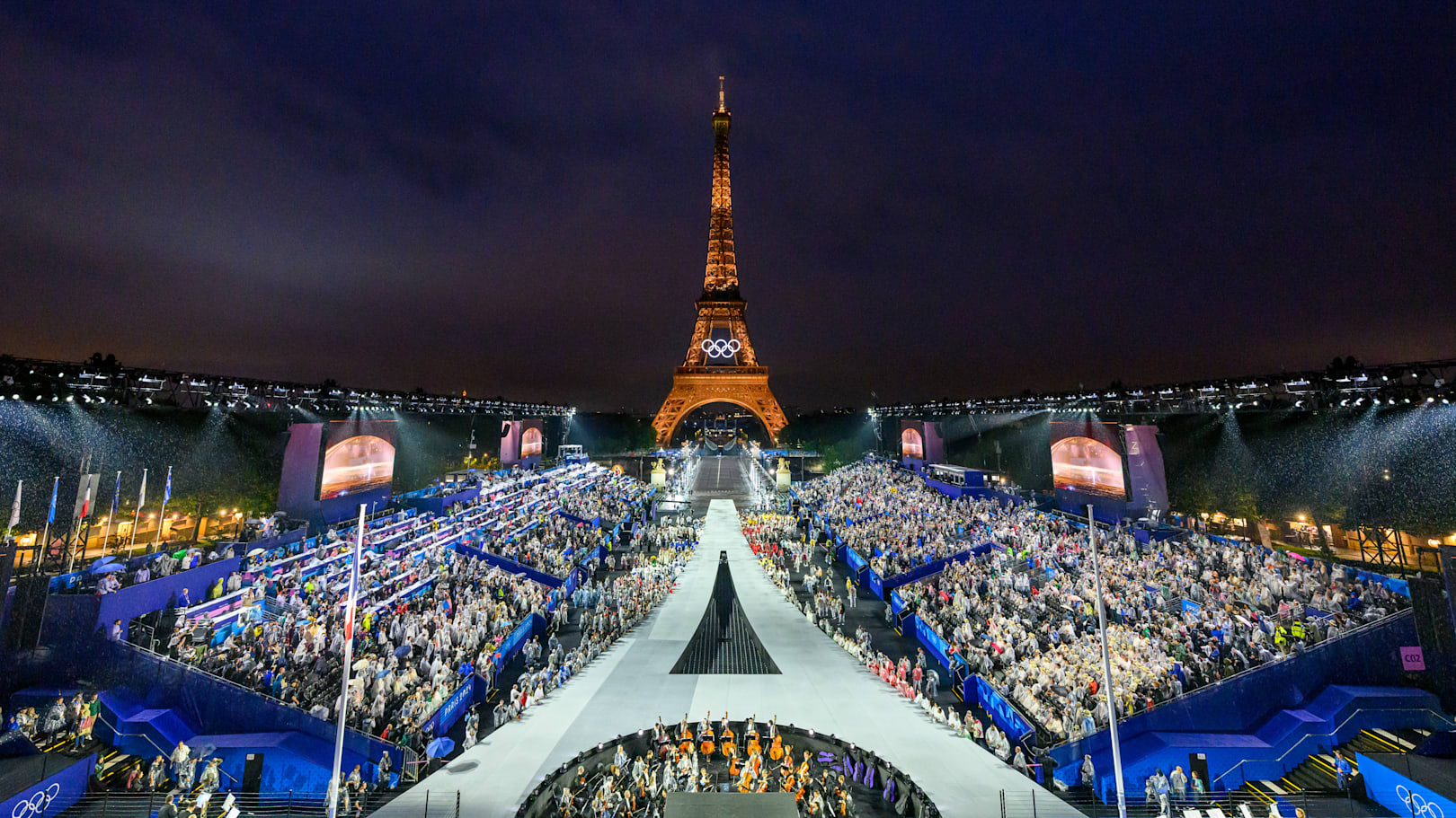
The Olympic Games aren't just about sports.
They are also, and perhaps above all, a huge showcase to symbolize the image of a country, a city... and creative expertise. In 2024, Paris isn't just hosting the Games; it's aiming to project a new image of the capital. Logo, mascots, pictograms, posters... No previous edition has focused so much on brand identity.
At Studio Elias, we delved into the intricacies of this 'made in France' visual creation. Who designed what? What were the design choices? How does Paris 2024 fit into the grand tradition of the Olympic Games? Through a graphic universe that pays homage to Art Deco, the values of the Republic, and the diversity of sports, we're taking you on an Olympic overview of branding.
{{cta-1}}
Behind every major global event lies an army of talent. And for Paris 2024, the objective was clear: to showcase French creative excellence. Unlike other editions entrusted to large international agencies, the Organizing Committee for the Olympic and Paralympic Games (COJO) made a committed choice: local collaboration, graphic craftsmanship, and cultural tailor-made solutions.
Rather than relying on a single "big agency," Paris opted for a constellation of complementary studios and profiles, all driven by one vision: to make these Games a celebration as visually intense as it is symbolically profound.
Formerly W&Cie, the Royalties agency is in charge of the brand identity. It laid the strategic foundations, defining the positioning, voice, values, and the overall branding structure. A committed creative direction, with the goal of creating an iconic Olympic brand that is rooted in French culture, inclusive, and accessible to all.
Their mission: to bring the past, present, and future into dialogue within a single identity. A successful gamble.
For the overall visual development, Ecobranding took over. Their philosophy? Eco-designed visuals that reduce environmental impact while maximizing visual impact. A relevant approach for Games that aim to be exemplary in terms of ecology.
This was notably reflected in:
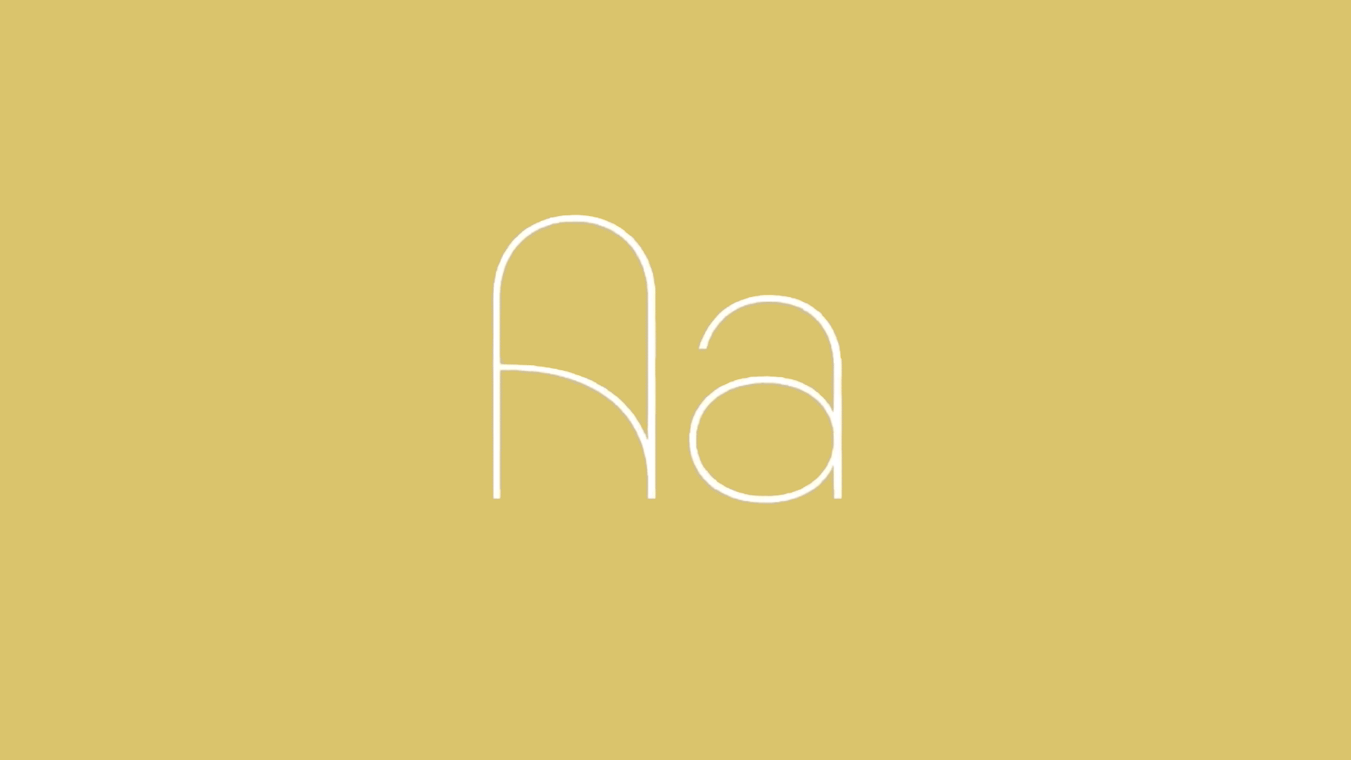
Regarding the lettering, studio 4uatre was commissioned to create the official typeface for Paris 2024. Inspired by Art Deco, this font symbolizes the connection between Paris 1924 and Paris 2024. It is structured, elegant, and modular, playing an essential role in identity recognition across both digital and physical media.
Each character is conceived as a tribute to French graphic heritage. And the result is clear: legible, distinctive, and above all, consistent with the rest of the visual identity.
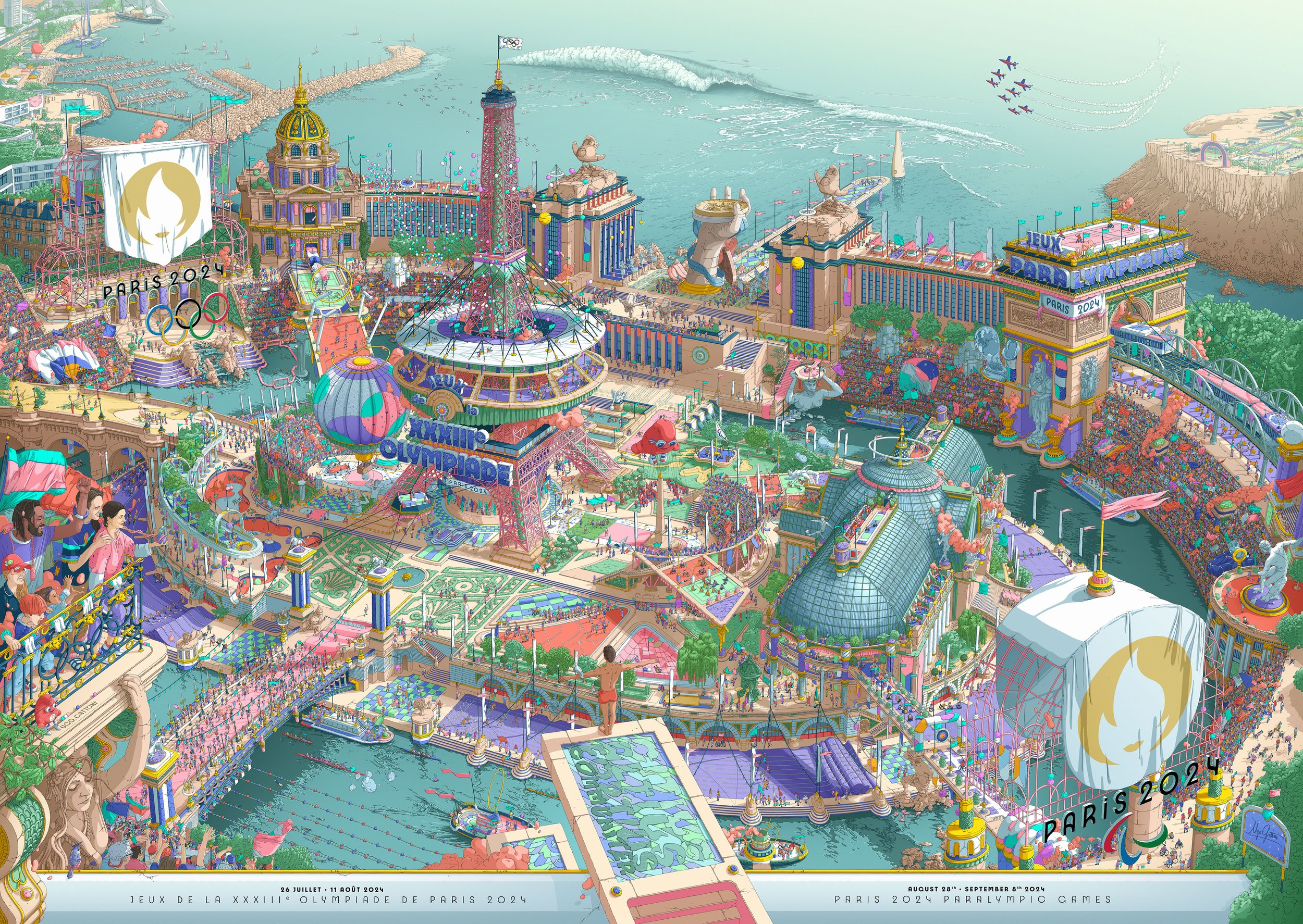
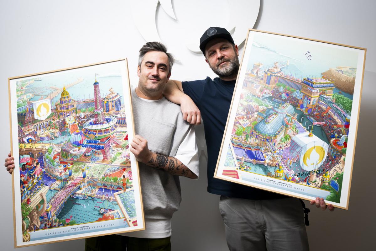
For the official posters, Ugo Gattoni, a French illustrator renowned for his ultra-detailed and dreamlike frescoes, was chosen. His work for Paris 2024 blends Parisian monuments, sports, architecture, and surreal scenes in a unique style.
This approach is powerful: it moves beyond a sleek, corporate visual to offer a work of art, a joyful and abundant vision of the Games. It's an invitation to dream, to marvel, to enter a generous, almost utopian visual world. And frankly, it's refreshing.
All these talents worked under the guidance of the COJO, the Olympic Organizing Committee, which played a true artistic and strategic director role. From the outset, their ambition was clear:
Rather than imposing a top-down direction, the COJO trusted the French creative ecosystem, and created the ideal conditions for a singular, coherent, and resolutely modern brand image to emerge.
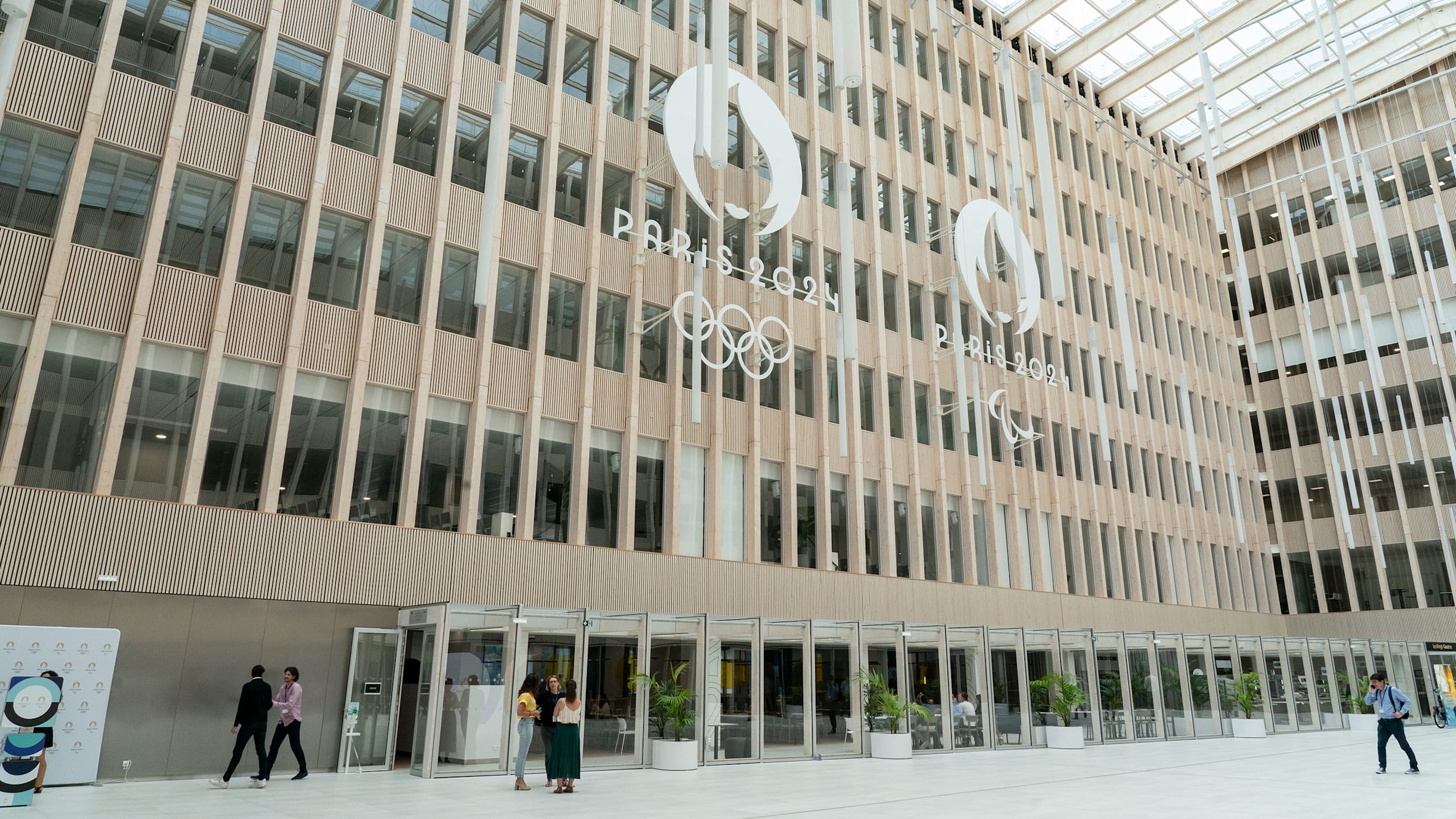
For the first time in the history of the Games, the same logo is being used for both the Olympic and Paralympic Games. This powerful choice demonstrates a commitment to unification, equality, and coherence — a way to unite these two events under a single, strong, and unifying vision.
The logo design combines three symbols in one:
A simple, clear, yet deeply meaningful symbol. Visually refined, it evokes both pride and approachability. In a world saturated with images, it is precisely this simplicity that resonates with the public, who seek clarity and emotion. This level of refinement is the goal of ourvisual identity : saying a lot with a little.
This historical grounding makes the Olympic Games logo a textbook example. To see more, check out our Top 10 Best Logos of All Time.
Stylistically, the logo draws inspiration from Art Deco, a direct reference to the Paris edition of… 1924. A century later, the circle is complete, with elegance. This isn't just a stylistic exercise: it's the result of meticulous, strategic design work, deeply rooted in French cultural history.
Looking for more content on logos? Discover our Logo creations for your business 👉
{{block-cta-1}}
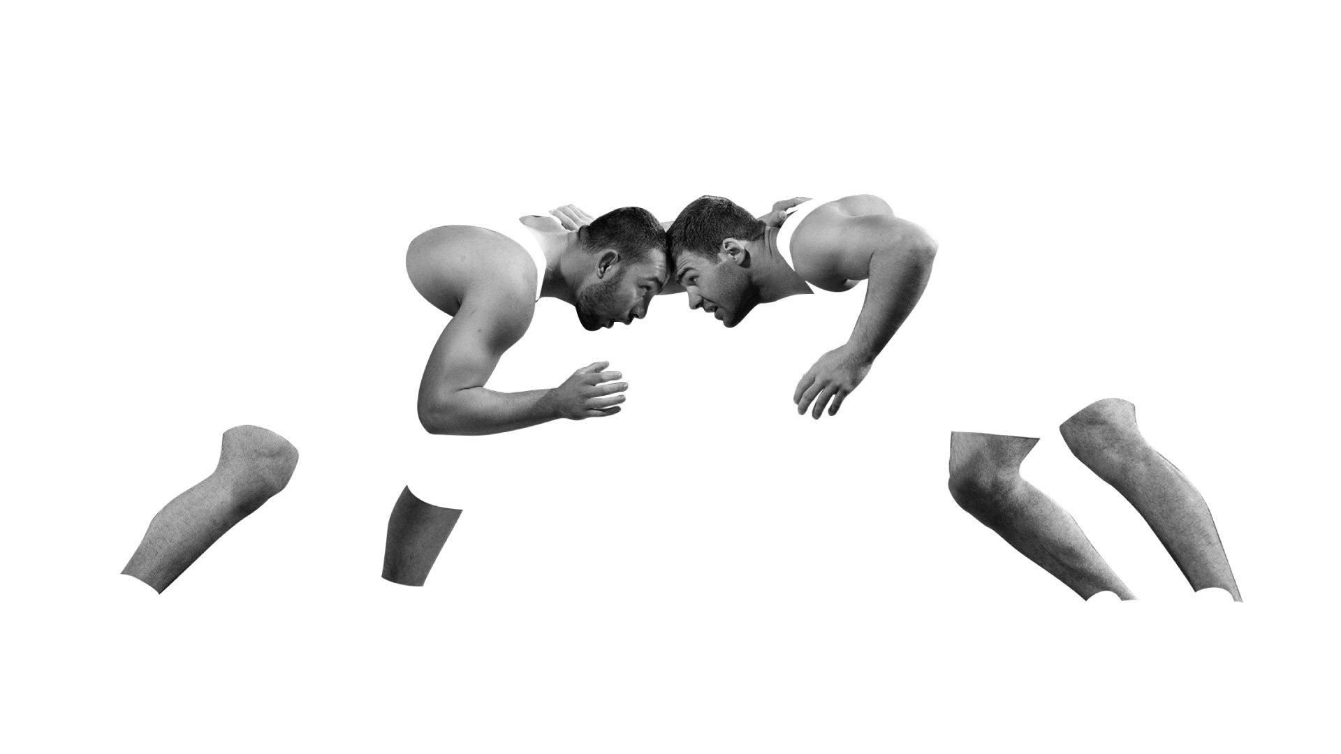
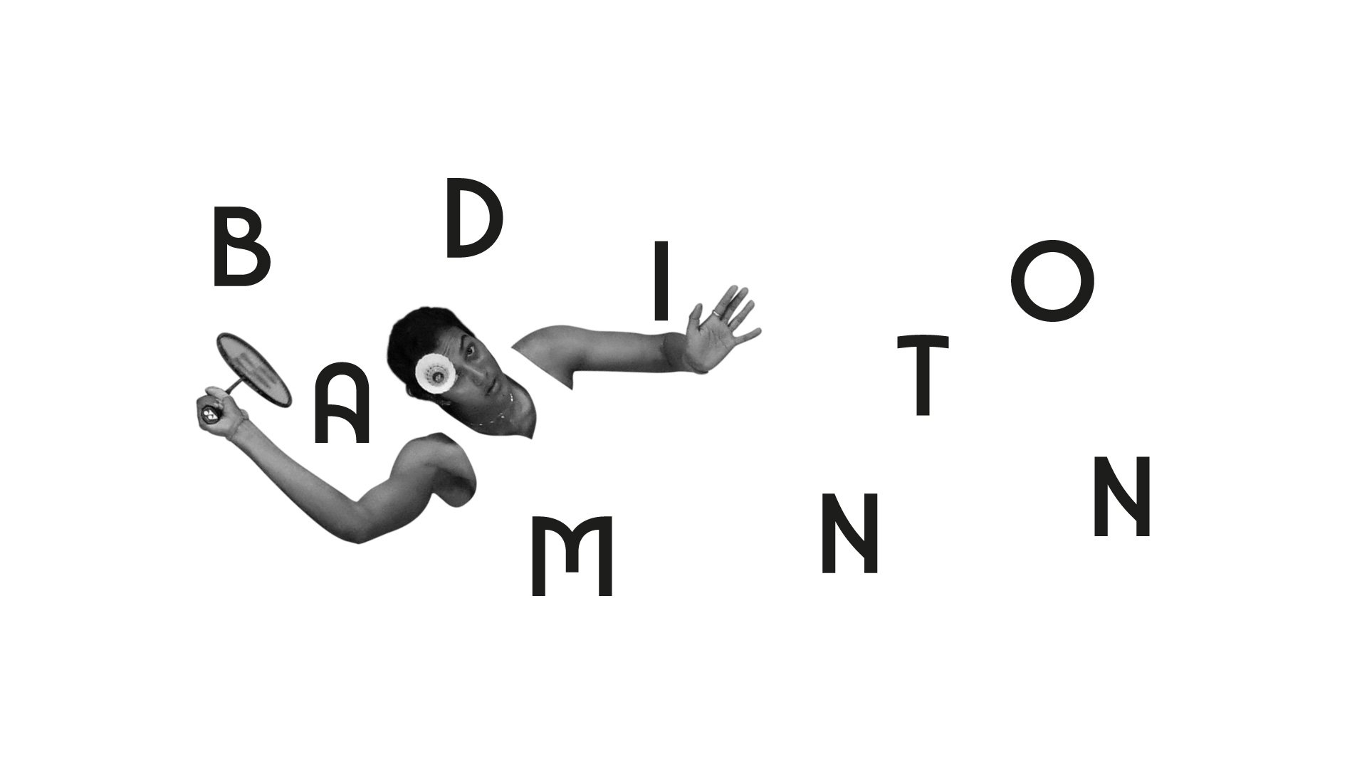
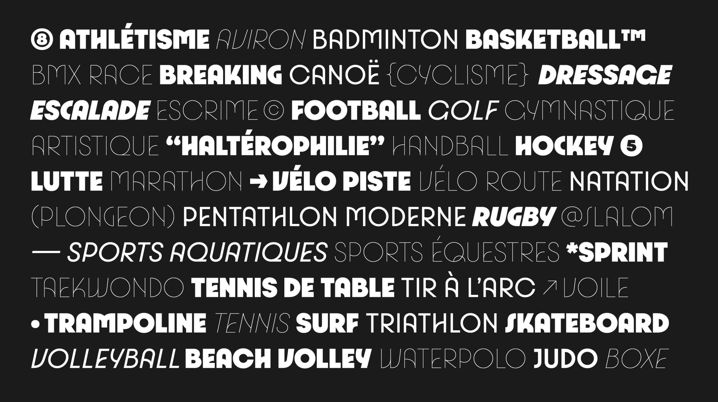
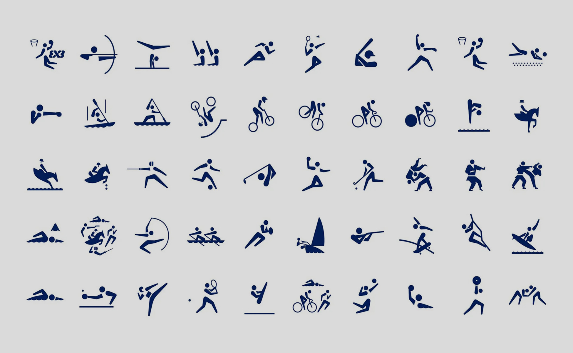
If you're used to stylized stick figures identifying sports, forget everything you know. Paris 2024 has reinvented sports pictograms, transforming them into true graphic emblems. Each sport is represented by a unique geometric shape, built on a 45° grid forming an X, and composed of recognizable elements: ball, racket, sword, helmet, etc.
The result is stylized, modern, almost heraldic. And above all: instantly recognizable.
A choice that reflects a new ambition: to transform the Olympic branding from a mere visual dressing into a universal language.
We might have expected them to be shaped like the Eiffel Tower or a giant baguette, but no. The official mascots for the Paris 2024 Olympic and Paralympic Games are called… the Phryges.
No funny animal this time, but a decidedly political, cultural, and committed choice: the Phrygian cap, an ancestral symbol of liberty, inherited from Antiquity and adopted during the French Revolution. It's safe to say this isn't just superficial design; it's a mascot with a powerful message.
Why this choice? Because it embodies several values dear to Paris 2024:
It's a strong statement. At a time when many events opt for visual neutrality, Paris dares to claim a history and a heritage, and we appreciate that.
There are actually two Phryges:
This duo embodies the diversity and unity of the Olympic and Paralympic movement. It's the first time a Paralympic mascot proudly displays visible equipment, without hiding or stylizing it — simply owning it with pride. A great lesson in representation.
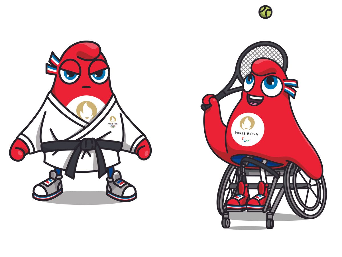
Visually, the Phryges are a success:
They have that cartoonish charm but also a visual authority that makes them immediately iconic. They appeal to children... but not only. And in the context of Paris 2024, they're not just there to entertain. They fully contribute to the visual narrative of the event.
The typeface created for Paris 2024 is a true marvel of editorial design. Also inspired by Art Deco, it is geometric, elegant, and timeless. Each letter is designed to evoke both tradition and modernity, in a quest for perfect balance.
This typeface is used across all media: signage, posters, tickets, merchandise... It becomes a true pillar of thebrand identity, and contributes to the instant recognition of Paris 2024.
The typeface is just one element of a comprehensive visual identity. Discover our guide to brand guidelines: definition and tips to leave nothing to chance.
To illustrate the Games, COJO commissioned Ugo Gattoni, known for his intricately detailed works and dreamlike world. The result? A rich, almost hypnotic official poster that blends Parisian monuments, sporting scenes, historical references... all in a surreal and ultra-festive style.
A decision that goes against the minimalism often seen in institutional communication: here, we celebrate richness, life, and vibrancy. And it works.
Ugo Gattoni is the Big Boss of illustrations, and at Studio Elias, we admire his work. However, we also offer custom illustrations in completely different worlds!
{{cta-2}}
The visual identity of the Paris 2024 Olympics isn't limited to a few communication visuals. It's a comprehensive visual interface, applied across all platforms: transport, stadiums, screens, merchandise, social media... The inspiration? Parisian cobblestones, translated into geometric patterns.
The color palette draws inspiration from French chic: midnight blue, gold, pink, turquoise, white... A modern, bold, and cohesive blend that adorns both physical structures and digital media.
To master colors in your own brand identity, our guide to choosing your color palette is an essential resource.
{{block-cta-2}}
The Olympic Games are also about design. Each edition tells the story of an era, a culture, and a branding approach. So, to truly grasp how Paris 2024 marks a turning point, there's nothing better than a quick look back – no flames, no podiums, just plenty of creativity.
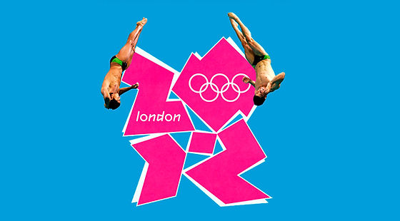
It's impossible to forget. The London 2012 logo, designed by Wolff Olins agency, generated a lot of discussion (and sweat in graphic designer forums). With its angular shape vaguely evoking an exploded '2012', its pop colors, and aggressive lines, it was a decidedly disruptive choice.
💡 The intention: To break conventions, appeal to urban youth, and highlight the raw energy of contemporary London.
🎯 The result: A much-discussed logo, sometimes mocked, often misunderstood. Yet, there was a deliberate consistency throughout the entire visual system. You either loved it or hated it — but you couldn't remain indifferent.
A complete change of tone with Rio. Here, the logo designed by the Brazilian agency Tatíl Design aimed to be warm, fluid, and organic. It depicts three silhouettes dancing hand-in-hand, forming a loop symbolizing unity, diversity, and the Carioca energy.
💡 The intention: To embody Brazilian joy of life, nature, dance, and humanity, by focusing on curves and gradients.
🎯 The result: A very accessible, poetic visual identity that truly reflected the host country's atmosphere. Less divisive, but also less memorable on certain mediums.
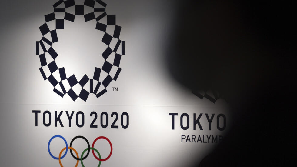
With Tokyo, we enter a world of meticulous detail. The official logo, after an initial version was abandoned due to plagiarism, was redesigned around a circle of unity, featuring patterns inspired by traditional Japanese forms.
💡 The intention: to marry ancestral Japanese craftsmanship with minimalist modernity.
🎯 The result: a highly structured, understated, and elegant identity, but perhaps a little too discreet to truly capture the public's imagination. A coherent visual system, but one that sometimes lacked emotion.
And then, there's Paris.
With its logo featuring three symbolic layers (medal, flame, Marianne), its Art Deco aesthetic, its heraldic pictograms, its mascots with a message, and its refined color palette, Paris 2024 makes a powerful statement.
💡 The intention: to build a complete, inclusive, and culturally engaged universe, making each element an ambassador for French identity.
🎯 The result: probably one of the most coherent Olympic identity systems ever designed. Everything is connected. The logo communicates with the typography. The pictograms interact with the architecture. The visual identity unifies the entire city. And the visual storytelling is crystal clear.
What Paris achieves, where others sometimes faltered, is the perfect balance between broad public appeal, symbolic depth, and graphic excellence. It's not just a beautiful logo; it's a full-fledged brand platform, conceived as a collection, a universe, a work to be experienced daily.

Simply put? Paris 2024 didn't just create a visual identity. It redefined the standards of event branding on a global scale.
{{cta-3}}
This branding offers a lesson. For a brand, an event, a startup, or an institution, Paris 2024 demonstrates that good design isn't just about aesthetics. It's about substance, meaning, and strategy, and the ability to tell a consistent story across all platforms. And if you're looking for more examples of brands that have successfully reinvented themselves, our Top 7 Rebranding Cases in 2025 will provide plenty of inspiration.
And that's something we know well at Studio Elias. It's our favorite playground. And if you want to take action, discover how we can support you on our dedicated rebranding page.


.jpg)
.jpg)


%20(1).gif)