A company can have the best product on the market and lose customers at first glance, because its image doesn't reflect its real level.
A company's visual identity isn't a logo and a color palette. It's a complete system (typography, colors, composition, motion, photo direction) that turns a brand strategy into immediate perception. When this system is right, the brand looks sharper, more credible and more desirable. When it's fragmented, it looks hesitant.
In this article, we explore:
What we stand for here: a strong identity doesn't try to look prettier. It tries to make the company more readable, more memorable and finally aligned with its level of ambition.
A brand can have a good product, a solid team and real ambition, then lose impact at first glance. That's often where a company's visual identity reveals its real role. Not as a veneer. As an accelerator of clarity, desirability and trust.
The subject goes far beyond the logo. A well-thought-out visual identity organizes how a company presents itself, stands out and stays in people's minds. It brings order to the signals. It helps the market understand faster, and better, what the brand brings.
For a growing company, it isn't a design detail. It's a positioning decision.

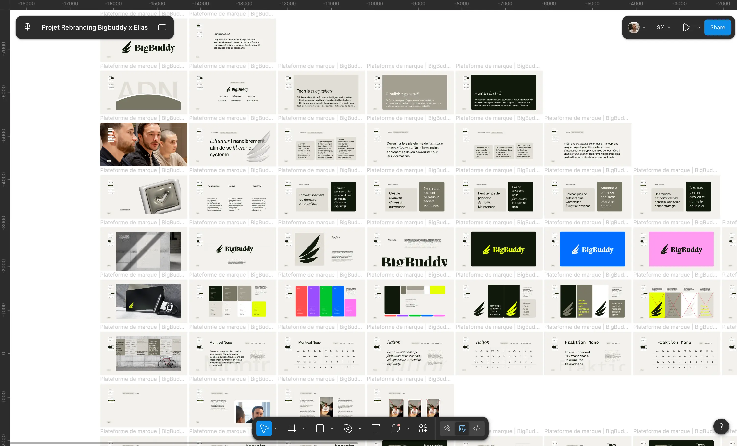
The most common mistake is reducing visual identity to a symbol or a color palette. In reality, it's a system: a coherent set of formal choices that turns a brand strategy into immediate perception.
This system includes the logo, of course, but also typography, color, composition, imagery, illustration principles, motion usage, message hierarchy and sometimes even how interfaces breathe. When everything is right, the brand looks sharper. When everything is fragmented, it looks hesitant.
To understand what a complete identity system should contain, our guide to brand guidelines details each component.
A good visual identity doesn't just try to be beautiful. It tries to be recognizable, credible and useful. It must work on a website, a sales deck, a paid campaign, a trade show, a LinkedIn profile, a client proposal. If it only holds up in a Figma presentation, it isn't finished.

Design doesn't replace the offer. However, it strongly influences how that offer is perceived. And in saturated markets, perception creates part of the value.
A weak identity slows everything down. Acquisition costs more. Materials lack unity. Teams improvise. The messaging varies from one contact to the next. The brand seems smaller, less clear or less mature than it really is.
The data confirms it: see our study on the figures that prove branding transforms business growth.
Conversely, a well-controlled identity makes things easier to read. It strengthens consistency between what the company says and what it shows. It improves perceived quality before the first conversation. For a founder, it helps sell a vision. For a marketing team, it smooths execution. For a business moving upmarket, it supports more ambitious pricing.
The decisive point is consistency. A brand that looks structured inspires more trust. And trust saves time in decision-making.
Not every company needs a full rebrand. Sometimes an adjustment is enough. Sometimes everything needs to be redone. It depends on the gap between current ambition and the projected image.
Some signs don't lie. The company has evolved, but its image has stayed at the previous stage. The website no longer reflects the real quality of the offer. Sales materials look dated. The team struggles to produce consistent content. The brand attracts the wrong prospects, or doesn't reassure the right ones.
That's often the case after a fundraise, a repositioning, an offer extension, a move upmarket or entry into a new market. An identity that worked with 5 people can become insufficient at 25. It's not an aesthetic problem. It's a question of alignment.
That's precisely when our branding agency steps in: when the image has to catch up with the ambition.
We often see this with high-potential brands. Their expertise is there, so is their traction, but their visual world carries neither their uniqueness nor their standards. They send a signal below their value.
To know whether the timing is right, our article on brand evolution or revolution gives you a concrete decision framework.
The right visual identity rarely starts with the logo. It starts with a clear intention. What perception do we need to create? What tension do we need to own? Which visual territory is credible in the market without falling into the already-seen?
The logo plays a central role, but it doesn't do everything. A well-chosen typeface can give more character than an overloaded symbol. Color can establish a strong presence or, on the contrary, make the brand ordinary if it imitates the sector's dominant codes. Photo direction can instantly elevate perception, provided it's conceived as a language, not as a decorative moodboard.
To understand what makes a truly memorable logo, our branding guide: creating a unique, modern and effective logo is a useful complementary read.
Composition is often underestimated. Yet it's what creates the feeling of control. A grid system, rhythms, contrasts, breathing room: all of this produces a signature. The same goes for motion design. For digital brands, movement is no longer an accessory. It can reinforce precision, emotion or the level of finish.
A strong identity stands on two legs: uniqueness, to exist, and discipline, to last. Discipline is what solid brand guidelines guarantee. Uniqueness is what a well-built brand platform establishes.
Many visual identities are clean, trendy and well executed. And yet interchangeable. The problem isn't the graphic level. The problem is the lack of a point of view.
Following a sector's codes can be reassuring, especially in B2B. But following them too closely erases the difference. Conversely, chasing originality at all costs can weaken readability. The right level of tension depends on the context.
A deeptech brand isn't built like a hospitality brand. A creative agency doesn't need the same language as an HR firm or a training company. The identity must frame the right signal: distinctive enough to leave a mark, relevant enough to convince.
That's where strategy matters. Without a clear foundation, visuals quickly head in three directions at once: one to please the founder, one to follow the competition, one to look modern. The result is often acceptable, rarely memorable.
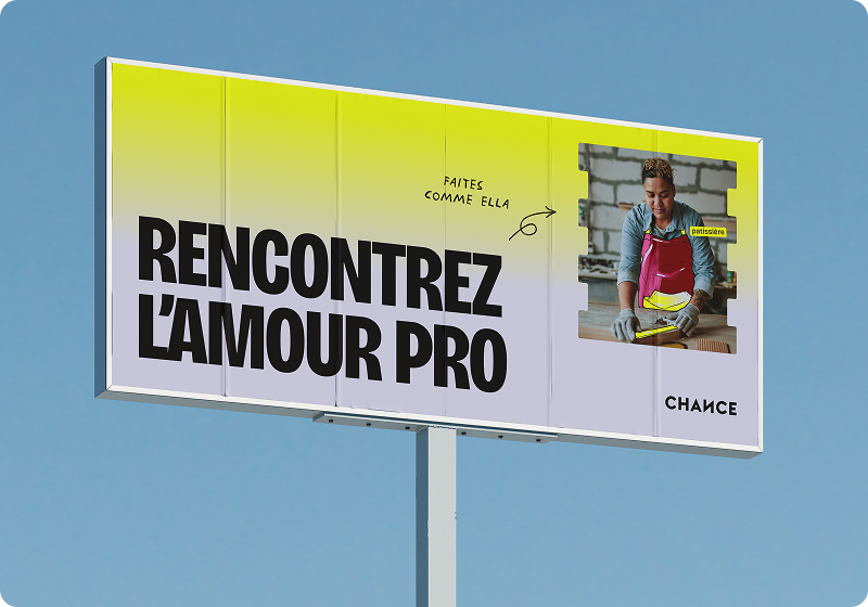
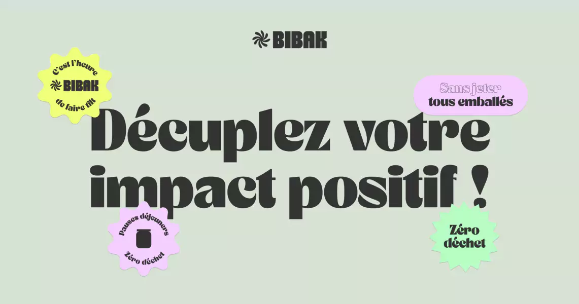
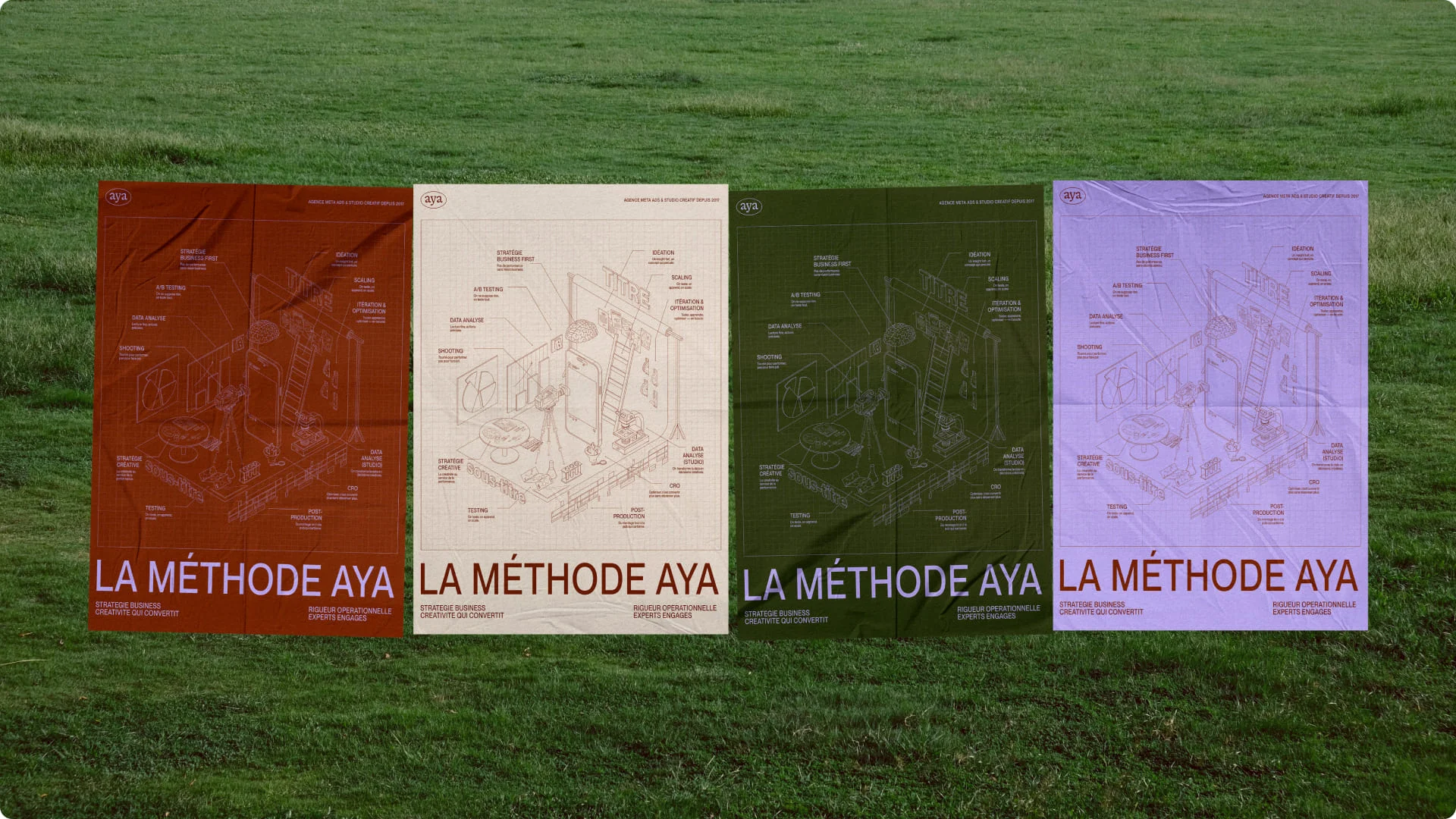
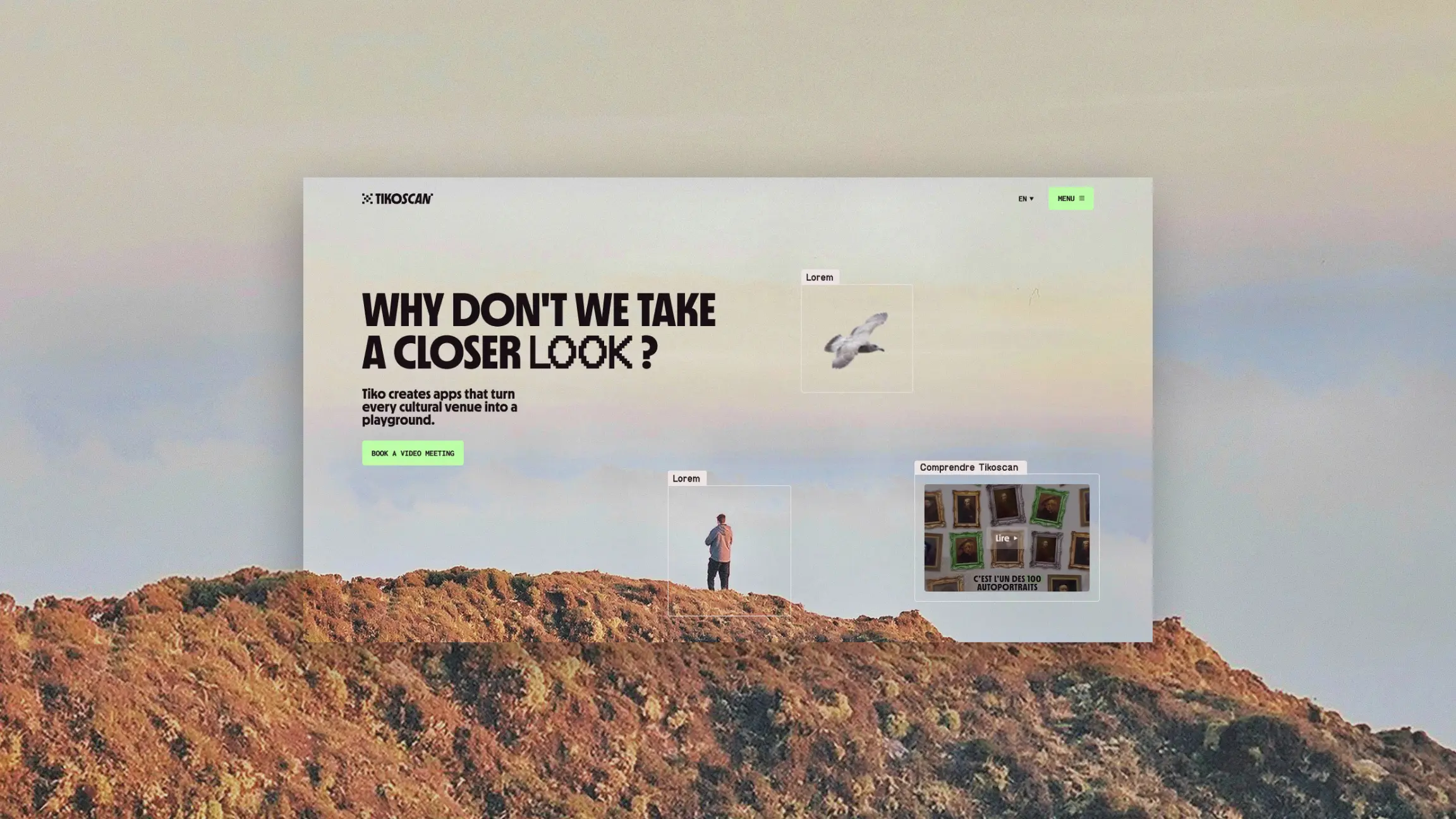
When Chance wanted to maximize the impact of its metro campaign, the challenge wasn't only graphic. It had to carry a strong mission with clearer messaging and a more striking presence. The result wasn't measured only in aesthetics, but in differentiation and campaign performance.
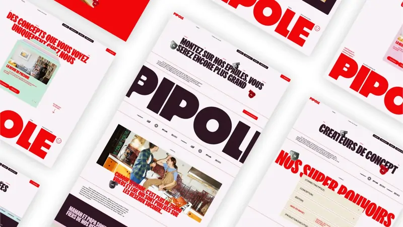
For Combo, the subject was different. After a major fundraise, the goal wasn't to make noise for the sake of it. It needed to support acquisition without draining cash, while encouraging adoption. In this kind of context, the visual identity must clarify, reassure and make the product more desirable in everyday touchpoints.
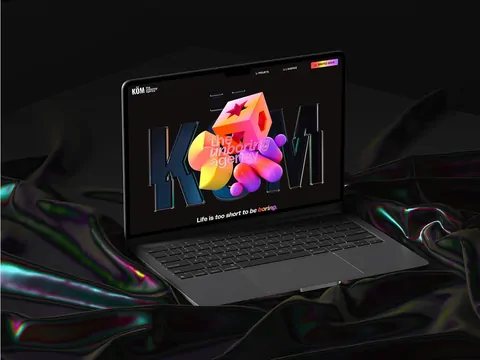
Köm, for its part, was entering a new market with a new offer. Here, the identity wasn't there to repaint what existed. It had to make an ambition credible. Same logic for Unow, which was entering the AI field in a dense competitive landscape. The rebrand became a lever for external and internal alignment.
These cases have one thing in common. The visual identity doesn't arrive after the battle. It prepares the ground.
The first reflex should be to set the strategic framework: positioning, targets, promise, personality, price level, competitive context. Without it, visual choices float.
Next, you need to design a language, not a series of isolated elements. The system must anticipate real uses: website, social media, sales presentation, recruitment, advertising, product, motion. An identity designed only for the launch ages quickly, because it wasn't built to live.
Quality of execution matters as much as the idea. Good art direction poorly rolled out loses its intensity. That's why the most convincing brands work on substance and form together. Verbal, visual and digital must move in the same direction.
You also need to accept that an identity doesn't solve everything. If the positioning stays vague or the offer is poorly structured, design can't compensate for long. It can amplify. It can't invent a consistency that isn't there.
Finally, a visual identity must be transferable. If it depends solely on the eye of the agency or the founder, it quickly runs out of steam. It needs simple rules, clear use cases and a design system precise enough to guide teams without freezing the brand.
Studio Elias stands for precisely this logic: a brand only has strength if its strategy, identity and digital rollout speak with one voice.
Ultimately, the right criterion isn't just aesthetic preference. It's the reaction it triggers. Does it make the brand more readable? More desirable? More credible? Does it support a move upmarket? Does it help sign, recruit, convince, launch?
A successful visual identity doesn't go for gratuitous effects. It establishes a presence. It creates a memory. It gives the company a form that finally matches its level of ambition.
When that rightness appears, everything seems simpler. The message comes across better. Materials gain impact. The brand stops compensating. It starts leaving its mark.
If your company has grown faster than its image, the signal is there. It's not about looking prettier. It's about becoming more accurate, sharper and more memorable.