


Figma has established itself as an essential tool for modern web design, thanks to its ability to combine collaboration, speed, and quality. This article highlights why it has become a reliable ally for designers and digital teams.
Choosing Figma isn't just adopting a tool; it's embracing a design methodology that is more fluid, collaborative, and user-experience-focused.
Creating a website without a mockup is a bit like building a house without blueprints: a perfect recipe for disaster. (Spoiler alert: it rarely ends well.) Fortunately, Figma is here to save your design from chaos!
Whether you're a designer, developer, or simply someone who wants their website to have more style than a 2000s PowerPoint, Figma is the tool for you. Accessible, intuitive, and ultra-powerful, it allows you to design modern interfaces, collaborate in real-time, and even prepare your site for seamless integration on Webflow, for example.
Curious to see everything Webflow can do once your mockup is ready? Our article on why develop your showcase website with Webflow in 2025 answers everything.
And because we know you don't want to get bogged down in a 50-page tutorial, we've prepared a simple and effective guide for you to master Figma and create stunning mockups. So, buckle up, we're taking you on a ride! 🚀

If it were a rockstar, it would fill stadiums with every update. This tool is a favorite among designers and agencies (including ours, of course) for a simple reason: it's accessible everywhere, ultra-flexible, and super intuitive. Whether you're on a Mac, PC, or even a tablet, everything happens directly in your browser. No need to download heavy software; you just open Figma and create.
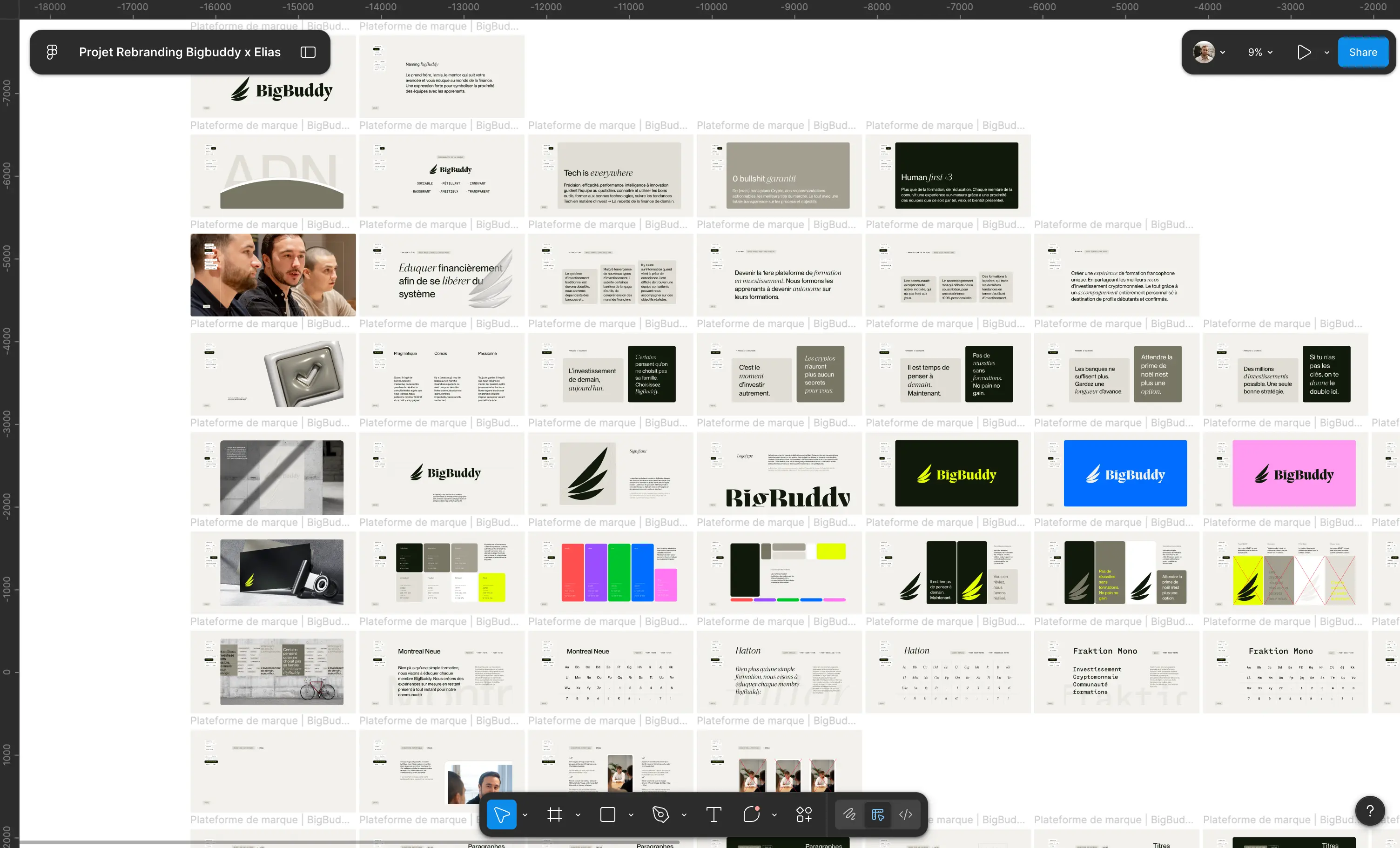
But that's not all. Thanks to reusable components, global styles, and seamless integration with other tools, it allows you to structure each section of a design with clarity. No more Figma mockups scattered like jigsaw puzzle pieces; Figma offers a clear process and facilitates the organization of data and content.

{{cta-1}}
Do you remember the time when you had to send a file "maquette-final-v2-def-der-final.psd" by email, hoping no one would touch it before validation? Forget about it.
With Figma, everyone can edit and use a design in real-time, all within a single file.
No more managing ten different versions of the same project: everything is centralized, fluid, and efficient.
To go further: Why Figma remains the #1 web design tool in 2025?
{{block-cta-1}}
In summary: Figma allows you to create, organize, and test your ideas without wasting time. And believe us, in 2025, nobody wants to deal with a rigid and difficult-to-modify design!
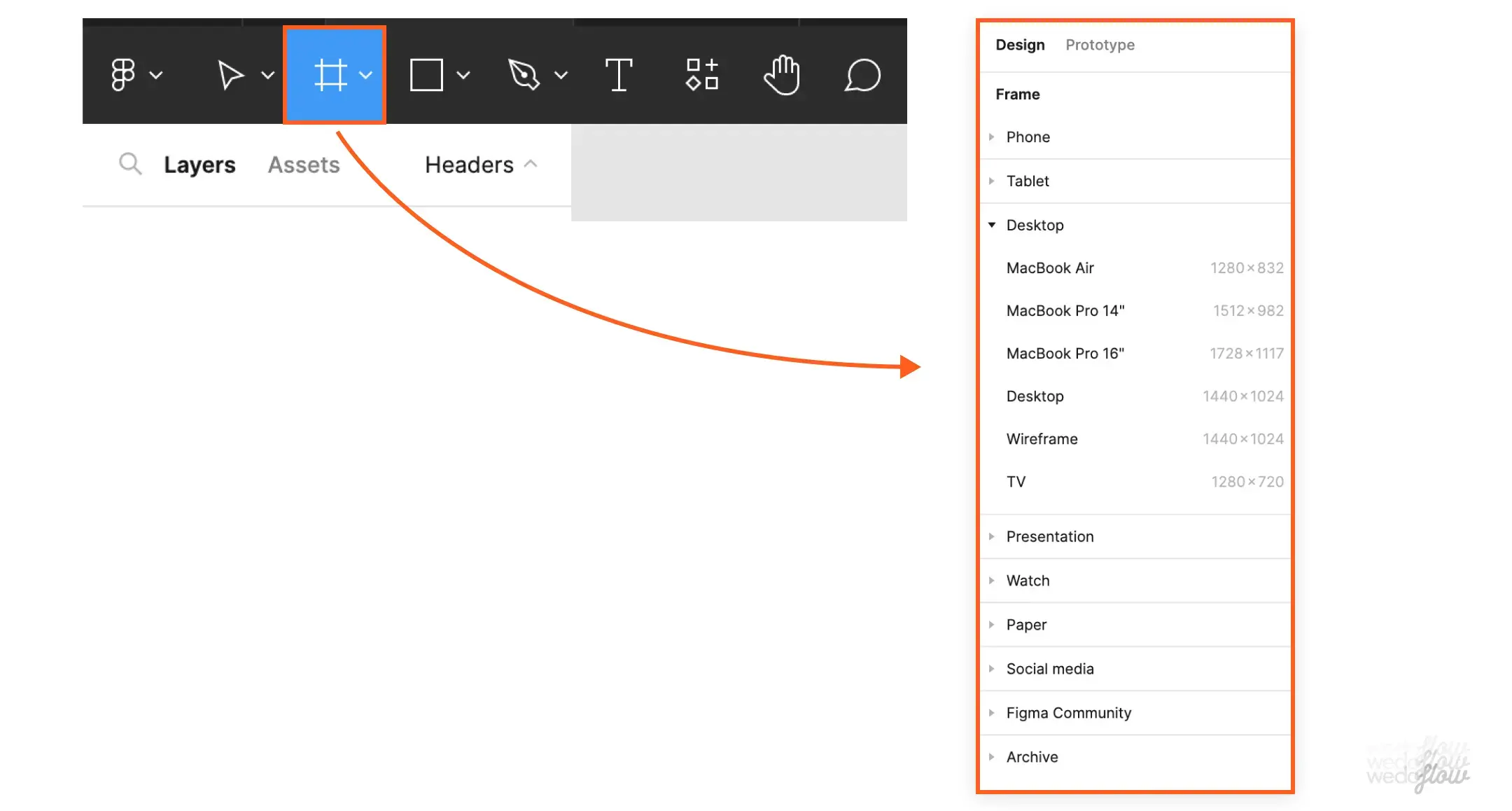
No need to be an expert, Figma offers a simple yet powerful interface. Here are the essentials to understand:
Figma is your design conductor : everything remains organized, clear, and easy to modify.

A poorly aligned design makes for a shaky website. Using Figma's smart grids and guides ensures:
✅ Perfect alignment
✅ Responsive design
✅ Harmonious layout
Quick tip: Never neglect guides, they save your design from approximations and provide a solid structure for every project.
No more tedious updates! With these tools, a change to one element is reflected everywhere.
Figma optimizes your workflow, makes life easier for designers and developers, and offers a seamless workflow experience. Embraced, validated. 🚀

Because while having a beautiful website is good, having one that's beautiful, functional, and optimized is even better. Figma allows you to structure your design in a clear and impactful way. Say goodbye to vague mockups and clunky user experiences; it's time to get serious.
Good design is like a good pizza: a solid base, consistency, and well-chosen ingredients. Here are the three elements that will make all the difference in your mockup:
A poorly designed website is like a Christmas sweater in summer. You notice it, but not for the right reasons.
The classic designer trap: creating a beautiful site… that's unusable. If users struggle, they leave.
To avoid this, here are some basic principles:
In short: beautiful AND practical, that's the winning combination.
To put these principles into practice directly in Webflow, discover our 8 Webflow elements to improve your site's user experience.

Your design needs to work everywhere. Because a poorly adapted site looks "cut in half" on mobile... and nobody wants that.
A few rules to avoid disaster:
A good website adapts to its user, not the other way around. With these fundamentals, your design will not only be effective but also a pleasure to navigate.
Figma is great for creating a flawless mockup. But once your design is ready, how do you turn it into a functional website without breaking everything? That's where Webflow comes in. With these two tools, you can go from concept to live site without sacrificing quality or efficiency.
Creating a beautiful mockup is one thing. Converting it into a well-coded website is another. Fortunately, Webflow makes the transition easier, provided you're well-organized. Here are the essential steps:
If everything is done correctly, your final site will be true to your design, while remaining fluid and high-performing. And when the site reflects a brand platform that is well-defined, it doesn't just appear consistent, it is.
Want to see what that looks like in practice? Here's how to convert your Figma web design to Webflow step by step.

A good Figma file makes for a hassle-free Webflow experience. To avoid unpleasant surprises during integration, here are some best practices:
📌 To learn more: The ultimate Webflow guide in 2025
By following these tips, you avoid wasting time and unpleasant surprises, and you create a site that respects your initial vision while being high-performing. Figma and Webflow are two tools made to work together, so you might as well make the most of them.
{{cta-2}}
Minimalism remains a reliable choice with clean and elegant interfaces. But maximalism is gaining ground with bold colors and dynamic compositions. To be chosen according to thebrand image and the target audience.
Details matter: responsive buttons, smooth transitions, immersive scroll effects. Figma allows you to test these interactions before Webflow integration, without burdening the user experience.
.gif)
{{block-cta-2}}
Dark mode has become a standard, and accessibility is a priority. High contrasts, intuitive navigation, readability… Good design adapts to all users.

📌 To go further: The 20 web design trends that will revolutionize 2025
Figma is the perfect tool to anticipate these trends and design cutting-edge websites.
{{cta-3}}
Whether you're a designer or a developer, Figma is your best ally for creating clear, interactive, and perfectly web-adapted mockups. Thanks to its intuitive interface, reusable components, and seamless integration with Webflow, it simplifies every step of the process, from the first digital sketch to going live.
In 2025, web design is evolving rapidly: minimalism or maximalism, immersive animations, enhanced accessibility… With Figma, you can test, adjust, and always stay at the forefront of trends.
So, ready to design stunning websites? Open Figma, unleash your creativity, and bring memorable web experiences to life!


.jpg)
.jpg)


%20(1).gif)