A B2B brand platform never stands out because of an extra adjective, but because of a territory that only one brand occupies: a mission (OpenAI), a literal promise (Docusign), a persona (Zapier), a visual metaphor (Ledger), an unoccupied emotion (Pleo), or a bold tone of voice (Freepik).
The point that makes or breaks a brand lies between the promise and the proof: a promise without demonstration remains a slogan, while a series of proofs without a central idea remains a product sheet. Our own projects—Allshare, BigBuddy, Aya, and Chance—show that this discipline (strategy before aesthetics) works just as well for young brands as it does for international giants, with measurable results: more applications, more won tenders, lower bounce rates, and greater impact.
A B2B brand doesn't lose a tender because its logo is too small. It loses because it looks like all the others. Same promise of proximity, same expert jargon, same website that talks about solutions before addressing the actual challenge. Yet, some brands have managed to cut through this noise without overplaying their creativity: their brand platform provides a clear direction, defining what they stand for, what they reject, and why they deserve to be chosen.
To evaluate a brand platform, you can always return to the same framework, that of a brand strategy that is well-defined: vision, mission, positioning, promise, proof, and personality. The decisive point almost always lies between the promise and the proof. An ambitious promise without demonstration remains a slogan. A series of proofs without a central idea remains a product sheet. Brands that last put this coherence down in black and white in a brand identity guide that all teams follow, and that is rarely a coincidence.
{{block-cta-1}}
Here are 10 brand platforms that succeed, from tech giants to the brands we built ourselves at Studio Elias.
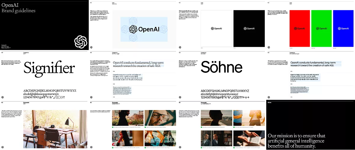
OpenAI's entire brand platform stems from a single mission: to ensure that artificial general intelligence benefits all of humanity. Nothing is decorative. The brand values—Gravitas, Precision, Approachable, Allure, Bold—maintain the tension between the rigor of demanding research and the wonder of a still-unknown technology. The logo itself, the central brick of its visual identity, a rigid construction softened by fine lines, expresses this same ambition: serious technology that remains human-centric. The lesson for B2B: when a mission is strong and precise enough, it is enough to discipline everything else in the brand, from the choice of words down to the very last pixel.
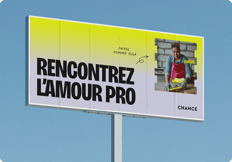
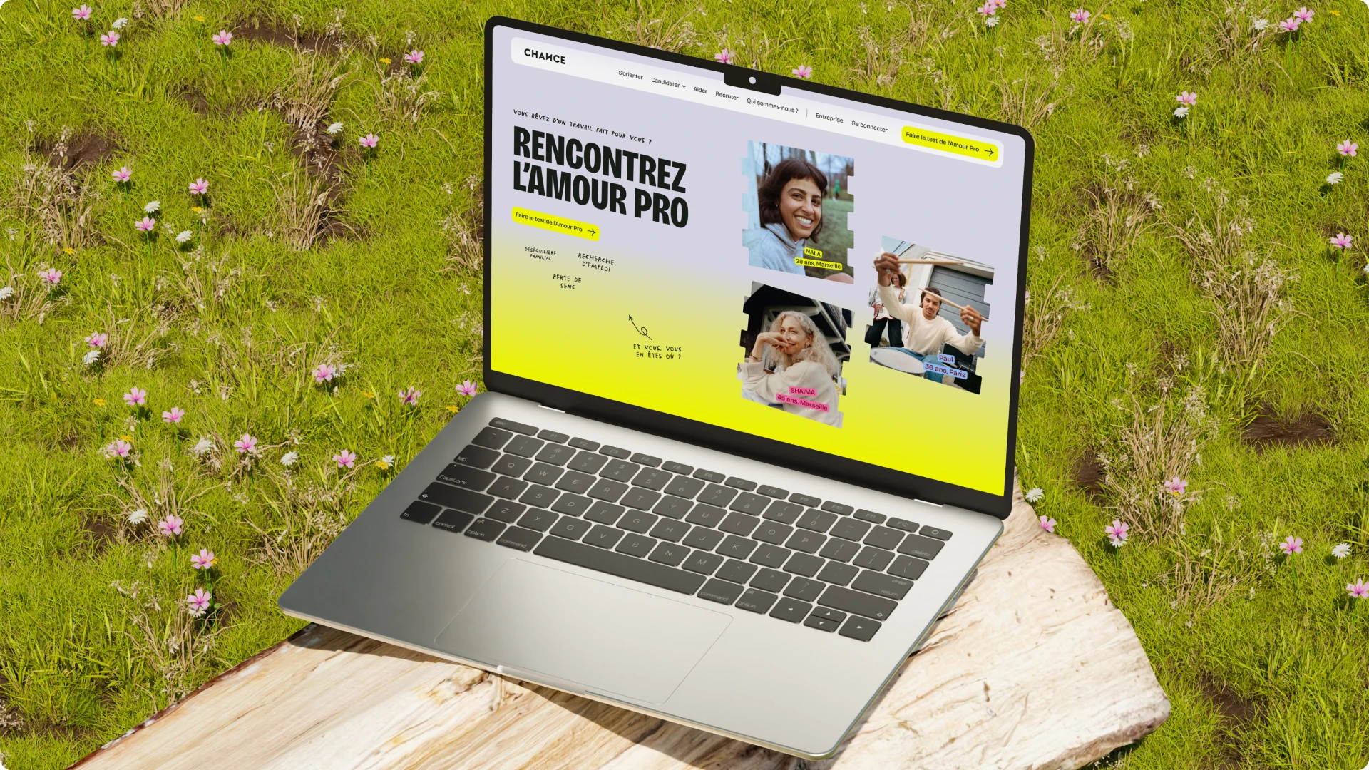
Chance supports people in career transition through human coaching and artificial intelligence. Their positioning—a method for finding your professional calling—carried a clear ambition: to awaken awareness and become the symbol of professional fulfillment in France. Studio Elias built a gentle, structured, and optimistic identity, driven by custom illustrations, to bring this promise to life even in their campaigns, which saw a 300% increase in impressions. The brand doesn't just explain a method; it makes you feel that it’s the obvious choice. A comprehensive brand book, photo projections, and a motion design module then allowed Chance to carry this identity across all its touchpoints, from recruitment to social media.
{{cta-1}}
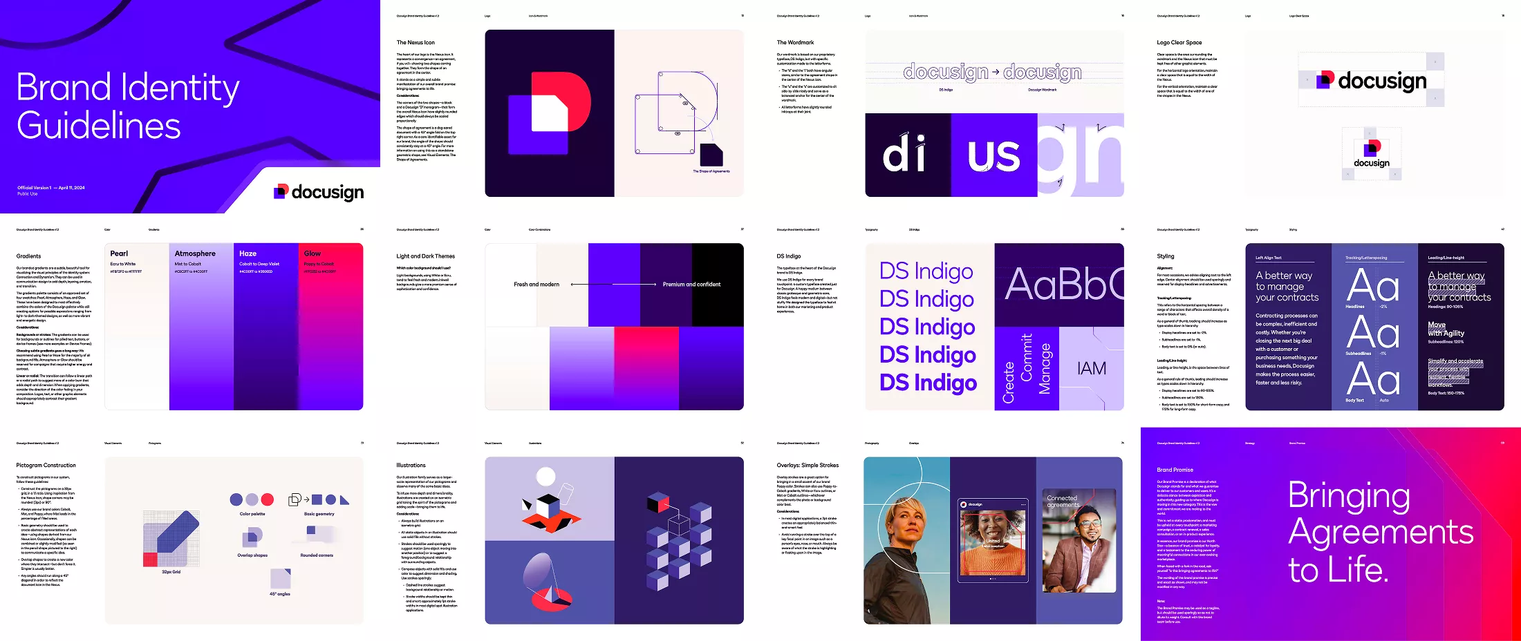
Docusign’s brand promise, "Bringing Agreements to Life," is formulated with deliberate precision: the text must never be altered and serves as a litmus test for every company decision, right down to a sales meeting or a contract renewal. This level of rigor accompanies a total category repositioning, from simple e-signatures to Intelligent Agreement Management, where Docusign asserts itself as the global platform for agreements rather than just a signing tool. Few B2B brands dare to make such a literal promise, to the point that it can also serve as a tagline. That is precisely what makes it impossible to confuse with a competitor.
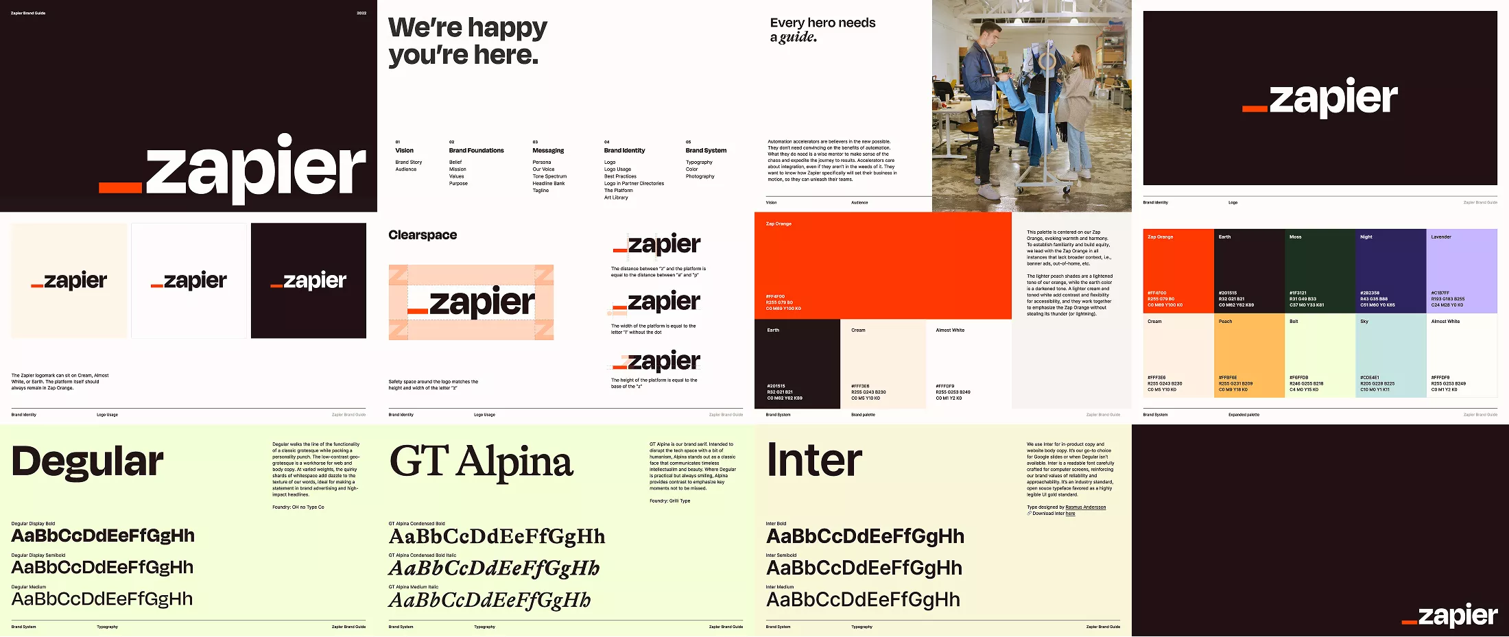
Zapier builds its voice around a specific persona, the Wise Mentor: wise, concise, helpful, and never pretentious or condescending. Its mission is to make automation accessible to everyone, and its values—Ingenuity, Reliability, Approachability, and Humanity—are expressed through a spectrum of tones ranging from pragmatic ("Zapier saves time") to aspirational ("What would you do with a thousand extra pairs of hands?"), depending on the touchpoint. The persona is not a creative gimmick; it is a tool for discipline that ensures a support email and a brand campaign sound like the same company. Internally, one conviction sums it all up: "We do our best work when technology works for us." This phrase, never shown to customers, remains the silent starting point for every brand decision.
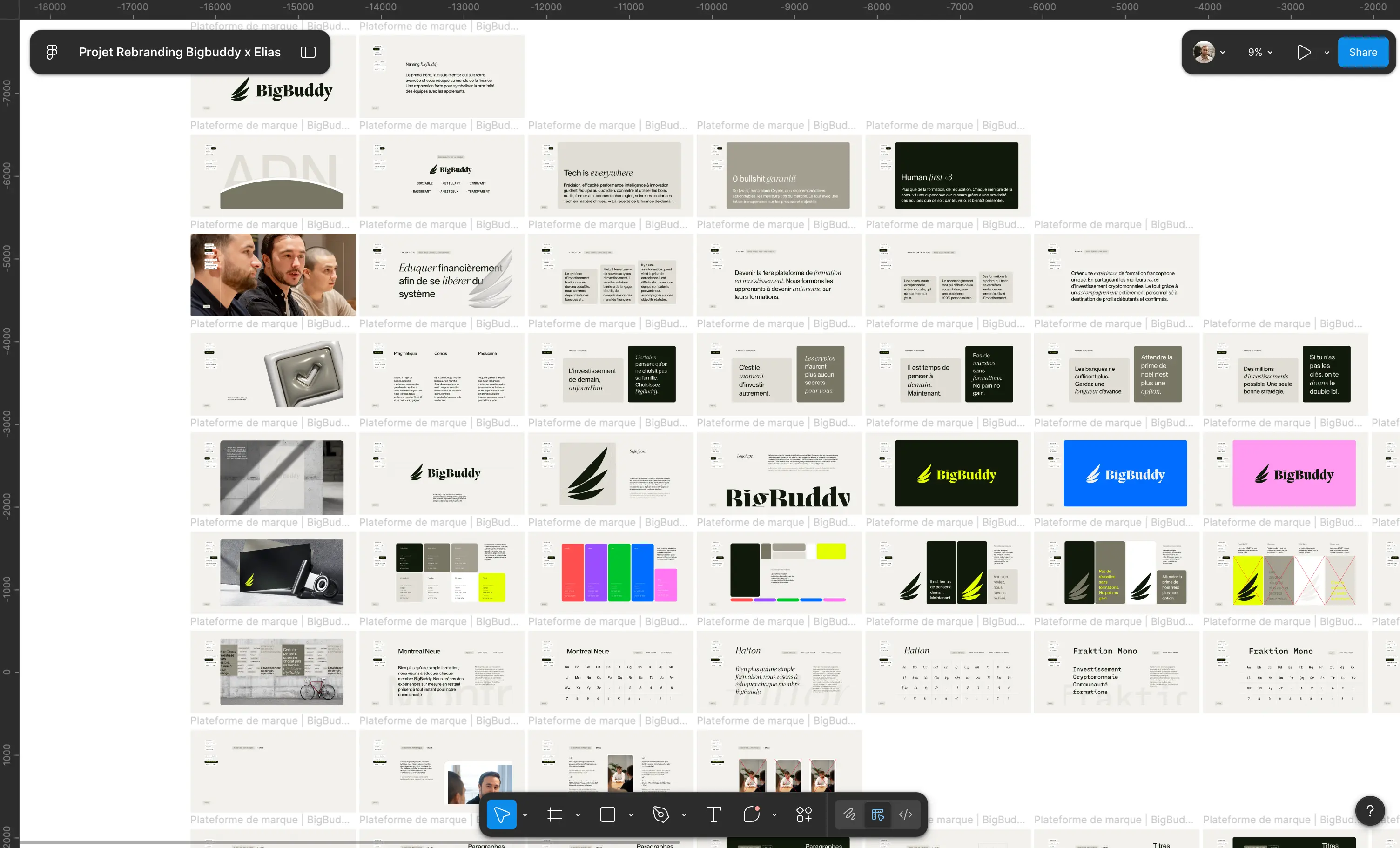
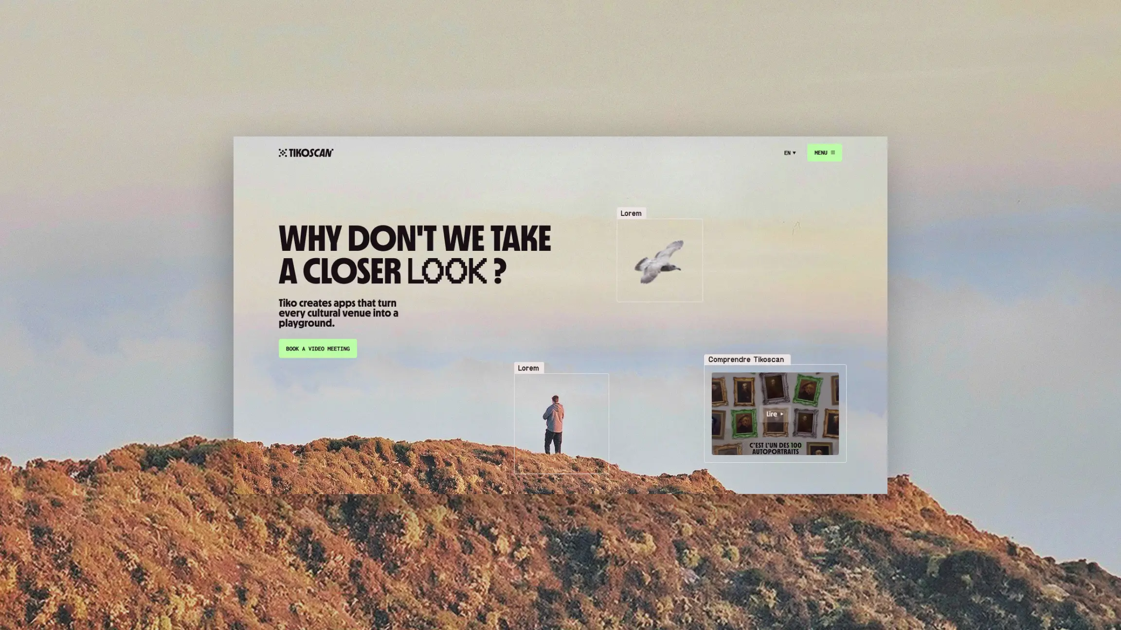
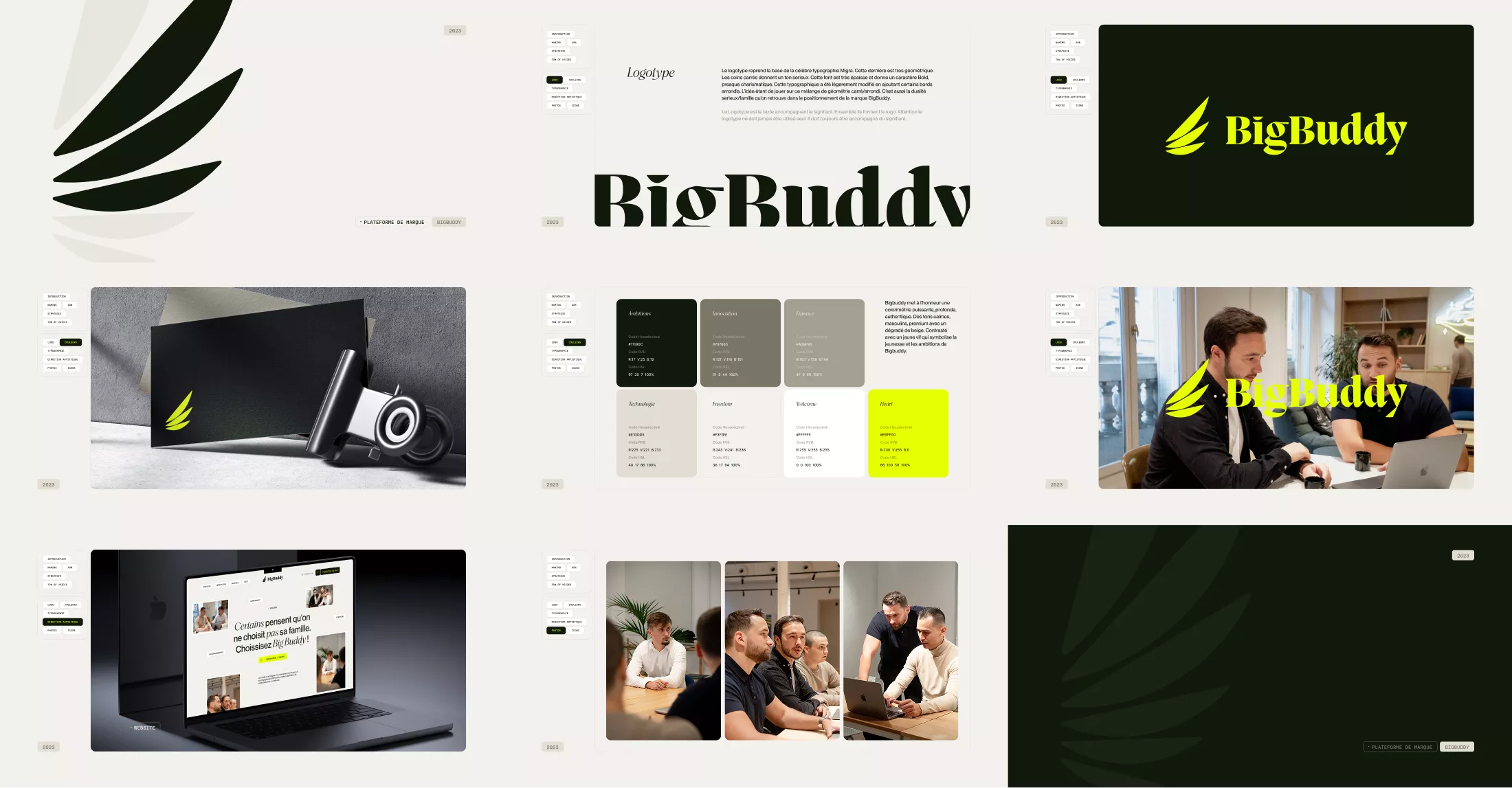
The rebranding of BigBuddy, a training organization for cryptocurrencies and new financial tools, began with ideation workshops and interviews with the founding team, well before any visual exploration. This brand platform established a clear positioning for a bold ambition: to become the leading investment education platform, providing everyone with the keys to financial autonomy. A ten-point increase in Net Promoter Score and a 20% reduction in bounce rate confirm that the "strategy first, aesthetics second" method also works for young, fast-growing brands. Art direction only followed, with three creative paths, custom 3D illustrations, and a photoshoot in Paris to accurately embody the brand.
{{cta-2}}
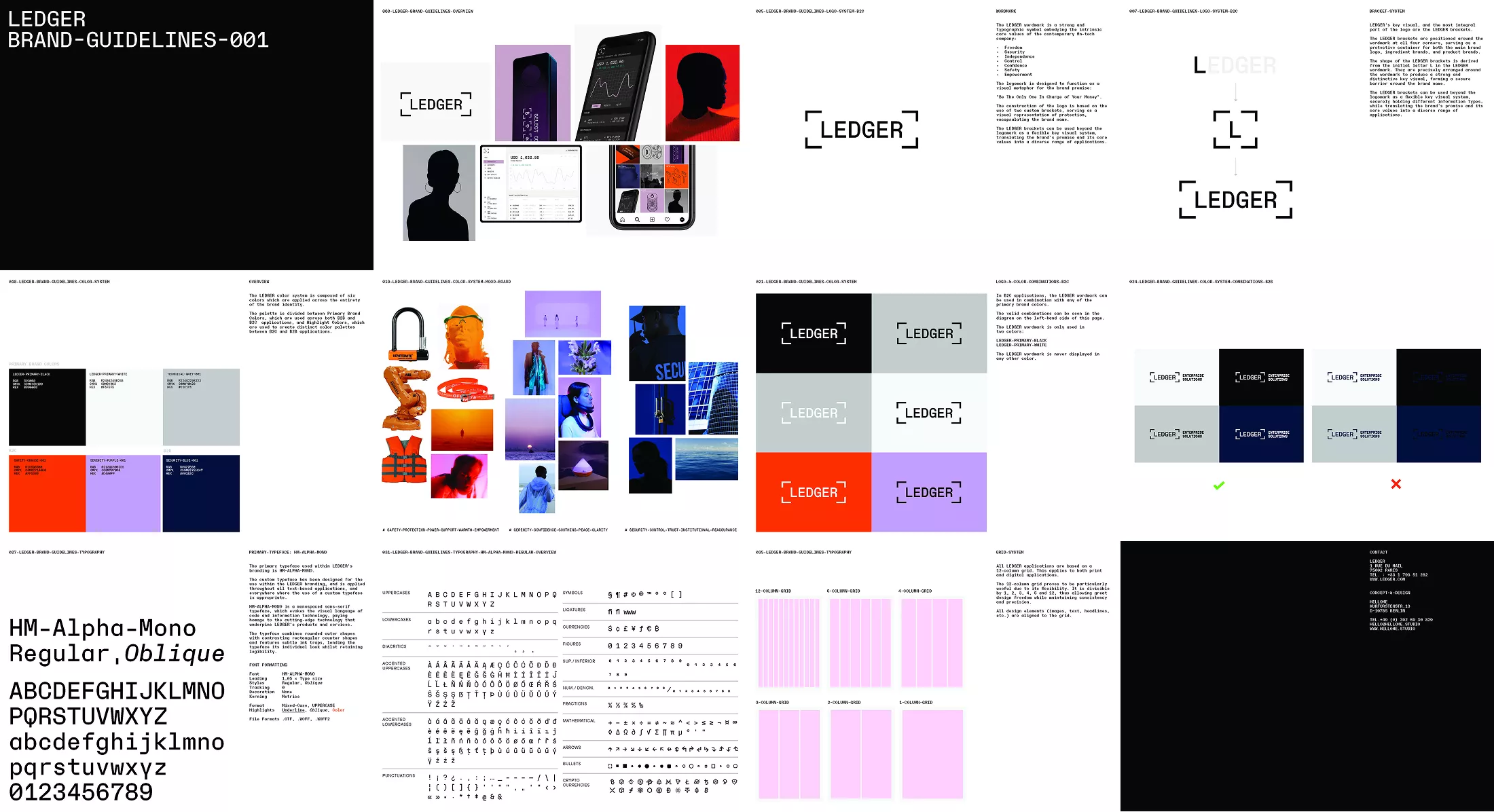
Ledger’s promise, "Be The Only One In Charge of Your Money," is literally embodied in its logo: the brackets framing the name act as a visual metaphor for protection, reusable far beyond the logotype as a full-fledged graphic system. The values—freedom, security, independence, control, and trust—infuse a palette that adapts without compromising itself: a warm orange for the general public, and a more sober, institutional blue for B2B audiences. One brand platform, two tones of voice, and a single promise kept on both sides. This is a principle rarely applied in B2B, where the temptation is often to standardize everything rather than adapt the tone without betraying the substance.
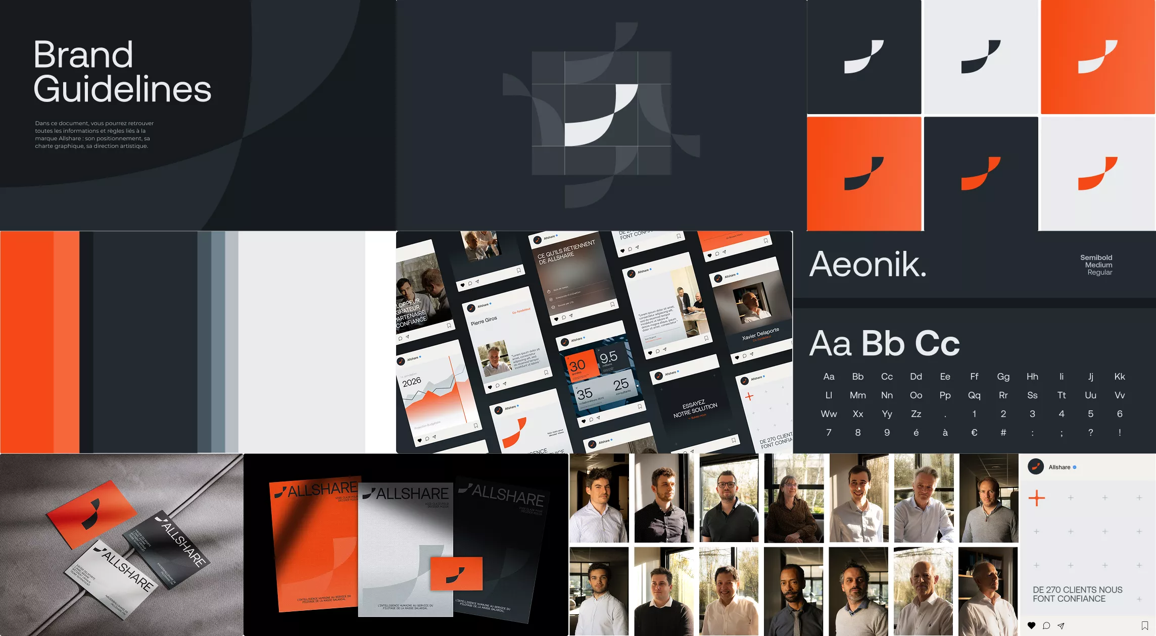
Studio Elias worked with Allshare for several months, starting with positioning before touching the logo or the website. This strategic work helped identify what makes Allshare different in its market: payroll data, a complex subject, handled by a human and agile facilitator rather than just another standardized tool, with support that inspires trust and longevity. The result: twice as many unsolicited applications and a 50% increase in brand-related searches. Proof that a clear platform precedes, and enables, a strong identity. The new website, developed on Webflow, was then handed over to Allshare's marketing teams, who were trained to gain autonomy rather than remain dependent on an agency.
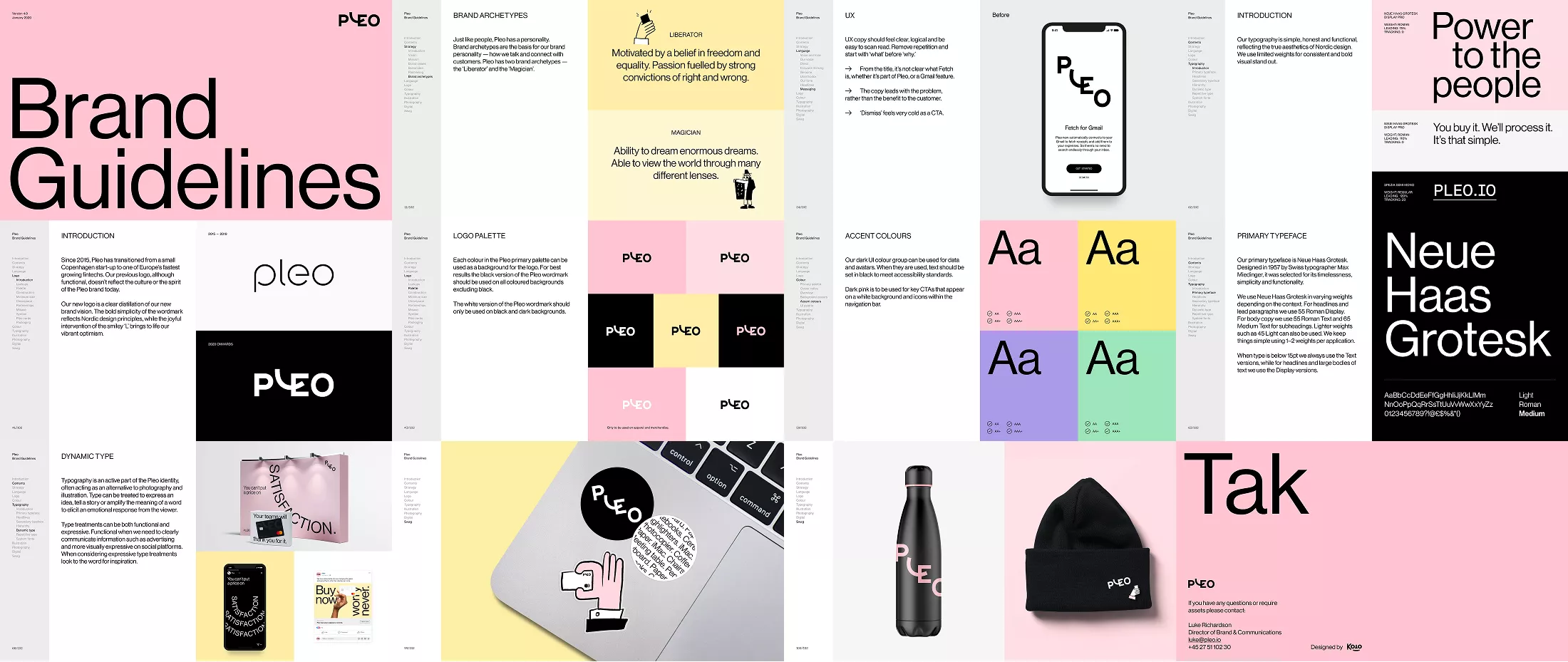
While its competitors all talk about working smarter or doing what you love, Pleo chooses an unoccupied emotional territory: making sure everyone feels valued at work. Its mission—to become the go-to spending solution for forward-thinking teams—and its brand idea, "Power to your people," flow naturally from this. Four values (transparency, fairness, fulfillment, and high standards) and two archetypes (the Liberator and the Magician) structure a consistent brand personality. The differentiation doesn't come from just another adjective, but from an emotional register that no one else occupies. The positioning states it clearly: everyone deserves to feel valued at work, and Pleo turns that into a spending system, not the other way around.
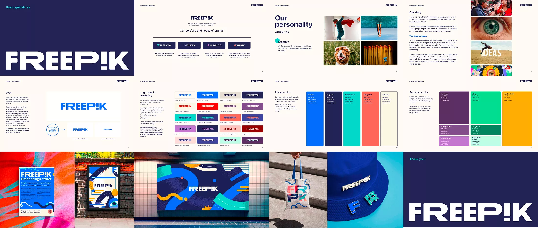
Freepik's positioning is crystal clear: to give creators and designers the tools and resources to bring their ideas to life faster, without ever losing their creative momentum. Its core message, "Freepik helps you create ambitious designs, faster," is built on clear values—taking action, driving change, keeping things simple, and staying curious—and a tone defined explicitly in the guidelines: joyful rebellion. In a market saturated with interchangeable creative tools, it is this specific tone, more than the list of features, that becomes the competitive advantage. The user need that underpins the entire strategy can be summed up in one sentence: "I have ideas, but I can't express them with the impact they deserve."
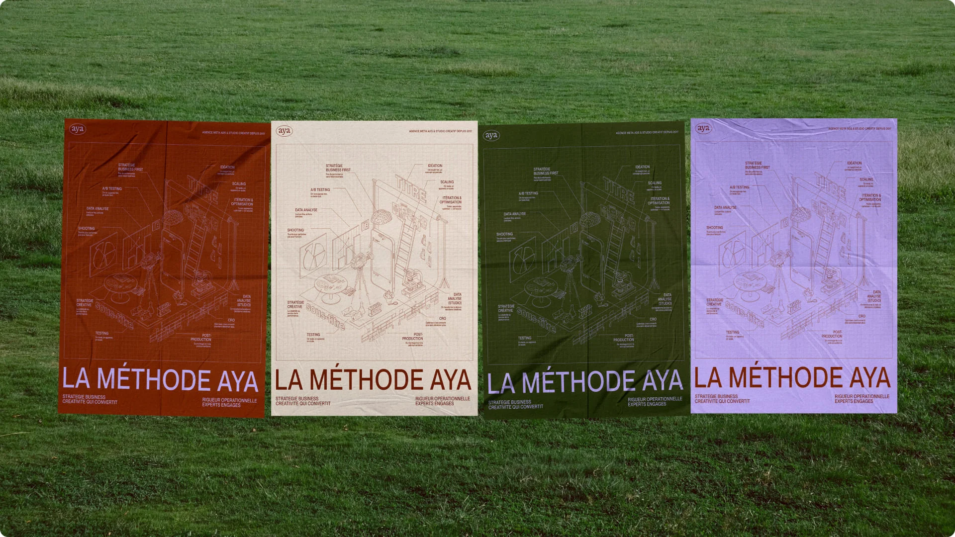
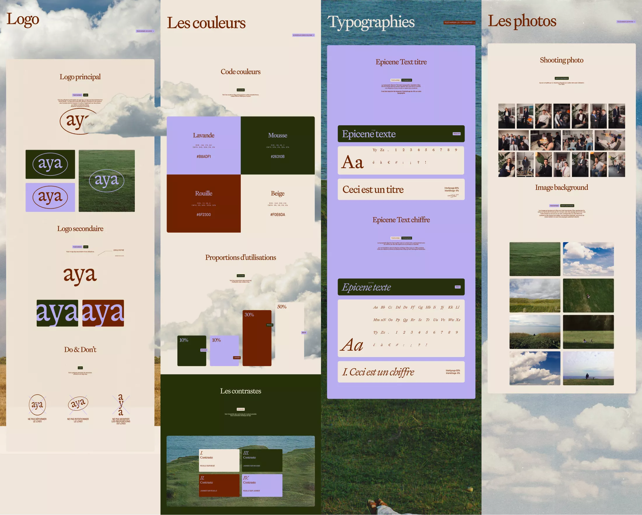
In a Meta Ads market saturated with generalists and interchangeable agencies, Aya built its brand platform around a unique concept: advertising horology. This means technical precision, artisanal craftsmanship, bold elegance, and a mastery of time and invisible mechanisms. This core idea guided the visual identity, the website, and all sales materials, right down to the custom client dashboard. The results speak for themselves: up to four times higher ROAS and a win rate of one in two on competitive bids. It is proof that a well-defined brand promise becomes a direct sales argument, not just a stylistic exercise. Everything started with in-depth groundwork—individual interviews, competitive mapping, and brand personality exploration—long before a single logo was drawn.
{{cta-3}}
None of these ten brands stood out by adding an extra adjective to their website. Each one chose a territory, a mission, or a tension that only they occupy, and then carried that idea through to every single touchpoint, from the logo to the sales pitch. This is exactly what we build at Studio Elias, a branding agency based in Paris, with every brand platform : consistency from strategy to deployment, to transform a competent company into a brand that people choose, and then remember.