

.jpg)
A landing page isn't just another page. It's a statement.
It says: here's what we do, here's what you gain, here's the next step. No detours, no clutter. One message, one action, one promise kept.
The best landing pages of 2025 all have one thing in common: they are built around a clear brand truth, translated into a consistent visual experience. It's not the number of features that convinces — it's the clarity with which the offer addresses a real need, expressed in the target audience's exact language.
Catchy headline, mastered visual hierarchy, intentionally placed CTA, well-chosen social proof, flawless mobile experience: every design decision is a conversion decision. And behind every conversion decision, there's a brand decision.
What you'll take away from this article: a high-performing landing page is, first and foremost, one that knows exactly what it is — and owns it down to the last pixel.
Ah, landing pages... these aren't just simple destinations! They are the backbone of your marketing campaigns, your best allies for transforming curious visitors into convinced customers. But here's the thing, not all landing pages are created equal. Some shine with their design and effectiveness, while others... let's just say they'd be better off staying behind the scenes.
In this article, we're sharing the best landing pages of 2025 to inspire you and boost your conversions. Here's what's in store: remarkable examples, practical tips (because we're nice), and of course, some recommendations from our own work at Studio Elias. Spoiler alert: they're awesome.

A landing page, or "page d'atterrissage" (yes, the French term is a bit less glamorous, we'll grant you that), is a web page dedicated to a single, specific objective : transforming your prospects into leads, customers, or engaged users. Unlike a regular page, it focuses exclusively on a defined action, whether it's filling out a form, downloading a resource, or clicking an engaging button like "Try for Free".
{{block-cta-1}}
This is where your marketing efforts culminate. Whether through advertising campaigns, newsletters, or social media promotions, the landing page is the bridge between your curious visitors and your business objective.
It acts like a magnet, capturing users' attention as soon as they arrive and guiding them towards a specific action. Here's what distinguishes a landing page from other web pages:
Practical example: You launch a Facebook Ads campaign for a webinar. Your landing page must match the ad's message and guide the user to sign up, without them having to search or think. That's the magic of a high-performing landing page!

A landing page has a single goal: to encourage your users to take action. However, the nature of this action depends on your specific objectives:

Imagine a restaurant without a menu: your customers would be lost, frustrated, and would likely go elsewhere. A well-designed landing page acts like that clear, appealing menu, guiding your visitors to what they're looking for.
Here's why it's essential:
We discuss this in more detail in our article Why build your landing page on Webflow in 2025.
A high-performing landing page relies on:
At Studio Elias, we know that every click counts. That's why we create landing pages that attract, engage, and convert into purchases, all while reflecting theunique identity of your brand.
In short, a high-performing landing page is the shortest path between a curious click and a happy customer.
So, ready to take the plunge? Contact Studio Elias and let's turn your visitors into ambassadors together! 🚀

{{cta-1}}
Designing a powerful landing page is like preparing a great meal: you need the right ingredients, a polished presentation, and that little something extra that makes people say "Wow!". Here are the essential elements to turn your landing page into a true conversion magnet. 🍽️
Your headline is the first thing your users notice. It should be:
Example: "Boost your sales with a landing page that converts 3x more." Studio Elias Tip: Don't hesitate to delve into your positioning; we can help you find the perfect headline, we promise, without endless brainstorming!

An image is worth a thousand words, especially on a landing page. Use:
Pro tip : On Webflow, we love integrating Lottie animations for a modern and fluid look.

Your value proposition must be clear. Ask yourself: what does my visitor gain by taking action?
Forms are often a point of friction. To make them effective:
Nothing beats the opinion of someone who has already taken the plunge. Include:
Your CTA button is the star of the show. Make sure it:

Don't overload your landing page. Instead, opt for:
Today, over 60% of visits come from mobile devices. Your landing page must be:
A successful landing page is a well-orchestrated symphony: each element plays its part to guide visitors to click, buy, or sign up. And to achieve perfection, Studio Elias is here to support you from concept to completion. 🎯
{{block-cta-2}}
Webflow has become the go-to tool for designers seeking customization and flexibility. Thanks to its advanced features, it allows for the creation of unique, high-performing, and optimized landing pages. Here are a few examples that showcase its full potential:
A minimalist, yet incredibly effective landing page. Its modular design emphasizes a clear and direct message: "Discover a component library to accelerate your Webflow projects." The colors are subdued, the content is structured, and the CTA ("Explore now") is positioned above the fold, ideal for immediately capturing attention.

This Webflow agency offers an immersive landing page that combines subtle animations and visual storytelling. Each section smoothly guides the user with perfectly executed transitions. All of this is supported by a compelling message: "we empower ambitious brands."

Milkshake uses colorful and dynamic visuals to capture attention immediately upon arrival. Their page quickly highlights the benefits of their tool, with concise content blocks and modern illustrations. The CTA "Create your first Milkshake link" is strategically repeated throughout the page to prompt action.

Why we love it? Webflow allows for customization of every detail, from design to animations, to ensure pages are not only beautiful but, more importantly, tailored to objectives.
Even the most established companies rely on high-performing landing pages to attract visitors and convert them into customers. Here's how they do it:
With inspiring visuals and a strong message like "Earn money from your spare space," Airbnb knows how to speak to its audience. Visitors immediately envision themselves in the proposed experience. An introductory video further humanizes the offer, while the "Get started today" button is always visible.
Simplicity and efficiency are the watchwords of the Dropbox landing page. A clean design, a clear title: "Share your files easily." Everything is set up to guide visitors towards a single action: clicking "Try for free." The result? A seamless user experience, designed to eliminate all distractions.
Vinted leverages social proof to reassure its visitors. Their page displays impressive figures ("50+ million users") and authentic customer testimonials. All of this is supported by a simple promise: "Declutter your wardrobe."
This social proof is one of the 8 pillars of a strong brand identity. To understand the others, read our article on the 8 examples of the best brand platforms in 2025.

Their secret? Ultra-targeted pages that directly address visitors' needs and aspirations, with visible and engaging CTAs.
Startups compete with ingenuity to design impactful landing pages, and these examples do not disappoint:
Thanks to thetool for creating a landing page from HubSpot, their landing pages, often used for e-books or webinars, feature an attractive visual, a clear description of the offer, and a short form.
Undisputed masters of inbound marketing, HubSpot knows how to captivate its audience. Their landing pages, often used for e-books or webinars, feature an attractive visual, a clear description of the offer, and a short form. The result: a high volume of qualified leads.

Unbounce is a benchmark for landing page specialists. Their example for a cloud service offer is a prime example: a catchy title, well-organized sections, and CTAs like "Book your demo now" that leave no room for hesitation.

Scalezia targets startups seeking growth. Their landing page for their growth resources is a great example of well-integrated storytelling: a modern design, a clearly defined promise ("Grow your startup with the right strategies"), and personalized CTAs, perfectly tailored to different visitor profiles.

Why it works These startups leverage best practices in design and content to educate, engage, and convert their visitors in record time.
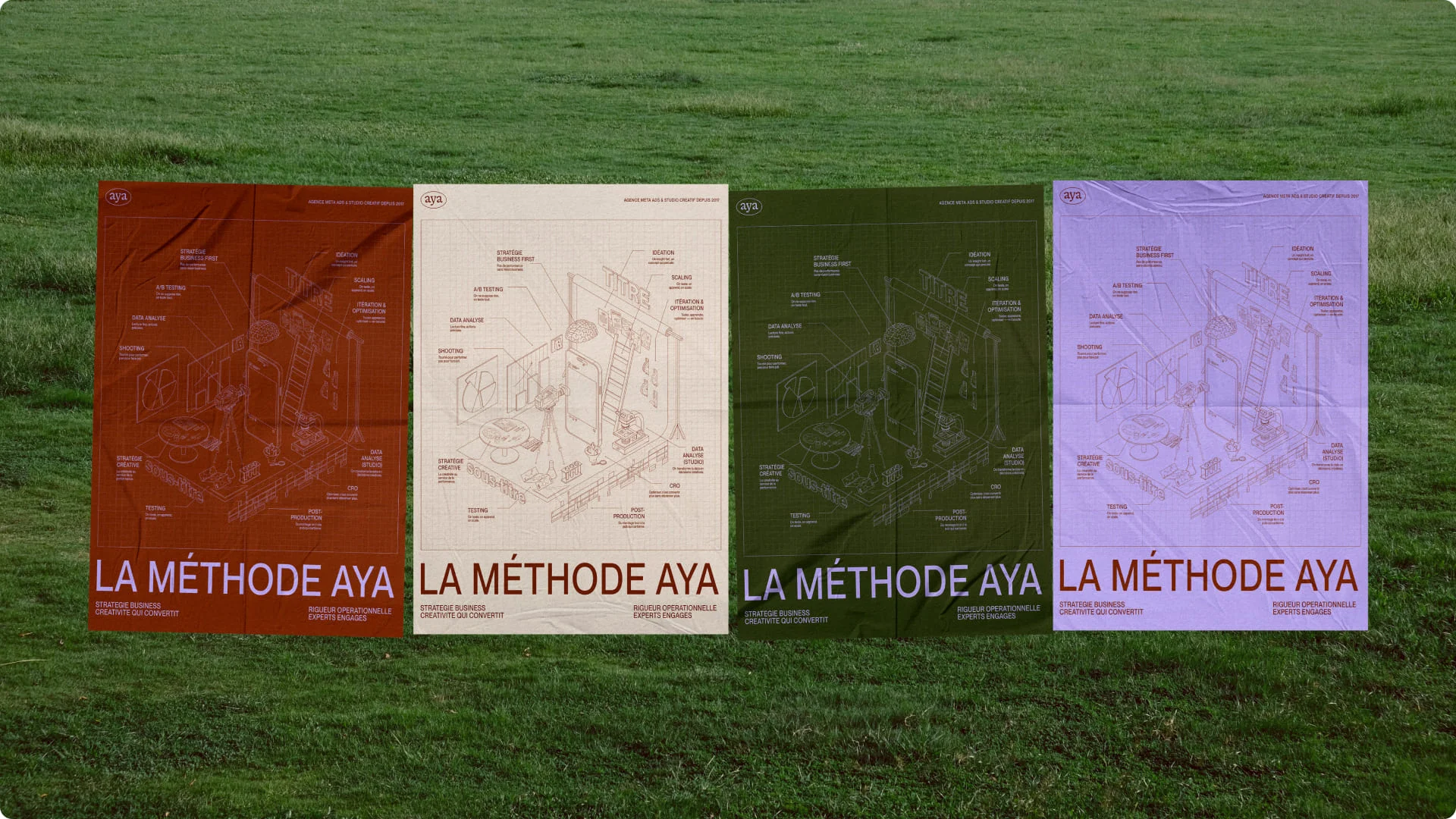
At Studio Elias, we craft custom landing pages designed to captivate your audience and boost your performance. Here are some concrete examples of our work:
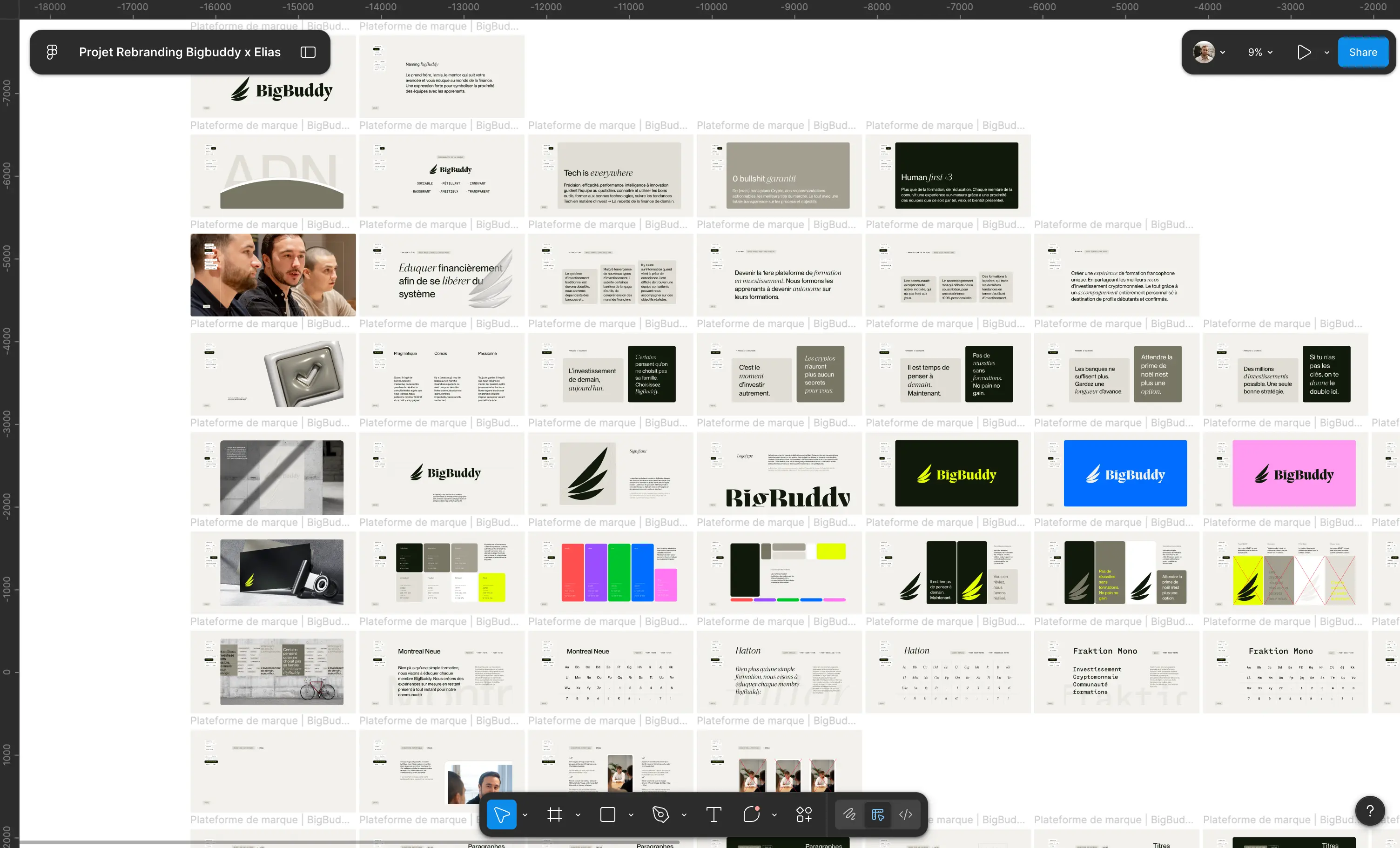
We conceptualized and developed the landing page for Big Buddy, a French-speaking platform dedicated to cryptocurrency investment training. Through meticulous optimization of user experience (UX) and search engine optimization (SEO), this page highlights tailored support suitable for both beginners and experts.
With a clean design, well-structured sections, and strategically placed calls to action, this landing page offers seamless navigation while maximizing conversions and user engagement. An achievement that combines aesthetics and performance to meet the needs of Big Buddy and its community. 🚀

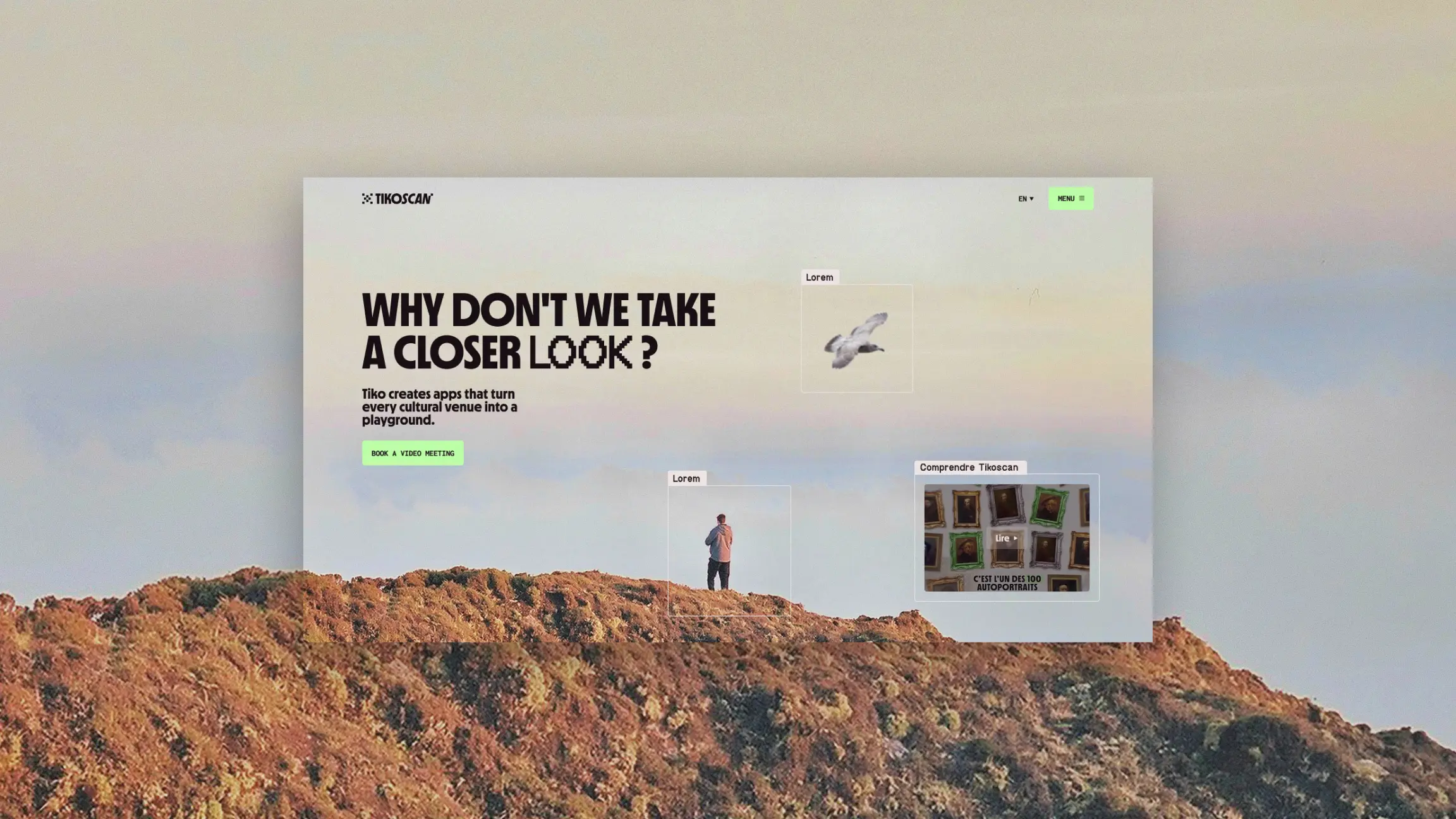
We designed the landing page for KÖM, an agency specializing in creating unexpected and inspiring content. Built with Webflow, this page combines bold design with fluid and intuitive navigation.
Optimized for search engine optimization (SEO), it highlights KÖM's unique identity through captivating visual elements and a clear message. The engaging user experience (UX) perfectly reflects the agency's creativity and boldness, while fostering visitor interaction and engagement.

Built directly on their account Webflow, this page combines modern design and intuitive navigation, perfectly tailored to business needs. By highlighting Combo's key features and optimizing the user experience, this landing page reflects their expertise while maximizing engagement and conversions.
.jpeg)
Why choose Studio Elias? Because we don't just create pretty pages: we create pages that perform, combining design, strategic content, and technical expertise.
Ready to design a landing page that inspires and converts effectively? Contact us and let's explore how to transform your ideas into a page that attracts, engages, and converts. 🚀
And to ensure this page is built on solid foundations, our brand platform service establishes the positioning, messaging, and values before the first line of code.
{{cta-2}}
Creating a landing page that attracts visitors, captivates them, and drives them to make a purchase is an art. In 2025, with powerful tools like Webflow and users more demanding than ever, mastering best practices is crucial. Here's how to turn your landing page into a true conversion machine.
These requirements begin even before the landing page: a brand strategy clearly defines the positioning, message, and target audience, which are the foundations of any page that converts.
When it comes to designing landing pages, Webflow stands out as the ideal tool:
Studio Elias Tip : For us, Webflow is an extension of our creativity. If you want a unique and high-performing landing page, you've come to the right place.
Here are the key steps to design a landing page that converts:
An effective landing page is pointless if no one can find it. Here's how to appeal to algorithms:
Designing a landing page can seem daunting, but not when you work with pros.
In summary, an irresistible landing page relies on careful design, targeted content, and flawless technical optimization. And if you want the best, Studio Elias is here to turn your ideas into reality. So, ready to captivate your visitors 🚀
Creating an effective landing page is good. But knowing how to avoid common mistakes is even better! Here are the pitfalls to avoid so your landing page is a hit, not a flop.
Your visitors aren't there to read a novel. A landing page should be concise and get straight to the point.
Studio Elias Tip: Clear and well-structured content will always perform better than an avalanche of information.

Images and animations are great for capturing attention. But if they slow down loading or make the page confusing, it's counterproductive.
The CTA is the heart of your landing page. If it's not clear, visible, or engaging, you're missing out on conversions.
In 2025, a landing page that isn't optimized for mobile is a marketing crime.

Users need reassurance before taking action. Testimonials and customer reviews are your best allies.
A landing page should guide the visitor towards a specific action, not overwhelm them with a thousand options.
A landing page is like a good dish: you adjust the ingredients until it's perfect.
Even if a landing page isn't always designed for organic traffic, a minimum of SEO optimization is essential.

A long and complex form drives your visitors away.
If your CTA is only at the bottom of the page, you lose visitors who don't scroll.
In conclusion, a killer landing page is one that avoids these common mistakes and optimizes every element for conversion. And if you have any doubts, Studio Elias is here to help you with designs that captivate and strategies that work. 😉
Creating a landing page is good. But leveraging its full potential is even better. Here are 7 proven tips to turn your visitors into delighted customers. 🚀
Not everyone has the same expectations, so adapt your message!
Colors influence emotions and decisions.
Example: An orange or red button can create a sense of urgency, while a blue hue reinforces trust and reliability.
Your calls to action (CTAs) must be visible and encourage users to take action.
Tip : Use precise action verbs like "Download now" or "Book your free trial".
A video can increase conversions by up to 80% (really!).
Good to know : On Webflow, embedding videos is a breeze. We can help you do it with style.
Your landing page should have a single goal.
Why? The cleaner your page, the more focused your visitors will be on what matters.

Visitors scan your page in seconds. Give them a reason to stay.
Example : "Save 30% of your time with our tool", or "Join the 5,000 satisfied users."
Anticipate objections and reassure your visitors with a well-thought-out FAQ.
In summary, these tips will help you maximize your conversions by making your landing pages more engaging, strategic, and effective. Need a hand applying them? Studio Elias is here to turn your ideas into concrete results. 💡
As you've seen, an effective landing page relies on a winning combination: attractive design, clear and impactful content, and a structure optimized to guide your visitors to action. But there's often a big gap between theory and practice... and that's where Studio Elias comes in. 🚀
{{cta-3}}
Why Choose Studio Elias for Your Landing Pages?
Don't let your visitors wander onto unconvincing pages. Trust us with your projects, and together, we'll create landing pages that turn clicks into clients. Contact Studio Elias today and take your conversions to the next level! 🌟


.jpg)
.jpg)


%20(1).gif)