
A logo is not just a design or a symbol. In the automotive world, it embodies the story of a brand, the identity of the company that carries it, and it makes millions of car enthusiasts dream. From the lioness to the star, from the prancing horse to the propeller, each one tells a journey, a vision and a promise.
At Studio Elias, we know that a successful logo is not just an image. It is an emblem of the brand that crosses the ages and adapts to changes in the global automotive market.
{{cta-1}}
Today, let's dive into those car manufacturers that have made history and find out why they still encourage designers who want to create a logo for their company.

It's hard to talk about automotive logos without mentioning the logo peugeot. The French brand adopted the lion as early as the 19th century, long before producing its first cars. A universal symbol of strength, flexibility and power, it already reflected the robustness and precision of the products manufactured by the company.
Over the decades, this lion has undergone numerous metamorphoses: standing on its back legs, roaring with pride, or revisited in more refined and minimalist versions. Each evolution has accompanied a new stage in the history of the automotive market, marking Peugeot's ability to adapt to trends while remaining true to its identity.
Today, the manufacturer has a modernized logo: a lion's head placed in a black and silver badge. This design combines heritage and modernity, giving Peugeot a premium, assertive and coherent brand image. A perfect example of how an automotive logo can stand the test of time while continuing to embody the vision of its founder and the ambition of the company.
Another iconic French brand: Renault. Since 1925, its diamond-shaped (or diamond) logo has symbolized precision and solidity. The story goes that after the First World War, Renault wanted a distinctive sign for its vehicles and chose this simple and effective geometric symbol.
Over the decades, diamonds have been redesigned dozens of times. The most recent design, minimalist and flat, reflects Renault's desire to anchor itself in the digital age and to appeal to a new generation.
If it were necessary to elect an emblematic logo of the automotive world, that of Ferrari would undoubtedly figure at the top. His black prancing horse on a yellow background, framed in the colors of the Italian flag, is much more than a simple graphic symbol: it embodies soul and passion.
The origin of this logo dates back to the First World War. The horse was on the plane of a heroic Italian pilot. After his death, his family offered Enzo Ferrari to take up this lucky sign again. He chose to adopt it and to add yellow, the color of his native city, Modena.
Since then, this emblem has become one of the most powerful in the industry: a compendium of speed, prestige and dreams, associated with the most beautiful sports cars in history.
BMW (Bayerische Motoren Werke), a German manufacturer, is famous for its circular logo in the colors of Bavaria (blue and white). Many still think that it represents a propeller in motion, but in reality, it pays tribute to the brand's regional roots and its attachment to Bavaria.
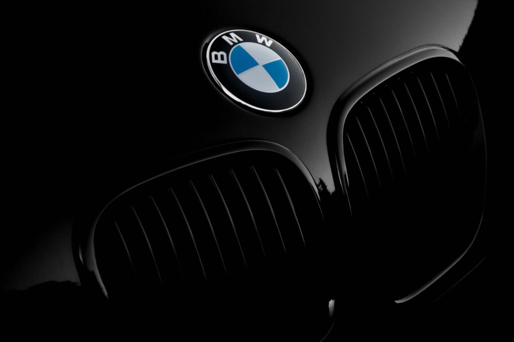
However, the propeller legend has emerged over time, due to the aeronautical past of BMW, which manufactured aircraft engines at the beginning of the 20th century. This interpretation, although originally false, enriched the storytelling of the logo and gave it additional strength: it embodies both local tradition and technological innovation.
This blend of history and modernity explains why the BMW logo is now one of the most recognizable and respected automotive logos in the world.
The logo Mercedes-Benz is one of the most recognizable in the world. Its three-pointed star symbolizes the brand's dominance on land, sea and air. A simple, powerful logo that summarizes the manufacturer's universal ambition.
Over the century, this logo has changed little, proof of its graphic strength. Today, it remains a reference for any company that wants to create a strong and timeless logo.
audi is distinguished by its four intertwined rings, representing the fusion of four German brands: Audi, Horch, DKW and Wanderer. This logo is a storytelling model: each circle tells a part of the company's story.

In the global automotive market, this logo inspires by its simplicity and its ability to evoke unity and collective strength.
Hard to find a logo richer in symbols than that of porsche. Created in the 1950s, it uses the coat of arms of the city of Stuttgart, the birthplace of the brand, as well as the coat of arms of the former kingdom of Württemberg. It features a prancing horse (a symbol of Stuttgart), stylized deer antlers and strong colors: black, red and gold, which recall the brand's German roots.
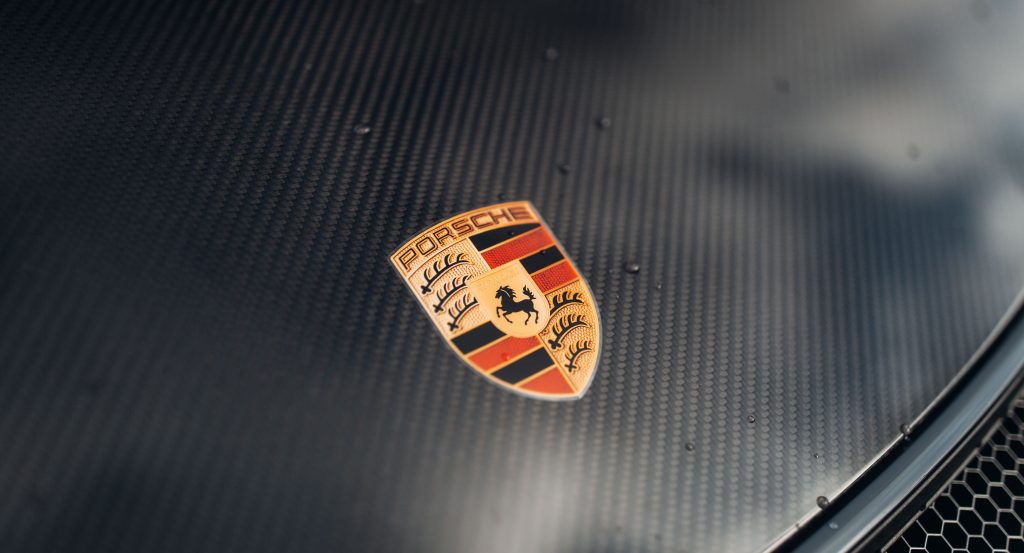
This car logo has survived the decades without ever losing its prestige. More than just a distinctive sign, it embodies the identity of the brand: power, precision and sporty elegance. A true emblem of the sports car, the Porsche coat of arms is now recognized throughout the world as a symbol of excellence and innovation.
Born in Germany, the logo vw Combine a “V” and a “W” in a perfect circle. Behind this simple representation lies an ambition: to create a car for the people (“Volkswagen” meaning “people's car”).
This iconic logo has evolved and adapted to digital technology, and remains a pillar of global motor racing today.
The logo Jaguar represents the leaping animal, symbol of speed and power. This emblem highlights the DNA of British sports cars.
The brand's image is based on this wild elegance, a choice that further encourages designers looking for animal-based logo ideas.
Unlike Ferrari and his horse, lamborghini chose a Taurus in reference to the astrological sign of its founder. The Lamborghini logo is an emblem of the Italian brand: strength, brutality and prestige.
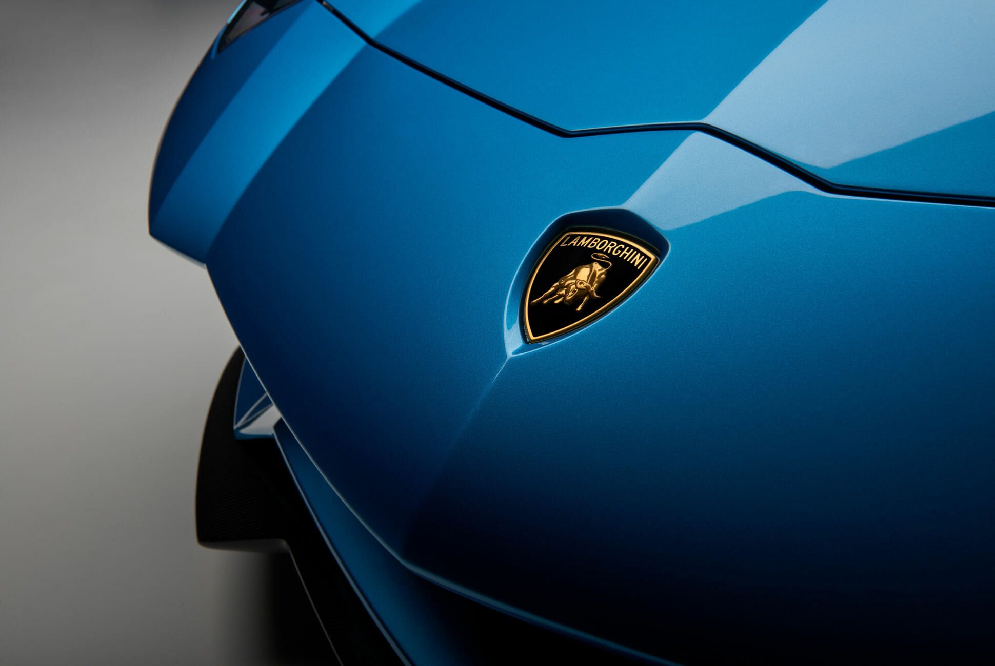
A perfect example to understand how to design a logo aligned with the personality of the founder of the brand.
These manufacturer logos show the cultural and historical diversity of the automotive industry.
Each car logo illustrates a strategic choice: an animal to embody power and speed (Jaguar, Ferrari, Peugeot), a color to recall the origins of a brand (BMW's blue and white for Bavaria), or a letter to simplify the message and remain immediately recognizable (the “V” and “W” from Volkswagen). These decisions are never trivial: they reflect a vision, a story and a desire to stand out in an extremely competitive global market.
For a modern business, having a logo that inspires trust, consistency, and professionalism is essential. It is not only a question of aesthetics: it is a strategic tool that acts as the first ambassador of your brand image. A well-thought-out logo can make the difference between a brand that remains invisible and one that finds its place in the minds of its customers.
At Studio Elias, we support our clients in creating a logo adapted to their market and their vision, whether they are a fast-growing tech startup, an innovative company in the automotive sector, or any other company that wants to strengthen its identity. Our approach is to analyze the codes of your sector, to design unique visuals and to give life to logos that evolve over time, while remaining true to the promise of your brand and the personality of your founder.
{{cta-3}}
Because beyond a simple design, a logo must stimulate, unite and last.
{{cta-2}}
From lion to horse, from propeller to star, automotive logos are not simple designs. They are condensed stories, landmarks in the history of the global market.
They inspire designers, they impress enthusiasts, and they show businesses that a well-designed logo is a strategic asset.
If you are looking to create a logo for your business or to rethink your visual identity, the Studio Elias team can help you. After all, even the biggest brands started with a simple design, which over time became a universal emblem.


.gif)

