
At Studio Elias, we often hear this question: “Is it really important to create a logo for my business?” The answer is simple: yes, but certainly not in any way.
A brand logo is not just a pretty design or a small icon to place on your communication media. It is the visual symbol that embodies your business, that expresses your personality and that offers your audience a first impression... sometimes decisive.
It is often forgotten, but the logo does not exist alone. It should be thought of as the center piece of a bigger puzzle: your brand strategy and visual identity. Without a clear artistic direction, a logo risks being just one visual among others, with no real scope or coherence.
On the other hand, when designed methodically, a logo becomes a real emblem, able to stand the test of time, adapt to different media, and above all, make an impression. Of nike unto Apple, going through Chanel or Coca-Cola, famous logos remind us that a simple sign can embody values, a story and an entire universe.
.png)
That is precisely what we do at Studio Elias: design logos that are never isolated, but always integrated into broader strategic thinking. Because for us, a logo is not an end in itself, but the starting point for a coherent and strong visual identity.
A logo is often the first contact between a company and its audience. Even before discovering your products or services, your customers identify your brand through a visual sign. It is this small symbol that should simultaneously intrigue, reassure and make an impression.
A well-designed company logo fulfills several missions:
A good logo design should therefore:
The big brands have understood this. When you think of Nike, Apple, or Coca-Cola, you don't just see a drawing or a word: you immediately visualize a complete universe. In a few seconds, their symbol becomes a landmark, a memorable logo capable of evoking a story, a lifestyle or a cult product.

But be careful: creating a logo is not enough. An inspired logo must be integrated into a global and long-term visual identity. Because a logo that does not rely on a solid artistic direction risks losing its strength over time. Conversely, a logo designed as a strategic element can evolve, stay modern, and continue to speak to your customers for decades.
A brand logo should not be considered as a simple graphic signature. It is a strategic element that influences the perception of the company in the long term. Behind every memorable logo, there is a reflection on positioning, target audience and brand identity.
A well-designed logo helps:
It is also a powerful marketing tool: a logo can evoke an emotion, tell a story in a single symbol, and strengthen customer loyalty. Like Nike, Google or Louis Vuitton, a logo becomes a visual reference point that goes beyond the simple product to become anchored in the collective imagination.

At Studio Elias, we always put the logo at the heart of our thinking. It is never an end in itself, but an essential building block that supports brand strategy and accompanies the evolution of the company over time.
An isolated logo, without artistic direction, is like a beautiful cover without a book behind it. It may catch the eye, but it lacks depth and doesn't tell anything solid. A logo must be designed to support the brand image over time, create coherence and reinforce every word of the company.
At Studio Elias, our role is not only to create a beautiful visual. We design inspired logos that fit into a global brand strategy, taking into account positioning, visual identity and target audience. Each project is a unique story, translated visually through a strong symbol.
For Bigbuddy, we didn't want a purely decorative logo. We created a true emblem logo, designed as a visual landmark to embody their vision of a more open and modern education. This logo reflects transmission, family and proximity, values that are essential to the project. The objective was clear: to assign a strong and inspiring identity to a brand that wants to be both human and focused on the future.

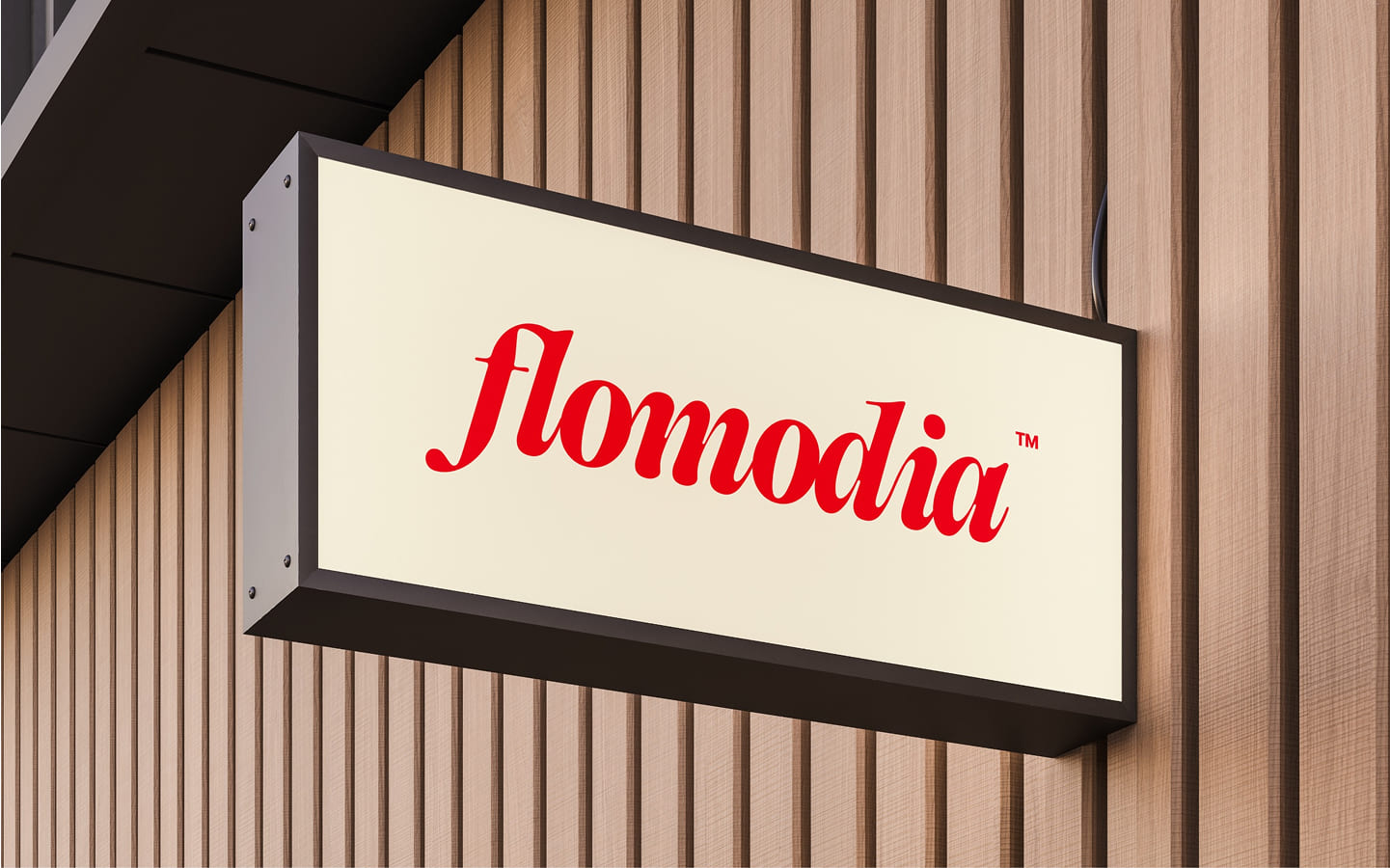
Chez Flomodia, a company in the technology sector, the priority was to design a modern and simple logo style that could stand the test of time without losing relevance. We worked on a fluid and clean design that reflects both innovation and accessibility. But beyond the futuristic aspect, we wanted to keep a human dimension, so that the logo remains close to its audience and conveys a welcoming image, far from the cold codes often associated with tech.
For Pipole, the challenge was high: to stand out in a saturated universe where communication brands compete creatively. The creation of a logo was therefore an opportunity to design a memorable, simple but impactful symbol, capable of embodying their unique identity. Each graphic element has been carefully chosen to reflect their personality and ensure perfect consistency with their marketing positioning. This logo has become a real visual landmark, guaranteeing Pipole immediate and lasting recognition.

{{cta-1}}
A logo is not just a shape or a color. It is a symbol full of meaning, a visual summary of everything that a company represents. Where words can multiply, the logo has the power to say everything in an instant, to transmit an emotion even before the message is read.
An inspired logo can suggest a story, a ambiance, or even a lifestyle. The Nike swoosh is more than just a graphic line: it embodies movement, energy, and performance. The Apple logo, with its bitten apple, has become the manifesto of innovation and simplicity. As for the Chanel logo, it has established itself as the timeless emblem of luxury, a signature that crosses the ages without losing its strength.
This ability to evoke much more than a design is what makes the logo an essential element of brand identity. It acts as a visual cue, a common thread that connects advertising campaigns, products and all communication. In the blink of an eye, it should allow the public to recognize the brand, but also to feel it.
At Studio Elias, we like to remind you that a logo is not only a recognition tool, it is also a vector of emotions. Well thought out, it reflects the personality of the brand, inspires confidence and makes you want to go further. It is precisely this role in accelerating the link between the brand and its audience that makes all the difference between a forgotten logo and a striking logo.
We think of each logo creation as an encounter: between a story and an aesthetic, between a brand strategy and an emotional experience. This is where design becomes powerful, because it is no longer about creating a simple visual, but about giving life to an identity that can stand the test of time.
Creating a good logo requires much more than opening an online logo maker and quickly testing a few logo templates. The real difference lies in strategic thinking: understanding what you want to convey and how to translate it into a logo design that makes sense.
An effective logo is never created by chance. It starts with a key question:
What is the vision of the company?
A brand logo must reflect an ambition, a direction. Some companies want to highlight their innovative side, others want to highlight their history or assert an appearance of proximity and trust. This first step allows you to give a clear direction to logo creation and to avoid designing a simple soulless design.

Each company logo reflects a strong stylistic choice. A letter logo highlights the brand name and affirms clarity. An abstract logo symbolizes ideas, a larger universe, often used in tech and innovation. The emblem logo, on the other hand, combines text and symbol in a unique form, ideal for sectors where heritage and tradition matter. The style chosen must correspond to the positioning of the brand and the image it wishes to project.
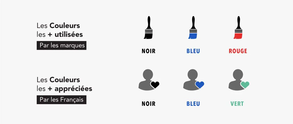
The colors used by brands are never trivial. The energetic red of Coca-Cola, the elegant black of Chanel or the creative multicolor of Google are proof of this. Each color evokes a specific emotion and contributes to the creation of a memorable brand identity. Choosing the right logo colors is therefore ensuring that the public immediately feels the right emotions about your visual identity.
A logo is not meant to remain fixed on a model. It must live and adapt to different contexts: website, social networks, product packaging, stationery, signage... An inspired logo must remain clear and identifiable, whether it appears large on a poster or in lower case on a smartphone icon. The strength of an unforgettable logo lies precisely in its ability to cross all formats without losing impact.
It is this combination — clear vision, adapted style, meaningful colors and adaptability — that makes it possible to create a sustainable logo. Major brands like Louis Vuitton or Chanel remind us that behind the apparent simplicity of a symbolic logo lies meticulous design work. It is this strategic thinking that makes the difference between an ephemeral logo and a brand logo that can stand the test of time while remaining consistent.
Creating a logo may seem simple on the surface, but many businesses fall into pitfalls that reduce the impact of their identity. A brand logo must be designed to last, which means avoiding certain approaches that are too superficial.
One of the most common mistakes is settling for an automatically generated online logo. These quick solutions often offer standardized results, with no real connection to the personality of the brand. A memorable logo cannot simply be the product of an algorithm; it must be the result of strategic thinking.
Another pitfall: wanting to say too much. Some logos are overloaded with complex details, colors, or shapes. However, a good logo must remain simple and legible, even in a reduced version, on a business card or a smartphone icon. The clearer it is, the more recognizable it will be.
It's also risky to copy an existing logo or get too closely inspired by famous logos. Instead of providing a clean identity, this practice blurs the boundaries and can even damage the credibility of the business. The objective is not to imitate Nike, Apple or Chanel, but to create a unique visual, adapted to your story and your market.
Finally, a common mistake is to design the logo without thinking about its integration into the overall visual identity. An isolated logo is not enough: it must harmonize with the company's graphic charter, communication tone and marketing strategy.
At Studio Elias, we take care to avoid these pitfalls by working on each logo as a key element of brand identity, capable of supporting the evolution of the company over time.
Logos created twenty years ago no longer look like the ones we see today. The history of logo design shows that nothing is fixed. Major brands like Lacoste or Nike have gradually simplified their design, refining every detail to maintain a contemporary aesthetic and immediate recognition. This ability to evolve while remaining true to their identity is the key to their longevity.
A company logo must therefore be designed with this idea in mind: it is not an immobile object, but a living element of the brand image. That means it needs to be strong enough to last, but also flexible to adapt to new trends, new mediums, and changing audience expectations.
At Studio Elias, we like to remind you that a successful logo is not an end in itself. It is the starting point of a visual story, intended to evolve with the brand. We always advise our customers to consider logo design as a continuous process, capable of supporting business growth, the arrival of new products or the opening of new markets.
In other words, a logo is not just a fixed image: it is a moving version of your branding, which must know how to adapt without ever losing its DNA.
{{cta-3}}
At Studio Elias, we believe that the logo is not an isolated element, but the anchor of a coherent and inspiring brand image. The project Green River, an offer of private cruises on the Seine in Paris, perfectly illustrates this philosophy.
From the start, the challenge was clear: to build a brand that is not only a service, but a real experience. Green River wanted to differentiate itself from a multitude of Parisian players offering cruises, often perceived as standardized. Our mission was therefore to give the brand a unique identity, capable of attracting demanding customers in search of refinement and exclusivity.
We supported Green River throughout the entire process: from strategic positioning to the creation of the visual identity, through artistic direction and logo design, to the launch of a website. Each step has been designed to reinforce the coherence of the brand and ensure a strong impact on its target audience.
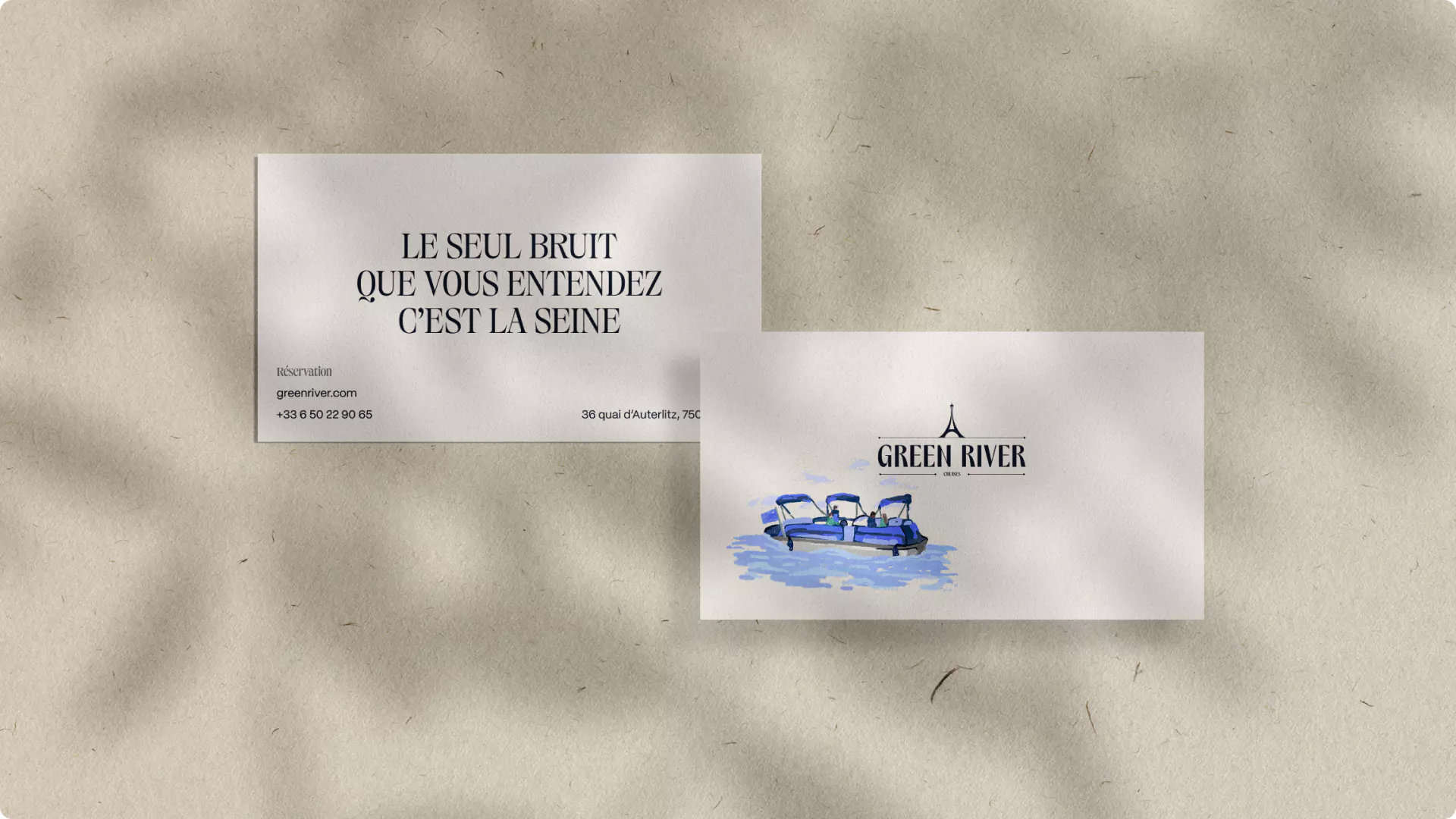
The brand promise we formulated — “To set sail without leaving Paris” — perfectly reflects this vision. More than a simple sentence, it is a real territory of expression that links the dream of escape to the magic of the capital. This slogan encapsulates the essence of Green River: a timeless, intimate and elegant experience to be enjoyed along the water.
The proposed experience also had to find a visual echo. This is why we worked on an artistic direction inspired by the bright environments of Paris. From the flamboyant sunset over the Seine to the sparkling reflections of the Eiffel Tower at night, each nuance has nourished the graphic universe. The logo, colors and visual supports reflect this duality between refinement and modernity, Parisian tradition and contemporary exclusivity.
The animated illustrations we created are not just decorations. They extend the history of the brand by presenting a poetic, moving, living Paris. They accompany the user on a visual journey even before boarding, reinforcing the idea that cruising begins with the first contact with the brand.
This project shows that behind each logo or visual identity lies much more than a design: a brand strategy designed to last, a visual universe that conveys emotions, and a story that engages the public. Green River embodies this approach, proving that when a logo is designed as a strategic compass, it becomes the true driver of a brand.
{{cta-2}}
Creating a logo is much more than drawing a symbol or choosing a color. It means designing a visual identity that embodies a vision, that reflects a mission and that accompanies the brand over time. A successful logo inspires trust, creates a lasting landmark and ensures immediate recognition.
At Studio Elias, we don't just “design logos.” We build true, coherent brand images, visual worlds that evolve with the business, that tell a story and that appeal to the target audience. Each project is thought of as a whole: an artistic direction, a strategy and a design combined to give birth to a memorable logo.
From Bigbuddy to Flomodia, from Pipole to Green River, our creations reflect a strong conviction: a logo does not live alone, it reflects a clear positioning and the expression of a solid brand identity.
So, if you want a logo that truly expresses the soul of your business, that sets you apart and that is part of a sustainable strategy, it may be time to build this story together.


.gif)

