
In 2025, web design is entering a new dimension: more human, more interactive, more immersive. It's the year when creativity meets technology to create websites that no longer just inform, but that inspire, captivate, and connect.
Our web design agency Studio Elias sees webdesign trends pass like others see real ones pass. Some are just going for a ride, others are settling in for good and transforming the way websites are designed. So we sorted it out to present to you The web design trends that will mark the year.
Because a good website is not just a good idea: it's also the right design tools. In 2025, web designers have at their disposal ever more powerful, intuitive and creative solutions to develop modern, dynamic and accessible interfaces.
Here is our small selection of the essential web design software this year tested, approved, loved by Studio Elias designers:
Webflow continues to dominate the modern web design scene. It allows you to create tailor-made websites without writing a line of code (or almost), while maintaining total control of aesthetics, animations, interaction and content.
👉 Why use it? To create a dynamic, responsive, SEO-friendly website, and above all... faithful to your image.

📖 Need a detailed overview of Webflow and all of its capabilities? Consult The ultimate guide to Webflow in 2025.
Still at the top of the podium in terms of collaborative design, Figma allows you to create models, prototype, animate and collaborate in real time. Its easy integration with Webflow, Lottie or Framer makes it an essential part of web design.
👉 What we like: creative freedom, custom fonts, shared libraries... in short, everything to create efficient and neat interfaces.

Need to add a smooth animation to your home page, an interactive button, or an animated illustration? Lottie makes it possible to create engaging visual experiences while keeping a site light and fast.
👉 The advantage: we remain committed to responsible design without sacrificing movement or visual impact.
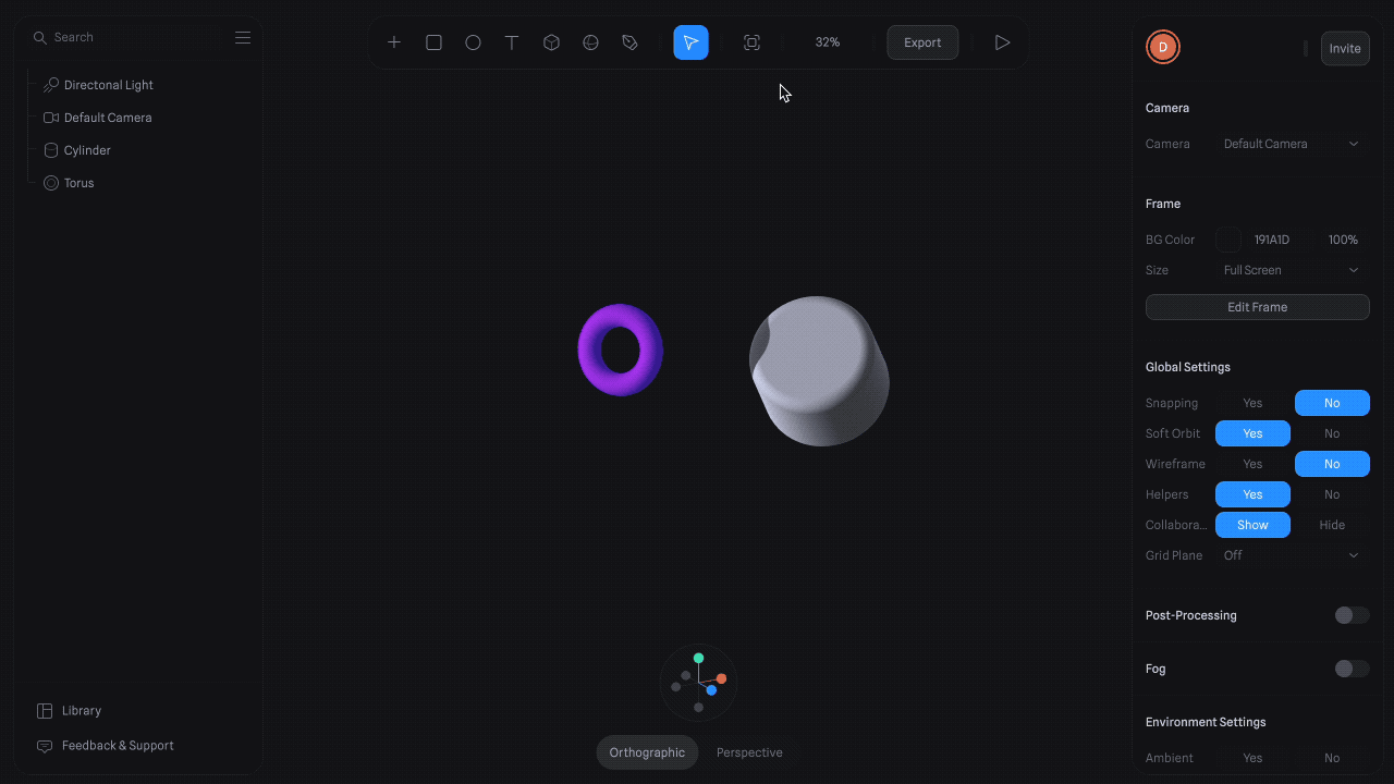
3D elements are everywhere in 2025, and Spline makes it easy to integrate them. This software allows you to design interactive 3D objects and integrate them directly into your pages without a heavy plugin or obscure line of code.
👉 For what? Bring your product to life, create an immersive experience, or simply add an original touch to your site.
You don't need to have an army of UX designers to choose a good color palette, powerful typography, or well-thought-out UI components. In 2025, we use:
👉 What it changes : a visually coherent site, with a strong aesthetic, which exudes professionalism without falling into the credits.
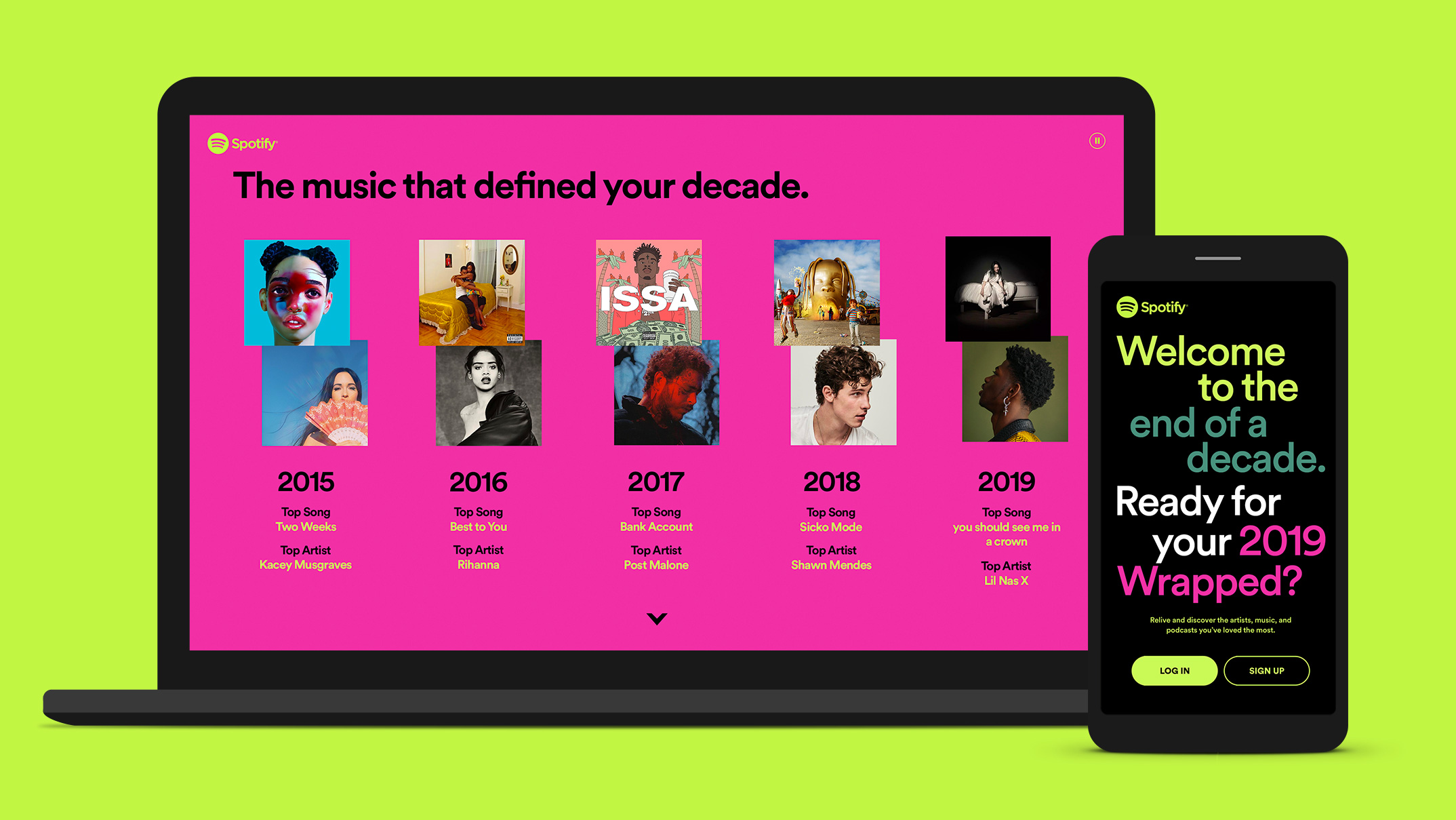
In 2025, the font is no longer content to accompany a design: it guides it, structures it and imposes its style. No more discreet and uniform fonts. Today, oversized titles, geometric fonts with bold lines, or warm handwritten fonts are becoming central elements in site design.
Using size and typographic contrast is no longer just a matter of aesthetics, it's a real strategy for capture the user's attention from the very first seconds and create a meaningful experience.
The hierarchy of information now depends as much on the choice of font as on its layout. The pronounced contrasts between titles, subtitles, and body text reinforce the understanding of the message and facilitate navigation.
Why integrate it into your website?
Elias Studio Advice : To maximize visual impact, combine bold typography with a minimalist background. This contrast will highlight your texts and give power to each piece of content, while maintaining smooth and pleasant navigation.
Long considered too rough, too raw, too chaotic, too chaotic, brutalism is now making a remarkable comeback, but in a more controlled, more elegant version: what is called high brutalism.
This current combines a deliberately disordered aesthetic: broken grids, asymmetric compositions, extreme fonts, sharp border effects with genuine attention to detail. The objective is no longer simply to provoke or break codes, but to assert a powerful identity while maintaining a form of readability and global balance.
This daring visual style allows certain brands or institutions to position themselves differently, to capture attention immediately and to anchor their digital presence in a unique universe, far from designs that are too smooth or too uniform.
Why does this trend work?
Our recommendation : play with this aesthetic in a targeted manner. A brutalist design can very well coexist with more stable elements: clear content areas, fluid navigation, controlled contrasts. The main thing is not to lose the user while creating a real graphic impact.
In 2025, web design is reconnecting to the essential. It is inspired by nature, not only for its organic aesthetics, but also for the values it conveys: authenticity, simplicity, sustainability.
This results in warm color palettes, earthy tones, natural textures (paper, wood, linen), hand illustrations, and soft typography. The whole creates a soothing visual atmosphere, far from flashy effects or overloaded compositions. This style, which is both simple and sensitive, invites trust and connection.
More than a graphic current, it is an emotional approach to design. The aim is not only to transmit information, but to offer a comforting, human, almost tactile web experience. The content is highlighted gently, and each visual element seems to be carefully chosen.
What this trend brings to your website:
Who is this trend aimed at? It is particularly relevant for wellness brands, players in the sustainable economy, handmade products or even social impact projects. But it can also provide a soothing counterpoint to more technical sites, provided it is integrated with coherence.
In 2025, micro-interactions became essential in modern web design. These are small visual effects, a button that pulses, a form that reacts, an icon that changes, that make an interface more fluid, more intuitive, and above all more pleasant to use.
These details, which are often invisible at first glance, play a key role in the user experience. They make it possible to guide, reassure, and strengthen engagement, without burdening the web page.
Why integrate them into your site?
The right dosage? Use these animated elements where they make sense: on a call to action, a form field, or a menu. Well placed, they make all the difference.
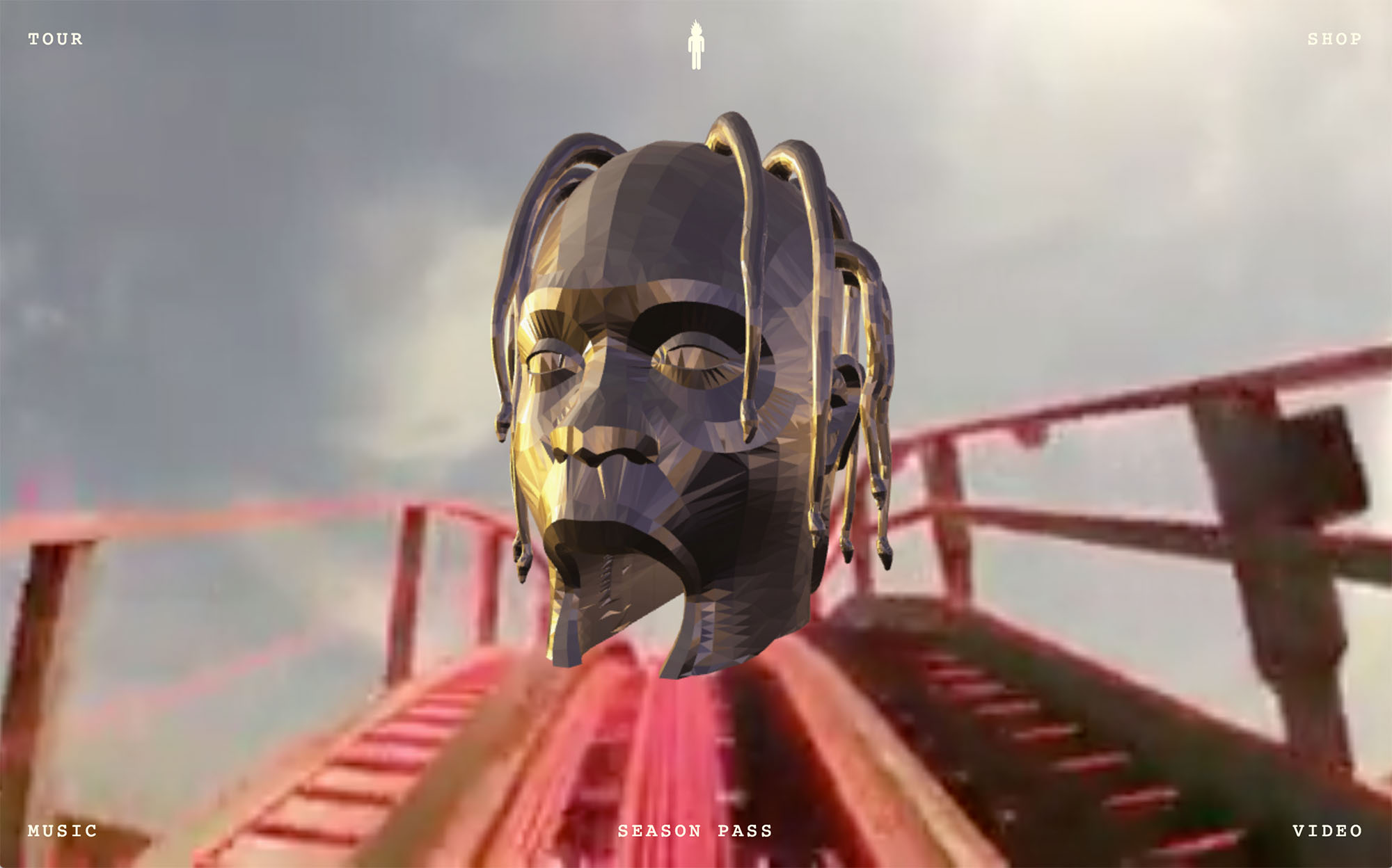
In 2025, we are giving back space to matter, to visual emotion. Rich textures, superimposed elements, abundant illustrations, soft animations: minimalism is receding to make way for immersive and expressive web design.
The visual becomes a real playground, designed to stimulate the senses and elicit a reaction. Each element contributes to building a strong identity, with relief, depth and a real personality.
Why adopt this trend?
A tip: this approach works very well for creative worlds such as fashion, lifestyle or culture, as long as you remain consistent throughout the design of the website and keep navigation clear.
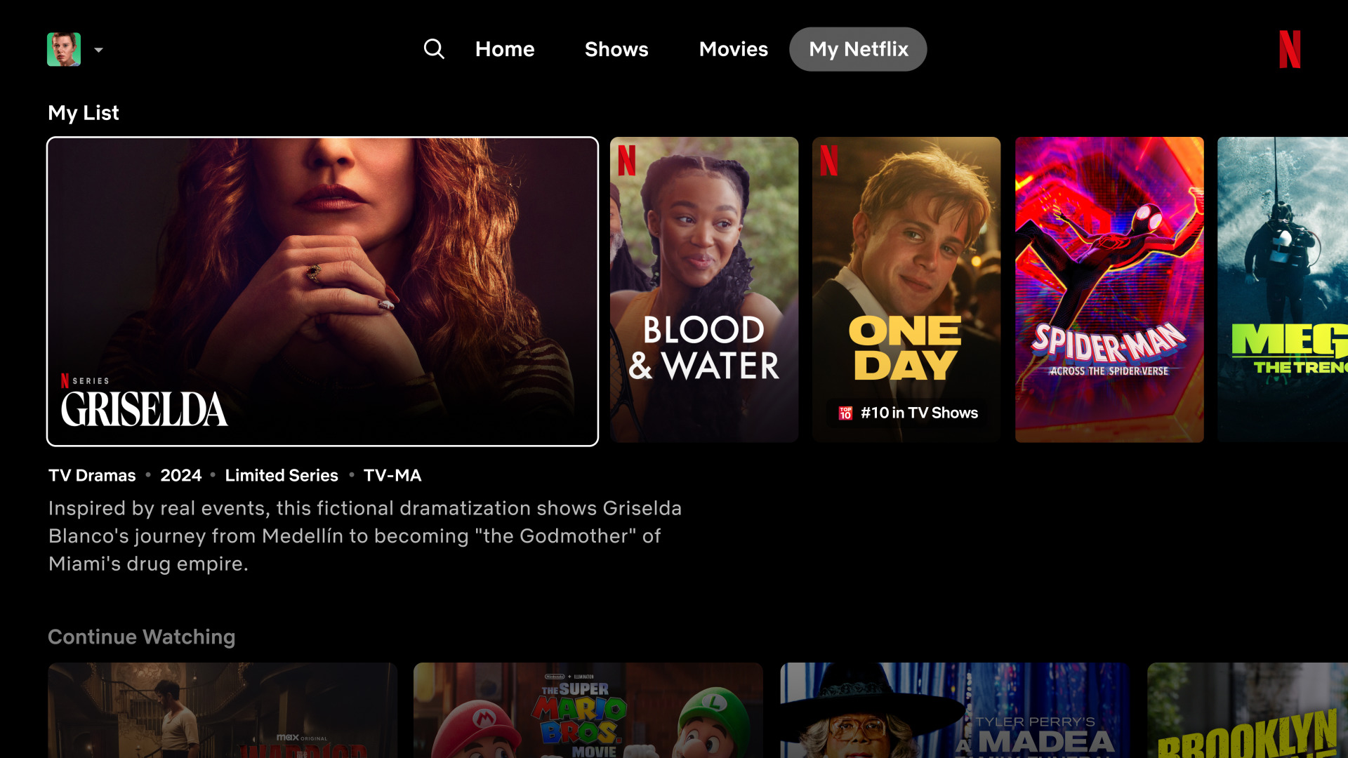
In 2025, smart websites are becoming the norm. Thanks to artificial intelligence, content, visual style, and even navigation adapt in real time to each user: their preferences, their behavior, their history.
This level of personalization transforms the experience into a tailor-made journey, much more engaging than a single interface for all.
Result?
To be tested without delay : personalized recommendations, automatic rearrangement of blocks, or display of contextual content according to the time or type of visitor.
Still as popular in 2025, dark fashion is emerging as a choice that is both aesthetic and practical. It provides a modern ambiance, highlights interactive elements, and improves reading comfort, especially in low-light environments.
Its effectiveness is based not only on its appearance, but on the quality of the user experience it offers.
To be used for:
A good reflex: offer a light/dark mode that can be activated according to the preferences of the visitor. It's easy to set up and it makes all the difference in terms of personalization.
In 2025, color is becoming a real user experience accessory. More than an aesthetic choice, it is used as an emotional lever. Unexpected combinations, vibrant pastels, strategic fluorescent touches... The objective is clear: to stimulate navigation and create a lively, dynamic, engaging interface.
By playing on color psychology, you can capture attention, create rhythm, and reinforce the impact of a call to action or a key message.
Why adopt this trend?
The important thing is to maintain readability and consistency. A well-thought-out palette can transform a site without compromising its ergonomics.
3D is now coming naturally into websites. Thanks to software like Spline or WebGL, it has become possible to integrate bulk elements directly into web pages, without affecting the loading speed or the user experience.
This web design trend offers a new way to enrich the interface, add depth, and capture attention, while remaining fluid and functional.
For what?
The idea is not to make 3D for 3D, but to use it intelligently, where it provides real value. A well-integrated 3D object can be enough to transform a page. There's no point in overdoing it if it's hurting performance.
In 2025, responsible web design is no longer a niche subject, it is a necessity. Reduced page weight, lightweight fonts, optimized images, optimized images, fewer heavy videos, simpler hosting... Sustainable design is a new balance between aesthetics, performance and ecological awareness.
What we call slow design does not mean doing less or less well: it is about doing more thoughtful things. It is an approach that seeks to minimize environmental impact while maintaining a fluid and qualitative user experience.
Why adopt this approach?
At Studio Elias, we have also dedicated a complete article to this subject: 👉 Optimizing your branding with web eco-design: a responsible and effective gesture
Good website design isn't just about what you see. It's also what it consumes, what it respects, and how it serves the user. The tool is important, but it is the substance that should always guide the form.
Not all web design trends are good to follow with your eyes closed. Some ideas seem stylish at the time... but quickly become cumbersome, outdated, or counterproductive. In 2025, it is better to sort it out and ask yourself the fundamental question: Is this trend really improving the user experience of my website?
Here are a few examples of pitfalls to avoid (or use sparingly).
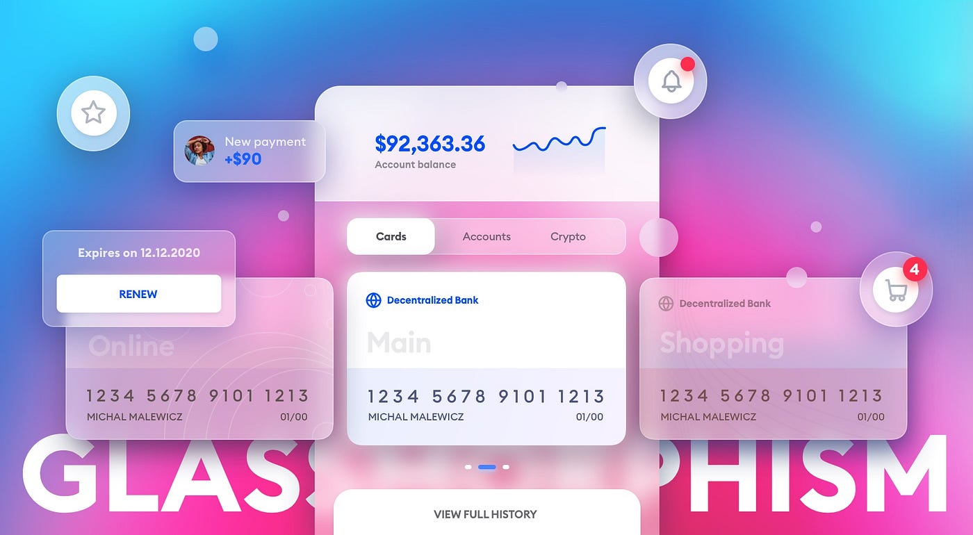
Yes, blur and transparency effects can be elegant. But when your entire site looks like a frosted window, the readability of the text takes a hit. Used sparingly, glassmorphism can provide a modern touch. In excess, it tires the eyes and interferes with navigation.
👉 To do: reserve it for secondary elements (maps, modals) and contrast sufficiently with the background.
A page that moves in all directions is funny... 3 seconds. Then it gets distracting, even annoying. The movement is good. Movement control is better. Too many animations slow down the site, hinder reading, and penalize accessibility.
👉 Good reflex: test your animations on mobile, time them, and never combine more than two effects on the same element.
In 2025, it's still a big no. A video that starts automatically (especially with sound) can scare a visitor away in 3 seconds. It's intrusive, disruptive, and often unnecessary.
👉 Alternatives: offer a “Play video” button or silent animations that catch the eye without interfering with the experience.
We love originality. But if your user no longer knows how to go down a page because the scroll goes diagonally, the sections slide backwards or you have to blow on the screen to go to the next step... it may be a bit too much.
👉 Tip: never sacrifice ergonomics in the name of “coolness”. The design of a site should always facilitate navigation.
Yes, we talked about dopamine colors. But be careful not to overdose: ultra-saturated palettes, combined without logic, can give a headache (and a bad image for your brand).
👉 The right move: choose a coherent color palette, with breathing zones (white, neutral), and respect contrasts.
What do these web design trends have in common? A desire to capture attention, to transmit a strong image, and to create designs that are both useful and beautiful. That's what we do at Studio Elias: we don't just design websites, we imagine digital experiences that make you want to stay, click, and share.
👉 And you, which of these trends will you incorporate into your website this year?


